
Dark Mode vs Light Mode: What the Research Actually Says
Dark Mode vs Light Mode: What the Research Actually Says
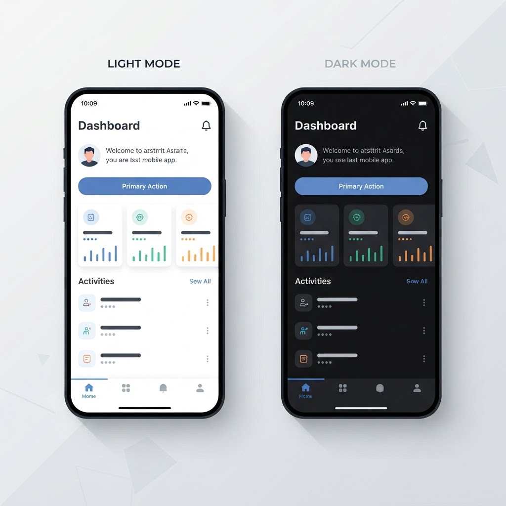
The dark mode debate has been raging since 2019, but the research is more nuanced than most designers realize. It's not a simple 'dark mode is better' or 'light mode is better', the answer depends on context, content, and the user's environment.
The Research: What Studies Actually Show
Reading Comprehension
A 2013 study by the Nielsen Norman Group found that users read faster in light mode. Specifically, users maintained higher reading comprehension and accuracy on light backgrounds. This held true across age groups.
However, a 2021 study by the University of Toronto found that dark mode can reduce eye strain in low-light environments. The key variable isn't the theme itself, it's the contrast between the screen and the surrounding environment.
Battery Life
On OLED displays, dark mode genuinely saves battery, but only on true black pixels. Dark gray (#1a1a1a) doesn't save significant battery because the pixel is still lit. Only pure black (#000000) turns the pixel off entirely.
The savings: about 30-40% battery reduction on OLED screens when using true black as the primary background. On LCD/IPS displays, there's no battery benefit.
Visual Fatigue
Research from the American Optometric Association shows that visual fatigue depends more on contrast ratios and text size than on light vs dark themes. A well-designed light mode with proper contrast is less fatiguing than a poorly-designed dark mode with low contrast.
When Dark Mode Wins
- Low-light environments. Using a device in a dark room? Dark mode reduces glare.
- Media consumption. Photos and videos look better against dark backgrounds, colors pop more.
- Long-form reading at night. Dark mode feels less harsh before bed.
- Code editors. Syntax highlighting works better against dark backgrounds.
- Data visualization. Charts and graphs often look more striking in dark mode.
When Light Mode Wins
- Daylight use. Bright ambient light makes dark mode screens harder to read.
- Text-heavy content. Long articles and documentation are easier to read in light mode.
- Accessibility. Users with certain visual impairments (like astigmatism) find light backgrounds easier to read.
- E-commerce. Product photos look more trustworthy on light backgrounds.
- Professional contexts. Light mode reads as more formal and authoritative in many business settings.
Designing Both Well
Contrast Ratios
Dark mode needs the same contrast ratios as light mode. The WCAG minimum of 4.5:1 for body text applies to both. Many dark mode designs fail here : gray-on-black looks fine to the designer but fails accessibility checks.
Key values for dark mode:
- Background: #0a0a0a or #121212 (not pure black for non-OLED apps)
- Primary text: #e0e0e0 or #f5f5f5 (not pure white, too harsh)
- Secondary text: #a0a0a0 or #b0b0b0
- Borders: #2a2a2a or #333333
Surface Hierarchy
In light mode, higher surfaces are lighter (white card on gray background). In dark mode, the inverse often works: higher surfaces are slightly lighter than the background (dark gray card on near-black background).
Color Vibrancy
Colors that look great in light mode often need adjustment for dark mode. A blue that reads as vibrant on white can look muddy on dark. The fix: increase saturation and brightness for dark mode color variants.
The Verdict
The research says: design both, and let users choose. Auto-switching based on system preference is the best default. But always make sure both themes are fully accessible, not just aesthetically different.
Want to test your designs in both themes? Try the NewForm Studio to mock up your interfaces. And to find the right tools for your workflow, take our 60-second quiz.
Find Your Stack
Discover the perfect design tools for your workflow.
Take the 60-second quizNewForm Studio
Turn your designs into professional mockups instantly.
Open StudioMore from NewForm

How to Create Fluffy Soft UI Elements in Figma: A Complete Tutorial
Learn how to create fluffy, soft, pillowy UI elements in Figma with this step-by-step tutorial covering shapes, shadow stacks, gradients, and where to use them.
7 min read · Oct 2, 2026

Mobile App UI Design Inspiration: 8 Screens That Show What Great Design Looks Like
A breakdown of 8 mobile app UI screens from designer @noahelhadedy, covering navigation, color, typography, spacing, and visual hierarchy principles you can apply today.
6 min read · Oct 2, 2026