
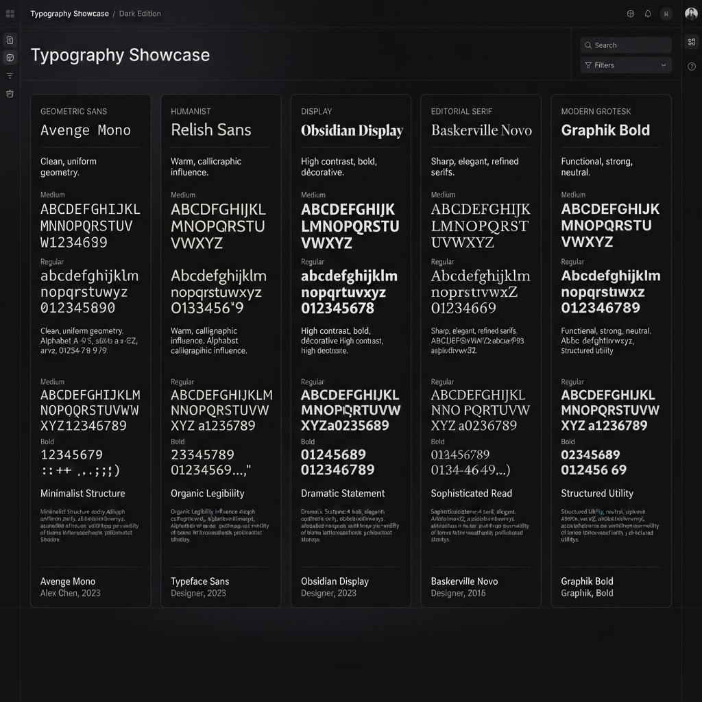
Inter Font Alternatives Every Designer Should Know
Originally shared as a carousel on @dailywebdesign, original carousel by @basit.designs. Expanded with download links, use cases, and pairing suggestions.


Inter is the default UI font of the internet. Designed by Rasmus Andersson and released as open-source, it became the go-to for clean, legible, and neutral, and it delivered. Then everyone adopted it. Now every SaaS dashboard, every app, every portfolio uses Inter.
If you want your work to feel distinct, you need alternatives. Here are the best Inter substitutes that preserve readability and neutrality, while giving your UI personality Inter can't.
1. Geist . Vercel's open-source typeface
Geist was designed by Vercel specifically for code and interfaces. It has Inter's technical precision but feels slightly more geometric and modern. Geist Mono pairs perfectly for code-heavy dashboards.
Best for: Developer tools, technical dashboards, SaaS with a modern startup feel | Free, open-source
2. Plus Jakarta Sans
Plus Jakarta Sans has slightly more personality than Inter, a slightly flared terminal on some letters gives it warmth without sacrificing neutrality. Works at every size from 11px body text to 80px hero headings.
Best for: Fintech, productivity apps, portfolios | Free on Google Fonts
3. DM Sans
DM Sans was designed by Colophon Foundry for DeepMind. Round terminals and generous spacing make it feel approachable, great for consumer-facing products.
Best for: Consumer apps, wellness/health products, B2C interfaces | Free on Google Fonts
4. Outfit
Outfit leans geometric, closer to Futura than Inter. Its weight range from Thin through Black is excellent.
Best for: Branding, marketing sites, apps where the interface is part of the brand statement | Free on Google Fonts
5. Sora
Sora is a Japanese-origin typeface with clean geometric structure. Slightly condensed proportions work well for compact, data-dense layouts.
Best for: Compact dashboards, data-heavy apps | Free on Google Fonts
6. Space Grotesk
Space Grotesk has an irregular, slightly quirky geometry that makes it stand out immediately. Popular in crypto, AI, and tech products.
Best for: Crypto, AI tools, tech products that want an edge | Free on Google Fonts
7. Manrope
Manrope hits the sweet spot between Inter's neutrality and something with slightly more character. Exceptional rendering at small sizes makes it a near-perfect Inter swap.
Best for: If you literally want "Inter but slightly different and fresh" . Manrope is the answer | Free on Google Fonts
How to choose the right one
- Who is your user? Consumer apps → DM Sans, Manrope. Developer tools → Geist. Bold creative → Space Grotesk, Outfit.
- What density do you need? Data-heavy? Geist, Sora, and DM Sans have good tabular numerals.
- What's your brand personality? Neutral + trustworthy → Manrope or Plus Jakarta Sans. Modern + technical → Geist. Bold + distinct → Outfit or Space Grotesk.
Presenting your typography choices
Present your type specimens as polished mockups using NewForm Studio. Upload your type scale or UI screens and generate professional device mockups to show clients or include in your portfolio.
View the full carousel on Instagram →
Credit: Original carousel by @basit.designs, follow them for more typography and design tips.
Find Your Stack
Discover the perfect design tools for your workflow.
Take the 60-second quizNewForm Studio
Turn your designs into professional mockups instantly.
Open StudioMore from NewForm

Top Dashboard UI Designs to Learn From (2026 Showcase)
Five standout dashboard designs across SaaS, AI, cybersecurity, energy, and fintech. Each one shows how to turn complex data into a clean, usable interface.
7 min read · Sep 24, 2026

10 UI Design Ideas to Steal for Your Next Project (2026)
Ten practical UI design patterns worth borrowing for your next project, from clear empty states to premium dark mode and compact data displays.
6 min read · Sep 24, 2026