
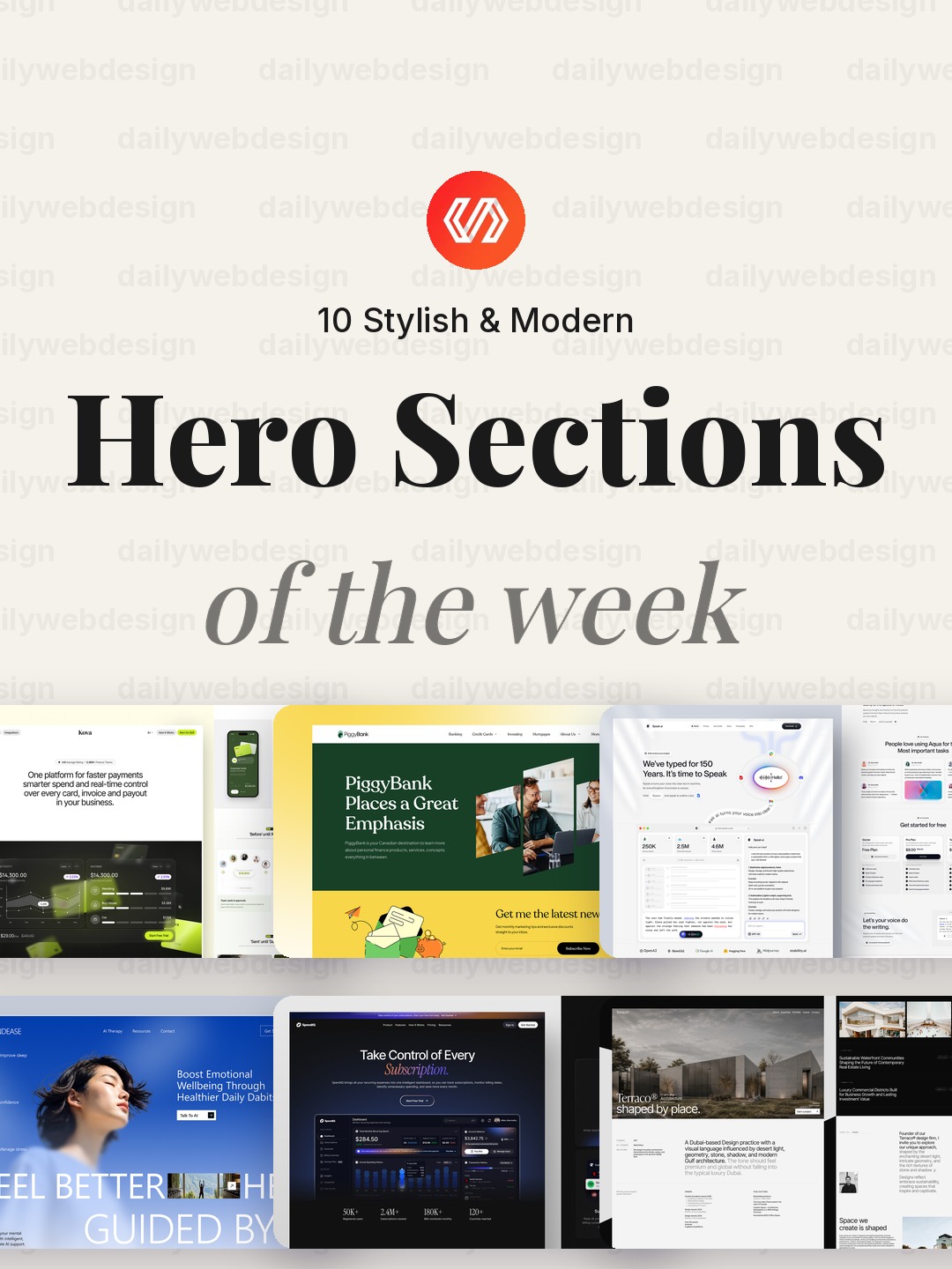
10 Stylish & Modern Hero Section Designs to Learn From (October 2026)
10 Stylish & Modern Hero Sections to Learn From (October 2026)
A hero section has a small job: help someone understand the page, decide whether it is for them, and see what to do next. These ten Dribbble examples span finance, AI, wellness, architecture, and studio sites, so the patterns are useful well beyond one visual trend.
The point is not to copy a screenshot wholesale. Look for the structure underneath it: what gets attention first, what earns trust, and what action the page makes easiest.
1. Kova - Fintech SaaS Landing Page by Korsa
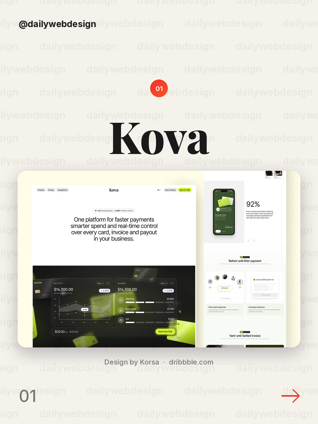
A fintech landing page has to make trust and value legible before a visitor commits. Look at how the hero can lead with one clear customer outcome, then support it with a product view or proof point. Keep the primary action singular, and let rates, security details, and secondary paths follow rather than compete with it.
2. Piggybank Website Redesign by Awe Design Studio
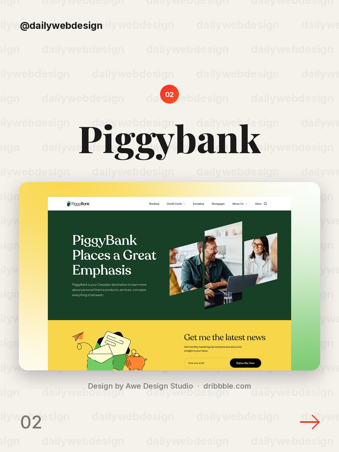
Design by Awe Design Studio, via Dribbble
A piggybank concept gives a redesign an approachable emotional hook. The useful lesson is to connect that metaphor to a concrete benefit, such as a savings goal or visible progress, instead of relying on a cute visual alone. Pair warmth with plain language about how the service works, especially around money.
3. Speak AI Voice Assistant Website Design by Alamin Hossen
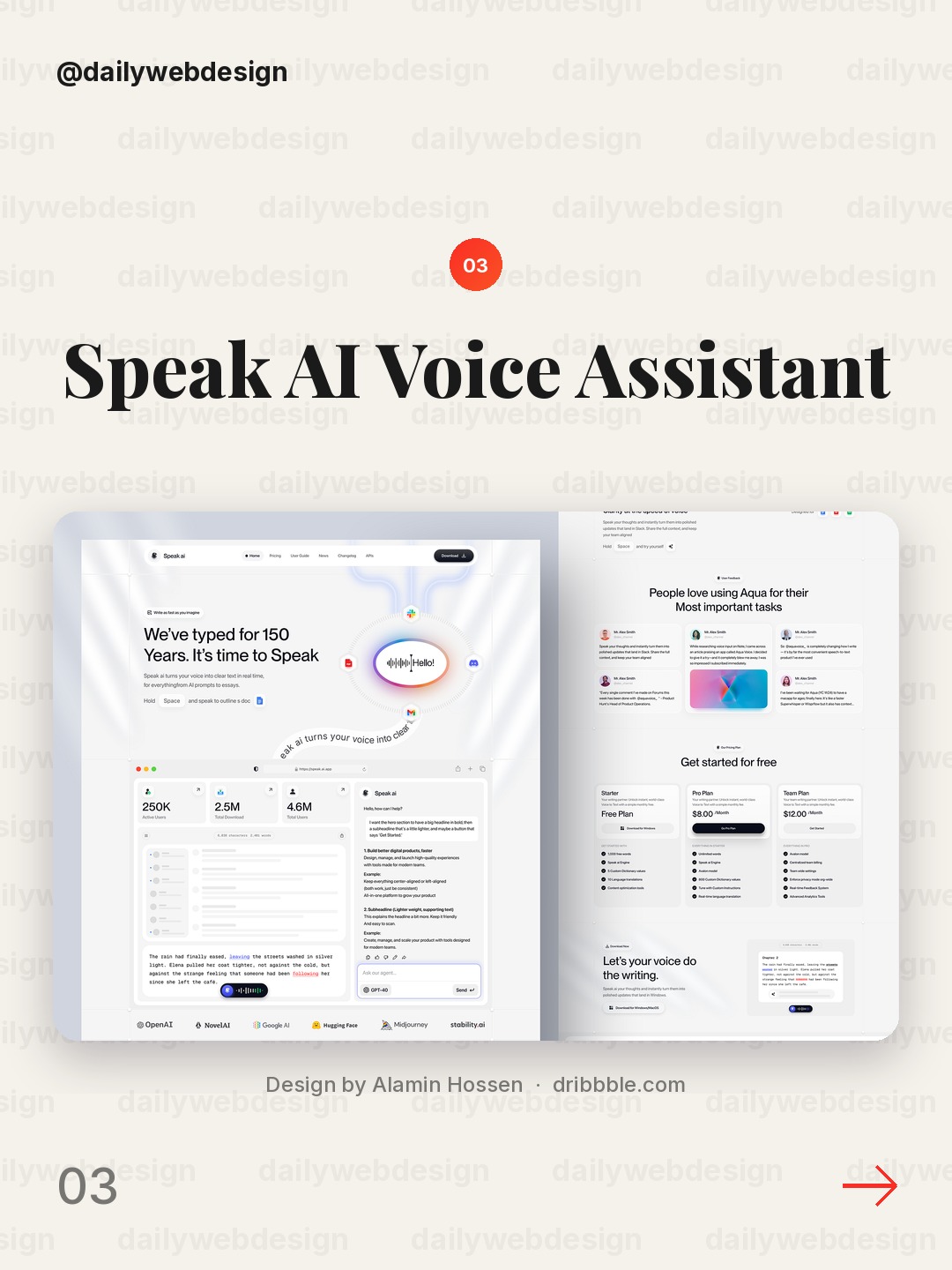
Design by Alamin Hossen, via Dribbble
For an AI voice assistant, the first screen needs to explain both what the product does and how a person starts speaking to it. A focused prompt or example can make the interaction feel tangible. Avoid asking the hero to communicate every capability; move use cases and technical detail into the next section.
4. AI Mental Health Platform by NexUX Lab
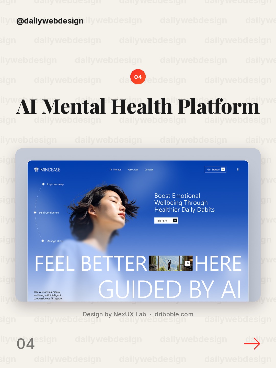
Design by NexUX Lab, via Dribbble
Mental health products need reassurance without making unsupported promises. A hero can establish who the platform is for, what kind of support it offers, and a gentle next step. Use calm hierarchy and direct wording, and keep crisis or clinical claims precise and appropriately supported elsewhere on the page.
5. Personal Finance SaaS Website Design - SpendIQ by One Week Wonders
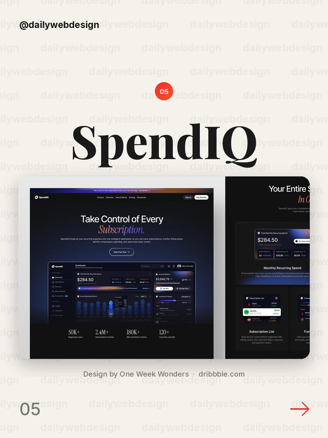
Design by One Week Wonders, via Dribbble
A personal finance product is easier to understand when the page anchors on one everyday task, such as tracking spending or planning a budget. Give that outcome priority, then use a product preview to show how it works. A clear distinction between the free entry point and paid features can reduce uncertainty.
6. Terraco® — Architecture & Interior Design by HR Rumen
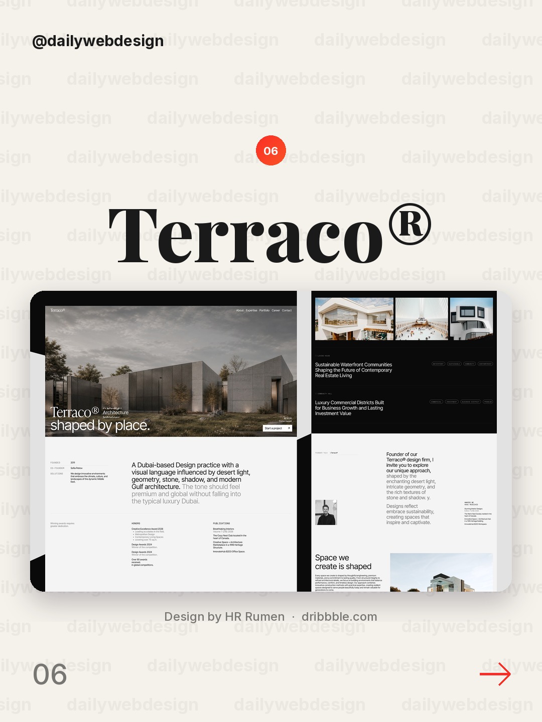
Design by HR Rumen, via Dribbble
Architecture and interiors benefit from letting imagery carry the first impression while the text provides orientation. Name the project or service clearly, keep navigation and the main inquiry action easy to find, and use restrained supporting copy so it does not compete with the work itself.
7. AI Share Hub - Web3 AI Platform Website Design by Nina Marinenko
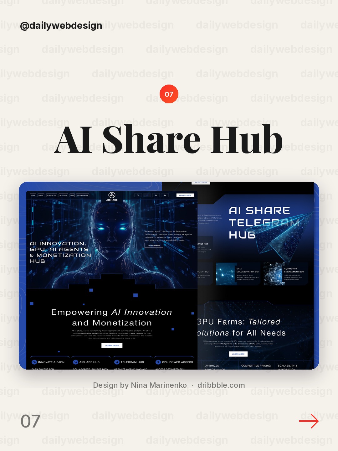
Design by Nina Marinenko, via Dribbble
A Web3 and AI platform can be difficult to explain because the category language is abstract. Lead with the job the user can accomplish, then introduce the underlying technology as context. A specific example in the hero is more useful than stacking several trend terms together.
8. Creative Digital Studio Website Design by Topnotch Studio
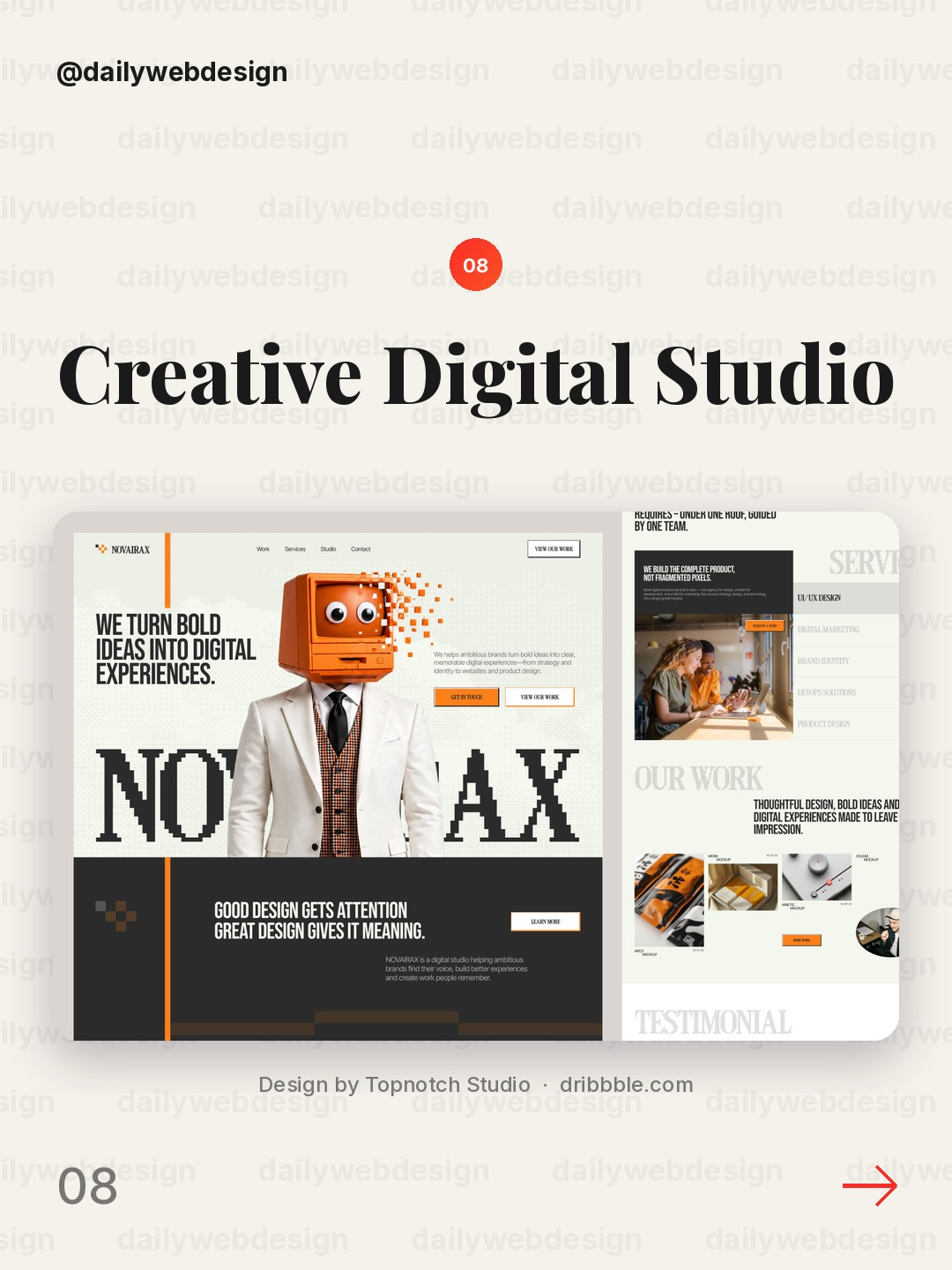
Design by Topnotch Studio, via Dribbble
A creative studio site has two audiences to serve: prospective clients and people evaluating the studio's taste. Make the offer and the studio's point of view visible quickly. One memorable visual direction can establish character, while a direct project inquiry action keeps the page practical.
9. Real Estate Website by Yscale Studio
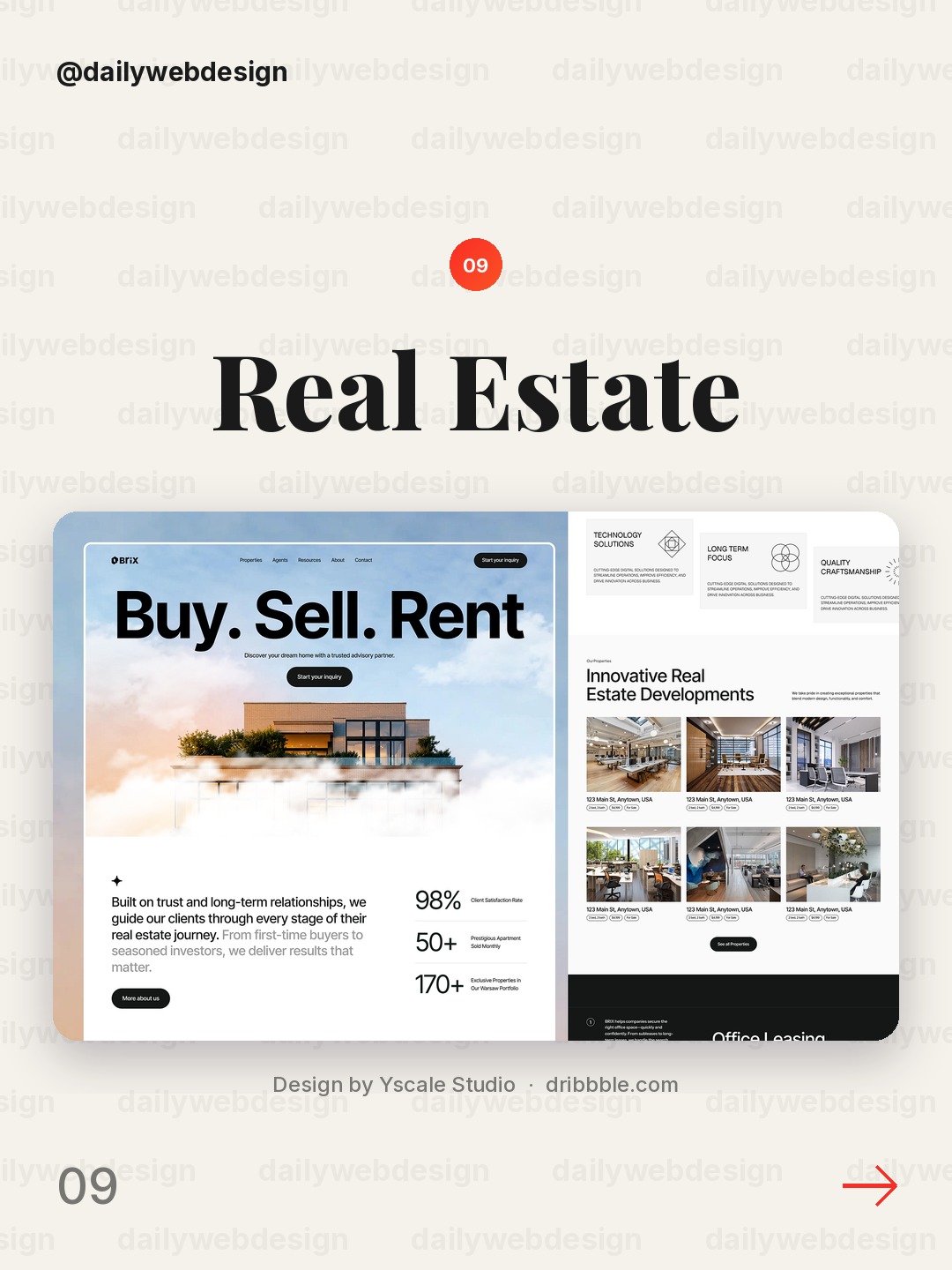
Design by Yscale Studio, via Dribbble
Real estate pages often need to serve people browsing and people ready to enquire. A focused headline, useful location or property context, and a visible search or contact action help visitors choose their next step. Keep the initial choice simple and defer filters that are not essential to starting.
10. Creative Agency Website & UX/UI Design by Artspire
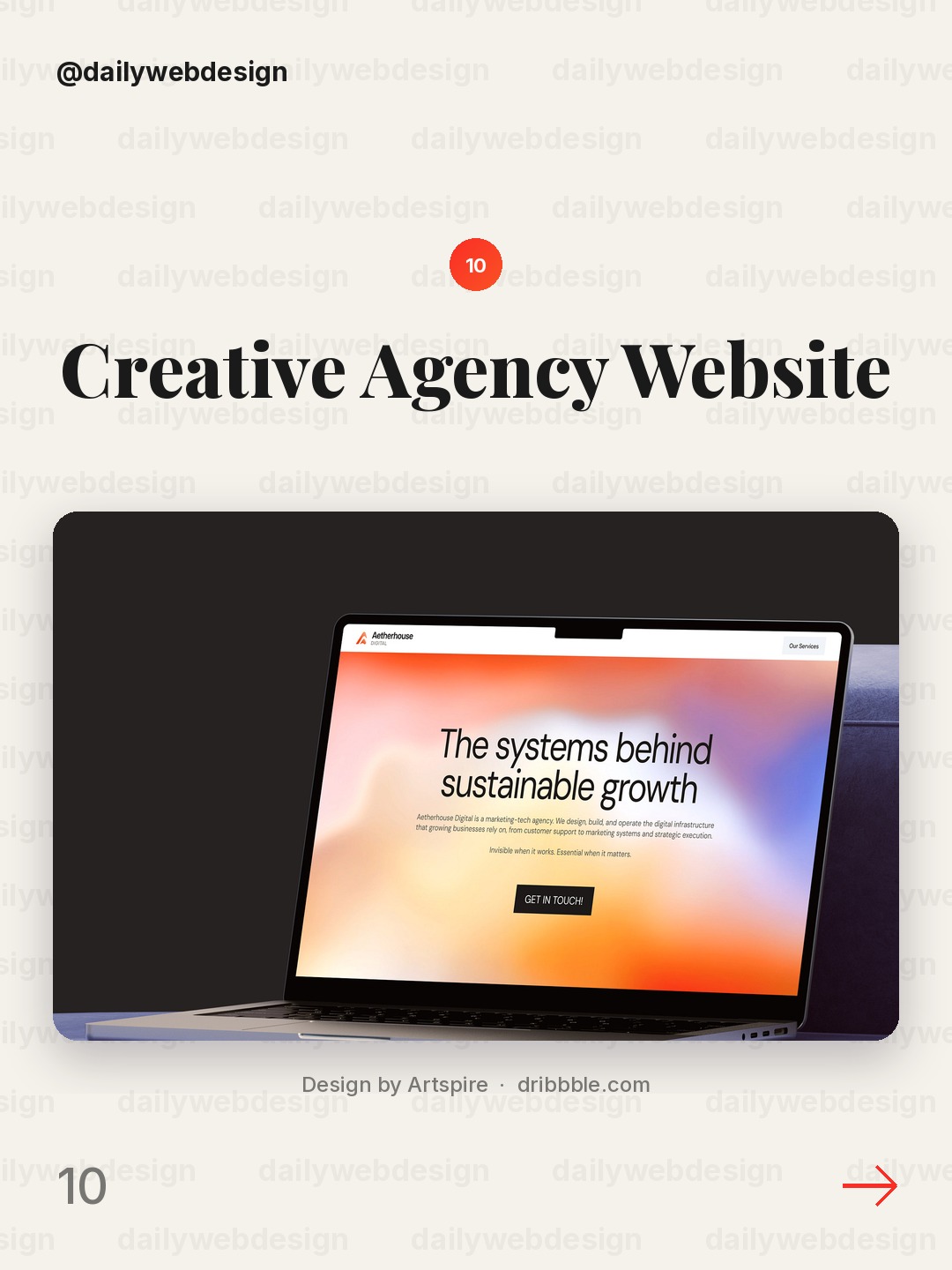
Design by Artspire, via Dribbble
For an agency, the hero should make its specialty and audience specific enough to be memorable. Pair a concise promise with one clear route into selected work or services. If the visual treatment is expressive, keep the message and call to action especially easy to scan.
What I would copy this week
First, write the hero headline around a user outcome, not a category label. Second, choose one proof point or product view that makes the promise credible. Third, give the page one obvious next action and move supporting details lower. Those three decisions improve clarity without requiring a full redesign.
Explore more practical design prompts and build ideas in the NewForm monthly challenges.
Which one is your favorite?
Pick the shot you would save. One vote per visitor.
Kova - Fintech SaaS Landing Page
Design by KorsaPiggybank Website Redesign
Design by Awe Design StudioSpeak AI Voice Assistant Website Design
Design by Alamin HossenAI Mental Health Platform
Design by NexUX LabPersonal Finance SaaS Website Design - SpendIQ
Design by One Week WondersTerraco® — Architecture & Interior Design
Design by HR RumenAI Share Hub - Web3 AI Platform Website Design
Design by Nina MarinenkoCreative Digital Studio Website Design
Design by Topnotch StudioReal Estate Website
Design by Yscale StudioCreative Agency Website & UX/UI Design
Design by ArtspireFind Your Stack
Discover the perfect design tools for your workflow.
Take the 60-second quizNewForm Studio
Turn your designs into professional mockups instantly.
Open Studio