

Bold Typographic Packaging: 4 Lessons From Standout Label Designs
Bold, type-first packaging is having a moment, and it is not hard to see why. On a crowded shelf or in a scrolling feed, a label that leans entirely on typography reads instantly, photographs cleanly, and needs no illustration budget to feel finished. A roundup spotted via @expert.pitch{target=_blank} collects exactly this kind of work: sparkling water, switchel, tonic and facial oil labels where the wordmark does everything. Each example teaches a slightly different lesson about typographic packaging design.
1. Let one word carry the entire hierarchy
 {: .blog-image}
The first label in the set spells the brand name in letters almost as tall as the can itself, then prints everything else, "sparkling water", "crisp and light", "365 ml", in a tiny, quiet line. That is the whole composition: one loud word and one whisper.
The lesson is about hierarchy, not size. Most packaging tries to make product category, flavor and benefits all readable at once, which makes nothing readable. One typographic voice at full volume, with supporting copy as a caption, reads from across a room and looks intentional in photos. When you lay out a label, decide first which single element gets to shout, and force everything else into a supporting role.
2. Use color blocking as your illustration
 {: .blog-image}
The Brinepoint design needs no drawing at all. Solid color fields do the separating, a stacked wordmark does the announcing, and the relationship between the two does the visual work. It reads as designed because the blocks are proportioned with clear intent, rather than splitting a can into equal thirds.
This is a workhorse move for small brands: a two-color palette plus strong geometry gives a feeling of completeness that illustration cannot buy at the same price. It also squares well with modern workflows, since flat color blocks survive printing at any scale and look sharp at feed size.
3. Turn functional copy into a design element
 {: .blog-image}
The switchel and tonic labels print instructions, "ginger switchel", "serve chilled, over ice", like a menu rather than a legal footnote. The founder-voice copy becomes the texture of the label itself, and it does more for personality than any tagline could.
Functional copy on packaging (ingredients, instructions, origin) is usually treated as an obligation and visually punished. The alternative: set it in the same typographic system as the brand, with deliberate sizing, and it becomes part of the design. This works beyond packaging, in storefronts, checkout screens and anywhere product copy is called "boilerplate". The parts of a design people skip are also the parts nobody bothers to design.
Takeaway: list the copy you consider unavoidable. Style it once, consistently, and the mundane sections of any layout stop dragging the rest down.
4. Quiet color, loud type
 {: .blog-image}
The last example in the set, DEWLO facial oil, goes the opposite way from the color-block work: calm, nearly monochrome packaging with typographic confidence carrying the whole identity. Nothing except the wordmark's posture tells you it is a premium object, and that is enough.
Two more labels from the same series show the same loud-type discipline carried across different formats, with color volume up on one and stripped down on the other:
 {: .blog-image}
 {: .blog-image}
What stays constant is the posture: the type is set like a poster, the product photography is minimal or absent, and the brand name behaves like the headline of the piece.
Making this practical: the shelf test and the feed test
Type-first design has two separate audiences: the physical shelf and the social feed. Before committing to a label direction, test both:
- The shelf test: sight distance check. Squint or step back five meters. If the brand word is not the only thing you can still read, the hierarchy is not strong enough yet.
- The feed test: screenshot your label mockup and shrink it to a thumbnail. Bold typographic labels are the rare designs that hold up at 120 pixels wide, which is exactly why brands living on Instagram traffic keep choosing them.
A couple of practical production notes, since these are concept-grade examples: printing giant flat color fields makes any substrate inconsistency visible, so request proofs. And printing type that runs over a seam, cap or fold shifts smaller than a millimeter, which is enough to break a stacked wordmark on a can. Design the label flat, but always approve it curved.
The pattern across all four lessons: decide what gets to be loud, make the quiet parts genuinely quiet, and let typography do the work that budget illustration would otherwise fake.
Source carousel by expert.pitch{target=_blank} via dailywebdesign on Instagram{target=_blank}. Slide images by the original designers, shared for commentary.
Want to photograph your own label concepts like these? Drop them into a phone or bottle mockup in the NewForm Studio{target=_blank} before you post.
Keep reading

Find Your Stack
Discover the perfect design tools for your workflow.
Take the 60-second quizNewForm Studio
Turn your designs into professional mockups instantly.
Open StudioMore from NewForm
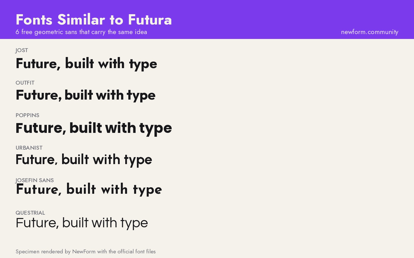
6 Free Fonts Similar to Futura (Real Specimens, 2026)
Futura is licensed and awkward at small sizes. These 6 free geometric sans, rendered from their official files, do the same job: Jost, Poppins, Outfit, Urbanist, Josefin Sans, Questrial.
13 min read · Nov 3, 2026

Free UI Components, SVG Generators and Icons: 4 Sites Every Designer Should Bookmark
Uiverse, fffuel, Iconbuddy and WebGradients cover most of the UI work designers re-solve every week: copy-paste components, SVG generators, 150,000 icons and CSS gradients.
4 min read · Nov 2, 2026