
6 Free Fonts Similar to Futura (Real Specimens, 2026)
Futura is a geometric sans drawn in 1927 by Paul Renner, and the closest free replacements are Jost (the most faithful) and Poppins or Outfit (friendlier, better for UI). Below are six free fonts similar to Futura, rendered from their official files at identical settings, plus the paid options if you have a budget.
TL;DR: the six, ranked
- Jost, closest overall match. Free, Google Fonts. A deliberate Futura revival: same circular bowls, same tall ascenders, same high-contrast geometry. Best for branding, editorial headers, anything where the Futura idea has to survive contact with a client's budget.
- Poppins, best for UI. Free, Google Fonts. Wider, lower contrast, far more even in a paragraph. Geometric voice without the spacing problems.
- Outfit, best for product brands. Free, Google Fonts. A modern geometric with a variable weight axis and a cleaner lowercase a than Futura itself.
- Urbanist, best for dense screens. Free, Google Fonts. Geometric skeleton at a narrower width, so 14px labels stop feeling airy.
- Josefin Sans, best for fashion and editorial. Free, Google Fonts. Low x-height, high waist, unmistakably 1920s. Beautiful in a headline, painful in body copy.
- Questrial, best single weight. Free, Google Fonts. One weight, drawn for web, circular and quiet. Enough for a landing page, not enough for an app.
If you want the shortest possible answer: use Jost for display, Poppins for body, and stop looking.
Why Futura is so hard to replace
Futura's geometry is not the hard part. Dozens of fonts copy the circles.
The hard part is what those circles do to spacing. Futura's lowercase is built from near-perfect circles and straight stems, which means the negative space around letters like c, e, o and s never resolves into even rhythm. In 1927, set in metal for a poster, that was the point: the page looked engineered. At 13px in a sidebar, the same rhythm reads as loose and slightly wrong.
That is the whole reason this query exists. People are not shopping for a prettier geometric sans. They are usually looking for one of three things:
- Legal cover. Futura is a Bauer Types / Neufville Digital licence. If you built a product with it years ago, you cannot ship a webfont of it without a licence, and the second designer on the project needs something that looks identical.
- A free version for client mockups and side projects. Nobody wants to spec a $400 typeface into a proposal that may not happen.
- Something that keeps Futura's personality but works smaller. Branding work survives Futura easily. Product UI almost never does.
Sort out which of the three you are, then read the section that matches. The measurements below came from the font files themselves, not from a screenshot of somebody's brand deck.
The specimens

Every board in this post is rendered by NewForm with the official font files at identical settings: 1600 by 1000, 74px headline, 16px body at 2x, a numeral row, the glyph row a g R 1 I l 0 O, and a 48px button. Same words every time, so the only variable is the letterforms.
1. Jost: the closest free match
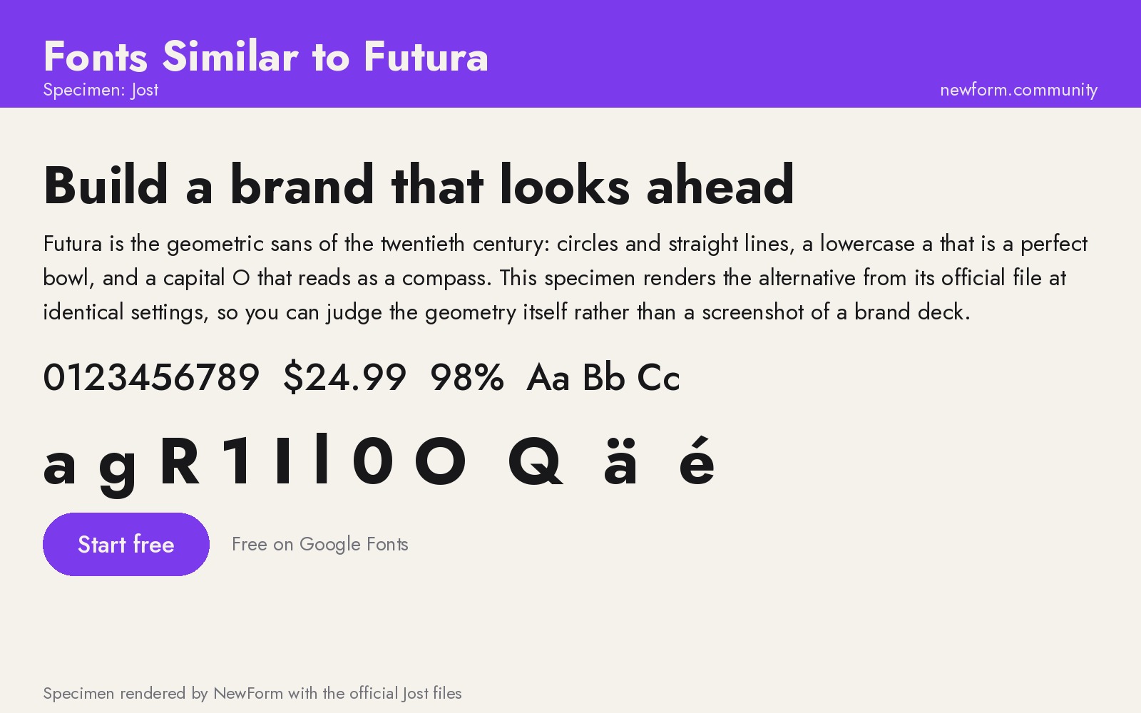
Why it works. Jost was drawn by Owen Earl as an explicit homage to Futura, and it is the only free option here that reads as a revival rather than an interpretation. The circular bowls, the single-story a, the pointed apex on the capital A, the tall ascenders that clear the cap height: all of it is tracked from the original. Weight 700 in Jost is where it gets closest to a Futura Bold you would see on a Bauhaus poster.
Where to use it. Branding, display type, packaging, editorial headers, presentation decks, and any product where the Futura reference is the point. It is also the best legal swap if you inherited a brand built on Futura and need a free version for web and mockups.
Settings that work. Jost sets loose at small sizes, exactly like Futura. Track it in slightly at body sizes and never set it below 16px in a paragraph. Its lowercase is small relative to the capitals, so headline line heights should be generous, around 1.1 to 1.2.
/* Jost, display and body */
.display { font-family: 'Jost', 'Futura', 'Century Gothic', system-ui, sans-serif;
  font-weight: 700; font-size: clamp(2.5rem, 5vw, 4rem); line-height: 1.08; letter-spacing: -0.01em; }
.body { font-family: 'Jost', system-ui, sans-serif;
  font-weight: 400; font-size: 16px; line-height: 1.65; letter-spacing: 0.005em; }
Watch out for. Two real problems. First, the small x-height makes dense UI look airy and slightly worn out, so it is a poor choice for form fields and data tables. Second, Jost's italic is a slanted roman rather than a true italic in most weights, which shows up immediately in editorial work. If your design calls for italics in body copy, pick Poppins or Outfit instead.
Where to get it. Jost on Google Fonts (free, open source, variable).
2. Poppins: the best Futura alternative for UI
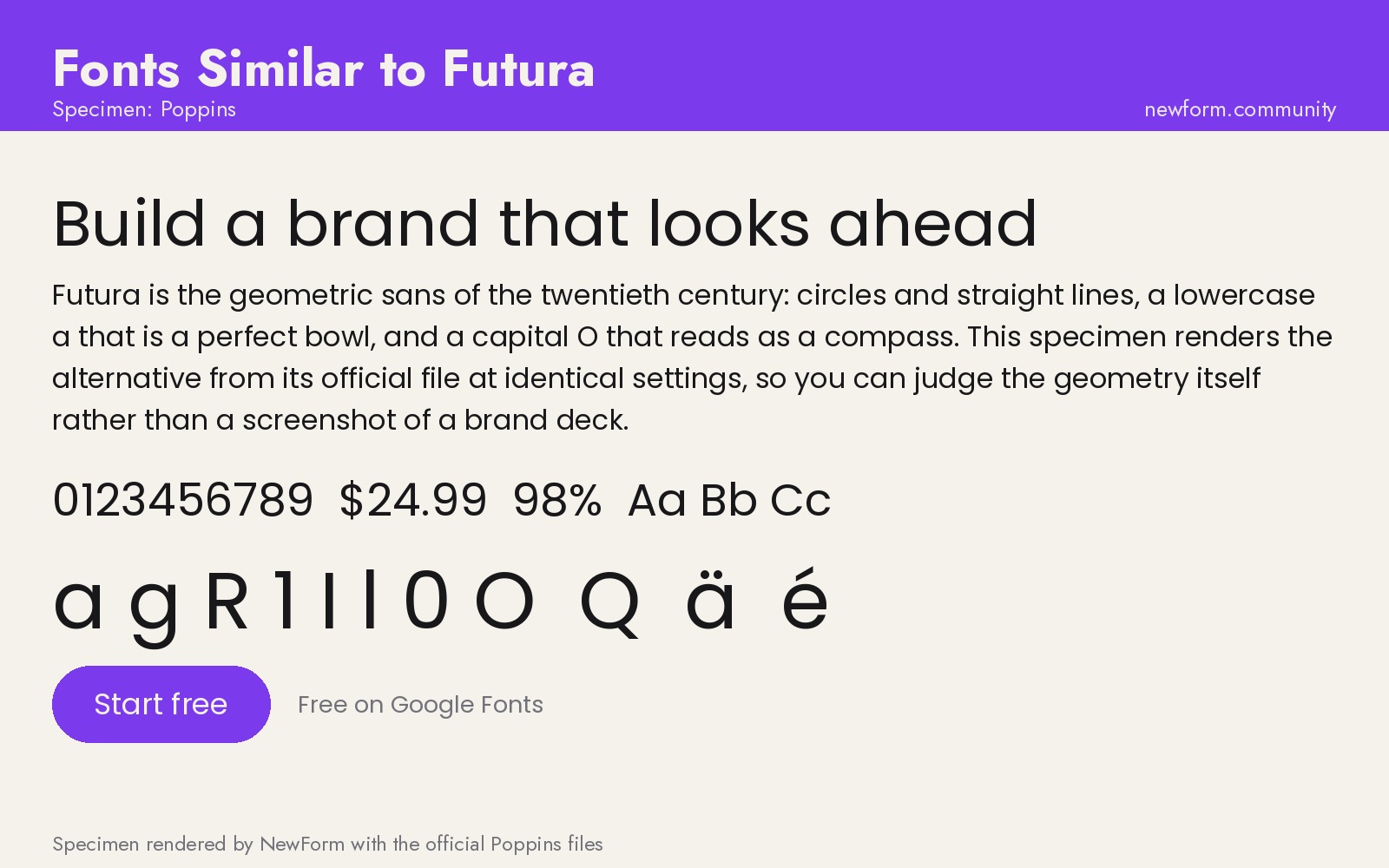
Why it works. Poppins takes the geometric idea and fixes the rhythm. The bowls are still circular, but the sidebearings are tighter, the x-height is higher, and the contrast is lower, so a paragraph holds together at 14px where Futura falls apart. It is the geometric sans most shipped in Indian and Southeast Asian product design for exactly this reason, and it is the one I use when a client wants Futura but has an app.
Where to use it. Product UI, marketing sites, dashboards, mobile apps, and body copy under a Jost or Outfit headline. It is also unusually good in button labels because the wide, round letterforms stay legible at small sizes with tight padding.
Settings that work. Poppins is already open, so resist tracking it out further. Weight 600 is the sweet spot for headings; 700 starts to look heavy and slightly cartoonish. Body at 16px with 1.6 line height.
/* Poppins, UI scale */
h1, h2, h3 { font-family: 'Poppins', system-ui, sans-serif; font-weight: 600; letter-spacing: -0.015em; line-height: 1.15; }
p, li, label { font-family: 'Poppins', system-ui, sans-serif; font-size: 16px; line-height: 1.6; }
.button { font-family: 'Poppins', system-ui, sans-serif; font-weight: 500; font-size: 15px; letter-spacing: 0.01em; }
Watch out for. Poppins has one real trap: it is everywhere. If your differentiation depends on the typeface looking unexpected, Poppins will not do it, because half the internet already uses it. It also has a wide, distinctive Q and a very round g that some people dislike at display size. And the Devanagari companion means some weights carry a slightly different rhythm than you expect.
Where to get it. Poppins on Google Fonts (free, open source).
3. Outfit: the modern geometric
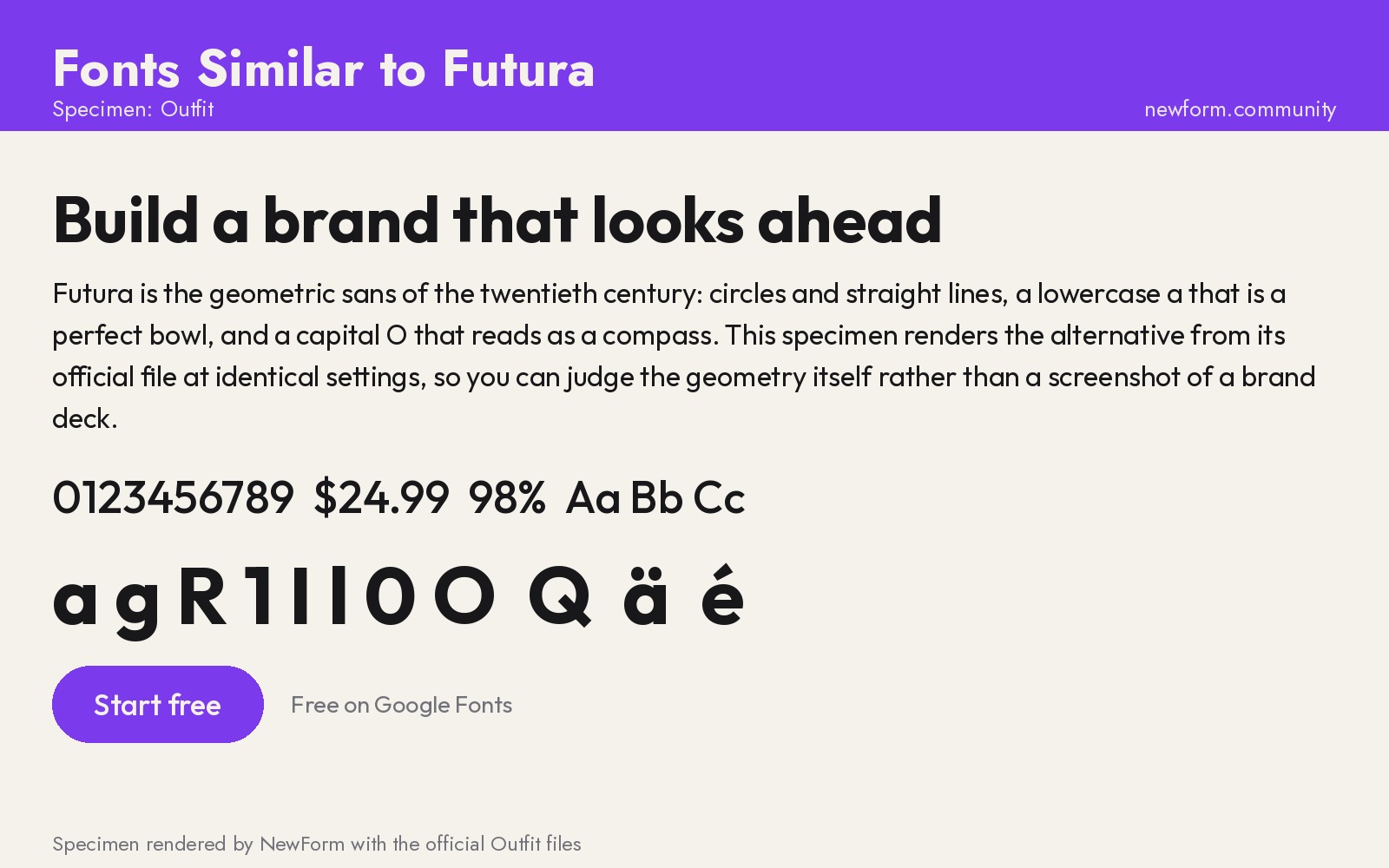
Why it works. Outfit is a geometric sans drawn in 2021 by Smartsheet's design team for a product brand, which means it was designed under the constraints Futura never had: it has to work at 12px, in a variable weight axis, in a real interface. It keeps the circular o and the clean geometric skeleton while giving you a properly resolved lowercase a and a tighter default spacing.
Where to use it. Product brands, SaaS marketing sites, app store screenshots, startup identity work. It is the safest pick if you want a Futura-adjacent look that will not fight you when the brand grows into a design system.
Settings that work. Outfit's variable axis runs from 100 to 900, so you can build a full scale from one file. Headlines at 600 to 700 with negative tracking, body at 400. It pairs cleanly with a serif for editorial work without looking like a novelty.
/* Outfit, variable */
:root { font-family: 'Outfit', system-ui, sans-serif; }
h1 { font-weight: 700; font-size: 3rem; line-height: 1.1; letter-spacing: -0.02em; }
h2 { font-weight: 600; font-size: 2rem; line-height: 1.2; letter-spacing: -0.015em; }
body { font-weight: 400; font-size: 16px; line-height: 1.6; }
Watch out for. Outfit is younger and therefore thinner on styles than Futura: no true condensed, no small caps, no optical size axis. If you need a Futura-style poster with condensed settings, you will end up back at Jost or a paid grotesk. Its personality is also quieter than Futura's, which is good for UI and slightly boring for a packaging project that wants to shout.
Where to get it. Outfit on Google Fonts (free, open source, variable).
4. Urbanist: geometric, but built for dense screens
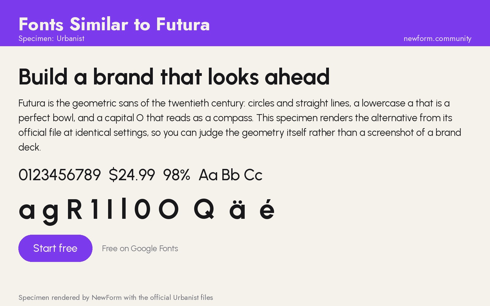
Why it works. Urbanist keeps the geometric skeleton and removes the width. Where Futura and Jost are round and generous, Urbanist is round and compact, which is what you need when a metric label, a table header and a nav item all have to survive on a 1280px dashboard. It also has a variable weight axis and a full set of low-contrast weights.
Where to use it. Dashboards, admin panels, developer tools, data-heavy products, and any interface where you want a geometric feel without filling the screen with air.
Settings that work. Urbanist runs narrower, so you can set body at 15px and keep readability. Use 600 for headings and 400 to 500 for UI labels. Avoid tracking it out.
/* Urbanist, dense UI */
.metric-label { font-family: 'Urbanist', system-ui, sans-serif; font-size: 13px; font-weight: 500; letter-spacing: 0.01em; text-transform: uppercase; }
.metric-value { font-family: 'Urbanist', system-ui, sans-serif; font-size: 32px; font-weight: 600; letter-spacing: -0.02em; }
.table-cell { font-family: 'Urbanist', system-ui, sans-serif; font-size: 14px; font-weight: 400; }
Watch out for. At very small sizes Urbanist's circular o can close up, and its numerals are not tabular by default, so columns of numbers may not align without font-feature-settings. If your product is a finance or analytics tool, test the numerals before you commit.
Where to get it. Urbanist on Google Fonts (free, open source, variable).
5. Josefin Sans: the fashion one
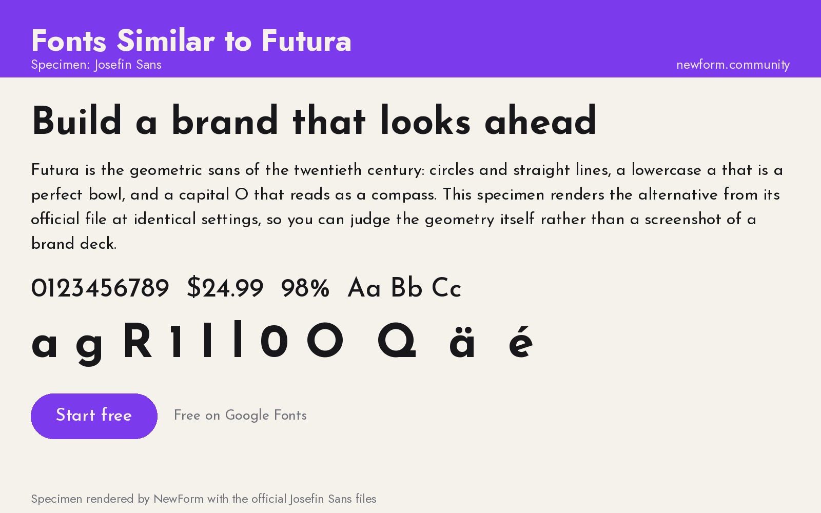
Why it works. Josefin Sans reaches past Futura to the same 1920s source material and exaggerates it: a very low x-height, high waist, small bowls, an elegant splayed M. It is the closest thing on Google Fonts to the signage lettering that Futura was reacting to, and it has a personality Futura itself lost when it became a corporate default.
Where to use it. Fashion and beauty branding, editorial headlines, wedding and event work, restaurant menus, anything with an Art Deco reference. It is a display face, so treat it as one.
Settings that work. Set it large, tracked slightly open, with tight line heights. Weight 300 to 400 in headlines looks expensive; 600 to 700 starts to feel like a poster. Never set a paragraph in it.
/* Josefin Sans, display only */
.hero-title { font-family: 'Josefin Sans', 'Futura', sans-serif; font-weight: 300;
  font-size: clamp(3rem, 7vw, 6rem); line-height: 1.02; letter-spacing: 0.02em; text-transform: uppercase; }
Watch out for. The low x-height destroys legibility below about 18px, and the small counters in e, a and s fill in when rendered thin on low-DPI screens. It also has no useful italic. If you use it for a client, pair the body copy with something plain like Inter and let Josefin do one job.
Where to get it. Josefin Sans on Google Fonts (free, open source, variable).
6. Questrial: one weight, done well
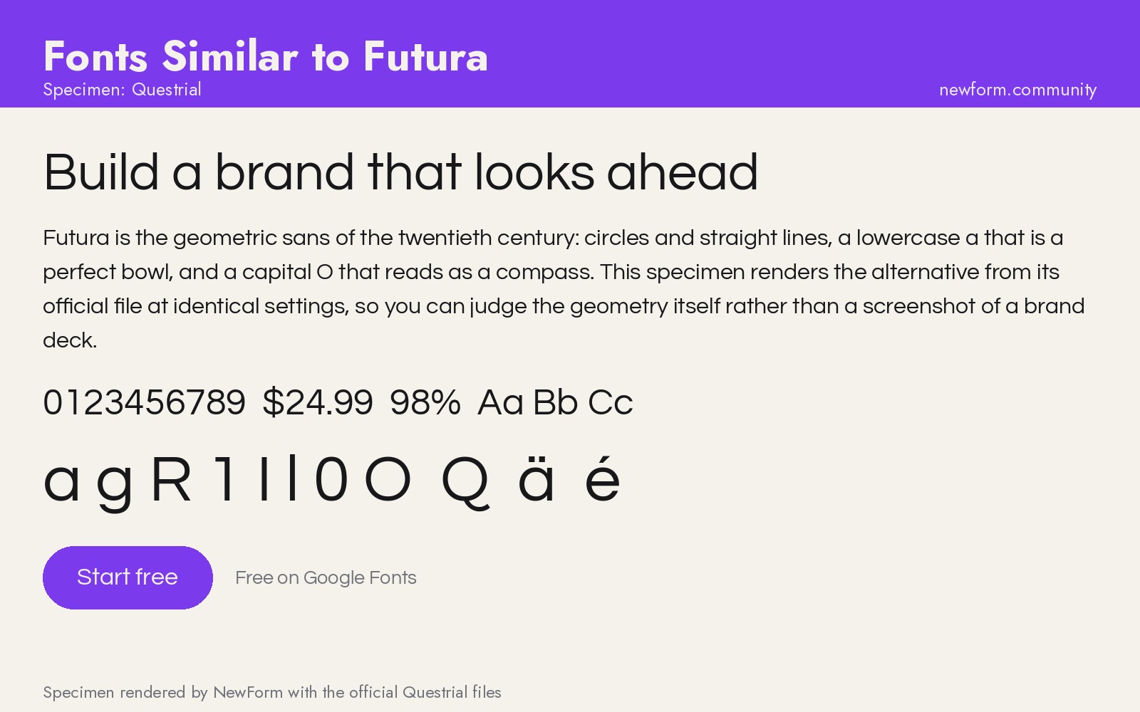
Why it works. Questrial is a single-weight geometric drawn for the web, with circular forms, a tall x-height for its class, and a calm, even color. It is not a Futura revival, but it is the closest free single-weight option that keeps the geometric silhouette without the spacing problems.
Where to use it. Landing pages, one-page sites, presentation decks, and brand work where a single weight is enough. It is also a good stand-in for Century Gothic, which is the font most non-designers actually mean when they say Futura.
Settings that work. Only one weight exists, so build hierarchy with size and color instead. Track it open for headlines, and keep line height at 1.5 or more.
/* Questrial */
.questrial-head { font-family: 'Questrial', 'Century Gothic', sans-serif; font-size: 48px; letter-spacing: 0.01em; line-height: 1.15; }
.questrial-body { font-family: 'Questrial', sans-serif; font-size: 17px; line-height: 1.62; }
Watch out for. No bold, no italic, no variable axis. If your layout ever needs emphasis, you will be faking it with color or resorting to a second family, and that second family is where the design usually falls apart.
Where to get it. Questrial on Google Fonts (free, open source).
The paid options, if you have a budget
None of these are rendered here, because we only publish specimens made from official font files. Links go to the foundries.
- Avenir and Avenir Next. The warmest Futura alternative ever drawn, by Adrian Frutiger. Humanist geometry, real italics, excellent at every size. Available through MyFonts or fonts.adobe.com if your team already has Creative Cloud.
- Neuzeit Grotesk. The most neutral geometric grotesk of the genre. Cleaner and more technical than Futura, and a common corporate choice in Germany.
- Brandon Grotesque. Futura's geometry with a lower waist and rounded corners, drawn for editorial and packaging. Softer and friendlier than Futura, and it holds up small.
- Century Gothic. The 1991 Monotype take on the same idea, and the font most people actually mean when they say Futura. Wider, rounder, and already installed on half the machines you will ever test on.
If you do buy one, buy it for a project that can carry the licence. Nothing ages worse than a brand built on a font nobody on the team can legally install.
Futura vs Jost: the head-to-head
Futura and Jost are the pair people compare most, so here is the honest version.
Similarity: very high. Same circular construction, same single-story a, same pointed A, same tall ascenders. Side by side at headline size, most non-designers cannot tell them apart, which is exactly the point of a revival.
Where Jost differs. Jost is slightly narrower and its weights lean toward a more even color, so a paragraph of Jost holds together better than a paragraph of Futura Bold. Its 700 is closer to a Futura Heavy, and its 300 is thinner and more elegant than anything in the original.
Where Futura still wins. Futura's original has a weight and spacing set that was cut for metal, and it shows at poster sizes: the rhythm is bolder and less polite. Futura also has a genuine set of condensed and display cuts, plus the licensed versions that ship with a real foundry pedigree.
The practical call. If you need a free Futura for the web, Jost. If you need a licensed Futura for a brand that will run for a decade, buy the original and budget for it.
How to switch from Futura without breaking the layout
- Match the x-height first, not the width. Futura has a small x-height, so a swap to Poppins or Urbanist will make your text look larger at the same pixel size. Drop one or two pixels on body copy after the swap and check again.
- Retune your tracking. Futura sits loose. Jost and Questrial do too. Poppins, Outfit and Urbanist are tighter, so remove any negative tracking you had on Futura headings.
- Rebuild the weight map. Futura's Medium is heavier than most 500s. If your design system maps 500 to Futura Medium, map it to 600 in the new family and check the buttons.
- Set a metrics fallback. Put a system font in the stack that is close in width, so the page does not reflow while the webfont loads.
- Check the numerals. Futura's numerals are lining and fairly even. Urbanist's are proportional by default, so turn on tabular figures in tables.
- Test at 14px, not at 74px. Every one of these fonts looks great in a hero. The font you want is the one that still looks right in a settings row.
/* metrics-friendly fallback stack */
body { font-family: 'Jost', 'Century Gothic', 'Futura', system-ui, -apple-system, sans-serif; }
FAQ
What font is most similar to Futura?
Jost. It is a free, open-source revival that tracks Futura's construction closely: circular bowls, single-story a, pointed capital A, tall ascenders. It is the closest free substitute available, and it is the one to reach for if you need a Futura look without the licence.
What is a free alternative to Futura?
Jost, Poppins, Outfit, Urbanist, Josefin Sans and Questrial are all free on Google Fonts. Jost is the most faithful, Poppins is the most usable in product UI, Outfit is the most modern, and Josefin Sans is the most decorative.
Is there a Google Font similar to Futura?
Yes, several. Jost is the direct one. Poppins and Outfit are the geometric sans most designers actually ship, and Questrial works if a single weight is enough.
What is the difference between Futura and Century Gothic?
Century Gothic, released by Monotype in 1991, takes the same geometric idea and makes it wider, rounder and more even in spacing. It is more legible at small sizes and was drawn for screens and office documents, where Futura was drawn for posters. If you want Futura's idea with fewer spacing problems, Century Gothic is the older answer and Poppins is the newer one.
Can I use Futura on a website?
Only with a licence that covers web embedding. Futura is owned by Bauer Types and licensed through foundries, and a desktop licence does not give you webfont rights. Most teams that want the look either license the original properly or switch to Jost, which is free for commercial use.
Which Futura alternative is best for a logo?
Jost at 700, with the tracking pulled in slightly and the wordmark set in all caps. If the logo needs to feel softer and more contemporary, Outfit at 700. If it needs to feel like a fashion house, Josefin Sans.
How do I switch a design system from Futura to a free font?
Match x-height first, then retune tracking and weight mapping, then test at the smallest size in your UI. The order matters: teams usually break their layouts by fixing width before x-height.
Put the type to work
You have the specimen. The next step is the thing people actually judge: how the type looks in a real layout, in a real product, with real content in it.
Render your pick as a mockup in Mockup Studio, then build the interface itself in Base44, which turns a prompt into a working app so you can test the type on a screen instead of in an image:
If you are still choosing, start with the Inter alternatives hub for UI-first picks, then font pairings every designer should memorize for a second family, and typography sizes for websites for the actual px values.
More in the Fonts Similar To series
Every guide uses our own rendered specimens and the same structure, so you can compare fonts side by side:
Keep reading

Find Your Stack
Discover the perfect design tools for your workflow.
Take the 60-second quizNewForm Studio
Turn your designs into professional mockups instantly.
Open StudioMore from NewForm
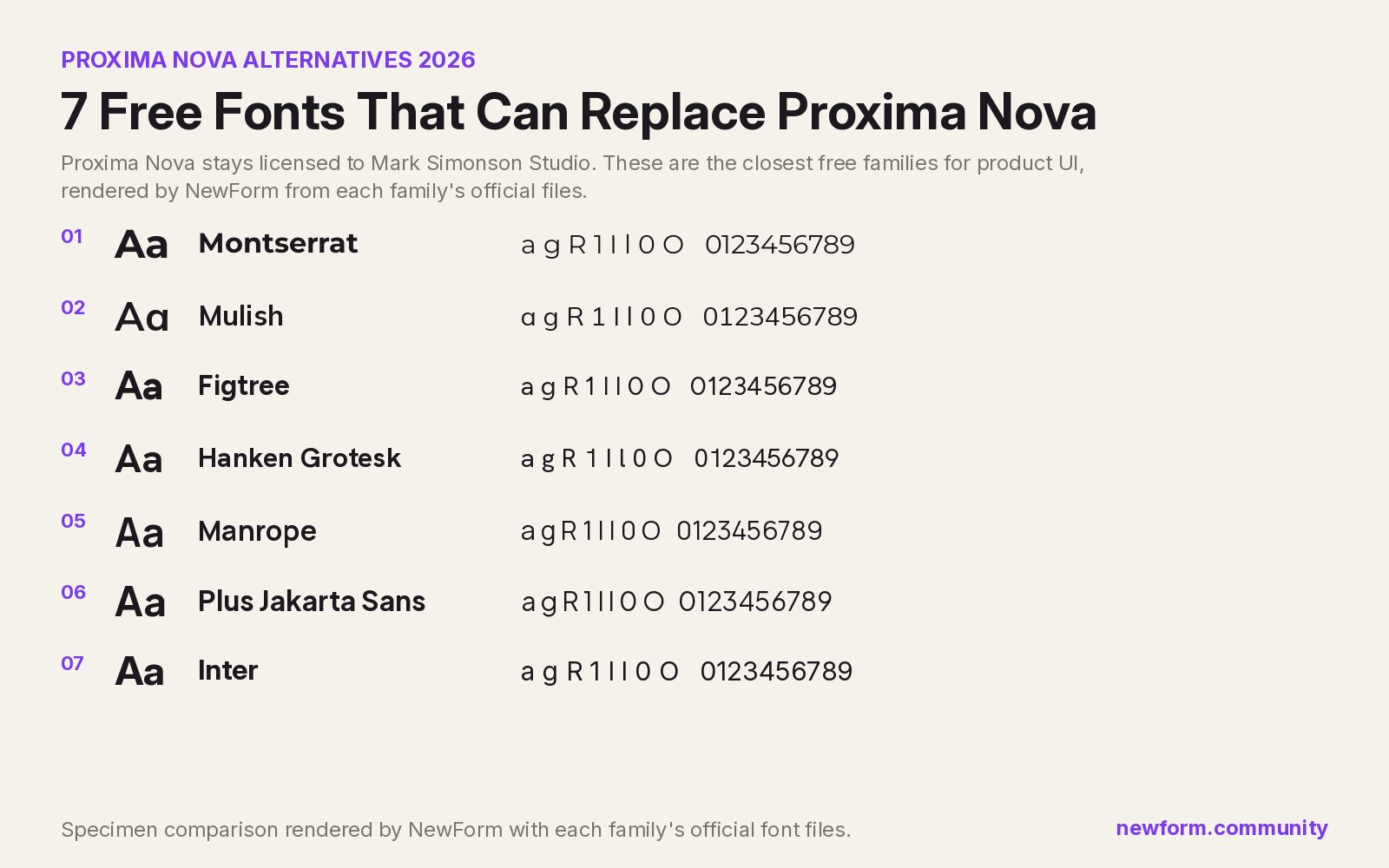
7 Free Fonts Similar to Proxima Nova (Real Specimens, 2026)
Proxima Nova is a licence you have to buy and it sets wider than you expect. These 7 free families, rendered from their official files, do the same job: Montserrat, Inter, Mulish, Hanken Grotesk, Figtree, Plus Jakarta Sans, Manrope.
13 min read · Nov 4, 2026

Free UI Components, SVG Generators and Icons: 4 Sites Every Designer Should Bookmark
Uiverse, fffuel, Iconbuddy and WebGradients cover most of the UI work designers re-solve every week: copy-paste components, SVG generators, 150,000 icons and CSS gradients.
4 min read · Nov 2, 2026