
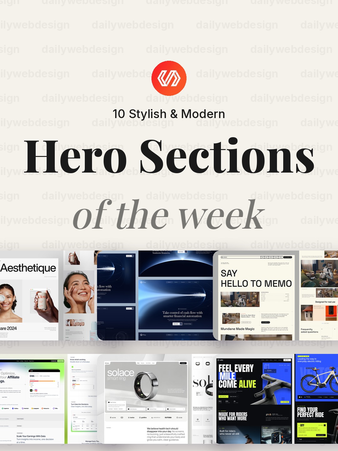
10 Stylish & Modern Hero Sections Designs to Learn From (October 2026)
Hero sections have a tough job: explain the offer, set the tone, and give visitors a useful next step before they scroll. This week’s Dribbble collection spans commerce, finance, AI, and studio sites, which makes it a good reminder that a strong first screen is not just a pretty image. It is the start of a clear path through the product.
1. Ecommerce Landing Page by Awe Design Studio
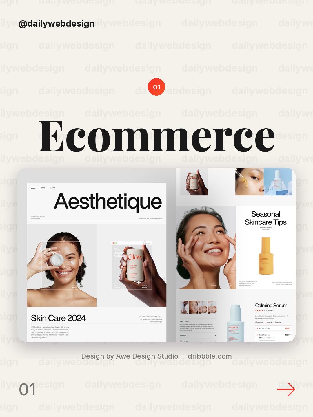
Design by Awe Design Studio, via Dribbble
The product and offer read clearly when the headline, product image, and one primary action share the same visual hierarchy. Keep secondary navigation quieter so visitors know where to begin.
2. Flux - Finance Landing Page by Awsmd
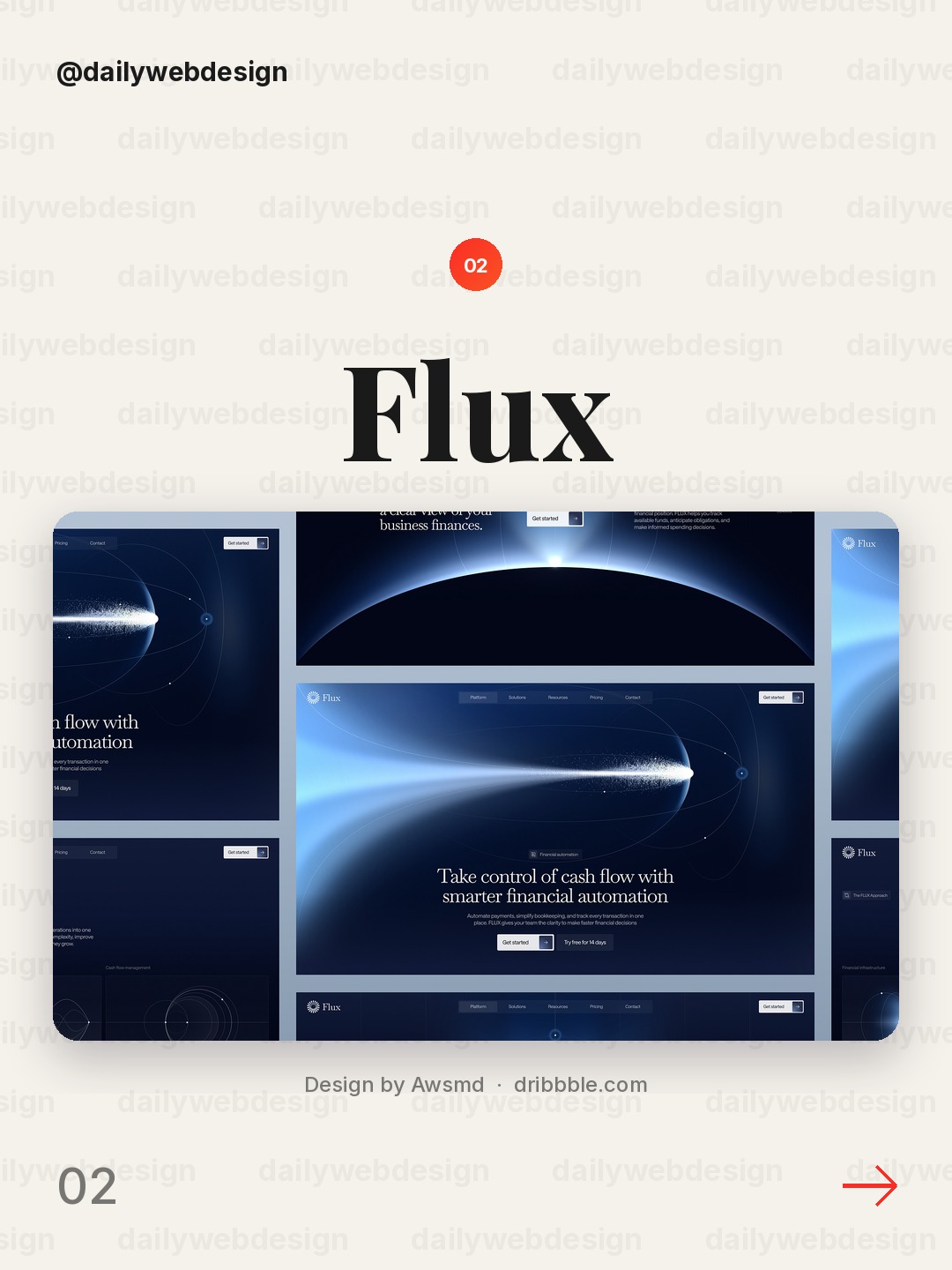
Finance pages need to make trust legible. Pair a concise value proposition with restrained color and a product preview that hints at the workflow, rather than relying on abstract claims.
3. Memo — AI Smart Home Assistant Landing Page by RAIHAN
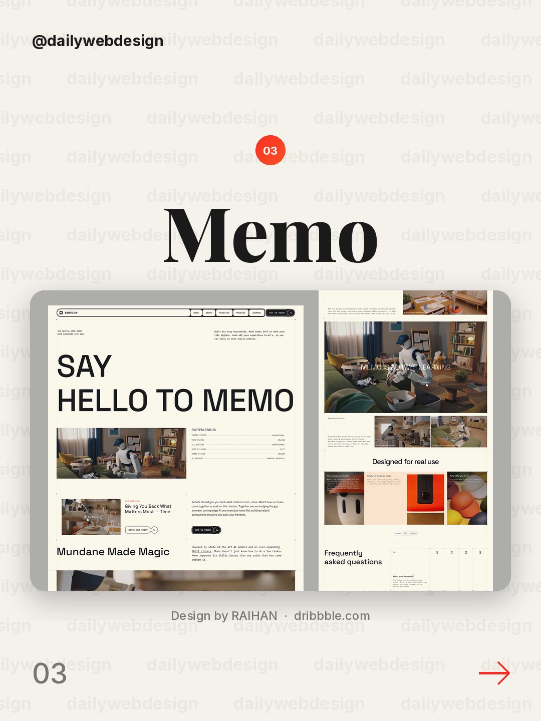
Design by RAIHAN, via Dribbble
For an AI assistant, show the interaction and its practical outcome. A recognizable device or home context makes the promise easier to understand than a feature list alone.
4. Stally— Affiliate Marketing Landing Page by Vektora
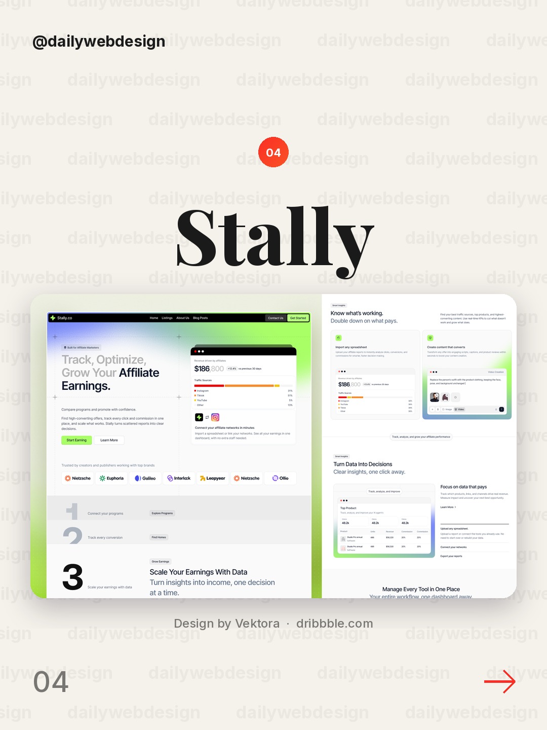
Design by Vektora, via Dribbble
Affiliate products have two audiences: the person evaluating the offer and the partner considering promotion. A focused headline and a clear explanation of the value exchange can serve both without crowding the first screen.
5. Solace - Smart Ring E-Commerce Landing Page by Korsa
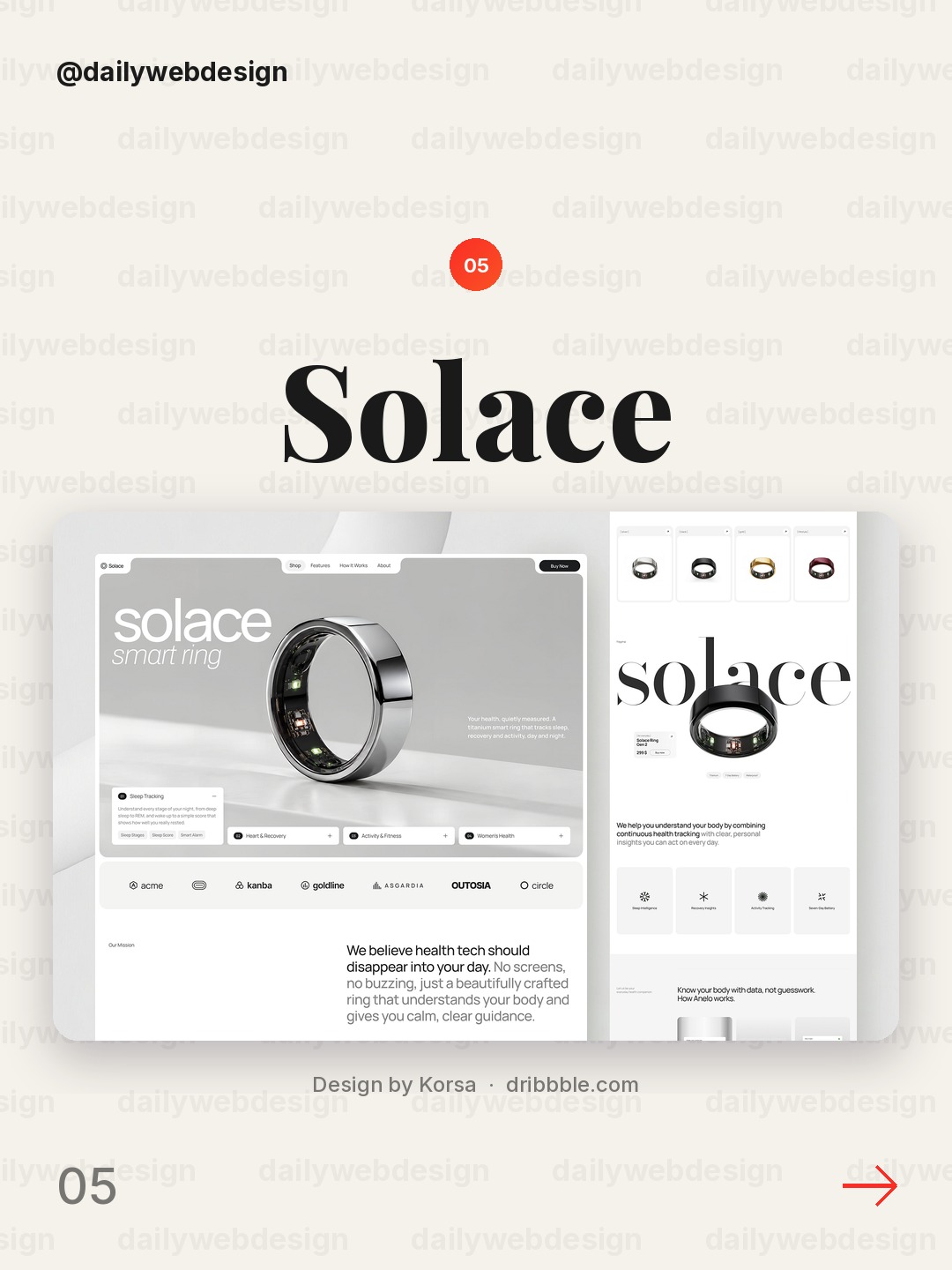
A commerce hero can create desire with a strong product image, but it should also answer the next question. Bring the product benefit and shopping path close to the visual instead of making people hunt.
6. Velto - E-Bike Website Design by Yscale Studio
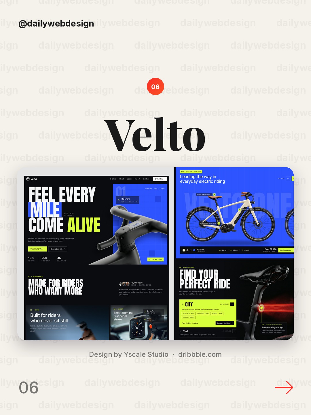
Design by Yscale Studio, via Dribbble
For an e-bike, the setting helps sell the experience as much as the object. Use a compelling lifestyle image, then anchor it with a direct product benefit and an unmistakable route to explore models.
7. Vela product page by Layo
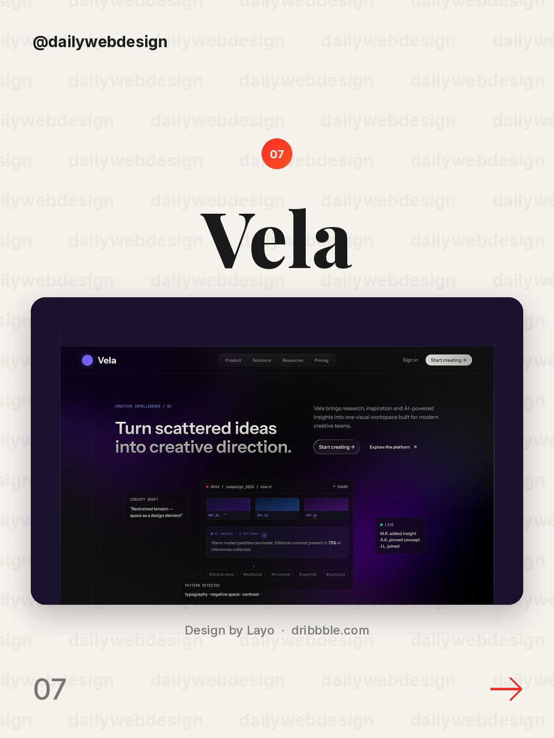
A product page can feel like a landing page when it treats the product itself as the star. Give the image room, use concise supporting copy, and make the next step visible without competing calls to action.
8. Architecture Website Design by HR Rumen
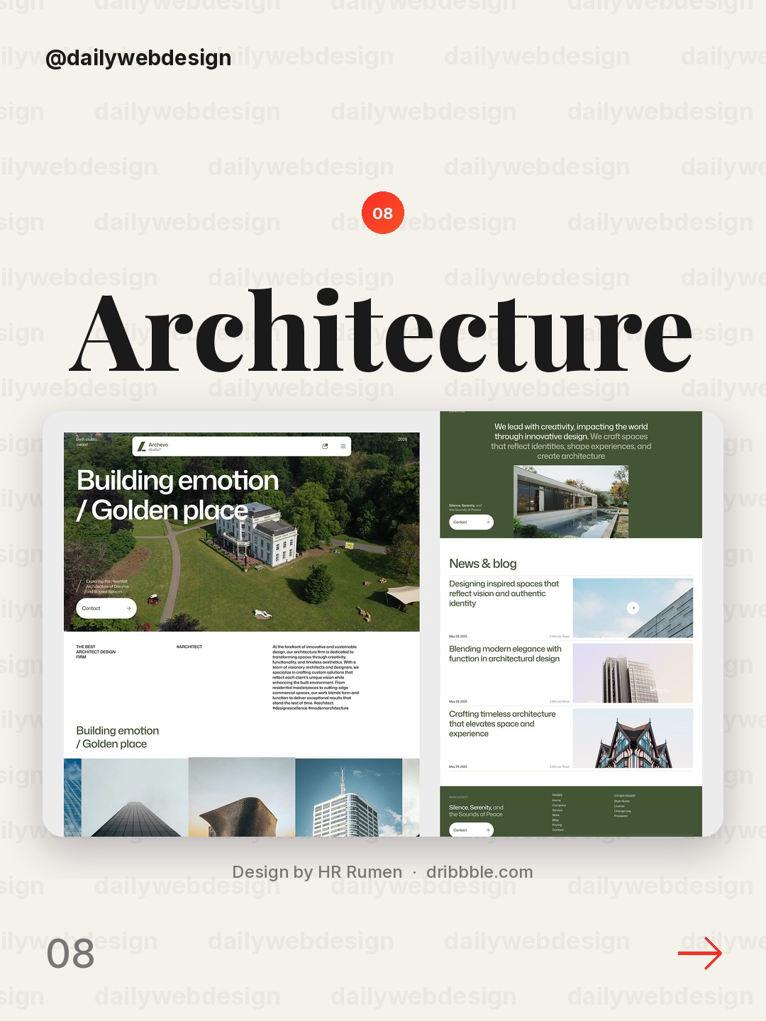
Design by HR Rumen, via Dribbble
Architecture is highly visual, so let the project imagery carry the first impression. A simple typographic frame and a clear studio identity preserve attention for the work.
9. Venture Studio Website Design by Hatypo Studio
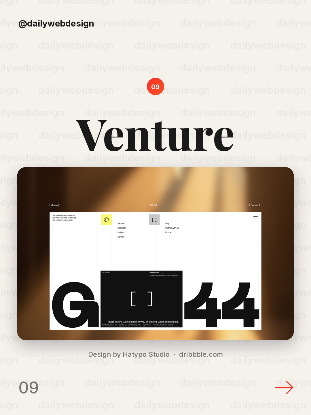
Design by Hatypo Studio, via Dribbble
A venture studio has to communicate both breadth and credibility. Lead with a specific positioning statement, then use selected work or evidence to show what the studio actually builds.
10. AI Business Intelligence Website UI/UX by Fahema Yesmin
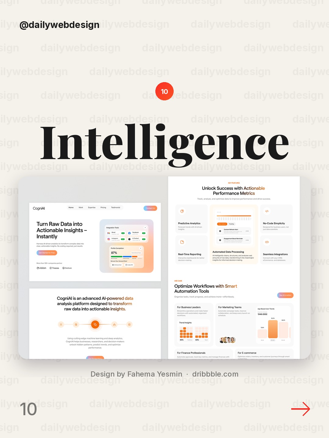
Design by Fahema Yesmin, via Dribbble
Business intelligence pages can feel dense before a user has seen any data. Set context with a crisp promise, then preview the dashboard or workflow so the visitor can picture the decision it will support.
What I would copy this week
-
Rewrite the first-screen headline until it says what the product does for a specific person.
-
Make the primary action visually obvious, and remove competing calls to action from the hero.
-
Use one relevant product or context image that proves the promise instead of decorating the page.
Want to put a new direction into practice? Join a NewForm monthly challenge and build it with a deadline.
Related on NewForm
Keep reading
Which one is your favorite?
Pick the shot you would save. One vote per visitor.
Ecommerce Landing Page
Design by Awe Design StudioFlux - Finance Landing Page
Design by AwsmdMemo — AI Smart Home Assistant Landing Page
Design by RAIHANStally— Affiliate Marketing Landing Page
Design by VektoraSolace - Smart Ring E-Commerce Landing Page
Design by KorsaVelto - E-Bike Website Design
Design by Yscale StudioVela product page
Design by LayoArchitecture Website Design
Design by HR RumenVenture Studio Website Design
Design by Hatypo StudioAI Business Intelligence Website UI/UX
Design by Fahema YesminFind Your Stack
Discover the perfect design tools for your workflow.
Take the 60-second quizNewForm Studio
Turn your designs into professional mockups instantly.
Open StudioMore from NewForm

10 Trustworthy Fintech Apps Designs to Learn From (October 2026)
Ten fintech app designs cover banking, payments, personal finance, and investing, with practical interface patterns to borrow. Explore the full collection, designer credits, and cast your vote.
5 min read · Oct 30, 2026
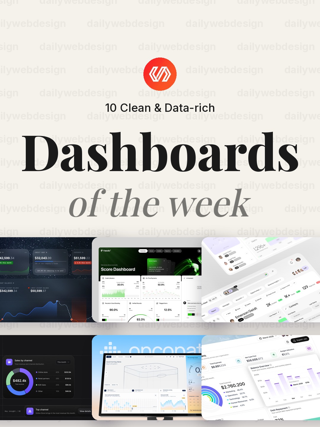
10 Clean Dashboard Designs to Learn From (October 2026)
Ten dashboard designs spanning finance, sales, healthcare, security, and monitoring, with practical interface patterns to borrow. Explore the full collection, designer credits, and cast your vote.
5 min read · Oct 29, 2026