
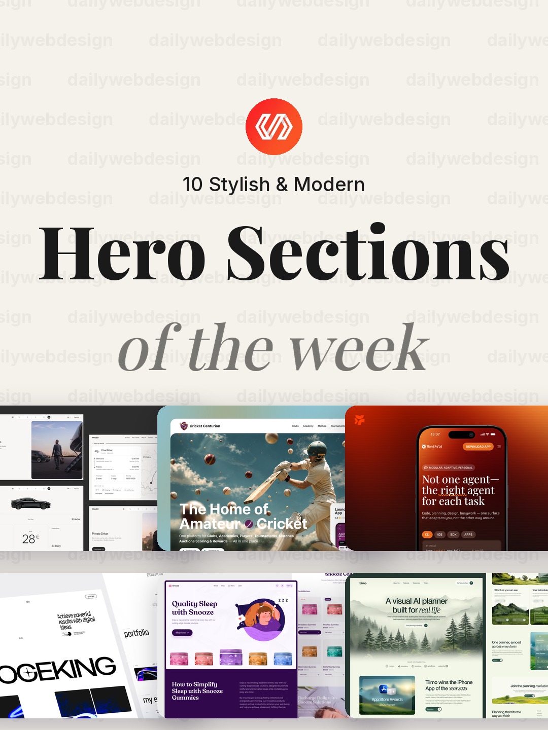
10 Stylish & Modern Hero Section Designs to Learn From (October 2026)
A hero section has a small job with a big impact: tell visitors where they are, why it matters, and what to do next. These ten popular Dribbble examples show how different businesses use imagery, typography, and focus to make that first screen feel clear and distinctive. The useful ideas are not just visual polish, they are choices you can adapt to your own page.
1. Logistics Landing Page Design – WayGo by Phenomenon Studio
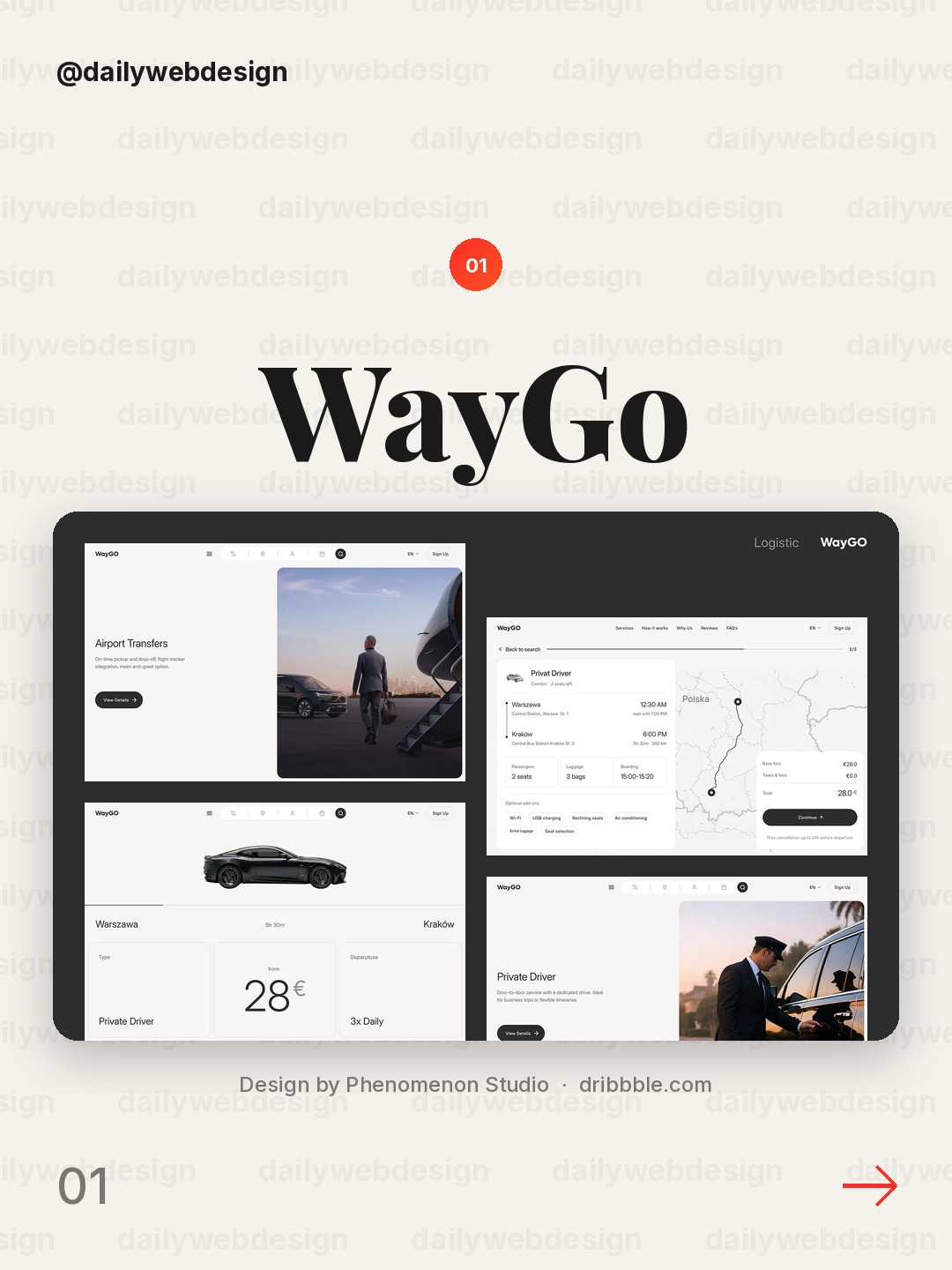
Design by Phenomenon Studio, via Dribbble
The wide image gives the product name room to breathe, while the transport imagery makes the service legible before you read a word. Notice how the headline and action sit over a quiet area rather than fighting the photograph. Keep the message short and let one strong image establish context.
2. Cricket Sports Landing Page Design by Nixtio
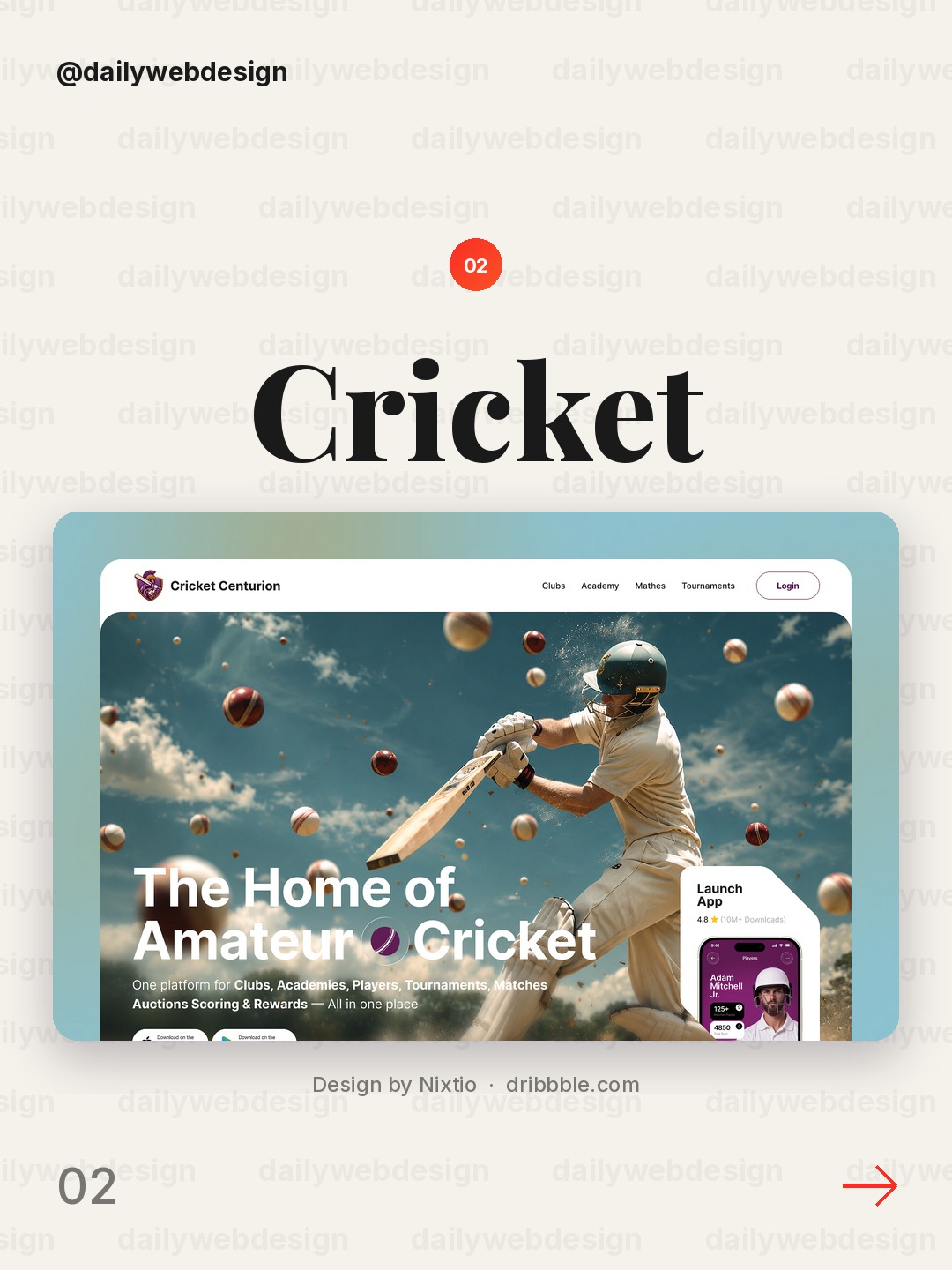
Design by Nixtio, via Dribbble
The oversized cricket image supplies energy without obscuring the page's purpose. The compact header and clear call to action keep the sports mood from becoming a poster with no next step. For a campaign hero, use a single subject, then place the main action where the eye naturally lands after it.
3. AI Agent Landing Page Design for WLS by Shakuro
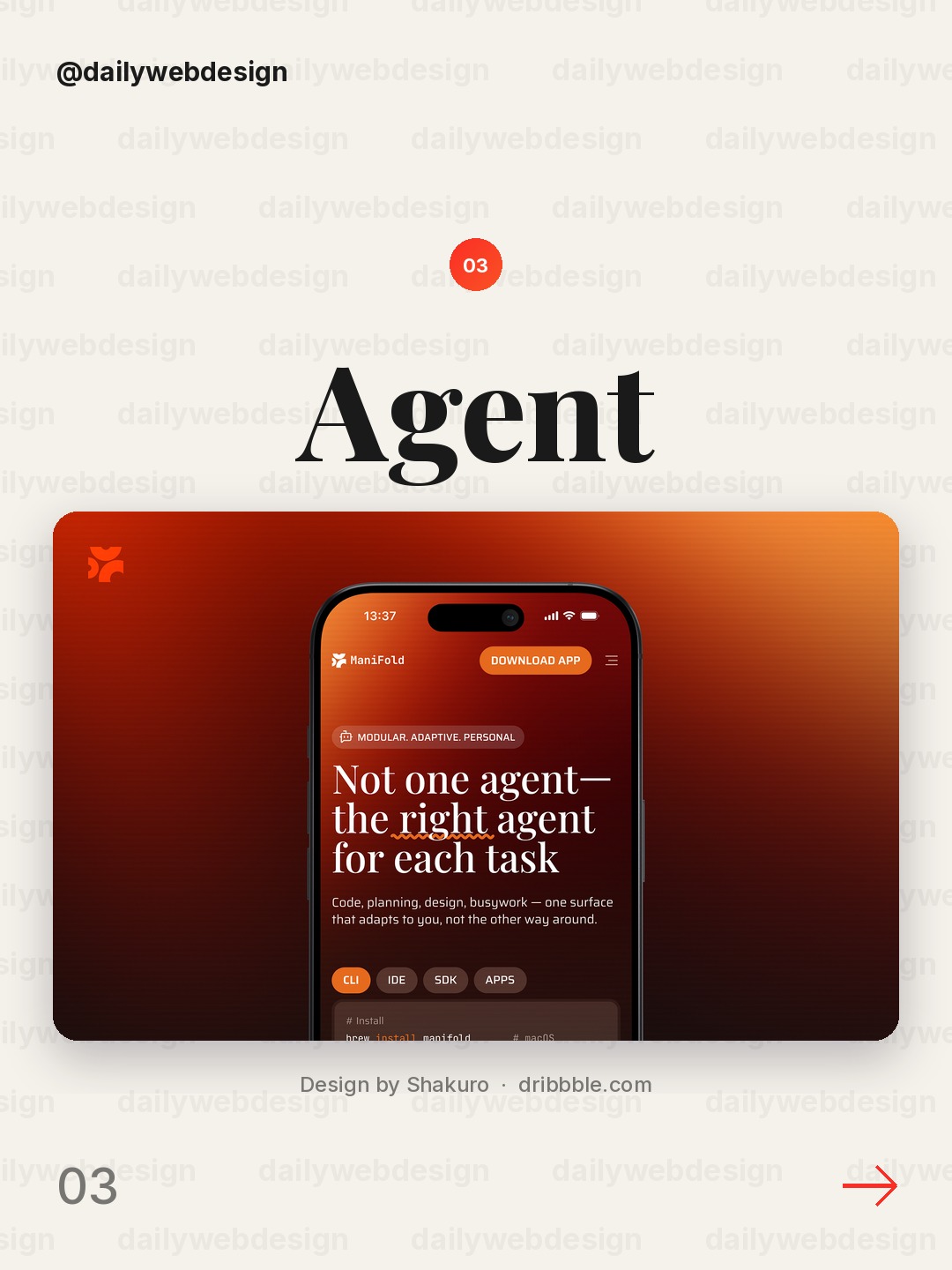
Design by Shakuro, via Dribbble
The abstract AI imagery makes a technical product feel approachable, while the restrained palette stops the concept from turning into generic neon futurism. The useful move is pairing a vivid visual with a plain-language promise. Explain the outcome first, then let the visual suggest the technology behind it.
4. Sogeking - Creative Agency Portfolio Landing Page by Korsa
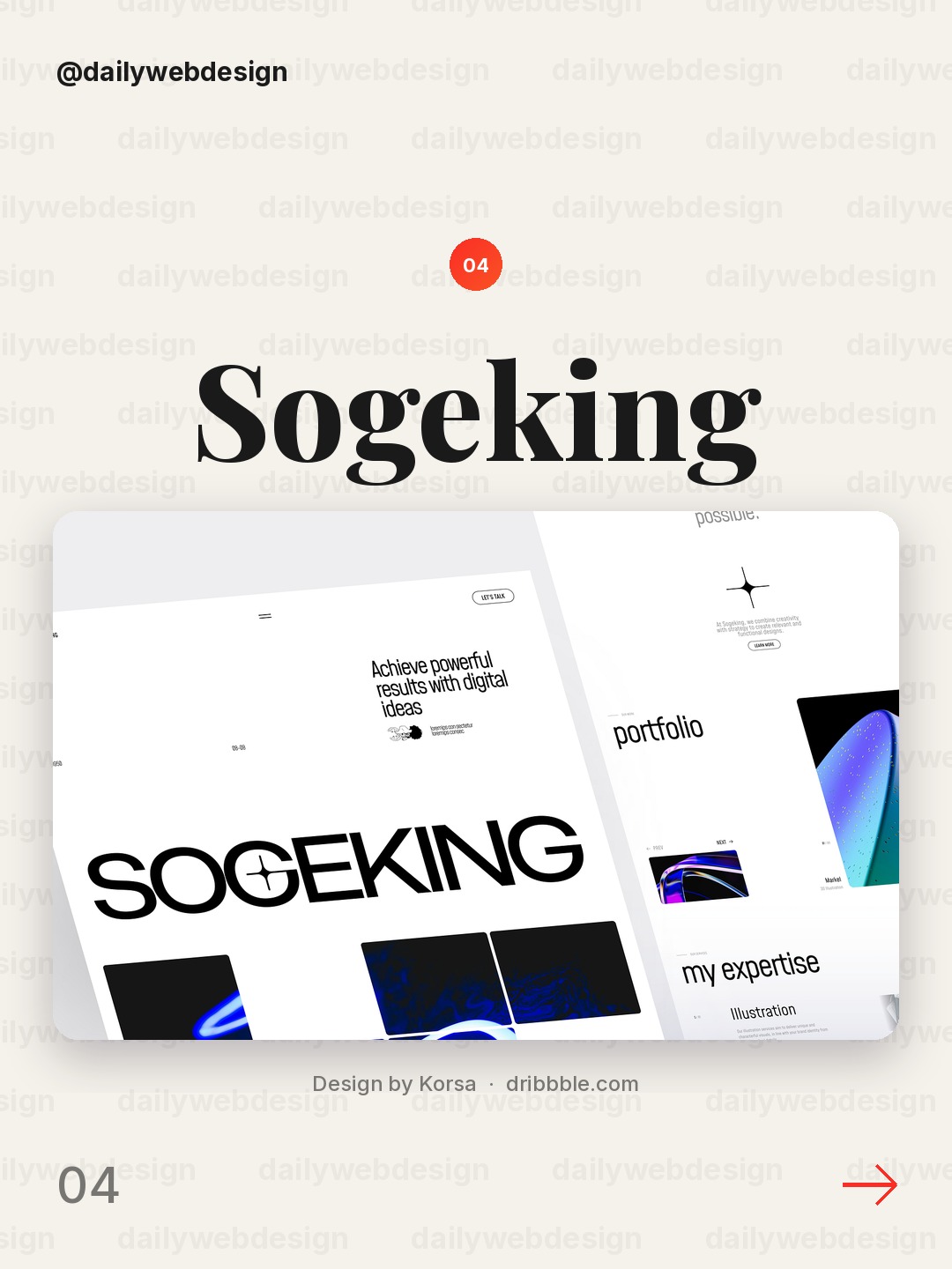
This portfolio hero uses a distinctive character and a confident composition to make the agency feel memorable immediately. A character or illustrated object can work as a brand signature, but it needs breathing room and a clear headline. Keep the first screen focused on one personality trait, not a collage of capabilities.
5. E-commerce Website by Awe Design Studio
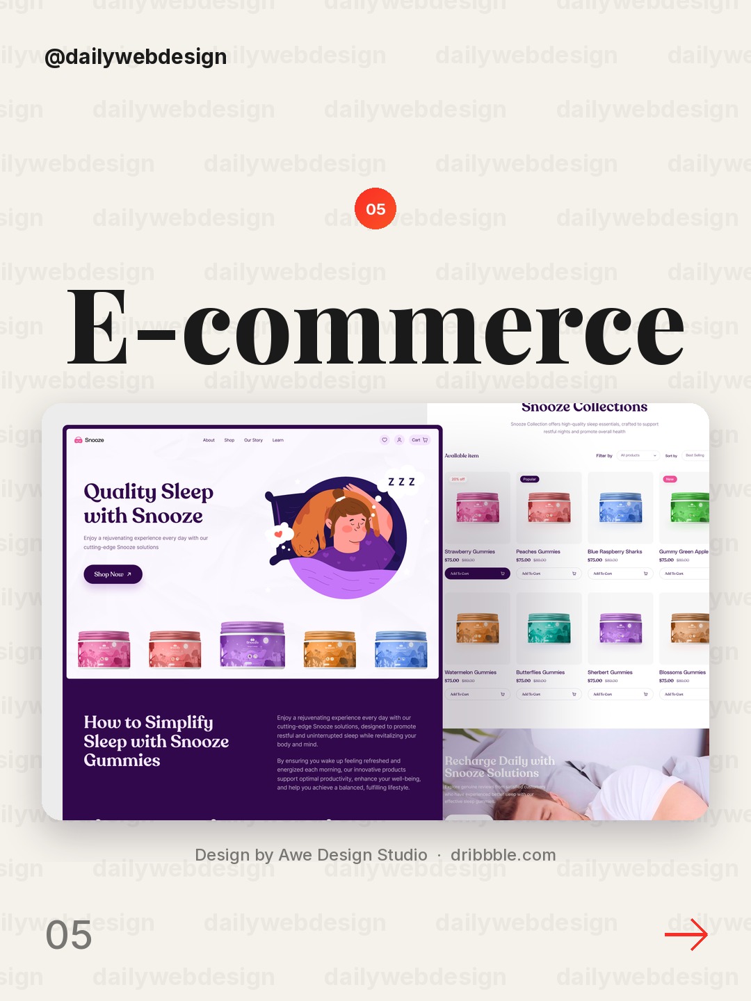
Design by Awe Design Studio, via Dribbble
The e-commerce page leads with product photography and enough negative space to keep the shopping context obvious. The lesson is to make the merchandise the visual anchor, not a decorative afterthought. Pair it with a concise value statement and a visible route to browse or shop.
6. AI Planner Website UI/UX Design by Alamin Hossen
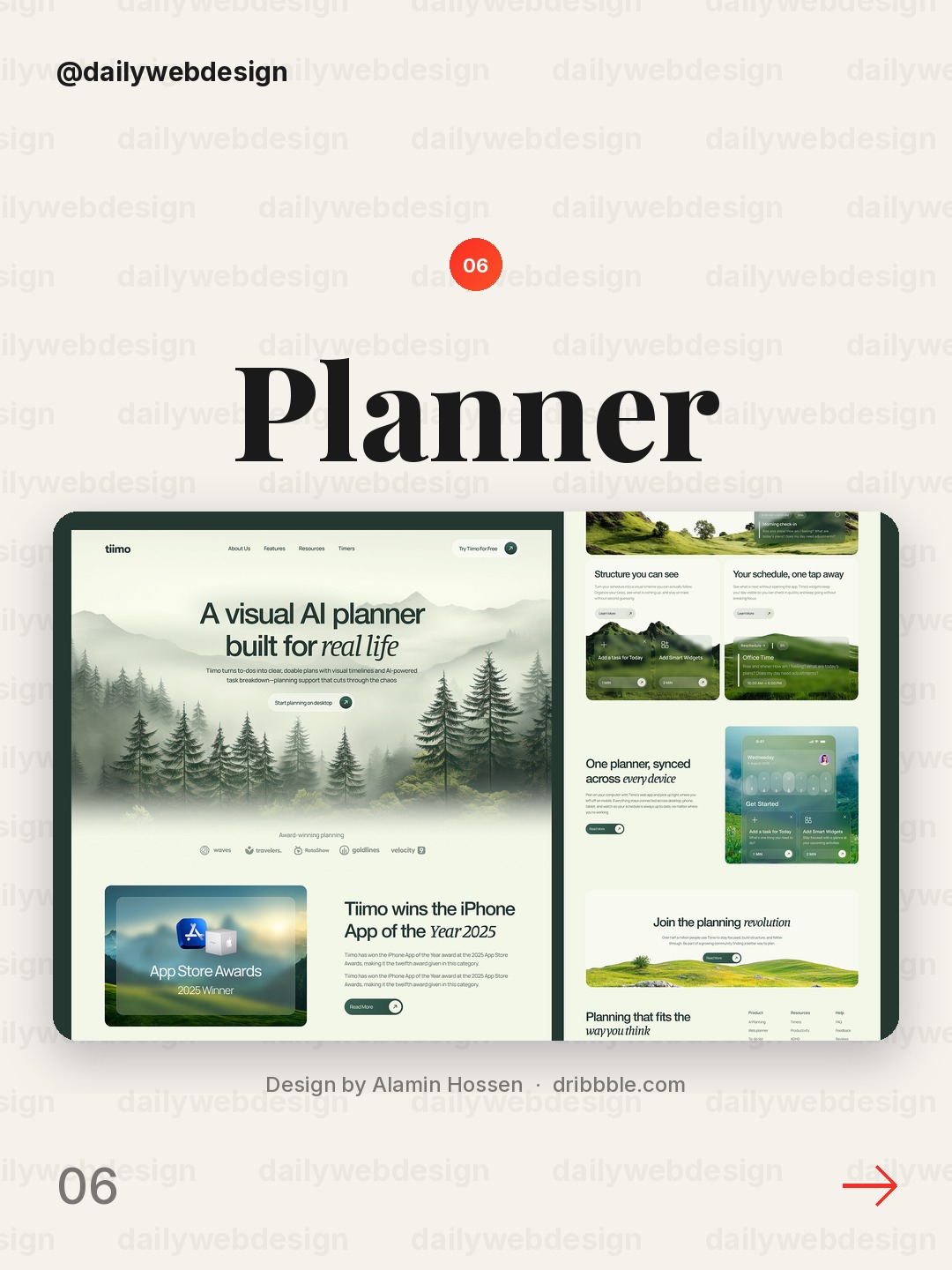
Design by Alamin Hossen, via Dribbble
The planner concept makes a productivity tool feel calm through its orderly layout and friendly visual language. That balance matters: a planning product should promise control without looking clinical. Use one clear preview of the experience, then support it with a specific benefit such as planning a day or organizing ideas.
7. Skincare E-commerce Website · UI/UX · Responsive Design by Visumind Creative
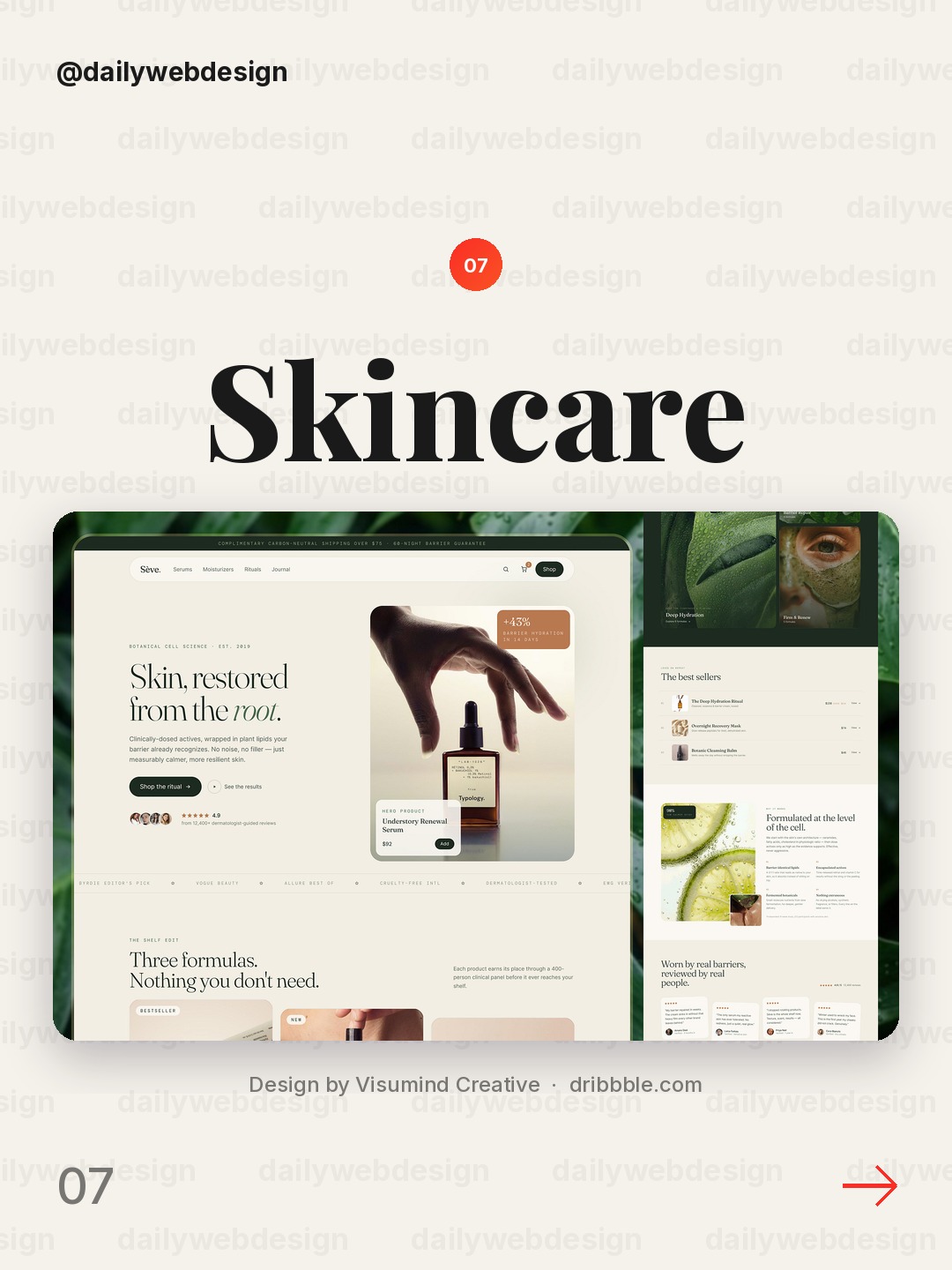
Design by Visumind Creative, via Dribbble
The skincare direction leans on clean product presentation and a softer visual rhythm that suits a personal-care brand. Its strongest transferable move is restraint: color, type, and photography all reinforce the same mood. Choose one sensory cue, then keep the headline and purchase path easy to find.
8. Website for a Biotech Company ✦ CellCarta by HALO LAB
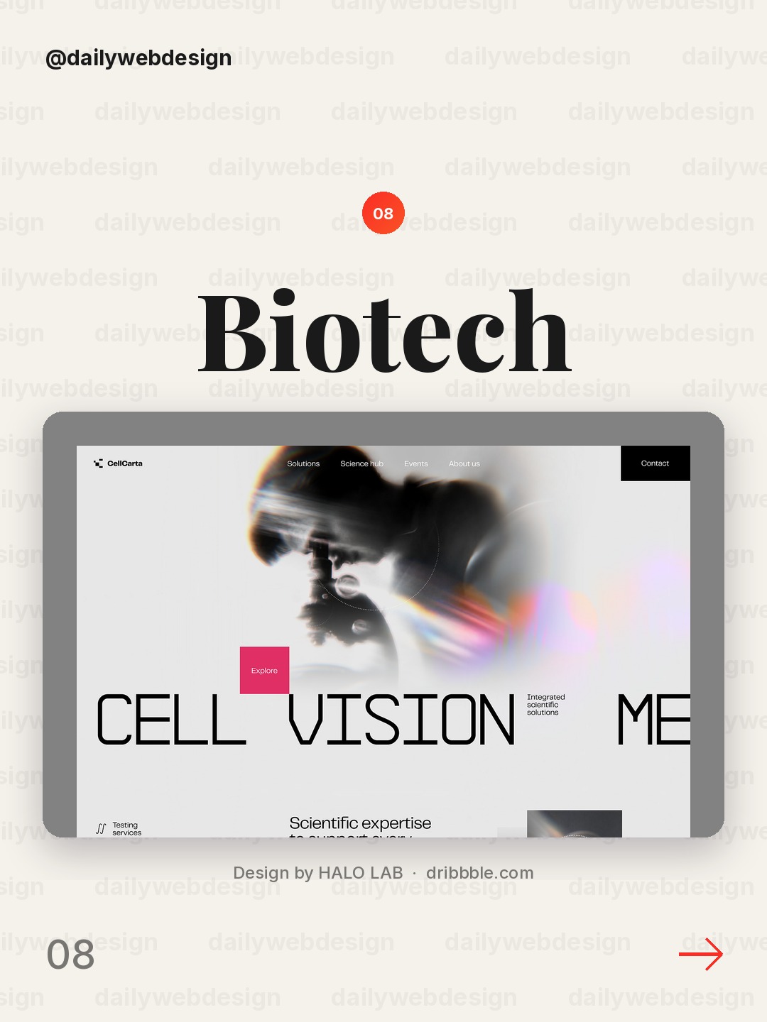
Design by HALO LAB, via Dribbble
A biotech company can easily feel abstract, so this hero's visual system has to make complex work feel tangible and credible. Use precise imagery and disciplined spacing to signal rigor, then translate the science into a human outcome. The headline should tell visitors what changes because of the research.
9. Web3 Agency Website Design by Artspire
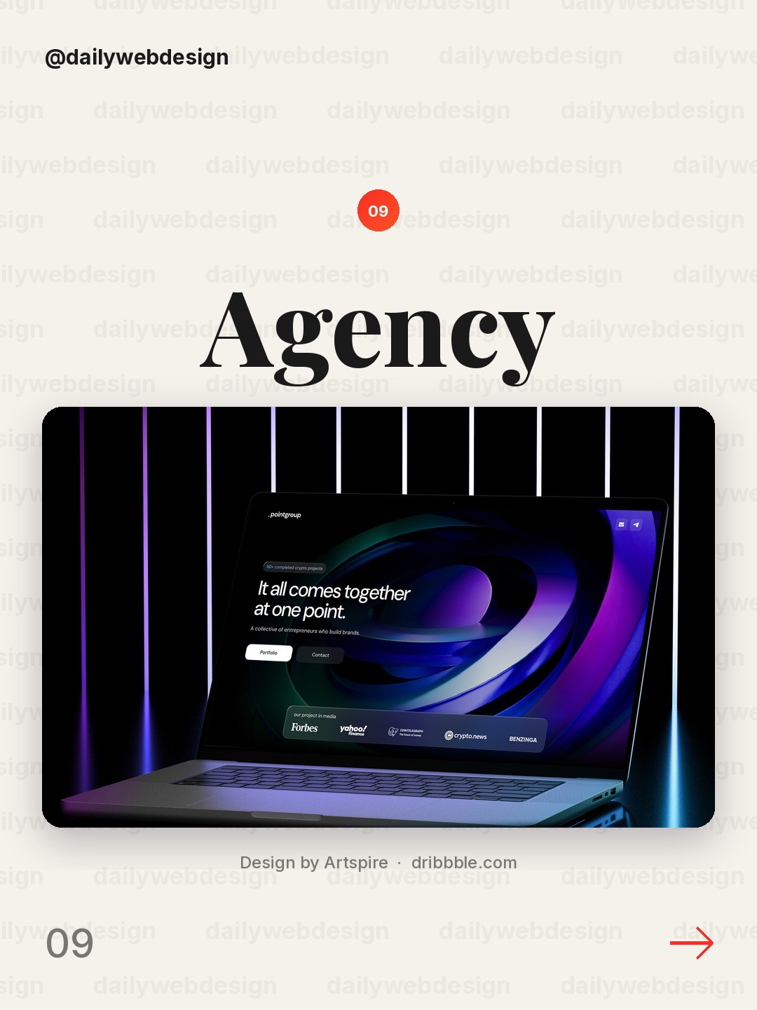
Design by Artspire, via Dribbble
The agency concept signals a digital-first identity with a more expressive visual treatment than a standard corporate landing page. The practical takeaway is to make the brand world distinctive while keeping the offer concrete. Pair a bold visual motif with one plain sentence about who you help and what you make.
10. Norvik — Freight Without Friction by Yscale Studio
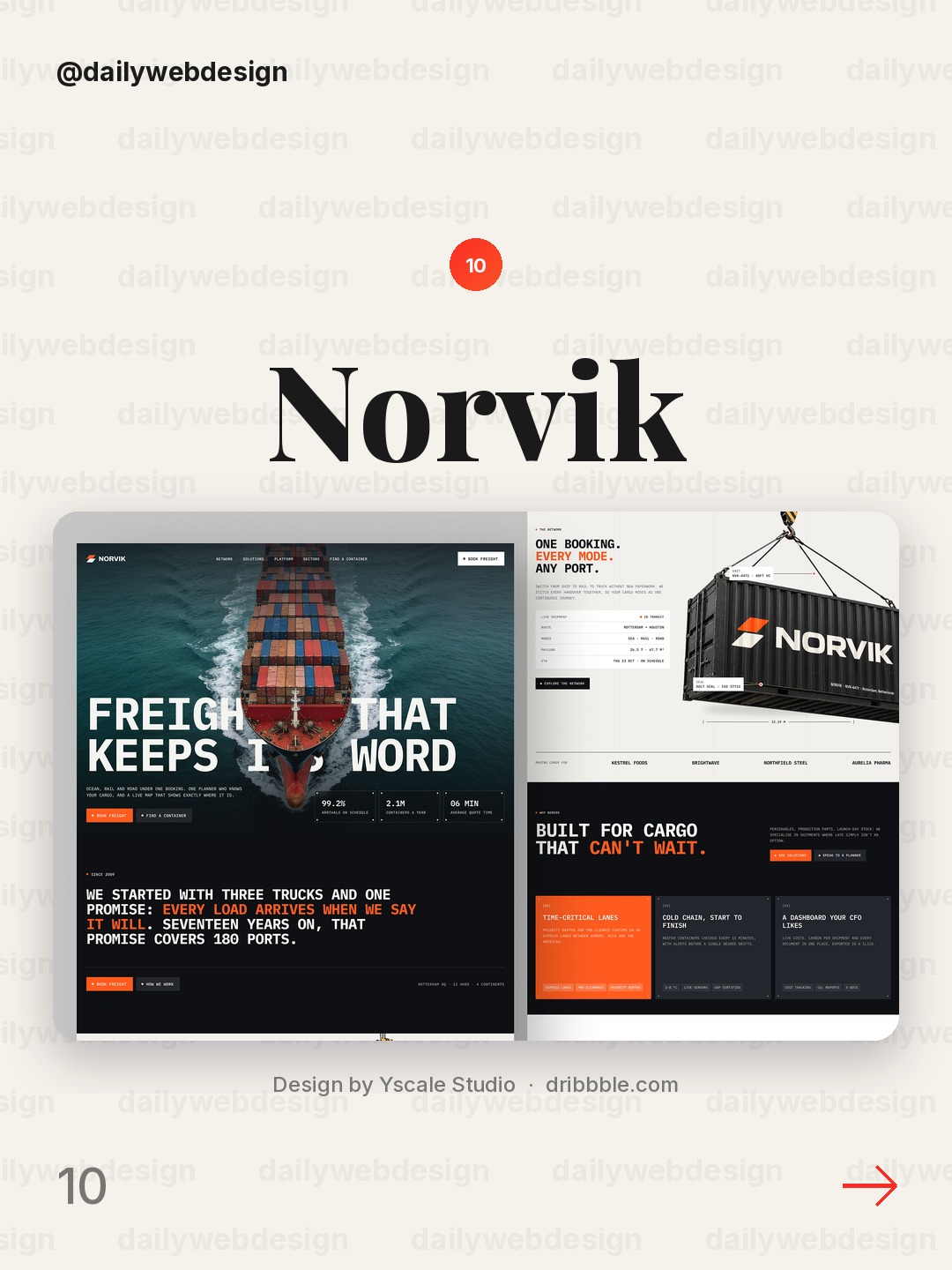
Design by Yscale Studio, via Dribbble
The freight concept makes logistics feel direct and modern rather than buried in operational jargon. Strong type and a simple composition can turn an unglamorous service into a clear promise. Lead with the result customers care about, then use supporting details to explain how the service removes friction.
What I would copy this week
- Rewrite the hero headline so it states one visitor outcome, not a broad company slogan.
- Pick one visual anchor, such as a product image or illustration, and give it enough space to be understood.
- Make the primary action obvious, then remove competing buttons and decorative elements that dilute it.
Which direction is your favorite? Vote in the showcase, then browse the NewForm monthly challenges for a practical way to try these ideas.
Related on NewForm
Keep reading
Which one is your favorite?
Pick the shot you would save. One vote per visitor.
Logistics Landing Page Design – WayGo
Design by Phenomenon StudioCricket Sports Landing Page Design
Design by NixtioAI Agent Landing Page Design for WLS
Design by ShakuroSogeking - Creative Agency Portfolio Landing Page
Design by KorsaE-commerce Website
Design by Awe Design StudioAI Planner Website UI/UX Design
Design by Alamin HossenSkincare E-commerce Website · UI/UX · Responsive Design
Design by Visumind CreativeWebsite for a Biotech Company ✦ CellCarta
Design by HALO LABWeb3 Agency Website Design
Design by ArtspireNorvik — Freight Without Friction
Design by Yscale StudioFind Your Stack
Discover the perfect design tools for your workflow.
Take the 60-second quizNewForm Studio
Turn your designs into professional mockups instantly.
Open StudioMore from NewForm
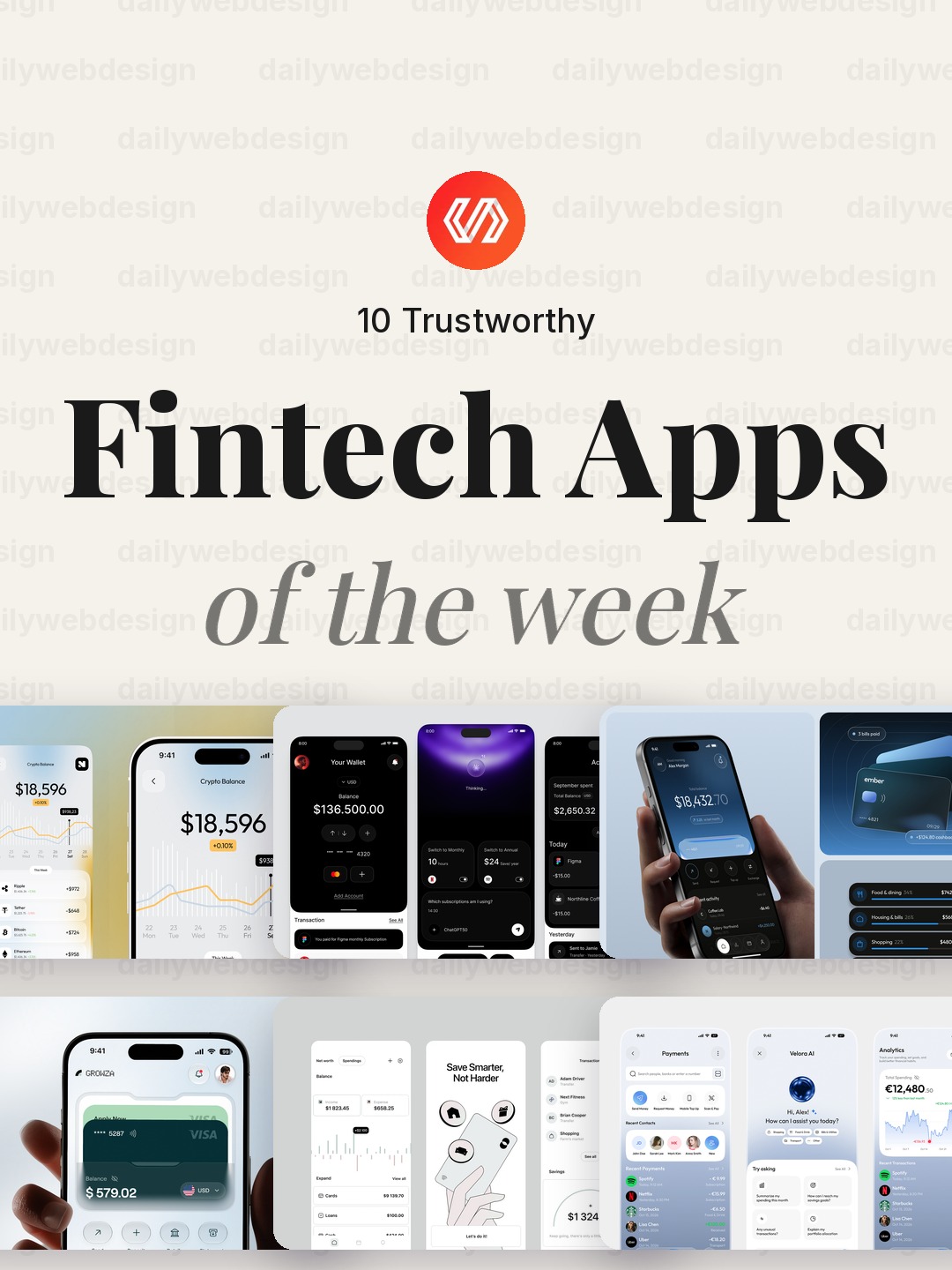
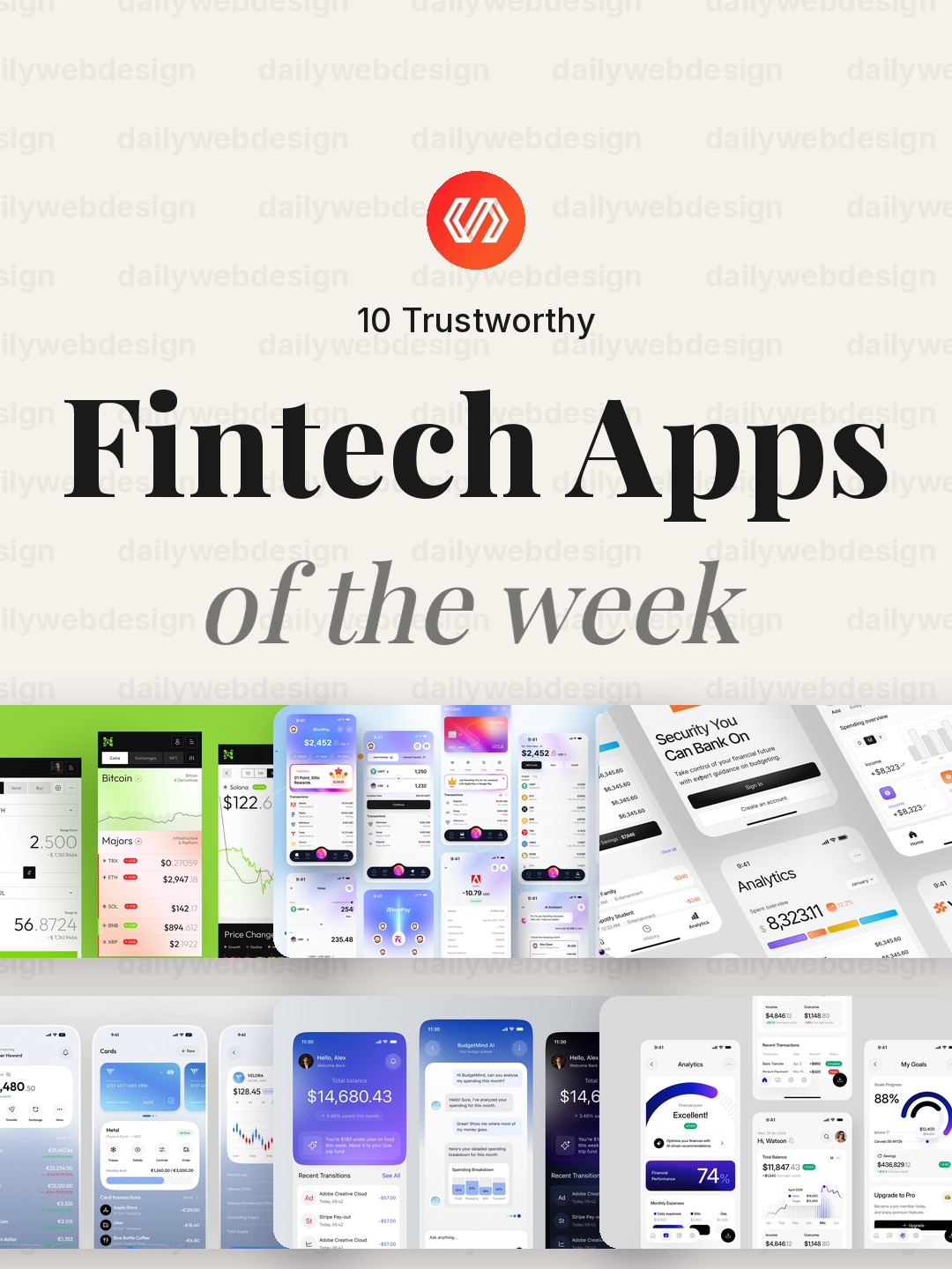
10 Trustworthy Fintech Apps Designs to Learn From (October 2026)
Ten fintech app designs cover banking, payments, personal finance, and investing, with practical interface patterns to borrow. Explore the full collection, designer credits, and cast your vote.
5 min read · Oct 30, 2026
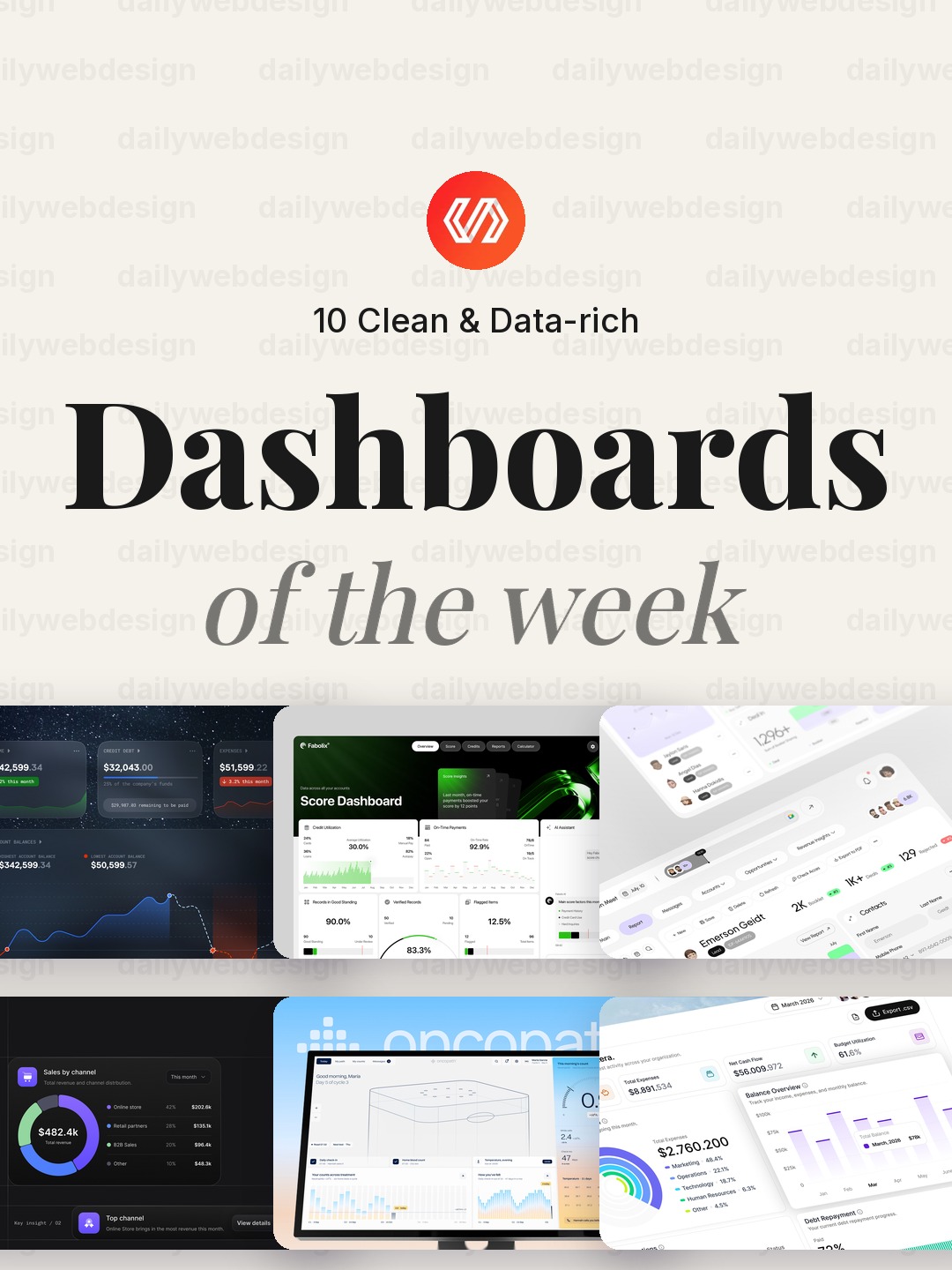
10 Clean Dashboard Designs to Learn From (October 2026)
Ten dashboard designs spanning finance, sales, healthcare, security, and monitoring, with practical interface patterns to borrow. Explore the full collection, designer credits, and cast your vote.
5 min read · Oct 29, 2026