
How to Create a Glass UI Effect in Figma: A Step-by-Step Tutorial
Visual source and original design: @creative_vaani.
Figma's glass effect can make a small interface element feel dimensional without adding a heavy texture or illustration. The useful version is restrained: a translucent pane, controlled blur, a light edge, and enough contrast for the content to remain readable. This practical walkthrough follows the carousel by @creative_vaani, which demonstrates glass-inspired icons and compact UI objects.
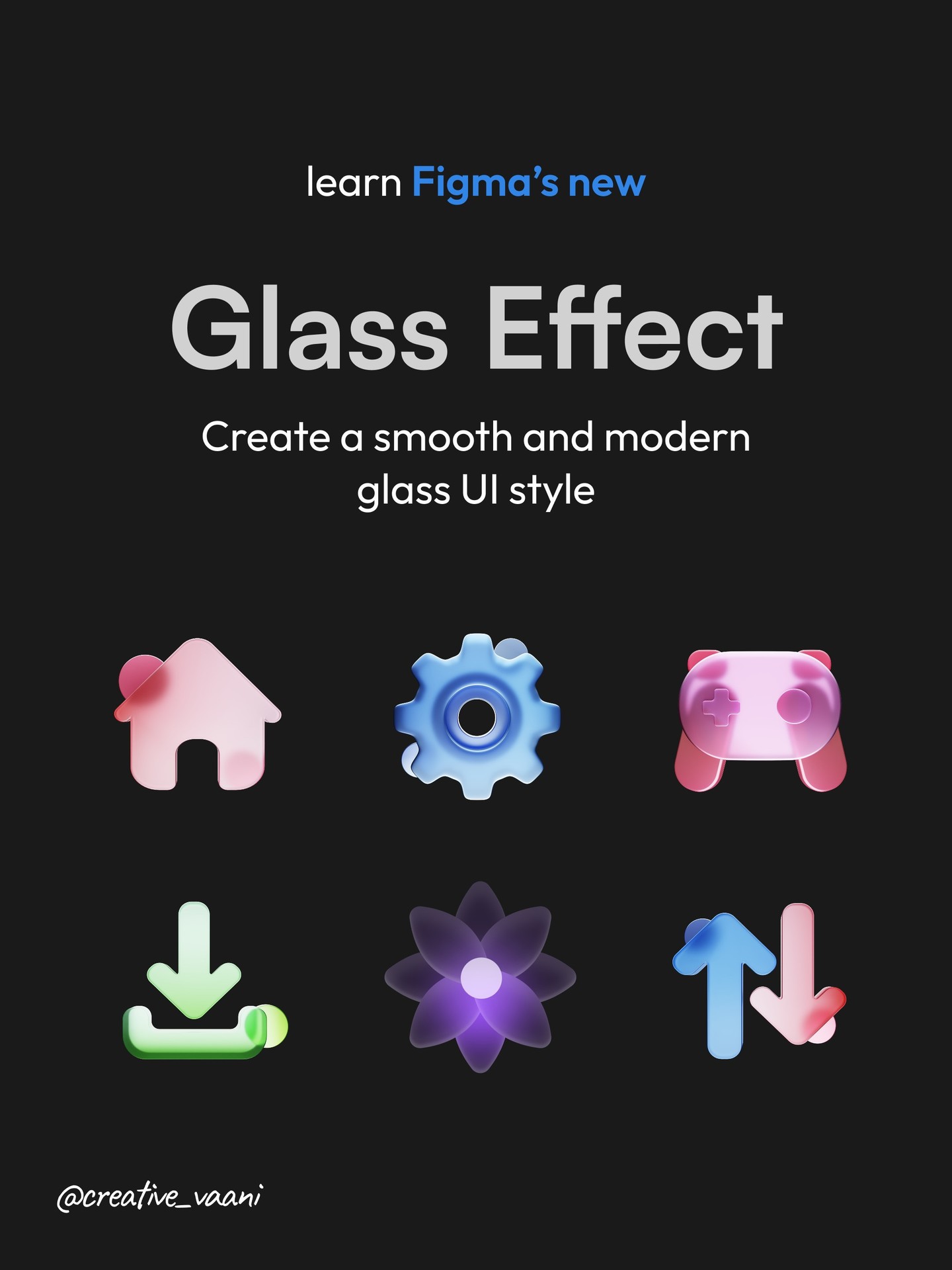
Image: @creative_vaani, via Instagram carousel.
What makes a glass UI element work
A glass surface suggests that something sits above or in front of another surface. That relationship depends on three cues: translucency, a blurred background, and a subtle boundary such as a stroke or highlight. Remove one cue and the element can look like a flat gray card. Push all three too far and it becomes a shiny effect that competes with the interface.
Use glass for a focused foreground element, such as a floating control, an icon tile, or a compact overlay. It is not a replacement for every card and panel. Dense text, forms, and long lists are easier to read on solid surfaces.
Step 1: Make a frame and set the scale
Create a frame in Figma for the object you want to build. The carousel suggests small examples around 180 by 200 pixels, which are useful proportions for an icon card. Add a second shape inside or above the base frame. For a simple icon, keep the outer frame large enough to leave breathing room around the glass object.
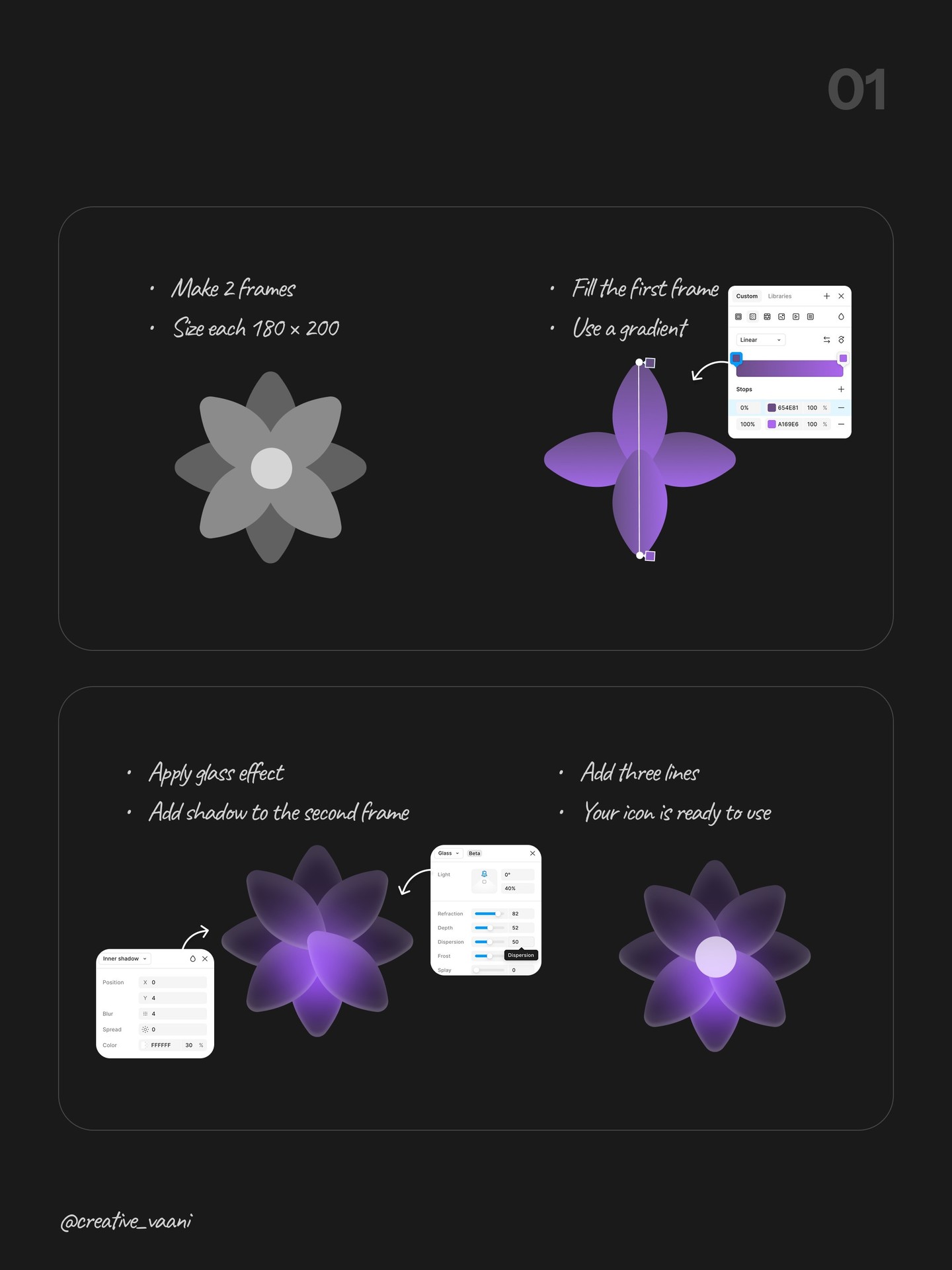
Image: @creative_vaani, via Instagram carousel.
Start with a background that has enough tonal variation to reveal the glass. A gentle gradient is sufficient. A uniform white page gives the blur nothing to distort, so the effect may be nearly invisible. Conversely, a noisy or highly detailed background can make the glass hard to read.
Step 2: Create the gradient and glass surface
Apply a linear gradient to the base shape. Choose two related hues or a light-to-dark transition rather than several unrelated colors. Place the second shape over it and apply Figma's glass effect from the appearance controls. Keep the transparency and blur moderate. The exact values should follow the background and element size, not a recipe copied without context.
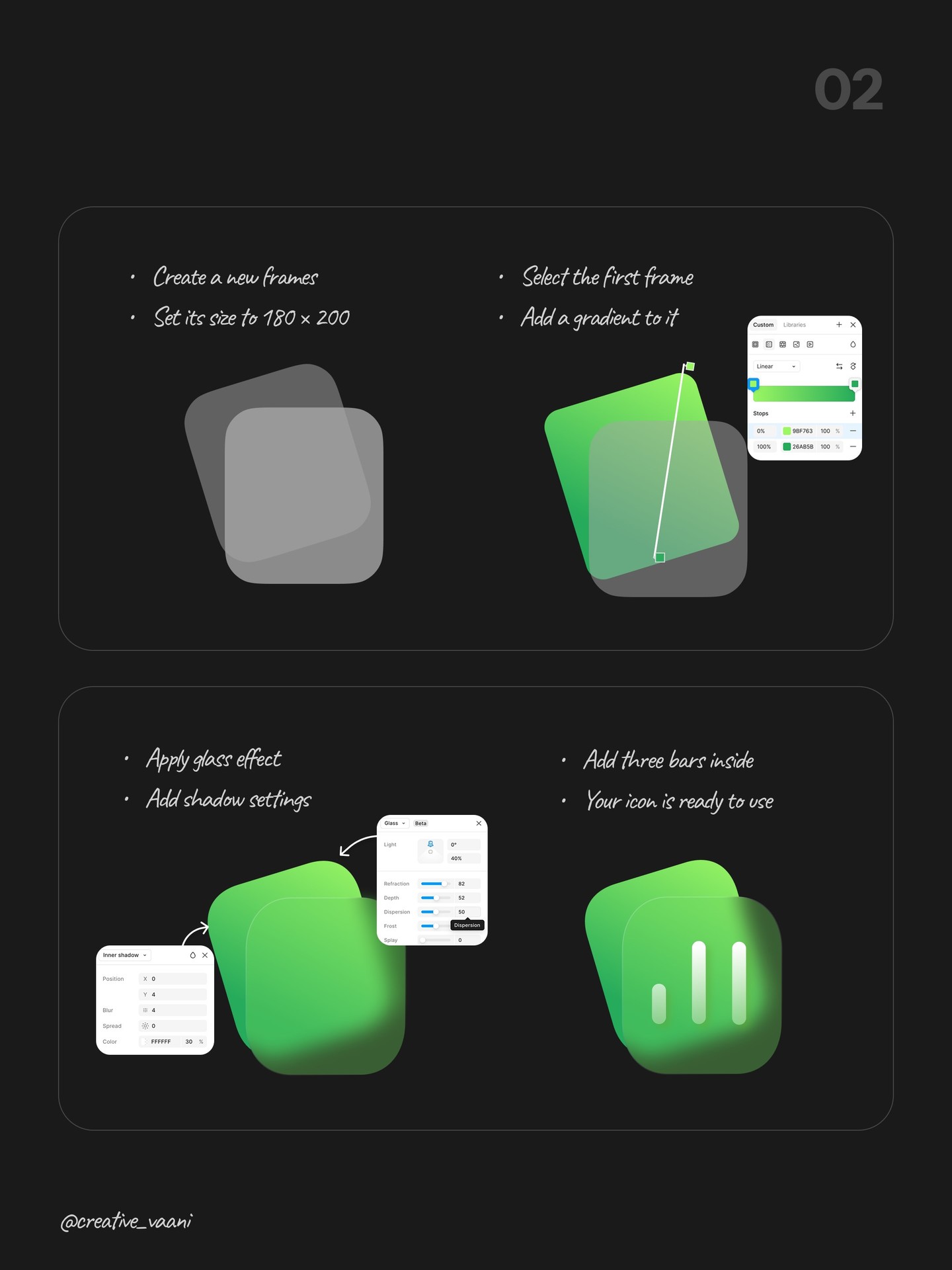
Image: @creative_vaani, via Instagram carousel.
A thin stroke around the glass shape helps define its edge. A pale stroke with partial opacity often gives enough separation. If you cannot see the boundary at normal zoom, increase the stroke slightly before increasing the blur or brightness. The shape should still feel attached to the page, not like a glowing sticker.
Step 3: Add simple content and a shadow
Add a few lines, bars, or a minimal icon inside the glass surface. The carousel uses three simple lines for one example and a calendar-like object for another. Keep interior marks bold enough to survive the blur and transparency. If the content itself needs a lot of tiny detail, glass is probably not the right container.
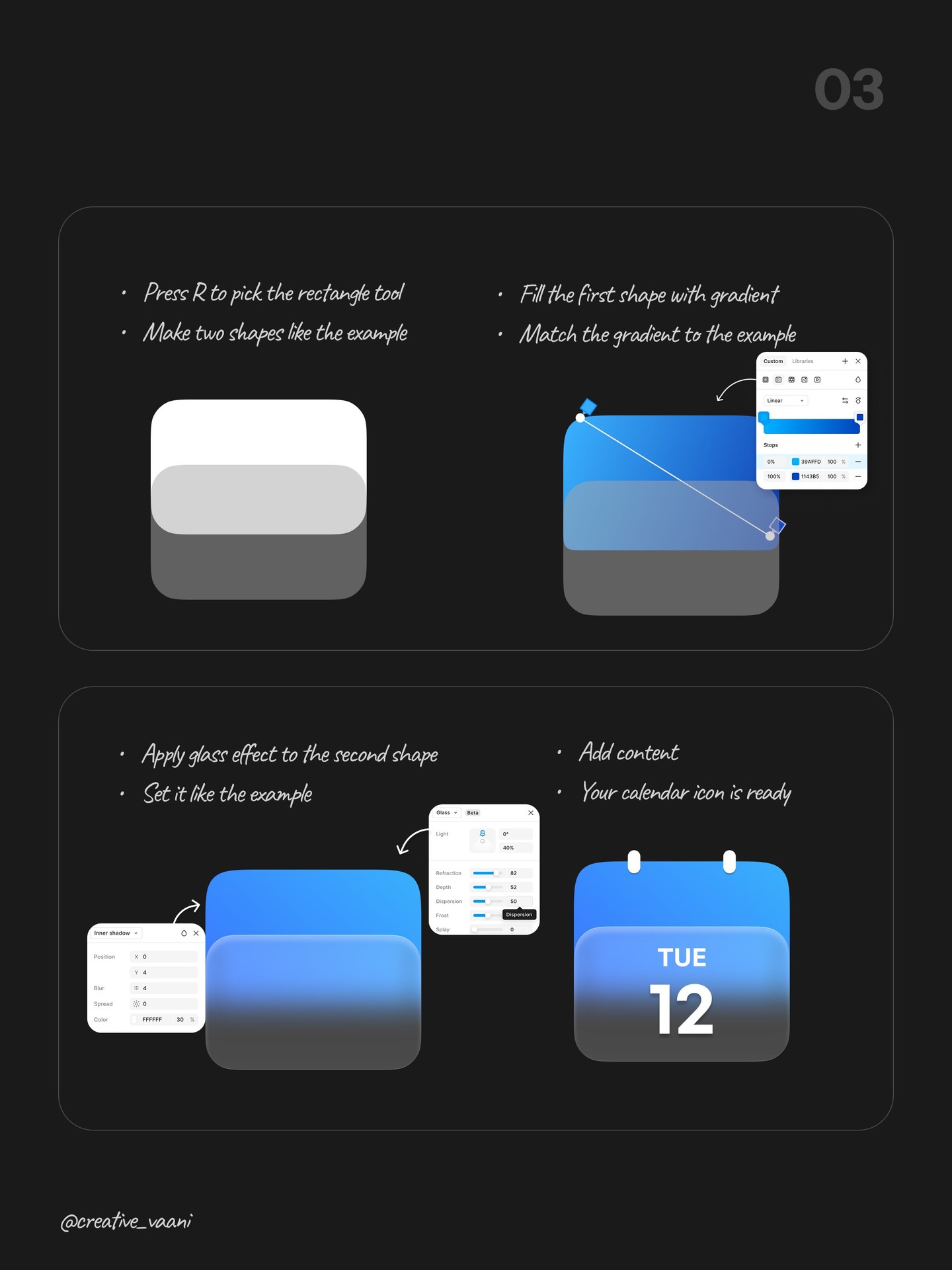
Image: @creative_vaani, via Instagram carousel.
Add a restrained shadow beneath the foreground object to establish depth. Shadows are easy to overdo: a large dark blur makes the element look detached, while a sharp edge can feel like a sticker. A soft, low-opacity shadow usually supports the glass effect better. View the object at its actual display size, not just enlarged on the canvas.
Step 4: Tune the details as a system
The carousel includes examples using drop shadow, inner shadow, and a small frame-within-frame construction. Each can add a different cue, but stacking every effect is rarely necessary. Choose the smallest combination that makes the object legible. If you use glass on several components, standardize the stroke, blur, and shadow so they look related.
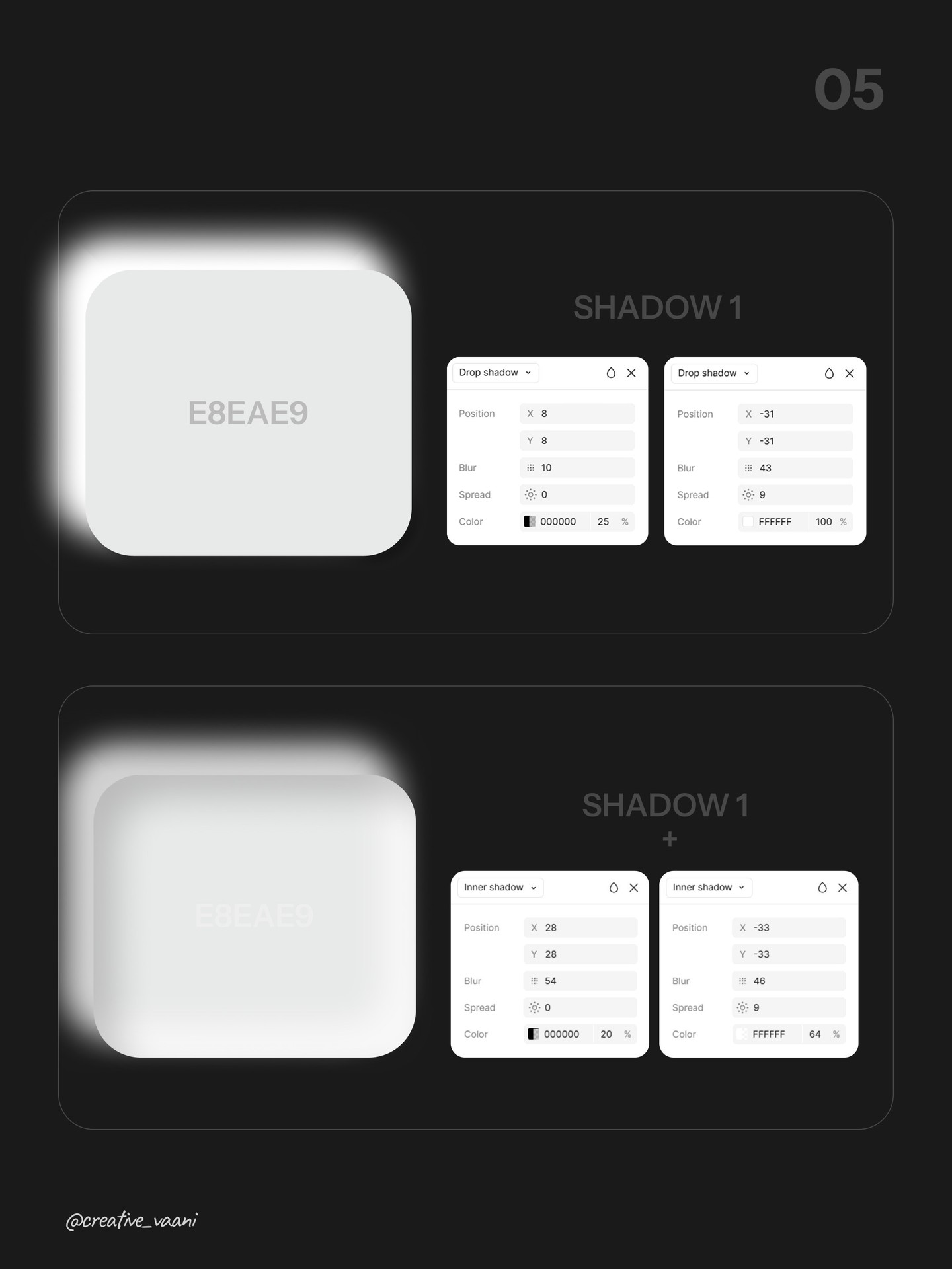
Image: @creative_vaani, via Instagram carousel.
For a clock or similar icon, the carousel uses a roughly 250-pixel outer frame and a smaller inner frame. The proportion matters more than the exact dimensions. Keep the border and inner shadow subtle, then align the clock face optically. A mathematically centered icon can still look off because the shape's visual weight is uneven.
Step 5: Check contrast and restraint
Glass effects can reduce contrast because the surface lets the background show through. Place text only when the background behind it is controlled. Test the layer against both light and dark areas, and check the smallest intended screen. The Figma help center documents current interface controls, while the WCAG contrast guidance gives a standard for readable text.
A fast review checklist:
- Can you identify the shape without relying on the shadow?
- Is the icon or text readable at the final size?
- Does the effect still work on the actual page background?
- Are blur, border, and shadow consistent with other glass elements?
- Would a solid surface communicate the same thing more clearly?
When to use it
Glass is most effective as a selective accent in a product with a relatively calm visual environment. Use it for a small floating action, media control, or decorative icon tile. Avoid putting essential text over unpredictable imagery, and do not use transparency as a substitute for hierarchy. If users need to understand a control immediately, clarity should win over atmosphere.
Visual source and original design: @creative_vaani.
View the original Instagram carousel
Related on NewForm
Keep reading

Find Your Stack
Discover the perfect design tools for your workflow.
Take the 60-second quizNewForm Studio
Turn your designs into professional mockups instantly.
Open StudioMore from NewForm

Free UI Components, SVG Generators and Icons: 4 Sites Every Designer Should Bookmark
Uiverse, fffuel, Iconbuddy and WebGradients cover most of the UI work designers re-solve every week: copy-paste components, SVG generators, 150,000 icons and CSS gradients.
4 min read · Nov 2, 2026

Bold Typographic Packaging: 4 Lessons From Standout Label Designs
Four real label designs, from LINEN sparkling water to DEWLO facial oil, teach hierarchy, color blocking, functional copy and quiet-color loud-type discipline.
4 min read · Nov 2, 2026