How to Create Realistic Glass Buttons in Figma (Step-by-Step Tutorial)
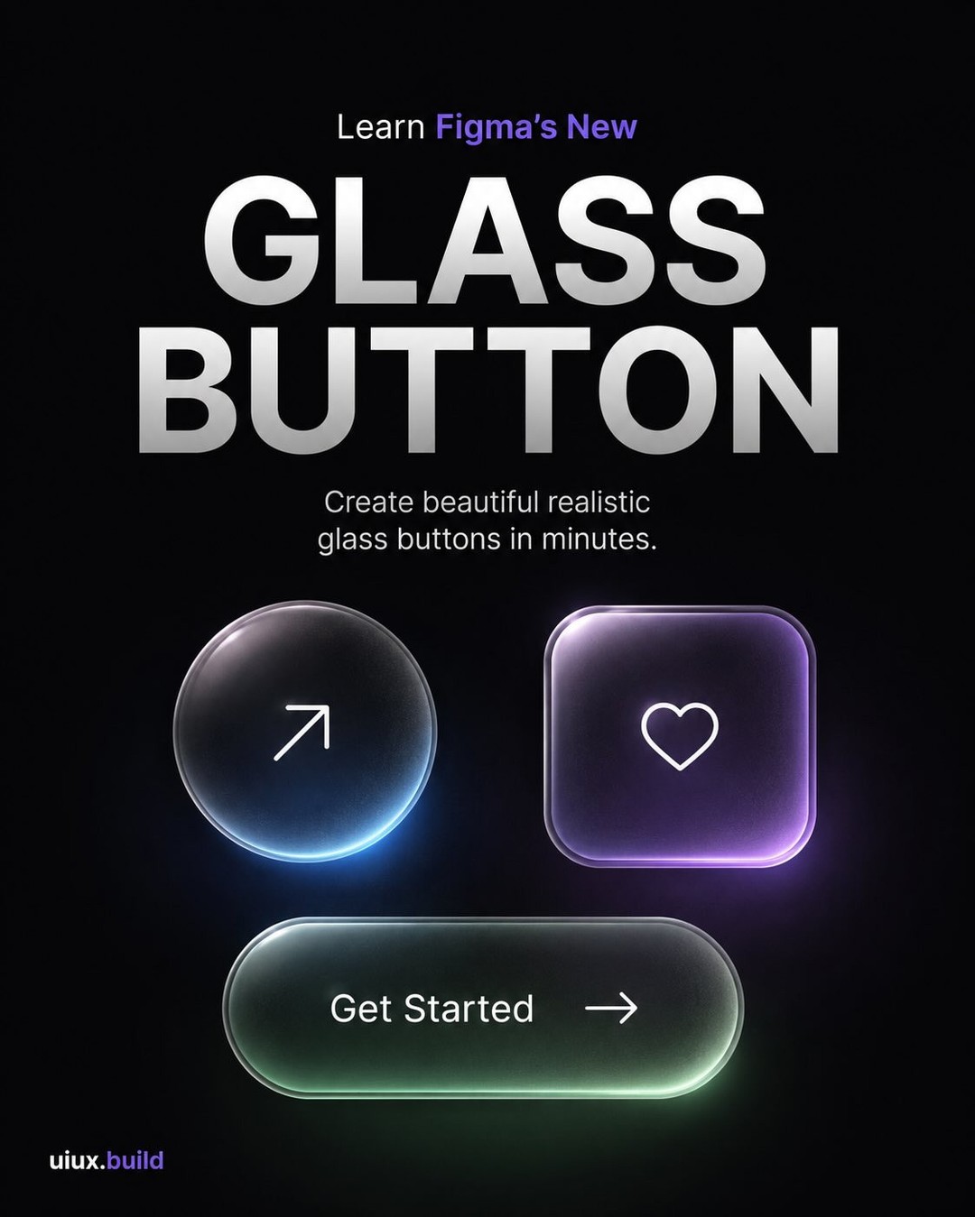
Original carousel by @uiux.build
Glass buttons are one of the most requested UI effects in Figma, and with the platform's built-in Glass effect, creating them is faster than ever. This tutorial walks through every step from a blank frame to a polished, realistic glass button you can drop into any design.

Step 1: Create Two Frames

Start by creating two square frames, each 180 x 180 pixels. Duplicate the first frame so you have two identical frames side by side. Enable "Clip content" on both.
Why two frames? The left frame becomes your base layer (the colored gradient underneath), and the right frame is where your glass effect lives. This separation gives you control over each layer independently and makes adjustments easier later.
Step 2: Build Your Base Gradient

Fill the first frame with a linear gradient. The carousel from @uiux.build uses a purple gradient (#8A5CFF at 100% opacity) as the base. Apply a corner radius to soften the edges and give it a button-like shape.
This base is what shows through the glass. The color you choose here determines the overall tone of your glass button. Purple gives a cool, premium feel. Blue feels calm and trustworthy. Orange feels warm and energetic. Pick a color that matches your brand or the context where the button will live.
Your base is now ready. Time for the glass.
Step 3: Apply the Glass Effect

This is where the magic happens. In Figma, add the Glass effect from the Effects panel. The default settings are a starting point, but the specific values from this tutorial are:
- Refraction: 82%
- Depth: 48%
- Frost: 60%
- Dispersion: 42%
- Tint: 20%
Here is what each setting does:
- Refraction controls how much the glass bends light. Higher values make the glass look thicker and more distorted.
- Depth determines how far the effect extends into the surface. Higher depth means more visible glass thickness.
- Frost adds a frosted quality. Higher frost means more opacity and less transparency. The carousel suggests increasing frost for a more solid look.
- Dispersion spreads the light. Lower dispersion creates a cleaner, more uniform glass. Higher dispersion creates more color separation at the edges.
- Tint adds a color cast to the glass. Keep this low for a neutral look, or increase it to match your brand color.
Pro tip from the carousel: Glass looks best with a soft background behind it. Place your glass button over a gradient or image, not a flat solid color.
Step 4: Make It Realistic

The difference between a good glass effect and a convincing one is in the small details. Add an inner shadow to create the impression of thickness at the edges. The carousel uses:
- Inner shadow: X=0, Y=16, Blur=40, Spread=0
- Color: #7E61FF at 30% opacity
Then add a soft highlight on the top edge to simulate light catching the glass surface. Reduce the layer opacity to keep it subtle.
A layer blur of 20 on the highlight edge softens it further, making it feel like natural light rather than a hard-edged effect.
The key insight here is subtlety. Each of these adjustments is small on its own. Together, they add up to a glass surface that reads as real material rather than a digital filter. As the carousel notes: "Small details make glass look premium."
Step 5: Final Polish

The last step is testing your glass button on different backgrounds. Glass reacts to whatever is behind it. The same glass button looks different on blue, purple, warm, or natural backgrounds.
Duplicate your glass component and place it on several different surface types:
- Blue: Cool and calm
- Purple: Soft and dreamy
- Warm tones: Vibrant and energetic
- Natural tones: Fresh and organic
This step matters because glass buttons almost never live on a single background. They appear on cards, headers, hero sections, and overlays. If your glass effect only looks good on one background, it will break the design wherever it appears elsewhere.
Pro tip: Glass effect looks different on every background. Use this to create depth and beautiful contrast rather than fighting it.
Summary: The Full Workflow
- Create two 180x180 frames with Clip content enabled
- Fill the base frame with a linear gradient and add corner radius
- Apply the Glass effect (Refraction 82%, Depth 48%, Frost 60%, Dispersion 42%, Tint 20%)
- Add inner shadow and soft highlight for realistic edge detail
- Test on multiple backgrounds to ensure the effect holds up everywhere
The entire process takes about 10 minutes once you know the settings. The result is a glass button that looks intentional, premium, and consistent across your design system.
For more Figma tutorials and design resources, check out the Figma Community where you can find glass button component files and editable versions of effects like these.
Want to build your own design tool or app? Build with Base44 and ship production apps with AI, no code required.
Original carousel by @uiux.build. View the original Instagram post here.
Where designers learn, create, and get discovered. newform.community
Related on NewForm

FREE FIELD GUIDE
The 8-Prompt Product
Answer 24 questions, run 8 prompts, and walk away this afternoon with a working, beautiful MVP you would be proud to show.
See what's insideKeep reading
Find Your Stack
Discover the perfect design tools for your workflow.
Take the 60-second quizNewForm Studio
Turn your designs into professional mockups instantly.
Open StudioMore from NewForm
9 Fonts Similar to Garamond for Editorial and Web (Free and Paid, 2026)
EB Garamond is the closest free match, Cormorant Garamond the best at display sizes. Nine Garamond alternatives rendered from their official files, with settings, CSS and a switch checklist.
14 min read · Nov 6, 2026
7 Free Fonts Similar to Times New Roman (Real Specimens, 2026)
Times New Roman is licensed and greys out on screen. These 7 free serifs, rendered from their official files, do the same job better.
15 min read · Nov 5, 2026