
Logo vs Branding: What the Difference Looks Like in Practice
Visual source and credit: @expert.pitch, original Instagram carousel.
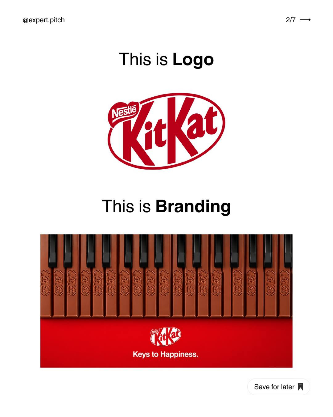
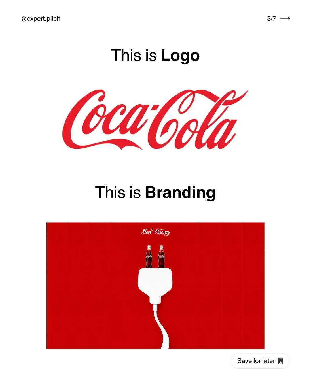
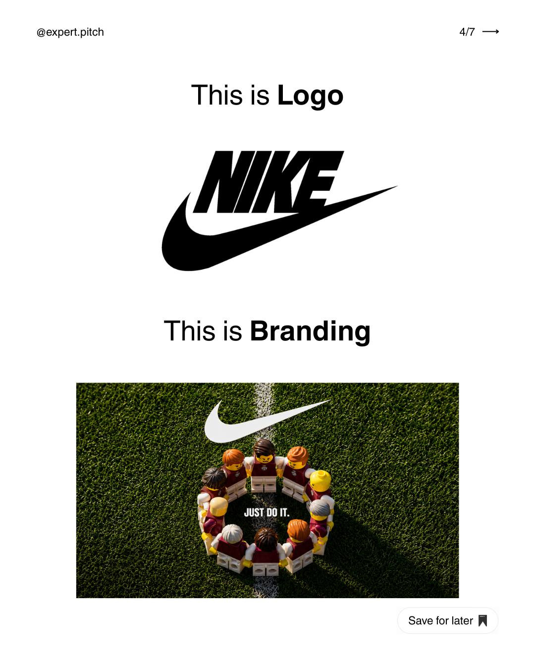
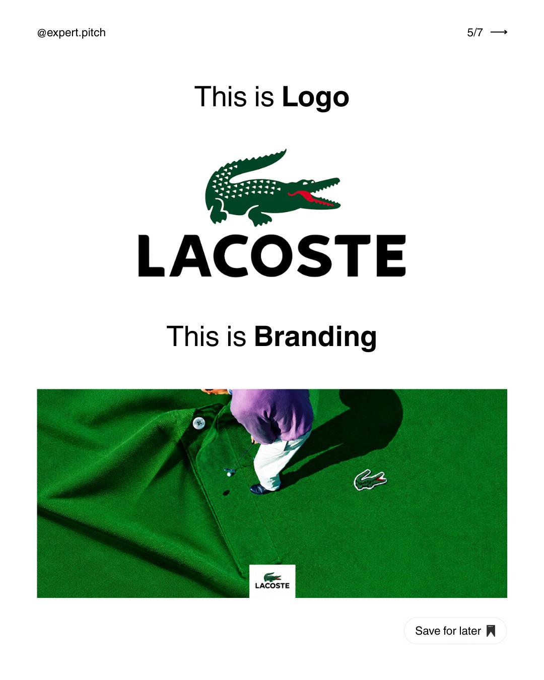
A logo is not the brand. It is one recognizable part of a much wider experience. A carousel by @expert.pitch makes the distinction visible by contrasting the logo with branding and showing the familiar Lacoste mark in context. The example is a useful reminder: the symbol matters, but the surrounding choices are what help people recognize the business across products, packaging, and communications.
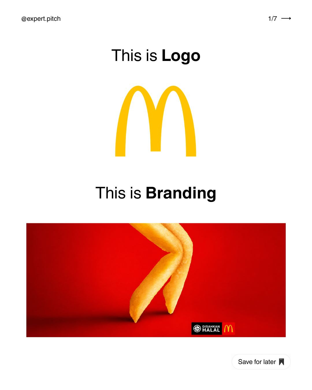
What a logo does
A logo is a visual identifier. It may be a wordmark, symbol, monogram, or combination. Its job is to be recognizable and usable in the places the business needs it: a storefront, app icon, label, social avatar, or document. A strong logo should work at different sizes and have sensible one-color versions. It should not need a paragraph of explanation every time it appears.
What branding adds
Branding is the coordinated system of visual and verbal decisions that shapes recognition and expectation. It includes the logo, but also color, typography, imagery, layout, tone of voice, and the way those pieces are applied. A person may recognize a business before seeing its logo because the colors, photography, packaging, or language already feel familiar.
Think of a logo as one instrument in an ensemble. Branding is the arrangement, the other instruments, and the performance. A distinctive instrument can help, but it cannot make every performance sound coherent by itself.
Three practical examples
1. The mark on a product
A logo printed on a label tells the buyer who made the product. Branding also determines the label’s color palette, material, typography, hierarchy, and supporting language. Two products can display the same mark and still feel very different if one uses premium paper and restrained type while the other uses bright colors and playful illustrations.
2. The app icon and the app experience
An app icon is a compact logo application. The brand continues inside the product through buttons, illustrations, onboarding language, empty states, and support messages. If the icon promises calm simplicity but the interface is crowded and the copy is shouty, the brand experience contradicts itself.
3. A campaign across channels
A campaign may use a logo in a social post, email, landing page, and event banner. Branding creates continuity across those formats through shared type, color, imagery, and message. The layouts should adapt to each channel, but the audience should still feel that they belong to the same campaign.
How to build a brand system around a logo
Start by defining the audience and the impression the business wants to leave. Choose a few adjectives, then translate them into design decisions. “Confident” might suggest strong contrast and decisive type. “Approachable” might suggest warmer color and more conversational copy. These are hypotheses to test, not universal rules.
Next, create a small set of reusable components: primary and secondary logo lockups, a color palette with usage guidance, type roles, image direction, and a few layout examples. Include clear do-and-don’t examples. Show how the system works on real touchpoints rather than presenting isolated swatches.
Finally, test the system in context. Place it on a mobile screen, a small social tile, and a printed or digital document. Check legibility, consistency, and whether the intended personality survives. If every touchpoint requires a designer to invent new rules, the system is not yet doing enough work.
Common mistakes to avoid
Do not expect a redesign of the logo to fix unclear positioning or inconsistent service. Do not treat a color palette as a complete brand guide. And do not force every application to look identical. Consistency comes from shared principles, not from stamping the same layout onto every format.
A logo helps people identify a business. Branding shapes the broader impression they remember. When the mark and the surrounding system work together, recognition becomes easier and the experience feels intentional. When they conflict, even a polished logo cannot carry the whole relationship.
Source and credit: Visual reference from @expert.pitch, original Instagram carousel.
A simple exercise for a small business
Choose three existing touchpoints, such as a website header, an Instagram post, and a product or service document. Hide the logo on each one. Can you still tell that they belong to the same organization from the color, type, image choices, and writing style? If not, identify one or two shared elements that can bridge the gap. Then restore the logo and check whether it appears at a useful size, with enough clear space, and in an appropriate version. This separates two different questions: whether the logo is being applied correctly, and whether the broader brand is consistent. The distinction matters because the fixes are different. A logo file or usage rule may solve the first issue; a better set of templates and voice guidance may solve the second.
Keep the system practical
A brand guide does not need to be a huge book to be useful. A compact guide can show logo variations, color values and accessible combinations, type roles, image direction, tone examples, and a few real layouts. Include the mistakes people are likely to make, such as stretching the logo, placing it on a busy photograph, or using the accent color for long paragraphs. Add a short rationale so the rules feel connected to the intended audience rather than arbitrary. When the organization grows, the system can expand to cover more channels. Start with the situations people use every week, make those easy to get right, and revisit the guide when actual work exposes a missing rule.
Carousel slides
Keep reading

Find Your Stack
Discover the perfect design tools for your workflow.
Take the 60-second quizNewForm Studio
Turn your designs into professional mockups instantly.
Open StudioMore from NewForm

6 Free Fonts Similar to Futura (Real Specimens, 2026)
Futura is licensed and awkward at small sizes. These 6 free geometric sans, rendered from their official files, do the same job: Jost, Poppins, Outfit, Urbanist, Josefin Sans, Questrial.
13 min read · Nov 3, 2026

Bold Typographic Packaging: 4 Lessons From Standout Label Designs
Four real label designs, from LINEN sparkling water to DEWLO facial oil, teach hierarchy, color blocking, functional copy and quiet-color loud-type discipline.
4 min read · Nov 2, 2026