
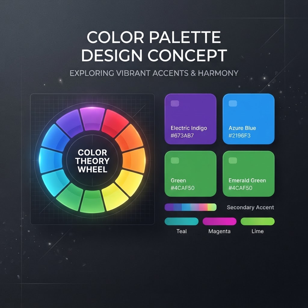
5 Color Palette Mistakes That Kill Your Designs
Why color palettes matter
Studies show users form a first impression within 50 milliseconds, and color drives up to 90% of that snap judgment.
Here are the five most common palette mistakes we see in challenge submissions, and how to fix them.
1. Too many colors
The mistake: Using 6+ distinct colors in a single interface.
The fix: Stick to the 60-30-10 rule:
- 60% dominant color (usually your background)
- 30% secondary color (cards, surfaces)
- 10% accent color (CTAs, highlights)
2. Ignoring contrast ratios
The mistake: Light gray text on white backgrounds because it "looks cleaner."
The fix: Always check WCAG contrast ratios. Minimum 4.5:1 for body text. Tools like Coolors and WebAIM make this effortless.
3. Using pure black (#000000)
The mistake: Pure black on pure white creates harsh eye strain.
The fix: Use off-black (#1A1A1A or #0C0C0F) and off-white (#FAFAFA) for a softer, more professional look.
4. No semantic system
The mistake: Picking colors ad-hoc without a defined system.
The fix: Define semantic tokens: --color-primary, --color-success, --color-danger. This makes your palette maintainable and consistent.
5. Forgetting dark mode
The mistake: Designing only for light mode, then scrambling to adapt.
The fix: Design both modes simultaneously. Define light and dark values for every semantic token from day one.
The takeaway
Great color palettes aren't about picking pretty colors, they're about system, contrast, and restraint. Master the fundamentals and your designs will instantly look more professional.
Find Your Stack
Discover the perfect design tools for your workflow.
Take the 60-second quizNewForm Studio
Turn your designs into professional mockups instantly.
Open StudioMore from NewForm
Level Up Your Design Workflow: Essential Tips and Modern Tools
Discover how to optimize your creative process with modern typography strategies, AI design tools, and expert techniques to elevate your digital product work.
6 min read · Aug 30, 2026
The Most Dangerous Thing a Designer Can Do in 2026
Stagnation is the biggest threat to your career. Learn how to evolve your design skills and stay ahead in the rapidly shifting 2026 industry landscape.
3 min read · Aug 14, 2026