
9 Fonts Similar to Garamond for Editorial and Web (Free and Paid, 2026)
The closest free alternatives to Garamond are EB Garamond for a near-exact match and Cormorant Garamond for large display type. Both are free on Google Fonts, both keep the old-style bones, and both fix the one thing wrong with Garamond itself: it was cut for lead type in the 1530s, not for a 16px checkbox. Seven more free options follow, each rendered from its official files at identical settings so you can compare them honestly.
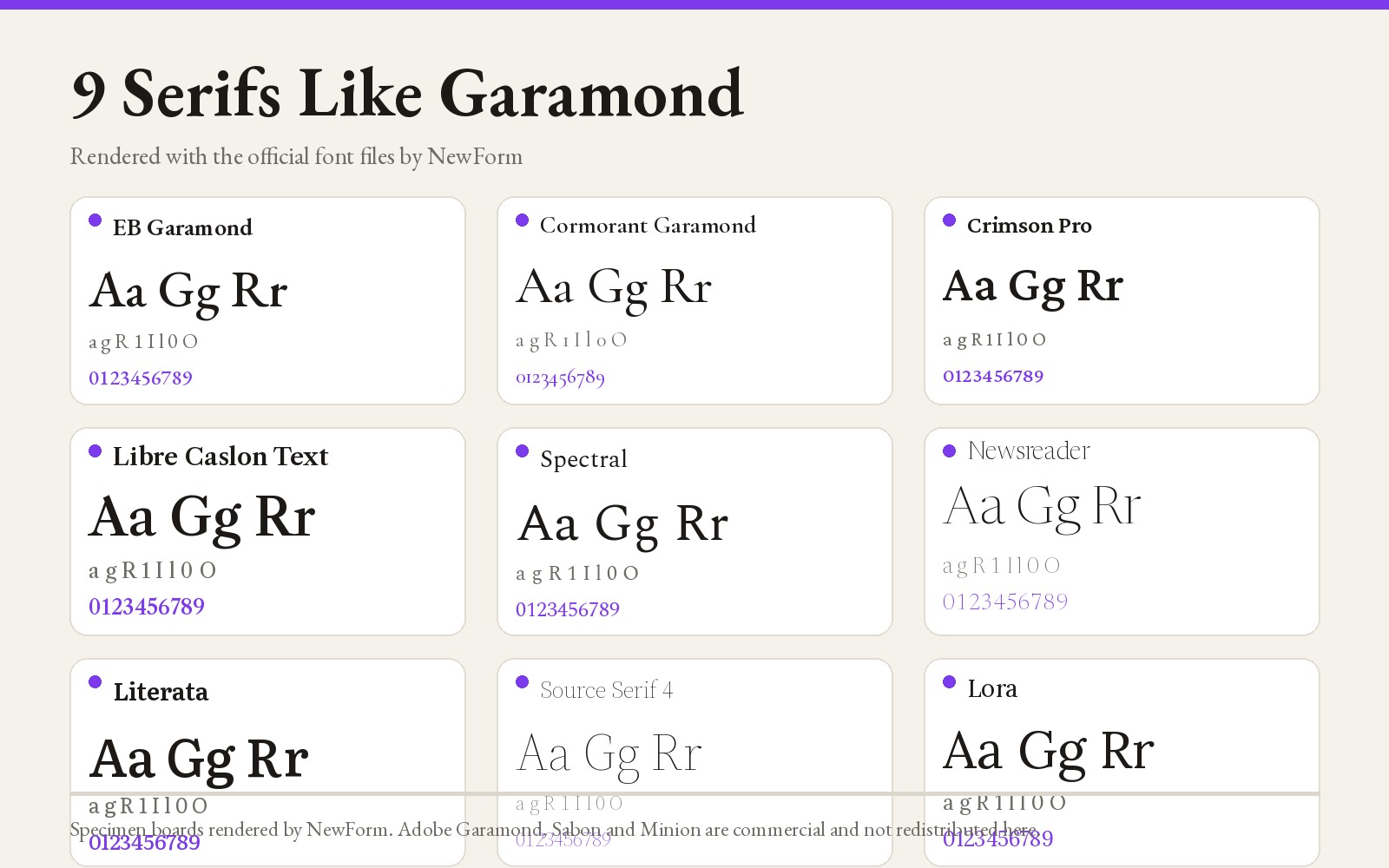
TL;DR: the nine, ranked
- EB Garamond, closest overall. Free, Google Fonts. An open revival of Claude Garamont's sixteenth century design with real italics, small caps and a wide weight range. Best when you want the Garamond feel and nothing more.
- Cormorant Garamond, best for display. Free, Google Fonts. Hairline serifs and huge x-height contrast. Best for magazine titles, pull quotes and 48px and up. Not for body copy.
- Crimson Pro, best for long reading. Free, Google Fonts. Built for books, sturdier at small sizes than EB Garamond. Best for documentation, essays and reading-heavy product surfaces.
- Libre Caslon Text, best when Garamond feels too soft. Free, Google Fonts. Caslon is the punchier sibling. Best for editorial layouts that need a little more backbone.
- Spectral, best for screens at 14 to 16px. Free, Google Fonts. Designed by Production Type for screen reading, with a low contrast cut that survives anti-aliasing. Best for article bodies and settings pages.
- Newsreader, best for news and newsletters. Free, Google Fonts. Variable with an optical size axis, so the display cut and the text cut are the same file. Best for editorial products with mixed sizes.
- Literata, best for e-readers and long paragraphs. Free, Google Fonts. Commissioned for Google Play Books, so it earns its keep at 100% zoom on a phone.
- Source Serif 4, best open source system serif. Free, Google Fonts and GitHub. Pairs with Source Sans 3 and has an optical size axis. Best for docs, changelogs and product marketing.
- Lora, best personality on a budget. Free, Google Fonts. Brushed curves and moderate contrast. Best for brand blogs and welcome screens that want warmth.
What actually makes Garamond, Garamond
Garamond is an old-style serif: angled stress, a small x-height, a low contrast between thick and thin, and an italic that looks drawn rather than slanted. Those traits are why it reads as literary and calm at 40px, and why it falls apart in a 12px data table. The x-height is the problem. At small sizes, small x-height means the lowercase letterforms occupy less of the line, so perceived size drops and the text looks lighter than it is.
Any swap worth making has to keep the old-style character and fix the small-size legibility. That is the axis these nine sit on.
1. EB Garamond
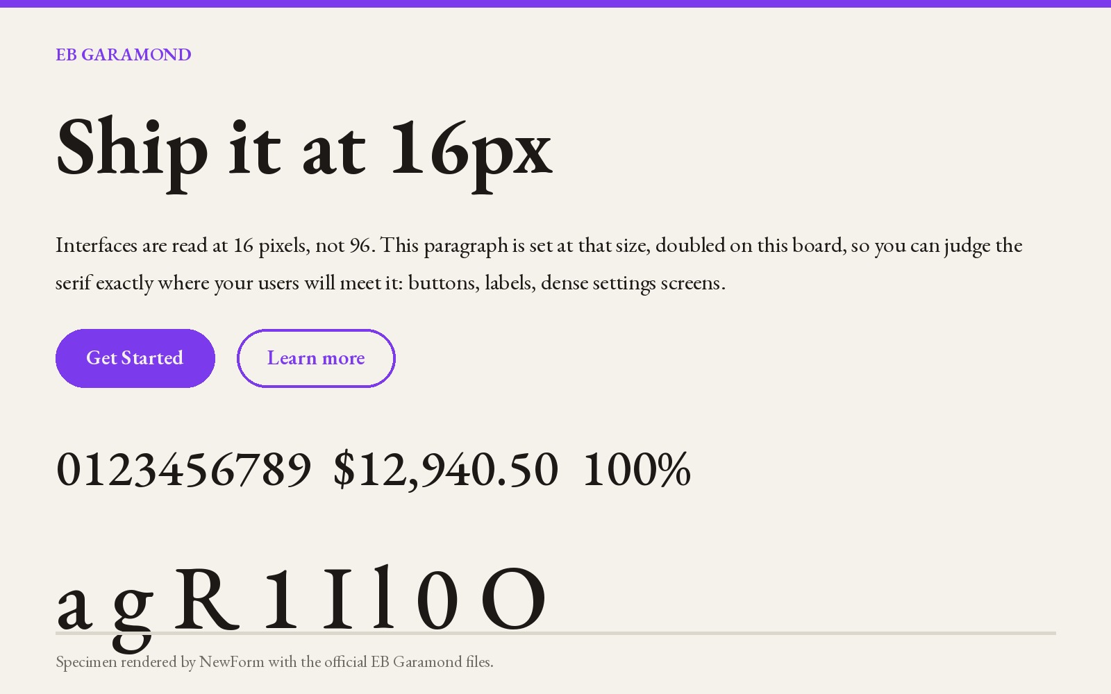
Why it works. It is the most faithful open Garamond available: a revival based on the 1592 specimen of Claude Garamont's punches, extended with the italics, Greek and Cyrillic that the original never had. It has a variable weight axis from 400 to 800, so you can go heavier at small sizes without switching fonts.
Where to use it. Editorial pages, essays, book layouts, brand sites where the literary tone is the point, and any place you would have used Garamond on paper.
Settings that work. Body 18px, line height 1.6, weight 400. Headings 400 to 500, not 700: this is a high-contrast old-style and bold weights get chunky fast.
font-family: "EB Garamond", Garamond, "Times New Roman", serif;
font-size: 18px;
line-height: 1.6;
font-weight: 400;
font-optical-sizing: auto;
Watch out for. The default weight is light, and at 14px on a 1x display it will feel thinner than Garamond does in print. Use 17px minimum for body copy, or bump to weight 500. Its numerals are old-style by default, so financial tables will look odd unless you turn on lining figures.
Where to get it. Free on Google Fonts. Adobe's Garamond Premier Pro is the paid reference cut, and Adobe Fonts includes it with Creative Cloud: fonts.adobe.com (registry slot: adobe_fonts).
2. Cormorant Garamond
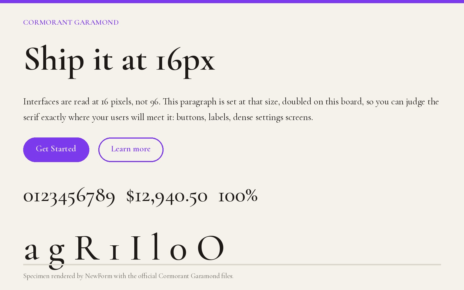
Why it works. Cormorant takes the Garamond skeleton and pushes contrast and delicacy far past what print could hold. The result is a display serif with real drama. It is also the reason the phrase "cormorant garamond font" pulls far more search volume than most Garamond variants: designers see it in fashion and editorial layouts and want to know what it is.
Where to use it. Magazine mastheads, hero headlines, pull quotes, wedding and hospitality brands, anything at 36px and above where elegance is the message.
Settings that work. Headlines at 48px and up, weight 300 to 400, line height 1.1, letter spacing slightly negative at large sizes. Give it generous margins; it needs air.
font-family: "Cormorant Garamond", Garamond, serif;
font-size: clamp(2.5rem, 5vw, 4.5rem);
line-height: 1.1;
font-weight: 300;
letter-spacing: -0.01em;
Watch out for. Do not set body copy in it. Below 24px the hairlines disappear and the small x-height makes the paragraph look grey and thin. It also has a huge apparent size range because of that contrast, so a 24px Cormorant line and a 24px EB Garamond line will not look like the same size.
Where to get it. Free on Google Fonts.
3. Crimson Pro
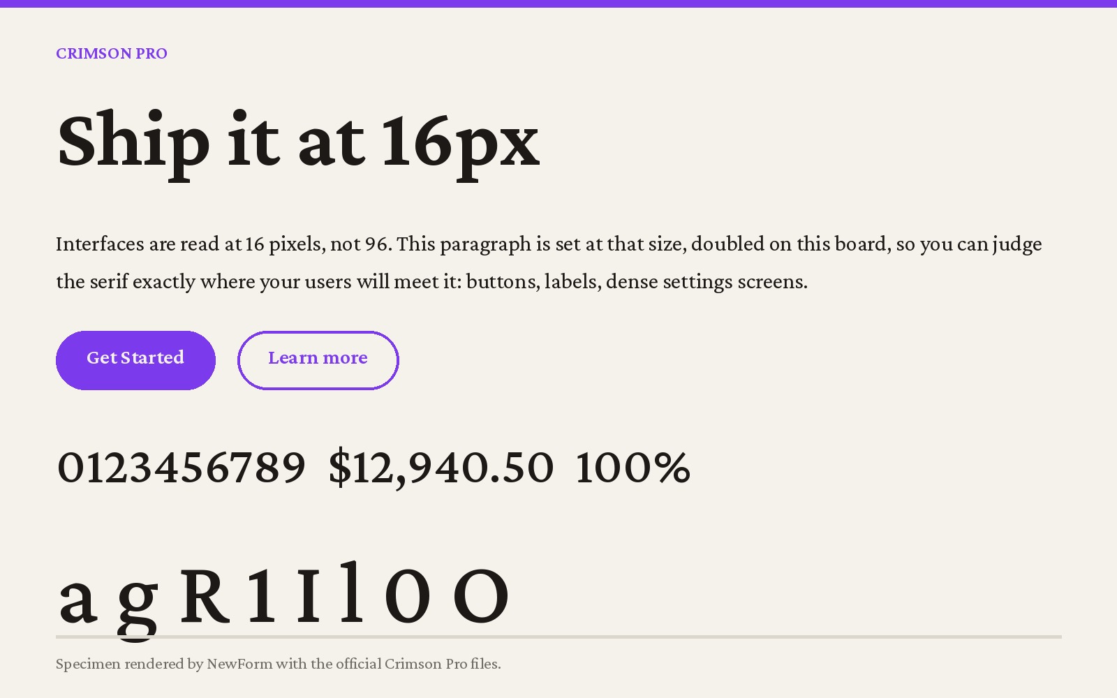
Why it works. Crimson was drawn by Sebastian Kosch specifically as a book face for digital reading, and Crimson Pro is the refined variable release. It keeps the Garamond proportions but raises the x-height and thickens the hairlines, which is exactly the correction screen rendering needs.
Where to use it. Long articles, documentation, help centers, onboarding copy, and any product surface where people read more than three sentences in a row. It is also a good pairing for a grotesque UI font: Crimson Pro for prose, Inter for controls.
Settings that work. Body 17 to 19px, weight 400, line height 1.65. For documentation at 15px, use weight 500.
font-family: "Crimson Pro", Garamond, Georgia, serif;
font-size: 19px;
line-height: 1.65;
font-weight: 400;
Watch out for. It is a text face with modest personality at poster sizes. If your layout needs a headline that shouts, it will not do it.
Where to get it. Free on Google Fonts.
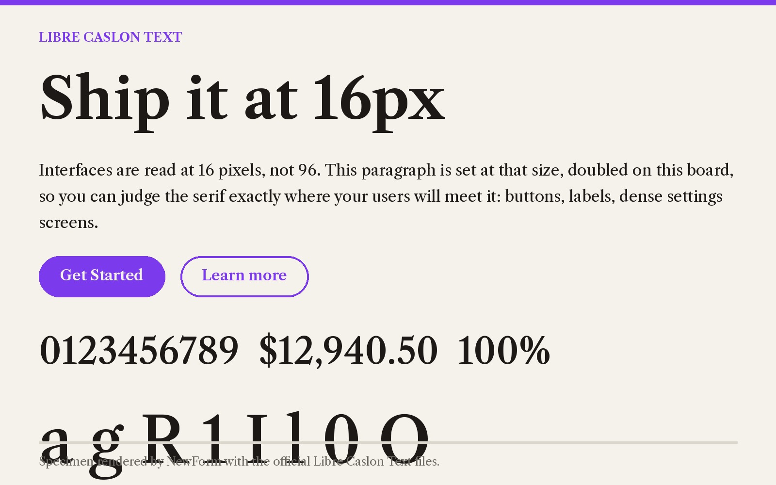
4. Libre Caslon Text
Why it works. Caslon is the typeface that replaced Garamond in English printing, and it shows: same old-style stress, more weight in the stems, sharper serifs. If Garamond reads as gentle, Caslon reads as confident. Libre Caslon Text is the open adaptation built for body text.
Where to use it. Editorial layouts, opinion columns, newsletter bodies, and interfaces that want a print feel without looking delicate. It is the safest pick for a serif UI accent that has to sit next to a sans.
Settings that work. Body 17 to 18px, weight 400, line height 1.55. Headings 500 to 600.
font-family: "Libre Caslon Text", Caslon, Garamond, serif;
font-size: 18px;
line-height: 1.55;
font-weight: 400;
Watch out for. The stem weight that makes it sturdy also makes bold feel heavy. Stop at 600. The x-height is larger than Garamond's, so paragraphs will look slightly bigger at the same px value.
Where to get it. Free on Google Fonts.
5. Spectral
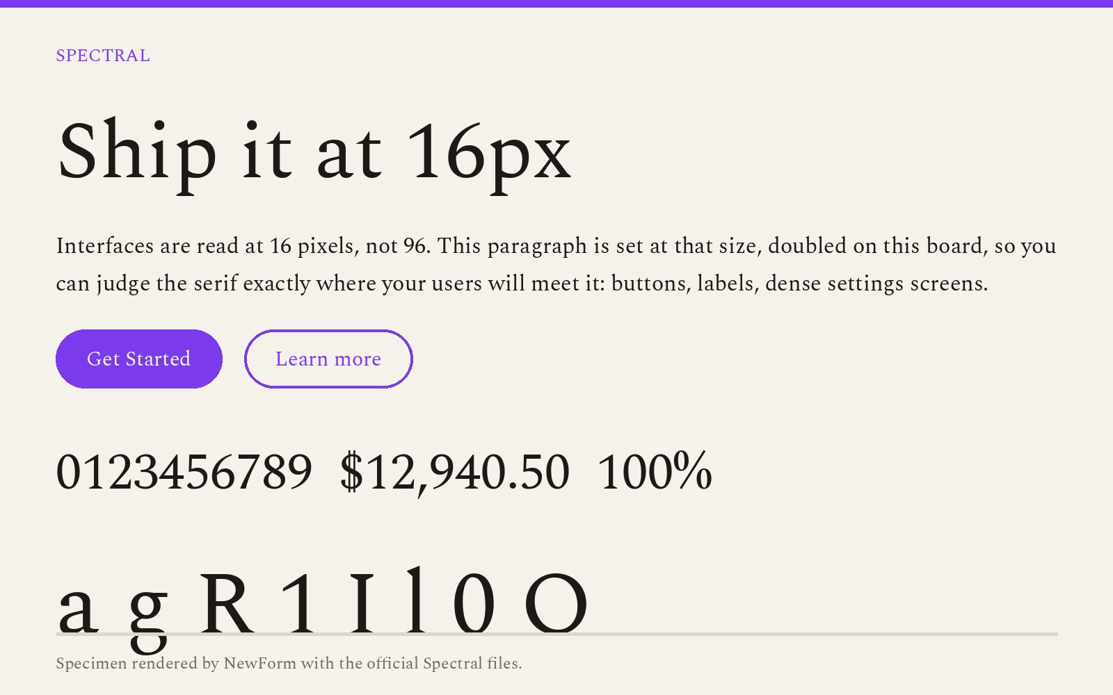
Why it works. Spectral was commissioned for Google Docs screen reading and designed by Production Type. It has a low contrast between thick and thin specifically so it holds up at 14 to 16px, where Garamond's hairlines break into pixels. It also has a wide weight range and a matching sans for UI labels.
Where to use it. Product surfaces with prose: settings explanations, empty states, release notes, in-app articles. Anywhere the font has to survive a 1x display and a cheap phone.
Settings that work. Body 16 to 18px, weight 400, line height 1.6. Use Spectral SC or the light cut only at display sizes.
font-family: "Spectral", Garamond, Georgia, serif;
font-size: 17px;
line-height: 1.6;
font-weight: 400;
Watch out for. It is a little cooler and more neutral than Garamond. You lose some of the warmth.
Where to get it. Free on Google Fonts.
6. Newsreader
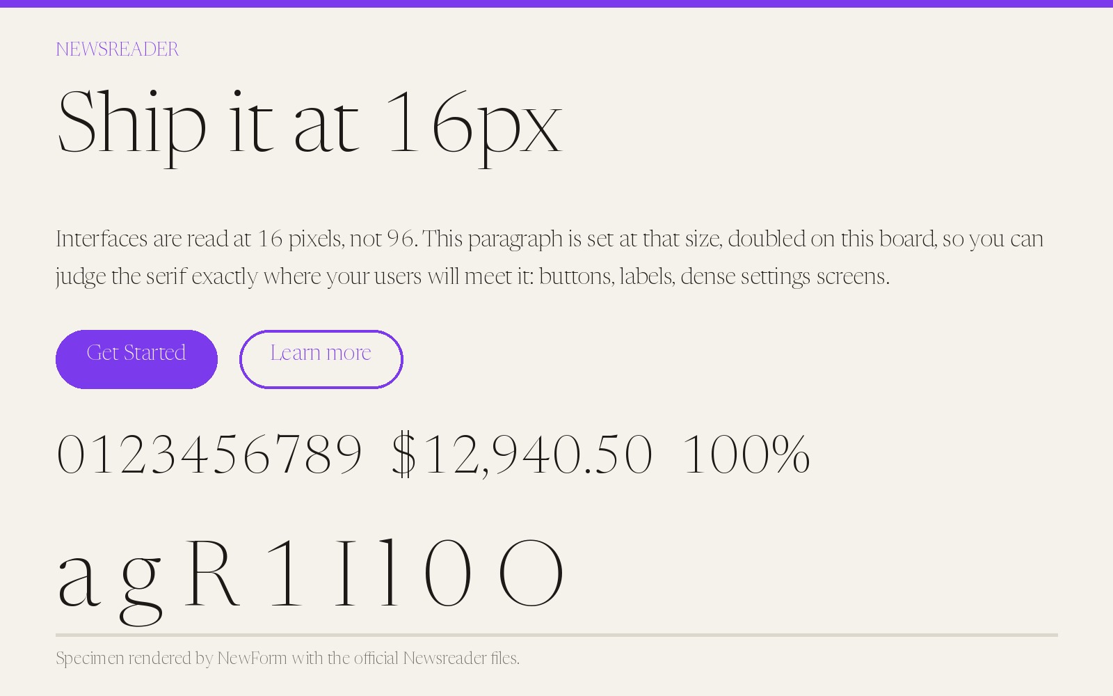
Why it works. Newsreader is a variable serif with an optical size axis: the same file carries a text cut and a display cut, and the browser interpolates between them based on rendered size. That is the modern answer to the old Garamond problem, where you needed separate optical sizes.
Where to use it. Editorial products with mixed sizes: a newsletter with a 56px headline and 18px body, a magazine layout, a news app.
Settings that work. Enable font-optical-sizing: auto and set sizes normally. Body 18px weight 400, headlines 44px weight 500.
font-family: "Newsreader", Garamond, Georgia, serif;
font-size: 18px;
line-height: 1.6;
font-optical-sizing: auto;
font-weight: 400;
Watch out for. Optical sizing support is good but not universal, and without it the text cut is used everywhere, which makes large headlines look heavy.
Where to get it. Free on Google Fonts.
7. Literata
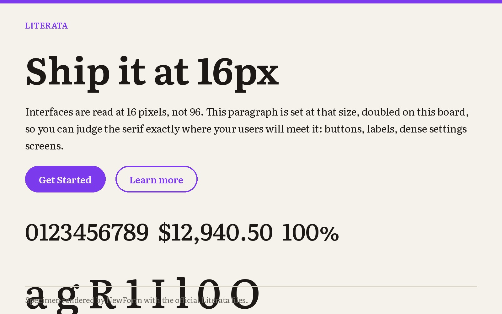
Why it works. Literata was commissioned by Google for Play Books, so its entire brief was long-form reading on screens of every size. It has distinctive angled terminals and a large x-height, which makes it the most legible of the group at 16px.
Where to use it. Reading apps, documentation, long-form marketing pages, and any place where a reader might be 40 paragraphs in.
Settings that work. Body 17 to 19px, line height 1.6, weight 400. Its display cut at 32px and up has real character.
font-family: "Literata", Garamond, Georgia, serif;
font-size: 18px;
line-height: 1.65;
font-weight: 400;
font-optical-sizing: auto;
Watch out for. The large x-height and angled cuts make it visibly more contemporary than Garamond. If the brief is "classic book page", this is not it.
Where to get it. Free on Google Fonts.
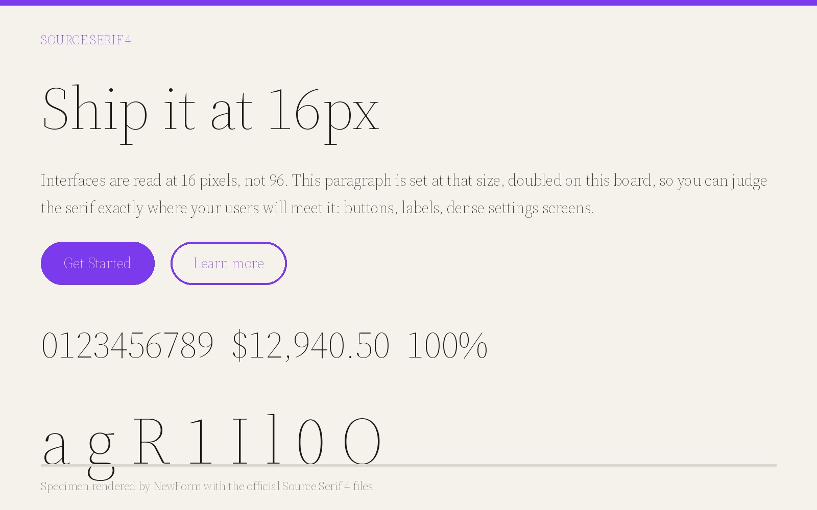
8. Source Serif 4
Why it works. Adobe's open source serif, now at version 4 with an optical size axis and a wide weight range. It is the serif half of the Source family, which means it has a genuine sans companion in Source Sans 3 and a mono in Source Code Pro. That gets you a complete type system from one licence, which is free.
Where to use it. Documentation sites, developer products, changelogs, and product marketing where the code samples and the prose have to live together.
Settings that work. Body 17px weight 400, headings 600, code in Source Code Pro at 14px.
font-family: "Source Serif 4", Garamond, Georgia, serif;
font-size: 17px;
line-height: 1.6;
font-weight: 400;
font-optical-sizing: auto;
Watch out for. It reads technical rather than literary. In a brand context it can feel like a docs font.
Where to get it. Free on Google Fonts and on GitHub under the SIL Open Font License.
9. Lora
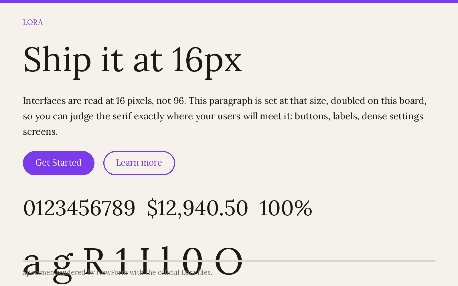
Why it works. Lora is a contemporary serif with brushed curves and moderate contrast, drawn for the web rather than revived from print. It keeps the old-style warmth that people like about Garamond but adds enough weight and x-height to work in a card or a hero at 28px.
Where to use it. Brand blogs, welcome screens, pricing pages, and product marketing that wants a human tone without going full editorial.
Settings that work. Headlines 32 to 56px weight 500 to 600, body 17 to 18px weight 400, line height 1.6.
font-family: "Lora", Garamond, Georgia, serif;
font-size: 18px;
line-height: 1.6;
font-weight: 400;
Watch out for. It is the least Garamond-like of the nine on the old-style axis. The curves are rounder and the stress is more vertical, so if fidelity is the goal, use EB Garamond.
Where to get it. Free on Google Fonts.
Garamond vs EB Garamond
If you are choosing between the commercial original and the free revival, the honest answer is that EB Garamond is not a pixel-for-pixel copy and does not try to be. It has a slightly lighter default weight, larger italics, and a much wider language and feature set. Adobe Garamond Pro and Garamond Premier Pro have tighter spacing and a more consistent colour on the page, which matters in print.
For screen work at 16 to 20px the difference is close to invisible, and EB Garamond wins on features and cost. For print or a brand system with a licensed type budget, Garamond Premier Pro is the better cut. Adobe Fonts includes it with Creative Cloud, and MyFonts sells the full Monotype catalogue including Adobe Garamond Pro: myfonts.com (registry slot: myfonts).
How to switch without breaking your layout
- Keep the size, change the leading. Old-style serifs have smaller x-heights than sans serifs, so a swap from Inter to EB Garamond at the same px will look smaller. Bump body from 16px to 17 or 18px and add 0.1 to your line height ratio.
- Set a real fallback stack.
"EB Garamond", Garamond, "Times New Roman", serifcovers the free cut, macOS's built-in Garamond, and the universally installed fallback. - Turn on optical sizing where it exists. Newsreader, Literata and Source Serif 4 all have an optical size axis.
font-optical-sizing: autogets you the text cut at body sizes automatically. - Check the numerals. Old-style figures are default in EB Garamond and most revivals. For tables, prices and dashboards, use
font-variant-numeric: lining-nums tabular-numsor the figures will bounce. - Subset before you ship. These are broad-coverage fonts. A Latin subset from Google Fonts cuts 150 to 300KB off a variable file, and
font-display: swapkeeps the first paint honest.
Once the type is set, the next question is usually how it looks in a real interface. NewForm's Mockup Studio turns a typeset screen into a presentation mockup, and if you want to ship the thing rather than mock it, Base44 turns a prompt into a working app.
FAQ
What font is most similar to Garamond?
EB Garamond is the closest free match. It is an open revival of the same sixteenth century design, with the italics, small caps and Cyrillic that the original never had. Cormorant Garamond is closer in spirit at display sizes, and Crimson Pro is closer in feel for long body copy.
Is there a free Garamond alternative on Google Fonts?
Yes, several. EB Garamond, Cormorant Garamond, Crimson Pro, Libre Caslon Text, Spectral, Newsreader, Literata, Source Serif 4 and Lora are all free on Google Fonts under the SIL Open Font License, which allows commercial use and self-hosting.
Is EB Garamond the same as Garamond?
No. It is a revival, not a copy. EB Garamond is based on Claude Garamont's punches via the 1592 specimen, but the spacing, default weight and italic designs differ from Adobe Garamond Pro and Garamond Premier Pro. At screen sizes the difference is small; in print it is visible.
What is the difference between Garamond and Cormorant Garamond?
Cormorant Garamond pushes contrast and delicacy far beyond what print could hold. That makes it a display face for 36px and up. Garamond and EB Garamond are text faces meant for reading at 16 to 20px.
Can I use Garamond alternatives in a commercial product?
Yes. Every font in this list is released under the SIL Open Font License, which permits commercial use, modification and embedding in apps and websites. The one obligation is that you cannot sell the font files by themselves.
What is the best Garamond replacement for a dashboard or app UI?
Spectral or Source Serif 4 at 15 to 17px. Both have low contrast and sturdy hairlines, so they hold up next to form controls and data tables. Reserve EB Garamond for prose and marketing pages, where it has room to breathe.
Should I pair a Garamond with a sans serif?
Usually yes. A classic combination is EB Garamond or Crimson Pro for headings and body prose with Inter for UI labels, buttons and data. That mix keeps the editorial tone in the reading experience while the controls stay crisp. Our Inter alternatives guide covers the sans side, and the font pairings guide has rendered combinations for both.
Where to get everything in this post
Specimens on this page were rendered by NewForm with the official font files. Free options come from Google Fonts, which needs no licence and no attribution. If you want a premium Garamond for print or a brand system, the commercial cuts live at MyFonts (registry slot: myfonts) and on Adobe Fonts with Creative Cloud (registry slot: adobe_fonts). For display serifs to pair with these, Creative Market (registry slot: creative_market) and the unlimited Envato Elements library (registry slot: envato_elements).
Affiliate note: some links above are affiliate links. If you buy through them, NewForm earns a commission at no extra cost to you. Free fonts are always listed first and never paywalled.
For the rest of this series, see the Inter alternatives hub, the Helvetica alternatives guide and the typography sizes guide.
More in the Fonts Similar To series
- Fonts similar to Inter (the hub, 12 alternatives and 5 head-to-heads)
- Fonts similar to Helvetica
- Fonts similar to SF Pro
- Fonts similar to Futura
- Fonts similar to Proxima Nova
- Fonts similar to Times New Roman
- Fonts similar to Garamond
- Inter vs Geist

FREE FIELD GUIDE
The 8-Prompt Product
Answer 24 questions, run 8 prompts, and walk away this afternoon with a working, beautiful MVP you would be proud to show.
See what's insideKeep reading

Find Your Stack
Discover the perfect design tools for your workflow.
Take the 60-second quizNewForm Studio
Turn your designs into professional mockups instantly.
Open StudioMore from NewForm
7 Free Fonts Similar to Times New Roman (Real Specimens, 2026)
Times New Roman is licensed and greys out on screen. These 7 free serifs, rendered from their official files, do the same job better.
15 min read · Nov 5, 2026
7 Free Fonts Similar to Proxima Nova (Real Specimens, 2026)
Proxima Nova is a licence you have to buy and it sets wider than you expect. These 7 free families, rendered from their official files, do the same job: Montserrat, Inter, Mulish, Hanken Grotesk, Figtree, Plus Jakarta Sans, Manrope.
13 min read · Nov 4, 2026