

Best Fonts for Dashboards: 7 UI Typefaces That Survive Real Data
The best font for a dashboard is a neutral grotesque with a tall x-height, unambiguous 1, l and 0, and real tabular figures: Inter for most products, IBM Plex Sans when the interface is dense and enterprise, Geist when the product is developer-facing. Everything else on this list is a variation on those three trade-offs, and I rendered all seven with their official files so you can compare them at the size your users actually read.
A dashboard is the hardest place to typeset. Every other screen asks you to be expressive; a data table asks you to be invisible while carrying 400 numbers, four label sizes and a filter bar in the same 900 pixels. Pick the wrong face and the numbers misalign, the 8s and 3s blur together, and users misread a churn rate.
So this is not a roundup of fonts I like. It is the short list I would actually ship, with settings, CSS and the one thing each gets wrong. If you are still choosing the size scale underneath, the website typography sizes guide covers that half.
TL;DR: the seven at a glance
- Inter. The safest dashboard face in 2026. Free, variable, 1,600+ glyphs, tabular figures built in. Best for most SaaS products.
- IBM Plex Sans. Enterprise density without fatigue, drawn for IBM's own data products. Best for B2B tools, admin panels and export-heavy screens.
- Geist. Vercel's grotesque, tuned for dark mode and code-adjacent surfaces. Best for developer tools and monitoring dashboards.
- Roboto. The Android default, still the best-tested face at small sizes on low-DPI screens. Best for mobile dashboards and cross-platform apps.
- Public Sans. The US government typeface, built for forms and tables that must feel accountable. Best for civic, finance and compliance dashboards.
- Figtree. Friendly geometry that keeps its shape at 12px. Best for consumer and creator dashboards.
- Manrope. Semi-geometric with strong numerals for headline KPI figures. Best as the display half of a two-font dashboard system.
Some links in this guide are affiliate links. If you buy a font through them, NewForm earns a small commission at no extra cost to you. Every free option is listed first.
What a dashboard actually needs from a typeface
Five things, in this order. Get them right and the layout does the rest.
- Tabular figures. Numerals that occupy the same width so columns align without manual cell widths. This is the single most common dashboard failure I see: a beautiful geometric sans whose proportions shift as values update, so the KPI card jitters every time data refreshes.
- A disambiguated 1, l, I and 0, O. In a legend or an ID column, "l0l" and "101" must never be guessable.
- A tall x-height. Labels sit at 11 to 13px in half the products I audit. A small x-height turns those into grey fuzz on a 1080p monitor.
- Real weight range. You need 400 for body, 500 for labels, 600 for the active tab, and often 700 for a single hero number. Two-weight families force you to fake hierarchy with color.
- A neutral voice. The chart is the content. A face with personality competes with it.
Set that bar and the short list collapses to seven.
1. Inter

Specimen rendered by NewForm with the official Inter files.
Why it works: Rasmus Andersson drew Inter for screen UI in 2017 and then kept tuning it against real dashboards. The x-height is generous, the terminals are sturdy, and the tabular figure set is complete, which is why Figma, Linear and a thousand internal admin tools run on it. At 12px it still reads as type instead of texture.
Where to use it: product UI, data tables, filter bars, settings screens. Any SaaS dashboard where the same face must survive both a spreadsheet view and a marketing page.
Settings that work: table cells 13px at 400, column headers 12px at 500 with 0.02em letter spacing and uppercase, KPI value 32 to 40px at 600 with -0.02em tracking, tabular figures on. Turn on "tnum" explicitly; do not assume the default figure set.
font-family: "Inter", system-ui, sans-serif;
font-variant-numeric: tabular-nums;
--label: 500 12px/16px "Inter";
--cell: 400 13px/20px "Inter";
--kpi: 600 36px/40px "Inter";
Watch out for: Inter is so common that a dashboard set in it reads as "default". If the product needs a voice, keep Inter for the data and pair a display face for headlines using our font pairings guide. Also check the variable axis: older static builds ship without the alternate digits you may want.
Where to get it: Free on Google Fonts.
2. IBM Plex Sans

Specimen rendered by NewForm with the official IBM Plex Sans files.
Why it works: IBM drew Plex for its own product surfaces, which means it was tested against Carbon, one of the most tabular-heavy design systems in public. The letterforms are slightly squarish with a large x-height, so dense rows stay legible for eight hours of shift work. It also has true small caps and a full set of symbols, rare in a free family.
Where to use it: B2B dashboards, admin panels with 20+ columns, anything with export buttons and permissions matrices. The IBM Carbon dashboard patterns are the reference implementation.
Settings that work: 14px body at 400, 12px labels at 500, hero figure 28 to 36px at 600. Plex runs a touch wide, so cap table columns around 14 characters per cell and let text-overflow: ellipsis do the rest.
font-family: "IBM Plex Sans", "Helvetica Neue", Arial, sans-serif;
font-variant-numeric: tabular-nums;
letter-spacing: 0.005em;
Watch out for: the family is large. Loading Plex Sans plus Plex Mono plus Plex Condensed will cost you real weight unless you subset. Pick two at most.
Where to get it: Free on Google Fonts and on GitHub.
3. Geist

Specimen rendered by NewForm with the official Geist files.
Why it works: Vercel released Geist in 2023 and uses it across deployment logs, analytics and every marketing page. It is a modern grotesque with tight spacing and a slightly condensed footprint, which buys you roughly one extra column in a data table compared to Inter at the same size. It was designed against dark interfaces, and dark mode is where most monitoring dashboards live.
Where to use it: developer tools, observability and monitoring views, changelogs, API consoles. Anything that sits next to monospace code.
Settings that work: 13px cells at 400, 11 to 12px timestamps at 400 with opacity: 0.64, KPI 30px at 600. Pair with Geist Mono for IDs, hashes and durations.
font-family: "Geist", "Inter", system-ui, sans-serif;
font-variant-numeric: tabular-nums;
font-feature-settings: "ss01" 1;
Watch out for: Geist's tighter fit means it needs a little more line height than Inter at the same size. Give dense rows 1.55 instead of 1.45 and the contrast fatigue goes away.
Where to get it: Free on Google Fonts and Vercel's GitHub.
4. Roboto

Specimen rendered by NewForm with the official Roboto files.
Why it works: Roboto has been the Android system face since 2011, which makes it the most battle-tested typeface on cheap screens. Its slightly condensed forms hold up at 11px on a low-DPI laptop better than almost anything else free, and its numerals are unambiguous by design. Material Design's data table specs were written against it.
Where to use it: mobile dashboards, cross-platform apps that must render identically on a five-year-old Android phone, internal tools users open on whatever hardware is on the desk.
Settings that work: 14px mobile body, 12px labels at 500, KPI 24 to 32px at 500. Turn on "tnum" for column alignment and keep tracking at 0; Roboto misbehaves with negative letter spacing at small sizes.
font-family: Roboto, "Helvetica Neue", Arial, sans-serif;
font-variant-numeric: tabular-nums;
Watch out for: Roboto is everywhere, so it reads as the Android default. It also has a smaller x-height than Inter, which means 12px labels need more weight to hold up. If your design leans high-contrast, look at the Free Helvetica alternatives for a tighter grotesque instead.
Where to get it: Free on Google Fonts.
5. Public Sans

Specimen rendered by NewForm with the official Public Sans files.
Why it works: Public Sans is the typeface of the US Web Design System, derived from Libre Franklin and maintained for federal services that must pass accessibility review. That origin shows: it is designed for forms, tables and dense disclosures, with a wide set of weights and honest, unshowy letterforms. When a dashboard has to feel accountable rather than exciting, this is the face.
Where to use it: finance and compliance dashboards, civic and healthcare portals, any interface that shows a number a user might challenge. Benefits eligibility screens, insurance claims views, grants reporting.
Settings that work: 15px body at 400, 13px labels at 600, KPI 32px at 700. It pairs well with a plain 1px divider grid, which is exactly what the USWDS table patterns do.
font-family: "Public Sans", "Source Sans 3", Arial, sans-serif;
font-variant-numeric: tabular-nums;
Watch out for: Public Sans has less personality than the rest of this list, and that is the point. Do not try to make it feel playful with color carrying the whole hierarchy.
Where to get it: Free on Google Fonts and GitHub.
6. Figtree

Specimen rendered by NewForm with the official Figtree files.
Why it works: Figtree was drawn by Erik Kennedy, a UI designer, for interface work rather than for branding. It is geometric enough to feel contemporary and open enough to stay readable in a crowded card grid, and it keeps its shape at 12px where most geometric sans turn into circles.
Where to use it: consumer dashboards, creator analytics, habit and fitness apps, anything where the data is emotional rather than operational.
Settings that work: 14px body at 400, 12px labels at 500, KPI 34px at 700. Figtree carries weight well, so one 700 hero number in a card is enough contrast.
font-family: "Figtree", "Inter", system-ui, sans-serif;
font-variant-numeric: tabular-nums;
Watch out for: geometric sans are weaker on the glyph row you actually care about. Check your 1 I l and 0 O rendering in the specimen above before you commit, and avoid all-caps labels under 11px.
Where to get it: Free on Google Fonts.
7. Manrope

Specimen rendered by NewForm with the official Manrope files.
Why it works: Manrope is semi-geometric with a tall x-height and unusually confident numerals. It was designed as a display face, and that is exactly how I would use it: the KPI figure and the card titles, not the table cells. Its 800 weight gives a hero metric the presence that Inter's 600 does not.
Where to use it: as the display half of a two-font dashboard system, on community dashboards, marketing analytics summaries, and any product where the top-line number is the story.
Settings that work: KPI 44 to 56px at 700 with -0.03em tracking, section titles 18px at 600, and set the table in the body face instead. Manrope's numerals are strong enough to carry a 60px figure and nothing else.
font-family: "Manrope", "Inter", system-ui, sans-serif;
font-feature-settings: "tnum" 1;
Watch out for: Manrope at 12px in a table row feels cramped because of its wide round forms. Keep it out of the cells, no matter how good the headline looks.
Where to get it: Free on Google Fonts.
How to switch a dashboard font without breaking the layout
- Measure the current face first. Screenshot a full data table and count characters that fit in your widest column at your current size. Every face on this list has a different width per character, so the number will change.
- Turn on tabular figures before you compare. Without
font-variant-numeric: tabular-numsevery test is wrong, because you are comparing proportional digits that no dashboard should ship. - Swap the CSS variable, not the stylesheet. If your scale is defined once as
--font-uiand--font-display, switching is a one-line change you can ship behind a flag. - Re-check the two densities that break first. The 20-column export table and the empty state. Both fail before the KPI cards do.
- Keep a metrics-compatible fallback. Inter, Roboto and Public Sans all sit close to a system-ui stack, so
system-uiis a reasonable fallback. If you switch to Manrope for display type, add asize-adjuston the fallback to prevent layout shift.
For the type scale itself, including clamp values that survive both 1440px and a phone, the typography sizes guide is the companion read.
FAQ
What is the best font for a dashboard?
Inter. It has tabular figures, a tall x-height, a full weight range and it is free, so it covers every dashboard requirement without a licensing question. IBM Plex Sans is the better choice when the interface is denser than 15 columns or aimed at enterprise operators.
What font do most dashboards use?
Most public dashboards run Inter, Roboto or a system stack. Carbon-based IBM products use IBM Plex Sans, Vercel's own analytics use Geist, and US government services use Public Sans. The pattern is that dashboards converge on neutral grotesques with tabular numbers rather than distinctive typefaces.
What is the best font for an admin dashboard?
IBM Plex Sans, or Inter at 13px with 500-weight labels. Admin panels are denser than customer-facing dashboards, so prioritize the face with the largest x-height and the most complete symbol set rather than the one with the most personality.
What is the best font for dashboard numbers?
Any face with true tabular figures, used with font-variant-numeric: tabular-nums. Inter, IBM Plex Sans, Roboto and Public Sans all ship them. Then set large KPI values at 600 or 700 with negative tracking around -0.02em so the figure reads as a single object.
Does font choice change how fast people read a dashboard?
Yes, mostly through x-height and digit width. A taller x-height at the same nominal size increases legibility at small sizes, and aligned tabular figures let users scan a column vertically instead of reading row by row. Neither has a measurable effect if the labels are under 11px, which is the more common problem.
Can I use one font for both the dashboard and the marketing site?
Inter, IBM Plex Sans and Public Sans all work for both. Manrope and Figtree are better kept as secondary display faces, because their roundness starts to compete with dense data once you reuse them everywhere. If you want the pairing logic instead of a single face, start with our font pairings guide.
See it in a live layout
Rendered specimens tell you how a face behaves in isolation. Before you commit, put it in a real screen: drop any of these into the NewForm Mockup Studio and see the type in a browser frame next to your actual data. When the type is set, ship the dashboard you just typeset with Base44, from prompt to working app.
Some links above are affiliate links. If you buy through them, NewForm earns a small commission at no extra cost to you.
More in the Fonts Similar To series
Every guide uses our own rendered specimens and the same structure, so you can compare fonts side by side:
- Fonts similar to Inter: 12 alternatives for UI type (hub)
- Fonts similar to Helvetica
- Fonts similar to SF Pro
- Fonts similar to Futura
- Fonts similar to Proxima Nova
- Fonts similar to Times New Roman
- Fonts similar to Garamond
- Fonts similar to Helvetica Neue
- Inter vs Geist: which UI font to ship
- Font pairing guide: which fonts go together
- Typography sizes for websites (the px guide)
- How to choose UI fonts by mood
Related on NewForm

FREE FIELD GUIDE
The 8-Prompt Product
Answer 24 questions, run 8 prompts, and walk away this afternoon with a working, beautiful MVP you would be proud to show.
See what's insideKeep reading
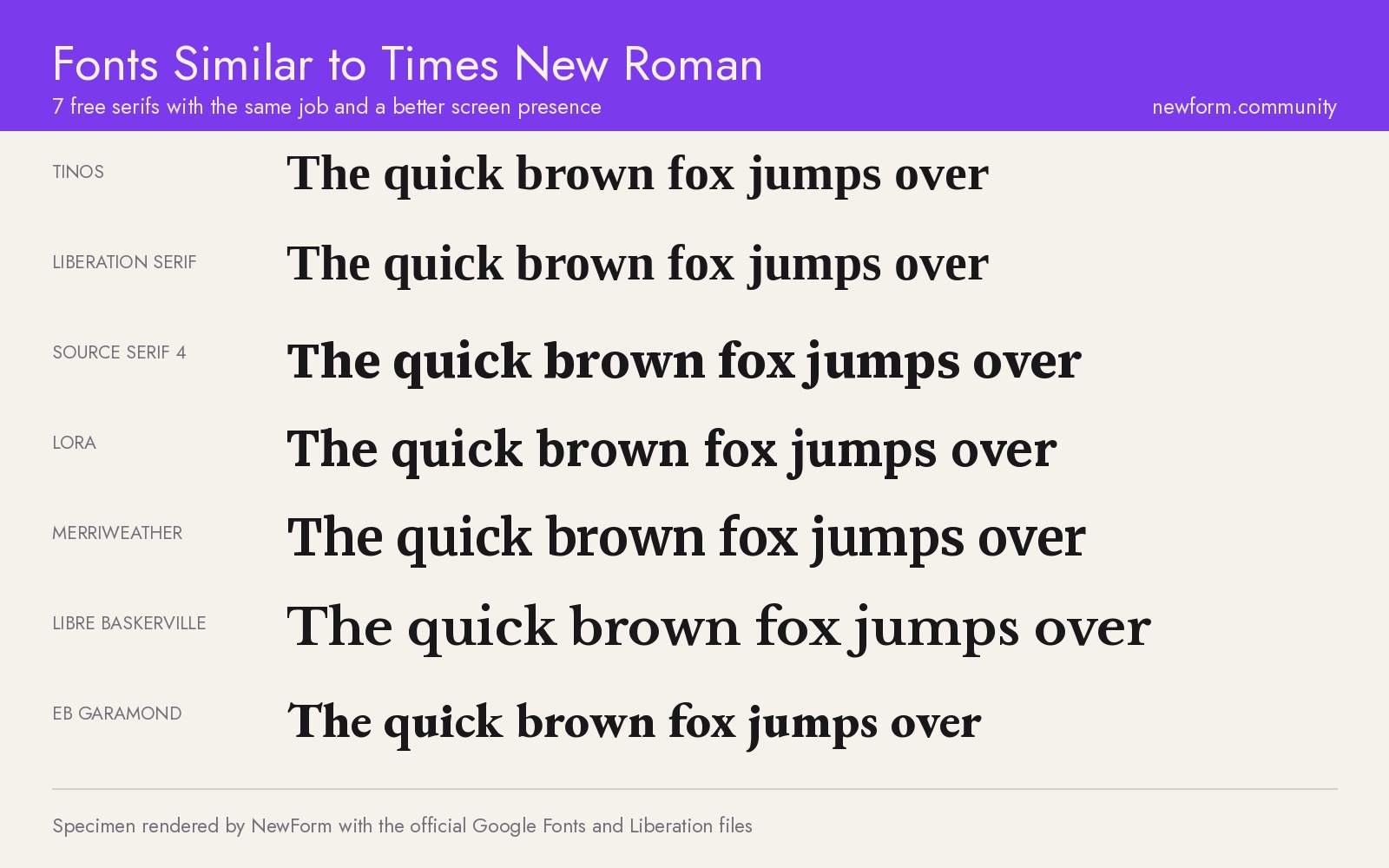
Find Your Stack
Discover the perfect design tools for your workflow.
Take the 60-second quizNewForm Studio
Turn your designs into professional mockups instantly.
Open StudioMore from NewForm
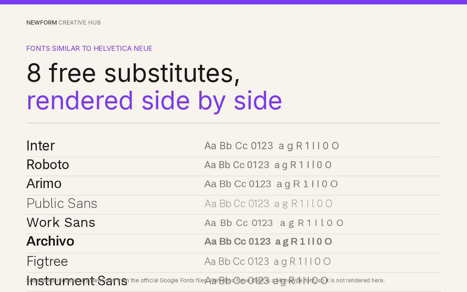
Fonts Similar to Helvetica Neue: 8 Free Substitutes for UI Work (2026)
Helvetica Neue is licensed and priced per weight. These 8 free neo-grotesques substitute for it in real UI work, with our own rendered specimens, CSS stacks and the settings that work.
11 min read · Nov 20, 2026
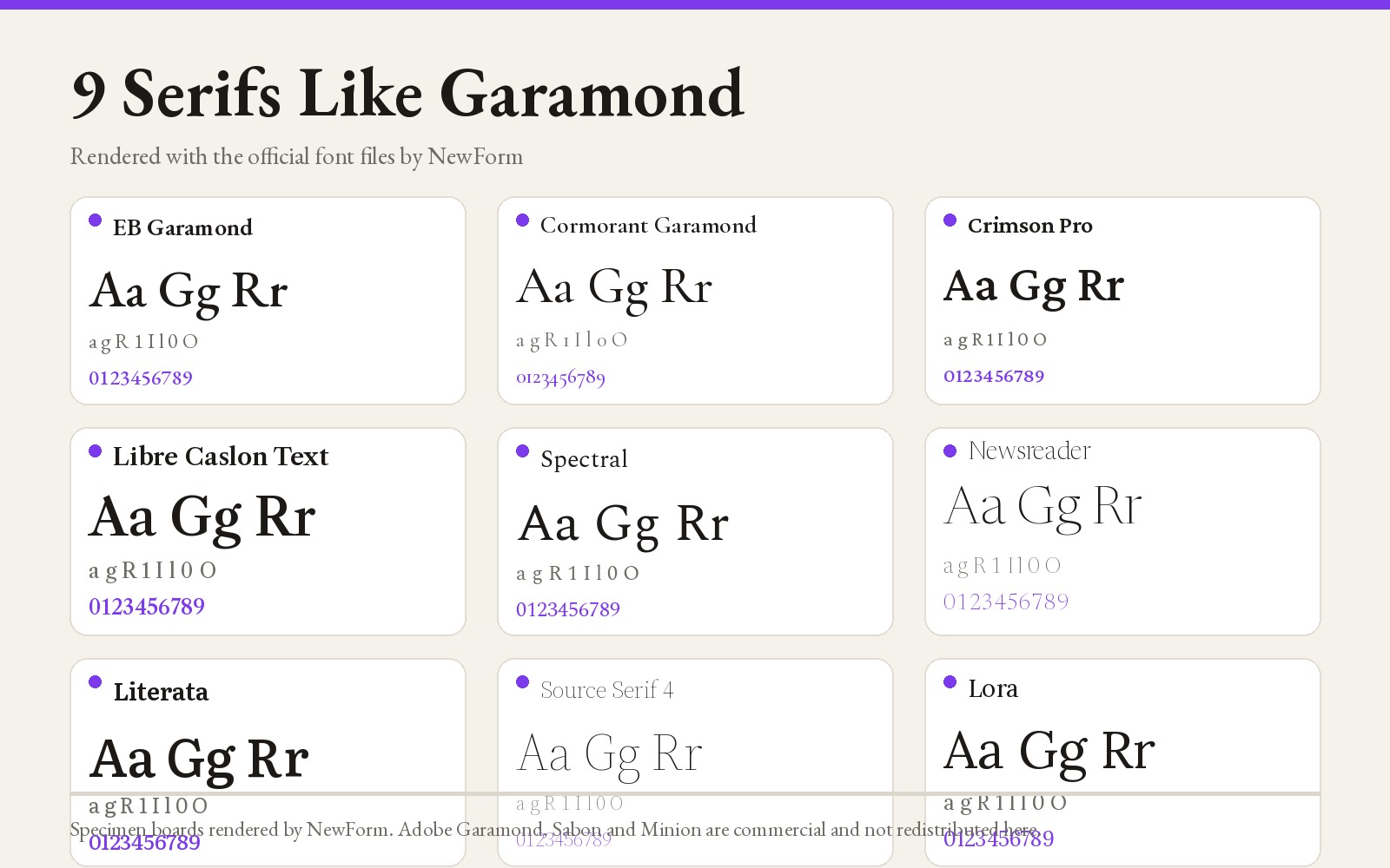
9 Fonts Similar to Garamond for Editorial and Web (Free and Paid, 2026)
EB Garamond is the closest free match, Cormorant Garamond the best at display sizes. Nine Garamond alternatives rendered from their official files, with settings, CSS and a switch checklist.
14 min read · Nov 6, 2026