
Fonts Similar to Helvetica Neue: 8 Free Substitutes for UI Work (2026)
If you want fonts similar to Helvetica Neue without the licence, start with Inter for screens, Arimo for a metric match, and Instrument Sans for a tighter, more editorial grotesque. All eight are free neo-grotesques with the same bones, and every board here was rendered from the official font files at identical settings so you can compare them honestly.
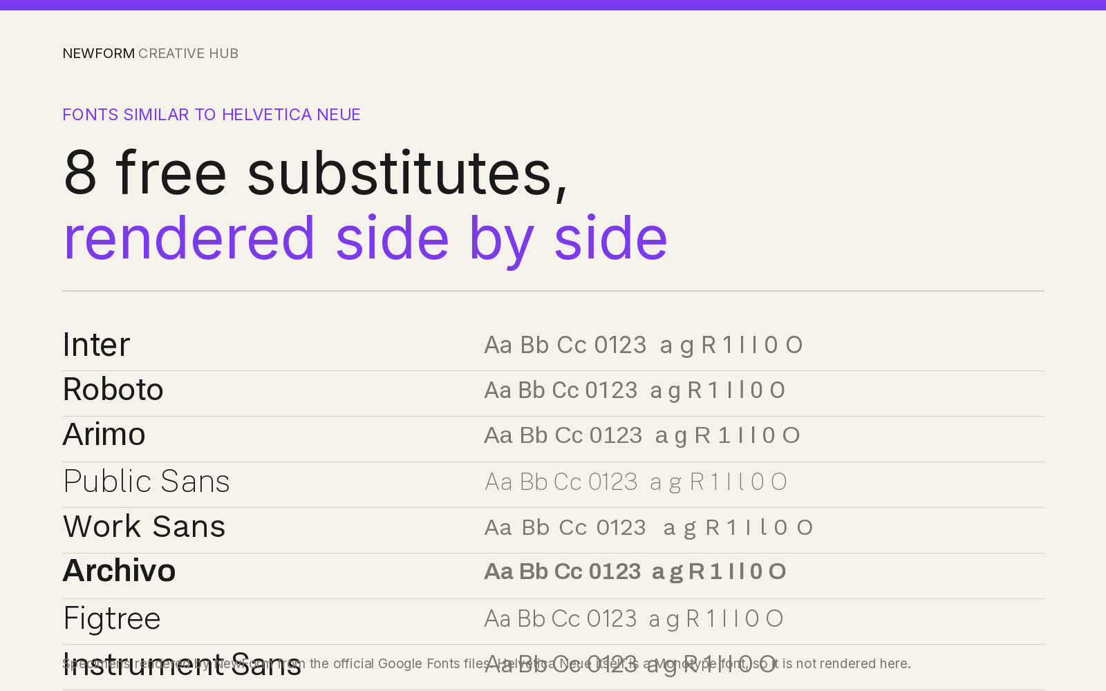
Helvetica Neue is the version most of us actually mean when we say Helvetica. It was cut for phototypesetting and digital, with a taller x-height, tighter spacing and more weights than the 1957 original. It is also owned by Monotype, sold per weight, and licensed by page views or installs. That is why designers keep looking for something close that ships as a web font without a legal review.
TL;DR: the 8 closest free matches
| Font | Vibe | Free or paid | Best for | Closest match to Helvetica Neue |
|---|---|---|---|---|
| Inter | Neutral screen grotesque, tall x-height | Free, Google Fonts | App UI, dashboards, body copy | 9/10 |
| Arimo | Plain, metric-compatible with Arial | Free, Google Fonts | Email, fallbacks, legacy layouts | 8.5/10 |
| Instrument Sans | Tight, slightly editorial | Free, Google Fonts | Marketing pages, headlines | 8/10 |
| Roboto | Slightly condensed, open apertures | Free, Google Fonts | Android, dense data UI | 7.5/10 |
| Public Sans | Government plain, sturdy | Free, Google Fonts | Forms, civic and enterprise UI | 7.5/10 |
| Archivo | Wide grotesque with a width axis | Free, Google Fonts | Labels, tables, condensed UI | 7/10 |
| Work Sans | Grotesque with small quirks | Free, Google Fonts | Headlines over Inter body | 6.5/10 |
| Figtree | Geometric, friendlier | Free, Google Fonts | Consumer apps, onboarding | 6/10 |
Disclosure: every font below is free and links straight to Google Fonts. Links to paid stores (Adobe Fonts, MyFonts, Creative Market, Envato Elements, Fontspring) use our tracked redirect so we can count demand before applying to those programs. They pay us nothing yet, and no link here changes what you pay.
What makes Helvetica Neue, Helvetica Neue
Four traits do the work. Closed apertures, so the a, c, e and s nearly touch the bowl. Horizontal terminals, so strokes end flat. Even stroke weight, which is why it reads calm small. And a tall x-height with tight spacing, which fits more words per line than almost any humanist sans.
Any substitute trades something. Open the apertures and it gets friendlier and wider. Add character to the g or the R and it gets more editorial. Change the spacing and your line lengths shift, which is what breaks layouts when you swap late. Each section names the trade.
1. Inter
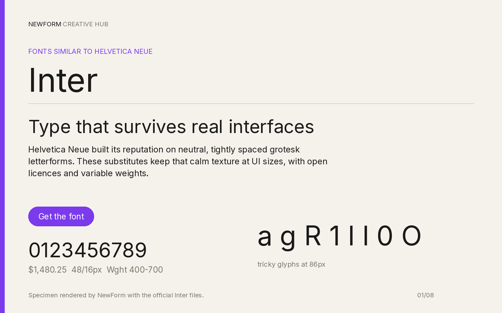
Specimen rendered by NewForm with the official Inter files.
Why it works. Inter was drawn for screens by Rasmus Andersson, with a tall x-height and tight spacing that lands close to Helvetica Neue at 14 to 16px. Even strokes, horizontal terminals, deliberately unremarkable letterforms: that is the job.
Where to use it. Product UI first: navigation, tables, forms, dashboards. The safest default for an app that must look neutral in any brand.
Settings that work. 15 to 16px body, line-height 1.5, 600 for headings, and a touch of negative tracking on large sizes only.
body {
  font-family: "Inter", system-ui, -apple-system, "Segoe UI", sans-serif;
  font-size: 16px;
  line-height: 1.5;
  font-feature-settings: "cv05" 1, "ss03" 1;
}
h1, h2, h3 { font-weight: 600; letter-spacing: -0.011em; }
Watch out for. Inter is everywhere, so it reads as "default app" rather than a choice. It also runs wider than Helvetica Neue, so a headline that fit before may wrap.
Where to get it. Inter on Google Fonts.
2. Arimo
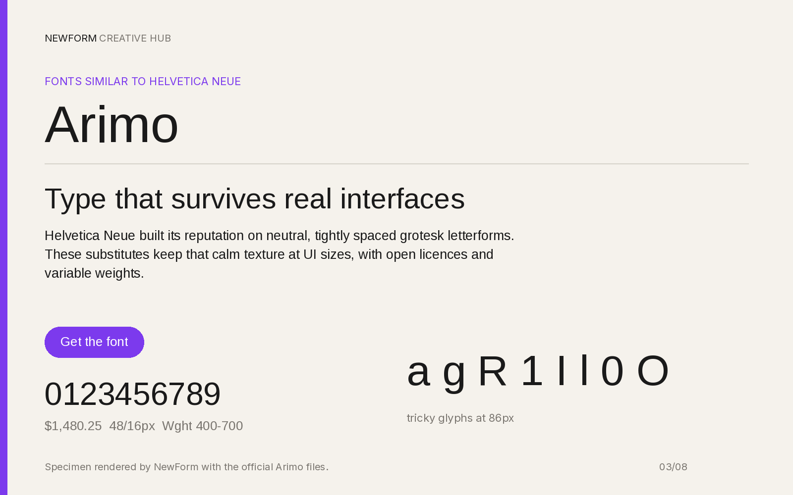
Specimen rendered by NewForm with the official Arimo files.
Why it works. Arimo is metric-compatible with Arial, and Arial is metric-compatible with Helvetica, so Arimo occupies the same widths as Helvetica Neue to within a rounding error. For a straight swap with no layout work, this is the one.
Where to use it. HTML email, PDF templates, legacy pages you cannot restyle, and any fallback stack where a shift in line length would show.
Settings that work. Set it exactly as you set Helvetica Neue. Nothing changes.
body {
  font-family: "Arimo", Arial, Helvetica, sans-serif;
  font-size: 16px;
  line-height: 1.5;
}
Watch out for. It is a little bland, and its quotes are straight rather than shaped. It also has fewer weights than Inter, so heavy display work is not its strength.
Where to get it. Arimo on Google Fonts.
3. Instrument Sans
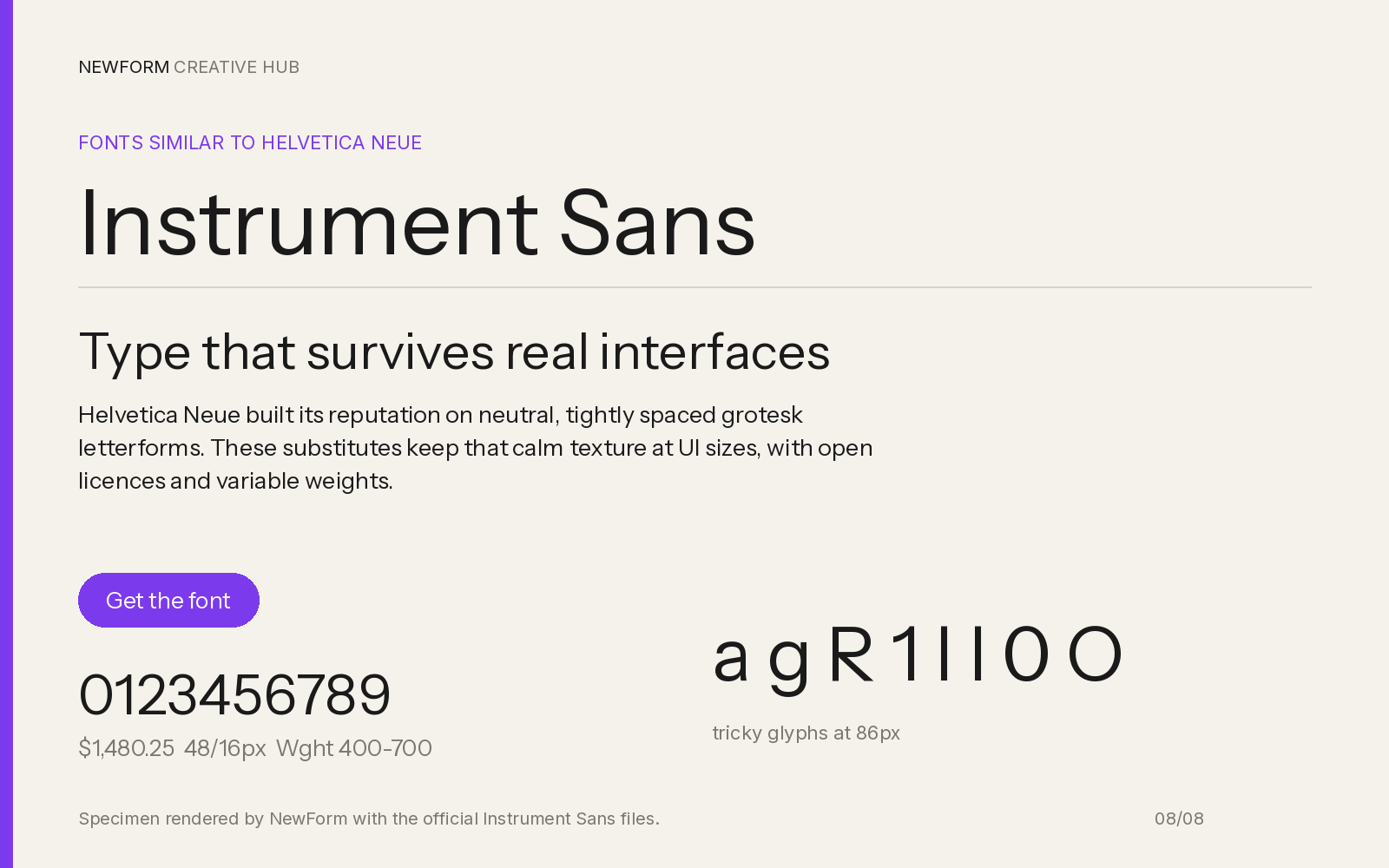
Specimen rendered by NewForm with the official Instrument Sans files.
Why it works. Instrument Sans keeps the closed apertures and even strokes, then tightens the spacing and adds a width axis. It reads closer to a Swiss grotesque on a poster than to a system font, which is what people actually want from Helvetica Neue on a marketing page.
Where to use it. Landing pages, section headlines, case study titles: anywhere the type does brand work rather than data work.
Settings that work. 600 for headlines with slight negative tracking, 400 at 16px for body, and the narrow width when a headline must fit a fixed column.
h1, h2 {
  font-family: "Instrument Sans", "Helvetica Neue", Arial, sans-serif;
  font-weight: 600;
  letter-spacing: -0.02em;
  font-stretch: 95%;
}
Watch out for. Tight spacing hurts below 13px, so not for dense UI. It is also newer, so fewer designers recognise it.
Where to get it. Instrument Sans on Google Fonts.
4. Roboto
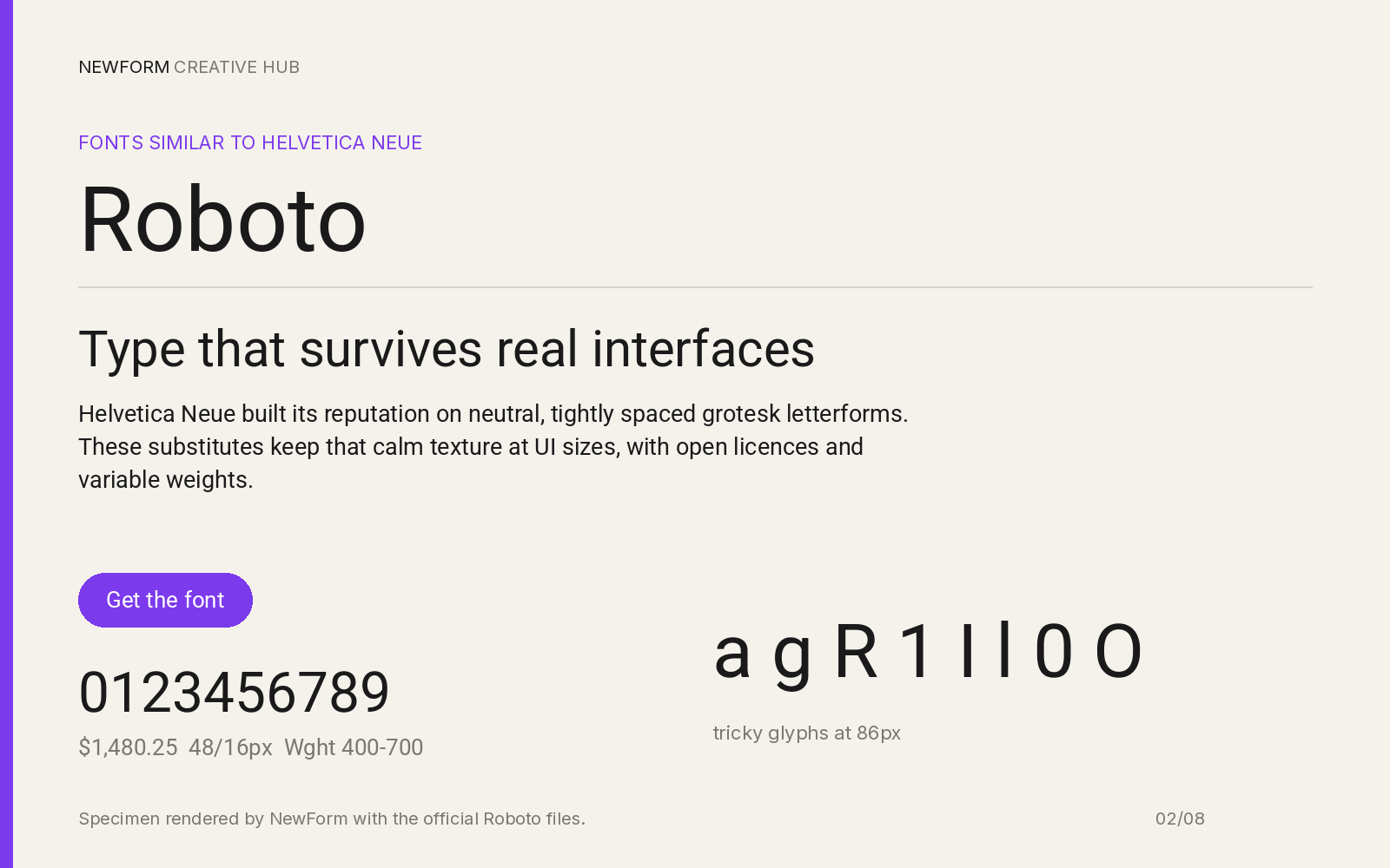
Specimen rendered by NewForm with the official Roboto files.
Why it works. Roboto was built for Android by Christian Robertson and solves the same problem: neutral, even, readable small on a screen. Its apertures are more open and it is a touch more condensed, so it reads softer but just as plain.
Where to use it. Data-dense interfaces, Android apps, anything with long tables where the narrower fit saves a column.
Settings that work. 16px body, line-height 1.5, 500 headings. No negative tracking needed.
body {
  font-family: "Roboto", system-ui, -apple-system, sans-serif;
  font-size: 16px;
  line-height: 1.5;
}
h1, h2, h3 { font-weight: 500; }
Watch out for. The open apertures feel friendlier and less Swiss. If your brand leans on the colder Helvetica tone, Roboto softens it.
Where to get it. Roboto on Google Fonts.
5. Public Sans
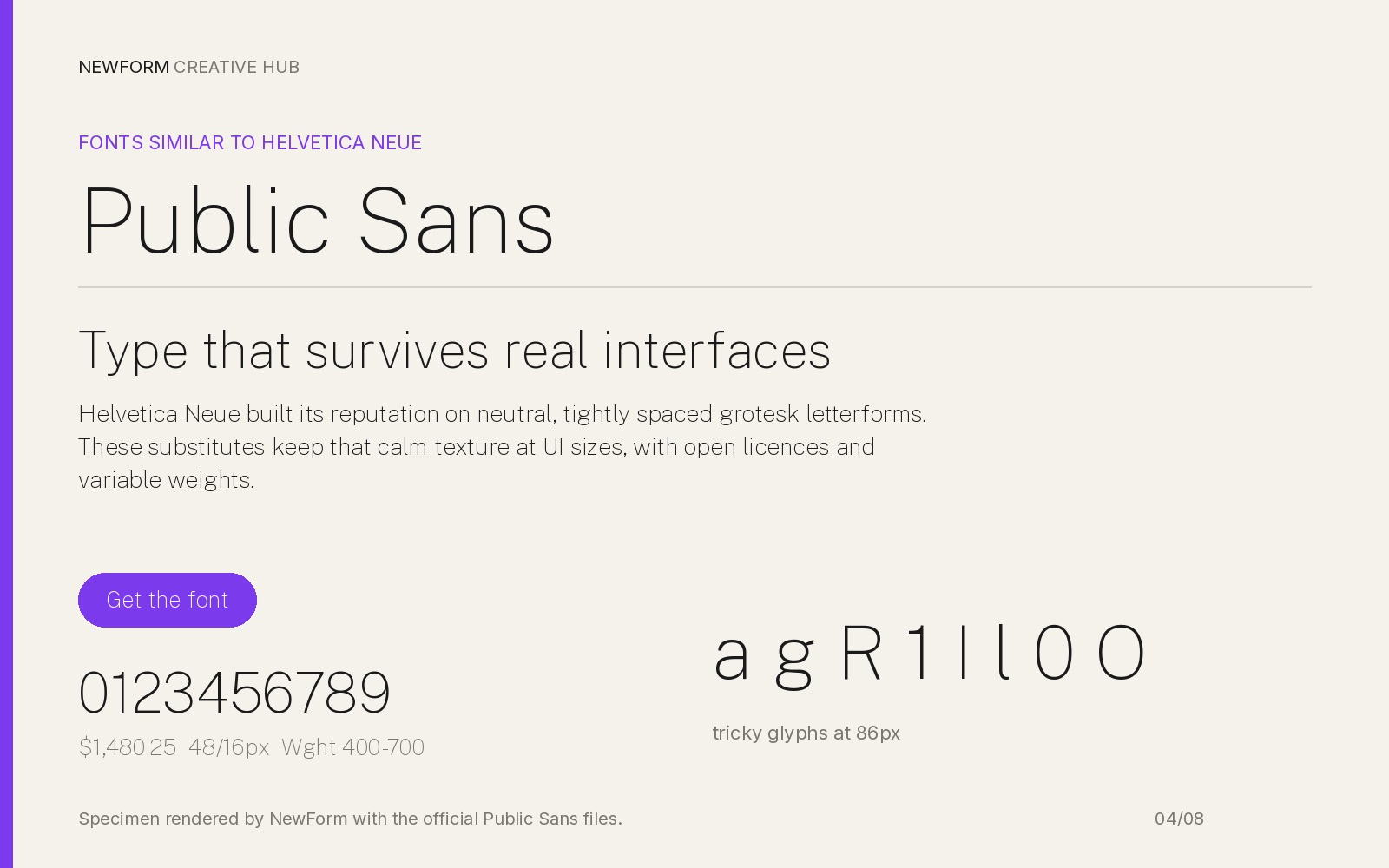
Specimen rendered by NewForm with the official Public Sans files.
Why it works. Public Sans was built for the US Web Design System, derived from Libre Franklin. It is a no-nonsense grotesque with a large x-height, sturdy strokes and a full weight range, and it holds up where 13px labels sit next to 40px headings.
Where to use it. Forms, settings screens, government and enterprise products, anything that must feel trustworthy rather than fashionable.
Settings that work. 16px body, 400 text and 600 labels, line-height 1.5, no tracking changes.
body {
  font-family: "Public Sans", system-ui, -apple-system, sans-serif;
  font-size: 16px;
  line-height: 1.5;
}
label { font-weight: 600; font-size: 14px; }
Watch out for. It has a faintly institutional tone and its italics are less refined than Inter's. A workhorse, not a showpiece.
Where to get it. Public Sans on Google Fonts.
6. Archivo
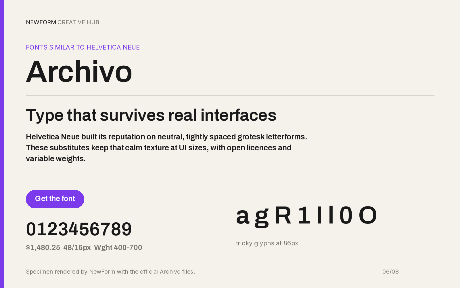
Specimen rendered by NewForm with the official Archivo files.
Why it works. Archivo is a grotesque built for high-performance settings, and its width axis is the useful part: a Helvetica-like skeleton you can squeeze for labels or widen for display, from one file.
Where to use it. Tables with many columns, data labels, badge text, and interfaces where horizontal space is the constraint.
Settings that work. 400 at 14 to 16px, width 92 to 95% for dense tables, 700 headings at normal width.
.data-table {
  font-family: "Archivo", "Helvetica Neue", Arial, sans-serif;
  font-size: 14px;
  font-stretch: 93%;
  font-variant-numeric: tabular-nums;
}
Watch out for. It is sturdier and squarer than Helvetica Neue, so it reads more technical. Never use condensed widths for body copy.
Where to get it. Archivo on Google Fonts.
7. Work Sans
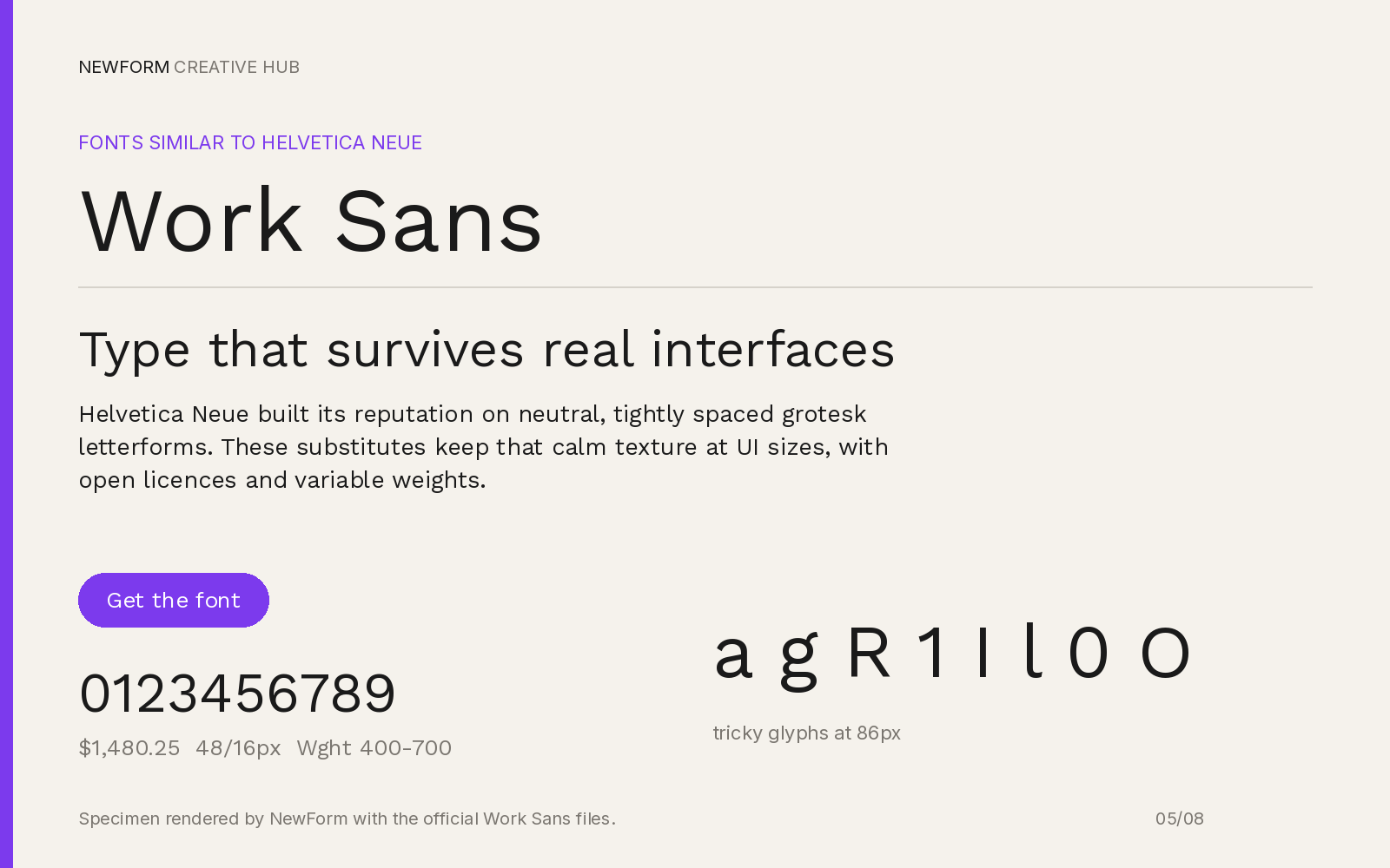
Specimen rendered by NewForm with the official Work Sans files.
Why it works. Work Sans keeps the grotesque skeleton but adds small human details: an angled terminal here, a distinctive R there. It gives you Helvetica's posture with more personality, which is often the real reason someone wants an alternative.
Where to use it. Headlines over an Inter or Roboto body, section titles, product names, editorial layouts that need a voice.
Settings that work. 600 for headlines at 32px and up with -0.02em tracking, 400 at 18px for standfirsts. Keep it out of 14px UI text.
h1, h2, .standfirst {
  font-family: "Work Sans", "Helvetica Neue", Arial, sans-serif;
  font-weight: 600;
  letter-spacing: -0.02em;
}
Watch out for. The quirks multiply in long paragraphs, and it runs wider than Helvetica Neue at the same size. As body text it tires.
Where to get it. Work Sans on Google Fonts.
8. Figtree
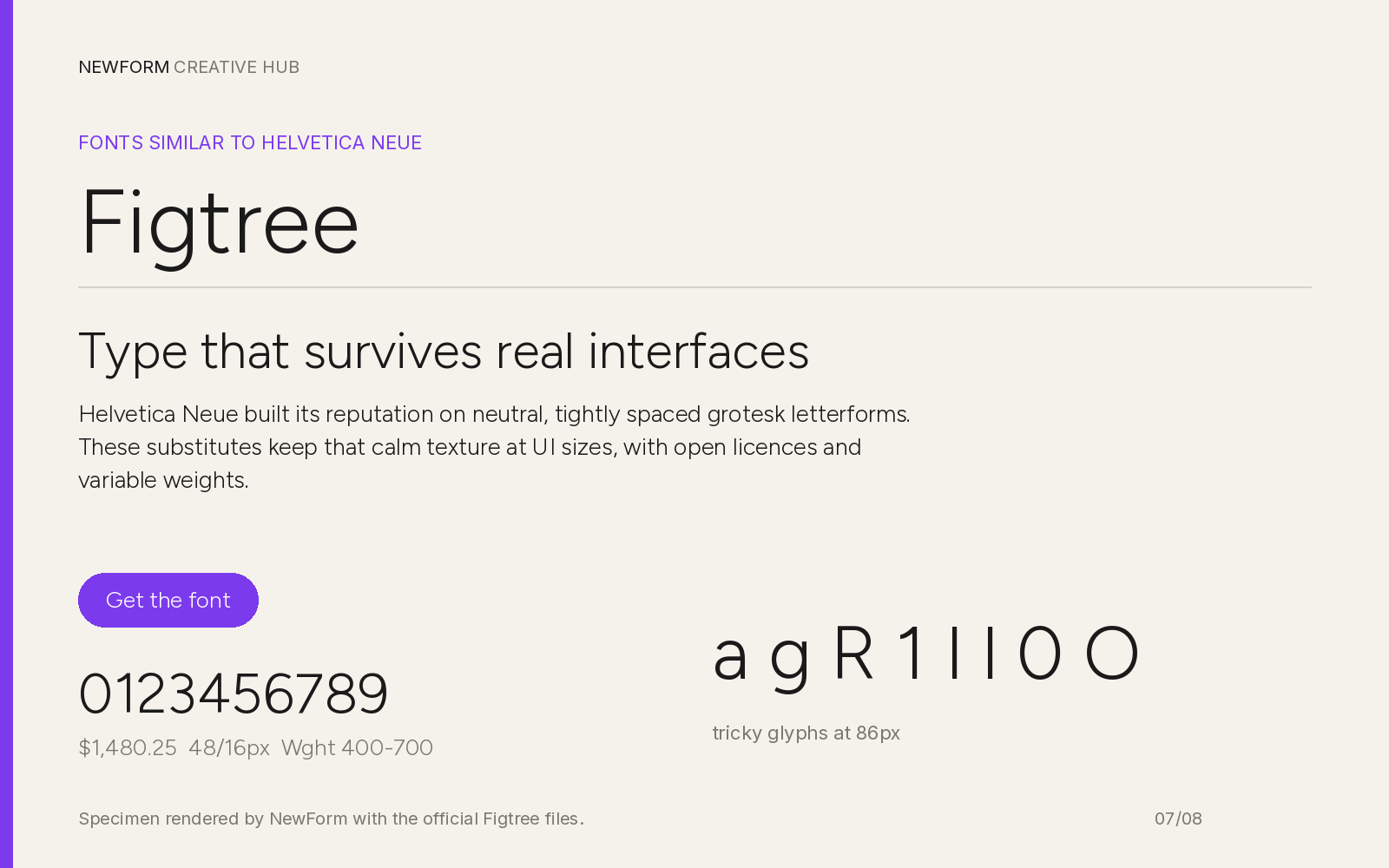
Specimen rendered by NewForm with the official Figtree files.
Why it works. Figtree sits between a grotesque and a geometric sans: rounder bowls, large x-height, open shapes. Warmer than Helvetica Neue, same plain rhythm.
Where to use it. Consumer apps, onboarding screens, empty states, brands that want Helvetica's clarity without the coldness.
Settings that work. 16px body, line-height 1.55, 500 to 600 headings.
body {
  font-family: "Figtree", system-ui, -apple-system, sans-serif;
  font-size: 16px;
  line-height: 1.55;
}
h1, h2, h3 { font-weight: 600; }
Watch out for. The rounder forms cost some Swiss precision, and numerals are less even in tables. Check tabular figures before shipping a dashboard.
Where to get it. Figtree on Google Fonts.
Head to head: the swaps people ask about
Inter vs Helvetica Neue. Inter is the better screen font and the worse brand font. More weights, better small-size hinting, free licensing, but it reads generic because everyone uses it. Helvetica Neue has more authority in print and display. For product UI, pick Inter. For a poster, pay for the real thing.
Roboto vs Helvetica Neue. Roboto is narrower and friendlier, Helvetica Neue wider and colder. Tight layouts and Android win with Roboto. The Swiss tone loses.
Arimo vs Helvetica Neue. The only true drop-in. Same widths, same line breaks, no reflow. It gives up character and fine detail, and has fewer weights, but nothing moves.
Instrument Sans vs Helvetica Neue. It gets closer to the Helvetica Neue look on a marketing page than Inter does, since the spacing is tighter and the shapes more assertive. Weaker in dense UI.
How to switch without breaking your layout
- Set the fallback first. Put the new font ahead of Helvetica Neue in the stack, so the fallback is what you are replacing, not a random system font.
- Check line breaks, not just looks. Screenshot three real screens before and after. If paragraphs gain or lose a line, adjust line-height by 0.05 and size by 0.5px before touching anything else.
- Fix numerals. Turn on
font-variant-numeric: tabular-numsanywhere numbers line up in columns. Most of these fonts default to proportional figures, which will make tables jitter. - Load only the weights you use. Two weights per family is enough, and it keeps the page fast enough that the swap does not flash.
- Test at 13px and 40px. Small text exposes spacing, large text exposes drawing. If both hold, the middle is fine.
For a second family, our guide to font pairings every designer should memorize covers the combinations that ship. The typography sizes guide has the px values, and the Inter alternatives hub compares twelve neutral options with the same rendered boards.
The paid originals, if you need the real thing
Sometimes a substitute is not the answer. Neue Haas Grotesk is the closest faithful revival, sold by Monotype through MyFonts. Aktiv Grotesk is the common corporate alternative and is included with an Adobe Fonts subscription. Suisse Int'l is the other name that comes up in studio work. All three cost real money and all are worth it when the type is the product.
FAQ
What are fonts similar to Helvetica Neue?
Inter, Arimo and Instrument Sans. Arimo is closest metrically, so nothing reflows. Inter is closest for screen UI at 14 to 16px. Instrument Sans is closest for marketing pages, where tighter spacing reads more like the original.
Similar fonts to Helvetica Neue that are free
All eight here are free on Google Fonts: Inter, Arimo, Instrument Sans, Roboto, Public Sans, Archivo, Work Sans and Figtree. None require a licence fee, a page view count or an install limit, and all can be self-hosted.
What is the best Helvetica Neue alternative for an app interface?
Inter. Drawn for screens, tall x-height, variable, and the widest weight range of the free options. Pair it with Arimo as the fallback so a failed load does not reflow your layout.
Is there a free Helvetica Neue alternative for commercial work?
Yes. All eight are released under open licences that allow commercial use and self-hosting. Check each repository's licence file if legal needs the wording, but none require a paid tier for commercial products.
Is Helvetica Neue free?
No. Helvetica Neue is licensed by Monotype and sold per weight, so shipping it on the web needs a paid licence that scales with page views. The eight fonts on this page are free substitutes that cover the same design territory.
Ship the layout, not just the type
Once you have picked a font, the fastest way to see it in context is to drop a specimen into a real screen. Our Mockup Studio turns a type choice into a presentation mockup in a few clicks, and to build the actual interface, Base44 will scaffold a working app you can style with any of the eight above.
More in the Fonts Similar To series
Every guide uses our own rendered specimens and the same structure, so you can compare fonts side by side:
- Fonts similar to Inter: 12 alternatives for UI type (hub)
- Fonts similar to Helvetica
- Fonts similar to SF Pro
- Fonts similar to Futura
- Fonts similar to Proxima Nova
- Fonts similar to Times New Roman
- Fonts similar to Garamond
- Inter vs Geist: which UI font to ship
- Font pairing guide: which fonts go together
- Best fonts for dashboards (tabular figures, x-height, CSS)
- Typography sizes for websites (the px guide)
- How to choose UI fonts by mood

FREE FIELD GUIDE
The 8-Prompt Product
Answer 24 questions, run 8 prompts, and walk away this afternoon with a working, beautiful MVP you would be proud to show.
See what's insideKeep reading
Find Your Stack
Discover the perfect design tools for your workflow.
Take the 60-second quizNewForm Studio
Turn your designs into professional mockups instantly.
Open StudioMore from NewForm

Best Fonts for Dashboards: 7 UI Typefaces That Survive Real Data
Seven dashboard typefaces rendered with their official files, compared on tabular figures, x-height and weight range, with CSS and settings that work.
9 min read · Nov 15, 2026
9 Fonts Similar to Garamond for Editorial and Web (Free and Paid, 2026)
EB Garamond is the closest free match, Cormorant Garamond the best at display sizes. Nine Garamond alternatives rendered from their official files, with settings, CSS and a switch checklist.
14 min read · Nov 6, 2026