
Best Figma UI Kits and Icon Sets for Product Designers in 2026
A good Figma UI kit gives product designers a head start without locking them into someone else’s product decisions. For most teams, start with the free shadcn/ui Figma kit; for a broad polished system, compare Untitled UI with Craftwork’s Deca; for icons, Lucide is the practical default and Phosphor is a flexible alternative. Check the live license and price before using any asset commercially.

Product image: Untitled UI, official site. Product details and pricing can change; verify the current listing before purchase.
Quick comparison: Figma UI kits and icon sets
| Resource | Best for | Price model | License / use note |
|---|---|---|---|
| Untitled UI | Broad production-style Figma system | Free and paid offerings; check current plan | Review the plan license for client and team use |
| Craftwork Deca | Free starter component library | Free download | Confirm the package terms on the product page |
| shadcn/ui Design System | Designing alongside shadcn/ui code | Free community file | The Figma file and code project may have different terms; check each |
| Untitled UI Icons | Matching icon style for Untitled UI | Free and paid options may vary | Check the current icon license before client delivery |
| Lucide | Neutral interface icons for product UI | Free, open source | ISC license; retain required notices when redistributing |
| Phosphor | Multiple weights and expressive icons | Free, open source | MIT license; follow the project’s attribution and use terms |
| Envato Elements | Downloading varied paid kits under a subscription | Subscription | Each item needs the correct project license |
The useful dividing line is not “best UI kit.” It is whether you need a design-ready component system, a code-aligned library, or just icons. Those are different jobs, and a kit that is excellent for one may slow you down for another.
1. Untitled UI: the broad all-in-one Figma kit
Untitled UI is the first place to look when you want a large, organized Figma component library rather than a few screens. Its product site describes a large collection of components, styles, and page templates, with a React component offering alongside the Figma kit. That breadth can help a solo designer move quickly across common product flows, but it is not a substitute for deciding your own tokens, accessibility states, or information architecture.
Untitled UI product image, sourced from its official website.
What to check: inspect how the file organizes variants, variables, typography, and responsive layouts before adopting it. Look at the actual screens you need, not only the headline component count. A large kit is valuable only if its naming and structure make components easy to find and adapt.
Price and license: the vendor offers different product options. Confirm the current price, seat limits, client-work permissions, and redistribution restrictions on the official listing. Do not assume a personal purchase covers every team or resale scenario.
Verdict: strongest when you need a broad starting point and will tailor it to a product. Less useful if your team already maintains a mature design system or needs only a handful of components.
2. Craftwork Deca: a free component-first starting point
Craftwork publishes the Deca UI kit as a free resource and describes it as containing more than 150 components. It is a sensible first download when you want to test a Figma kit workflow without committing to a paid library. Its smaller scope can be a benefit: you can understand the component organization before importing a huge system.

Product preview: Craftwork, from Craftwork’s official site.
What to check: open the actual file and verify that the components match your target platform, that variants behave as expected, and that the typography and color styles are editable. A free file can still cost time if its conventions fight your team’s conventions.
Price and license: Deca is promoted as a free download. Read the current terms linked from the product page before using it in client work, distributing a modified kit, or including assets in a product template.
Verdict: a low-friction trial for a designer learning how to work from reusable components. For a production system, validate coverage and maintenance needs instead of inferring them from the component count.
3. shadcn/ui Design System: best when design needs to track code
The shadcn/ui Figma Community file is useful when the implementation will use the shadcn/ui component approach. The key benefit is shared vocabulary: designers and developers can discuss familiar components and states rather than translating between an unrelated visual kit and the codebase.

Product preview associated with shadcn; see the Figma Community file and the shadcn/ui project for current details.
What to check: distinguish the Figma community file from the implementation project. They are separate artifacts and can have separate maintenance and licensing details. Verify component parity with the version your developers actually use, especially for form states, dialogs, menus, and responsive behavior.
Price and license: the referenced community kit is offered as a free resource. Check the file’s current license and the project license independently before shipping a commercial product.
Verdict: a strong fit for teams already building with shadcn/ui. It is not automatically the right choice for a product using a different component framework.
4. Untitled UI Icons: a matched icon family
Untitled UI Icons make the most sense if you already use the matching Untitled UI visual system and want consistent stroke, sizing, and naming. Before buying or importing a large icon pack, test it in a real screen: navigation, empty states, actions, and dense data tables put different demands on an icon set.
Untitled UI image, from the official product site.
Price and license: check the current product page for included formats, plan terms, and commercial-use scope. A license for one designer may not cover a whole organization or redistribution inside a template.
Verdict: consider it for visual consistency with Untitled UI. If you are choosing a standalone icon family, compare the free open-source options below first.
5. Lucide: a neutral, practical default
Lucide is an open-source icon family with a restrained line style that works across many product interfaces. Its official project documentation identifies the ISC license. For a typical product design exercise, the practical advantages are a consistent visual language and a straightforward way to browse icons, then use the corresponding package in implementation.

Lucide project image, sourced from lucide.dev.
What to check: set a consistent stroke weight and size, then test icons beside actual labels. Avoid using a different icon for every action just because the library is large. For teams shipping the assets, retain license notices as required by the project terms.
Price and license: free and open source under ISC, according to the project. Check the repository’s current license file for the exact notice requirements.
Verdict: a good default when you need a clean, broadly usable UI icon set and want to avoid a paid bundle.
6. Phosphor: useful when weight and tone need to vary
Phosphor offers an icon family with multiple weights, which gives a designer more room to build hierarchy without mixing unrelated icon styles. That range can help when a product needs a quiet default icon, a stronger selected state, and a more expressive marketing illustration while staying in the same family.

Phosphor project image, from phosphoricons.com.
What to check: choose a weight intentionally and use it consistently across related controls. Keep the semantic meaning clear at small sizes, and verify the right package for your implementation framework.
Price and license: the project is open source. Confirm the exact current license in its official repository before redistributing assets or shipping a template.
Verdict: choose Phosphor when weight variation is a real design need. If the interface needs a quiet, consistent baseline, Lucide may be simpler.
7. Envato Elements: a marketplace, not one design system
Envato Elements is different from the individual kits above. It is a subscription marketplace with many design assets, including Figma UI resources. The range can be useful when a project needs a particular visual direction or a one-off asset, but quality, component structure, and upkeep vary by item.
What to check: inspect the individual listing, file format, update history, previews, and license for the specific project. Keep a record of the license attached to the item you download. A subscription does not mean every asset can be reused without project-specific conditions.
Price and license: subscription pricing and licensing can change, so consult the live Envato Elements terms and the item page. The Envato affiliate program is not active for NewForm, so this is a plain link, not an affiliate recommendation.
Verdict: useful when you need breadth and know how to evaluate files. Do not treat a marketplace search result as a vetted design system.
A quick way to choose
- Need a broad Figma starting system? Compare Untitled UI and Craftwork Deca by opening the actual files and testing the components you need.
- Building with shadcn/ui? Start with the related Figma Community file, then confirm it matches your installed implementation.
- Need only icons? Try Lucide for a restrained baseline or Phosphor when weight variation helps your hierarchy.
- Need a specific visual style? Search a marketplace, then evaluate that individual kit’s structure and license before committing.
- Working with a team or client? Confirm seats, commercial use, modification, and redistribution rights in writing from the current license.
FAQ
What is the best free Figma UI kit?
For a code-aligned workflow, start with the shadcn/ui Figma Community file. For a broader free component-library trial, review Craftwork’s Deca. The better choice depends on the implementation and the kit’s current terms.
What is the difference between a UI kit and a design system?
A UI kit is a collection of reusable interface components and styles. A design system adds documented rules, tokens, governance, accessibility guidance, and ownership for how those components evolve.
Are Figma UI kits safe to use in client projects?
They can be, but check the license for commercial use, seats, client work, modifications, and redistribution. Also verify rights to any fonts, icons, photos, or illustrations bundled inside the file.
Which icon set should I use for a product interface?
Lucide is a practical neutral default. Phosphor is worth testing when multiple icon weights support the interface hierarchy. Use one family consistently and confirm its license terms.
Can I use an icon set from a UI kit in a product I sell?
Only if the current license permits that use. Check the icon set’s own terms, not only the terms for the surrounding Figma file.
Official links and disclosure
The links to Untitled UI, Craftwork, shadcn/ui, Lucide, Phosphor, and Envato above are direct links to their official sites or project listings. NewForm’s Base44 link is an affiliate link, which may earn NewForm a commission at no extra cost to you. Base44 is not a UI kit; it is included as a next step if you want to turn a finished design into a working app. Verify current pricing and license terms before purchase.
Sources checked
- Untitled UI official site and icons
- Craftwork official site
- shadcn/ui Figma Community file and project site
- Lucide documentation and license
- Phosphor official site
- Envato Elements license terms
Related on NewForm
Keep reading

Find Your Stack
Discover the perfect design tools for your workflow.
Take the 60-second quizNewForm Studio
Turn your designs into professional mockups instantly.
Open StudioMore from NewForm
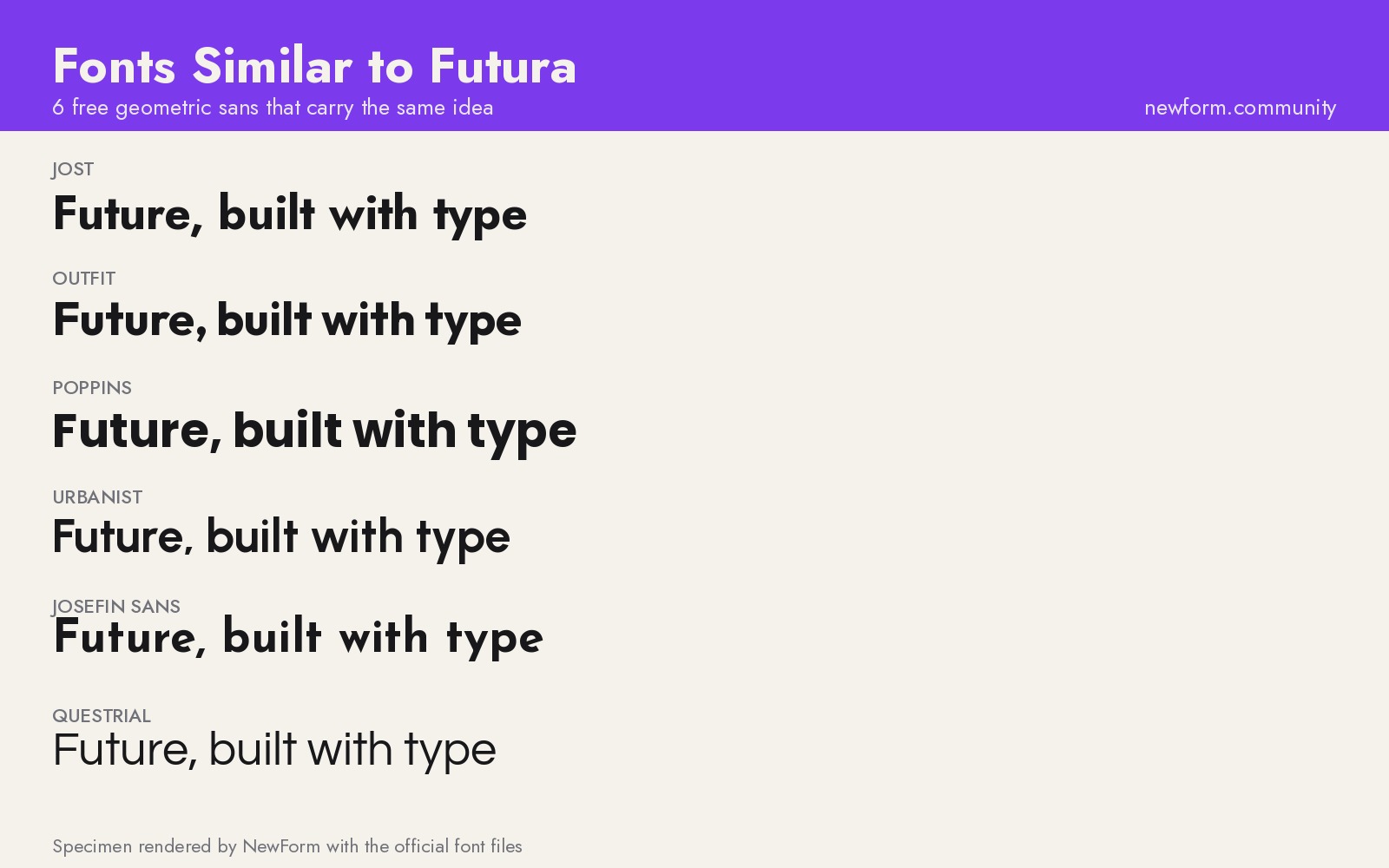
6 Free Fonts Similar to Futura (Real Specimens, 2026)
Futura is licensed and awkward at small sizes. These 6 free geometric sans, rendered from their official files, do the same job: Jost, Poppins, Outfit, Urbanist, Josefin Sans, Questrial.
13 min read · Nov 3, 2026

Bold Typographic Packaging: 4 Lessons From Standout Label Designs
Four real label designs, from LINEN sparkling water to DEWLO facial oil, teach hierarchy, color blocking, functional copy and quiet-color loud-type discipline.
4 min read · Nov 2, 2026