
How to Clean Up a Cluttered UI: 5 Practical Figma Fixes
Visual source and original design: @ui.martin.
A cluttered interface is often the sum of small decisions: one extra color, another type style, a tight gap, a shadow on every card, and decoration that does not explain anything. This tutorial turns the carousel by @ui.martin into a practical cleanup pass for one mobile screen. Make the changes in order and compare before and after at the same viewport size.
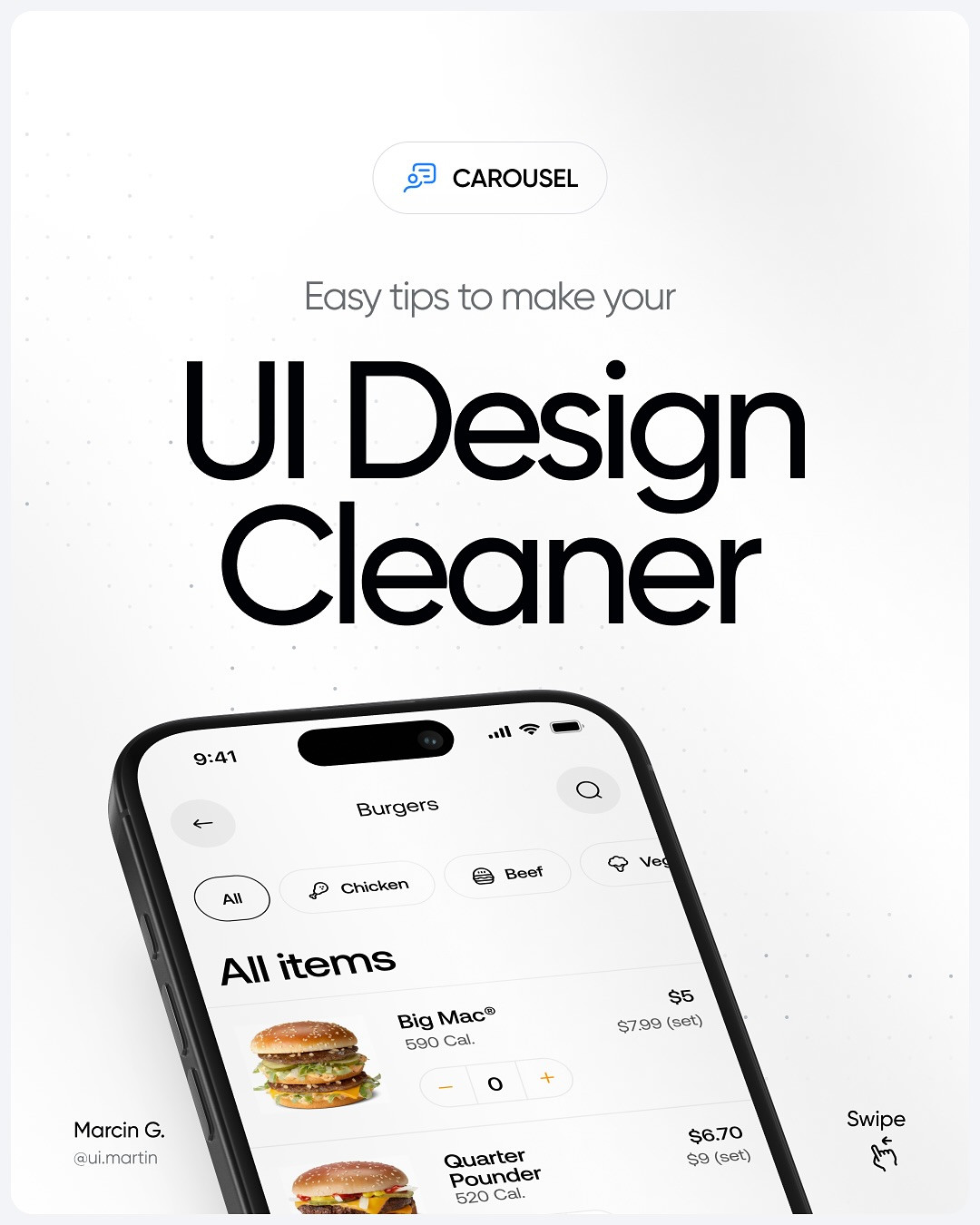
Image: @ui.martin, via Instagram carousel.
Step 1: Reduce the palette to a clear hierarchy
Start with the colors. Keep a compact set of core colors and assign each one a purpose: background, surface, text, and action. The carousel recommends a 60-30-10 balance as a useful composition guide. Think of it as a way to stop accent colors from taking over, not as a rigid measurement. In the example, the cleaner interface uses color to support categories and actions rather than tinting every object differently.
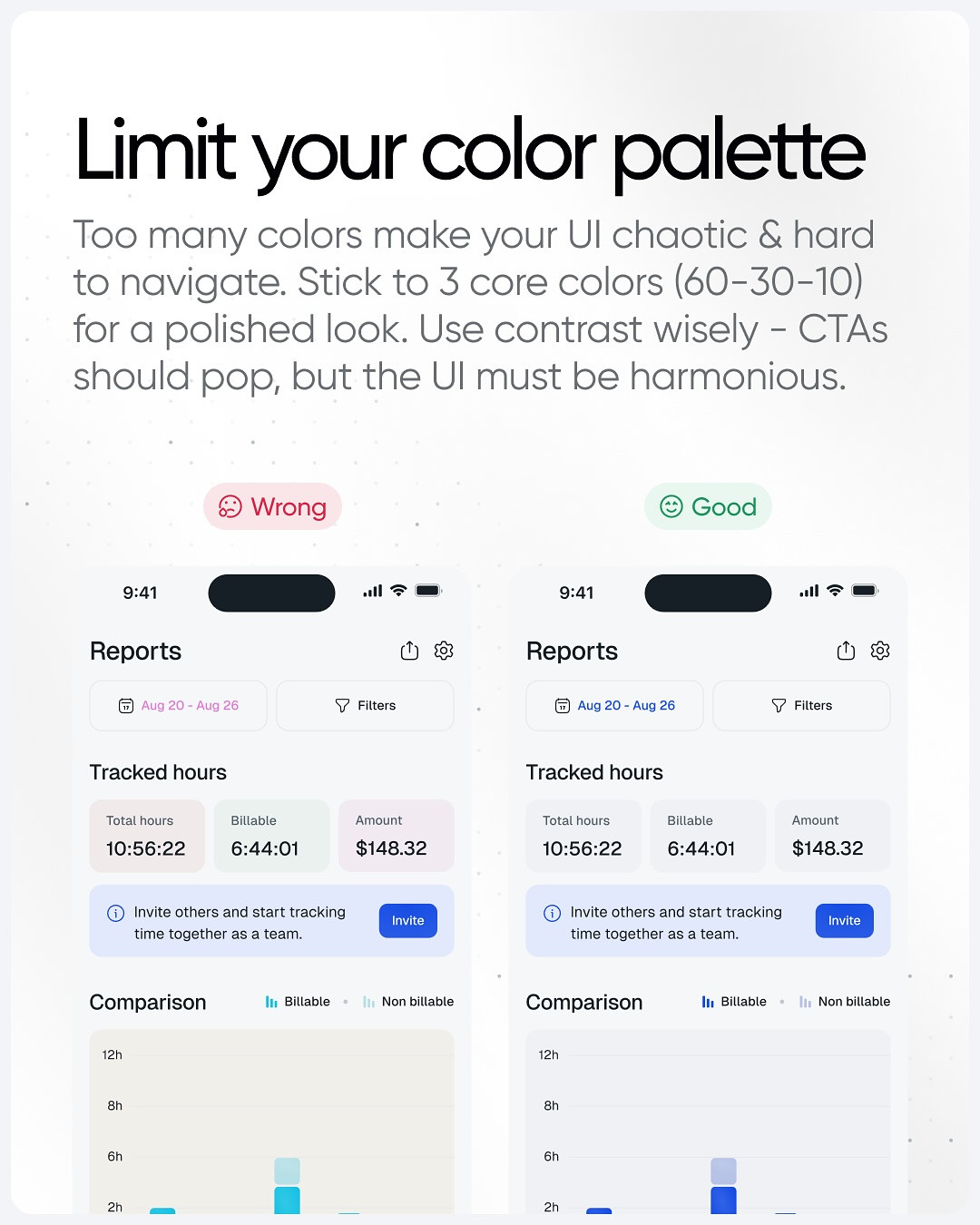
Image: @ui.martin, via Instagram carousel.
In Figma, select the elements that use near-duplicate colors and replace them with a shared style or variable. Keep error, success, and warning colors distinct from brand accents. Then verify that primary buttons still stand out and that text remains readable. The W3C WCAG contrast guidance is a useful standard for checking text contrast.
Step 2: Simplify type choices
Choose one primary type family for the interface and, if the design needs it, one complementary family. Create a small type scale for display headings, section headings, body text, and labels. Avoid giving each component its own unrelated size or weight. In the carousel's example, the less consistent layout competes with itself, while the cleaner one relies on a smaller set of styles.
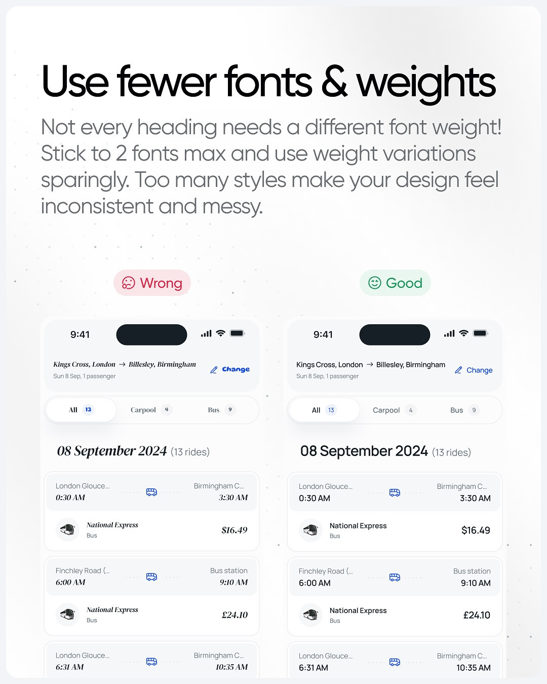
Image: @ui.martin, via Instagram carousel.
A practical pass is to inspect every text layer on the screen. If two labels have the same role, make their typography consistent. Use weight and size to create hierarchy, not as decoration. Check small labels at device scale: if a type choice becomes too thin or tiny, simplify it before adding more styles.
Step 3: Add space where the screen needs breathing room
Spacing is not empty area to fill later. It separates groups, makes touch targets easier to use, and shows which pieces of content belong together. The carousel compares cramped and better-spaced layouts. In your own screen, identify the tightest area first, then increase padding around the primary content and establish consistent gaps between related items.
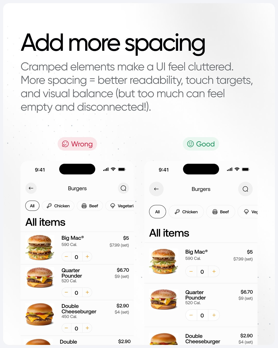
Image: @ui.martin, via Instagram carousel.
Use a spacing scale instead of arbitrary values. For example, choose a small set such as 4, 8, 12, 16, and 24 pixels, then apply it consistently. The scale itself can vary by product. What matters is a repeatable rhythm and enough space around controls for comfortable use. Check both a dense screen and a simple one, because a scale that works for a card may not work for a navigation bar.
Step 4: Trade decorative shadows for purposeful borders
Shadows can communicate elevation, but too many create visual noise. The carousel shows product cards where a subtle border gives enough separation without making each tile appear to float. Remove shadows from elements that are not elevated or interactive. Keep a shadow only when it explains layering, such as a menu above the page or a floating button.
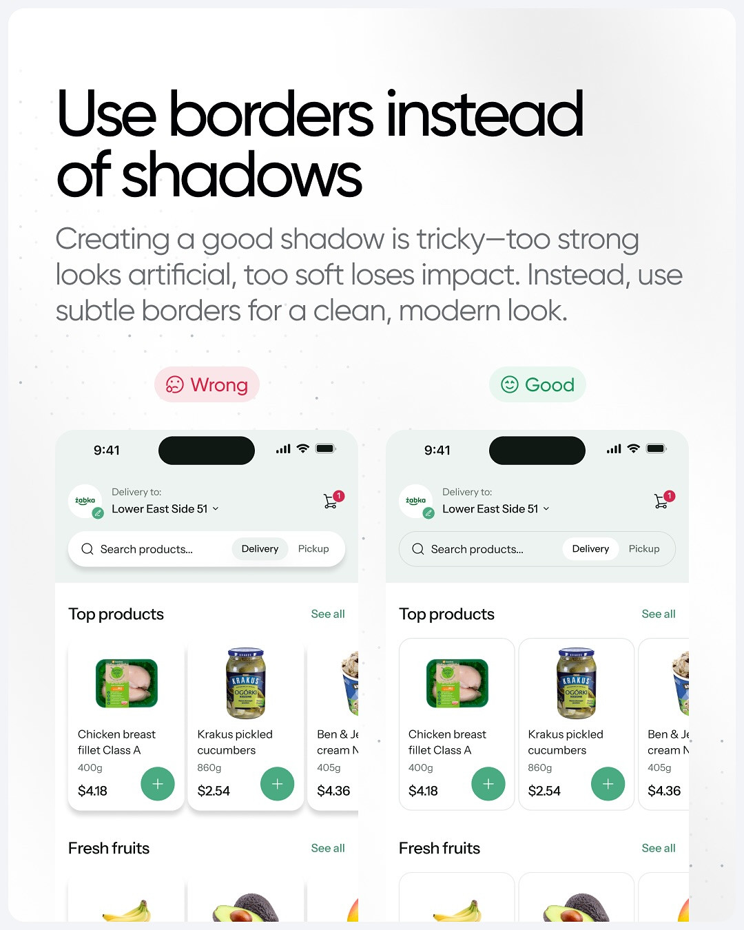
Image: @ui.martin, via Instagram carousel.
Use a low-contrast border against the surface, and check it in both light and dark contexts if the product supports them. If the edge is too faint, adjust the border before adding a shadow. The goal is grouping and definition, not ornament.
Step 5: Remove background shapes without a job
Decorative circles, blobs, and abstract shapes may add personality, but they can also compete with content. Ask what each shape communicates. If it signals a category, state, or action, keep it. If it only fills a gap and pulls attention from the task, remove it. The carousel contrasts a busy product list with a quieter version where the interface content can lead.
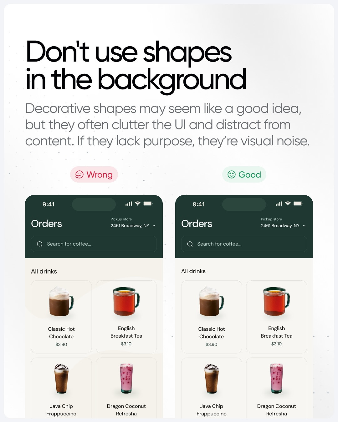
Image: @ui.martin, via Instagram carousel.
Run a five-minute cleanup review
- Hide the colors that do not have a clear role.
- Normalize type styles for matching content roles.
- Check spacing around the most crowded group.
- Remove shadows that do not communicate elevation.
- Delete decorative shapes that do not support meaning.
- Compare the screen at its real device width.
Make one change at a time and capture a before-and-after. If the screen feels calmer but becomes harder to scan, you removed too much hierarchy. If it looks polished only when zoomed in, check whether spacing and typography survive at actual size. Cleaner design is not minimalism for its own sake. It is the removal of friction while keeping the signals people need.
Visual source and original design: @ui.martin.
View the original Instagram carousel
Related on NewForm
Keep reading

Find Your Stack
Discover the perfect design tools for your workflow.
Take the 60-second quizNewForm Studio
Turn your designs into professional mockups instantly.
Open StudioMore from NewForm

6 Free Fonts Similar to Futura (Real Specimens, 2026)
Futura is licensed and awkward at small sizes. These 6 free geometric sans, rendered from their official files, do the same job: Jost, Poppins, Outfit, Urbanist, Josefin Sans, Questrial.
13 min read · Nov 3, 2026

Bold Typographic Packaging: 4 Lessons From Standout Label Designs
Four real label designs, from LINEN sparkling water to DEWLO facial oil, teach hierarchy, color blocking, functional copy and quiet-color loud-type discipline.
4 min read · Nov 2, 2026