
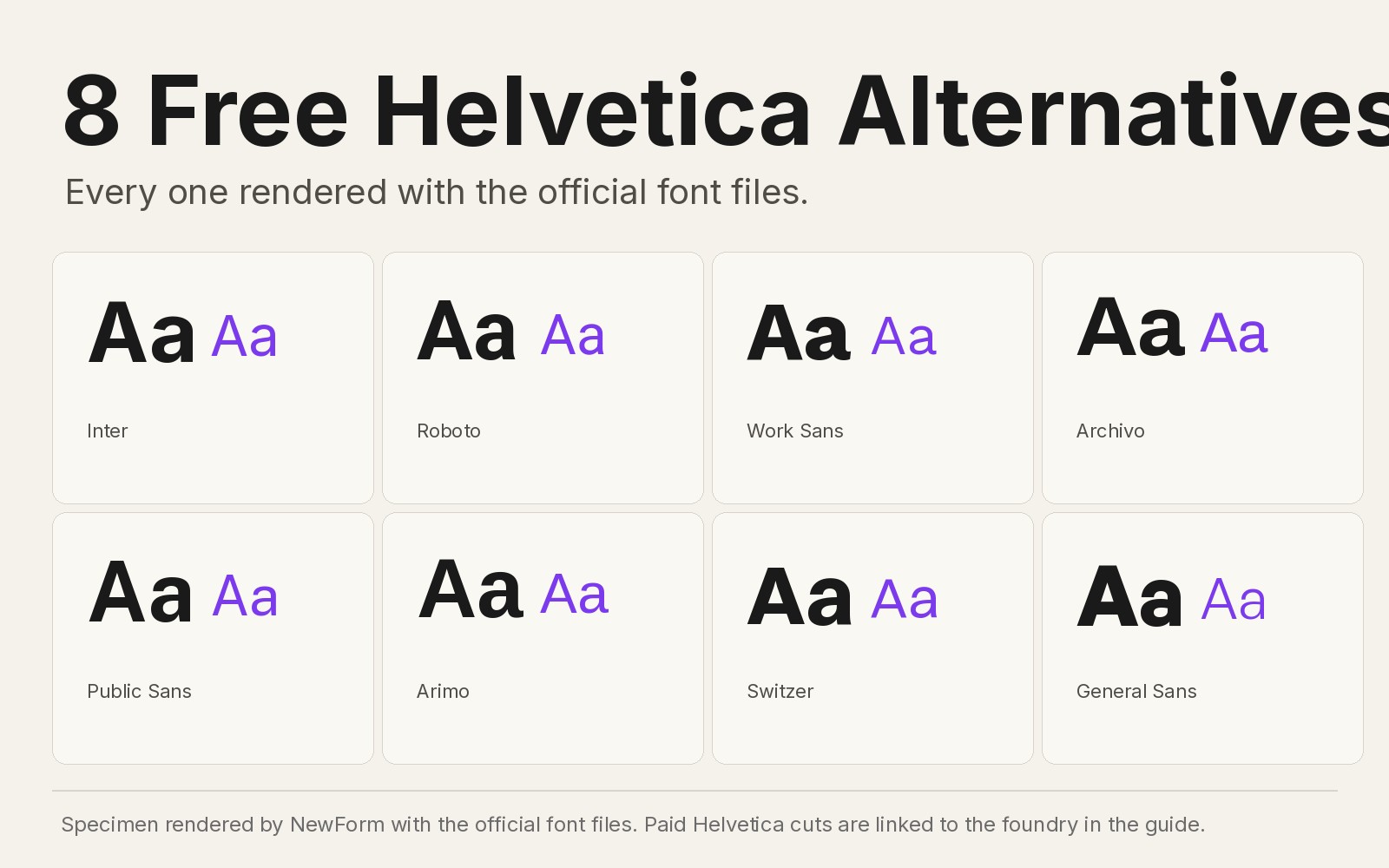
8 Free Helvetica Alternatives for UI Designers (2026 Edition)
Helvetica turned 69 this year and it still costs real money to ship in a product. It was drawn in 1957 by Max Miedinger at the Haas foundry in Switzerland, renamed for the international market, and became the default voice of western design: the New York City Subway, American Airlines under Vignelli, Lufthansa, a million wordmarks since. The problem in 2026 is the license. Helvetica Neue families run hundreds of dollars per weight, webfont serving adds more, and Helvetica Now made it worse before it got better.
So here are the eight free fonts I would actually ship instead, with our own specimens rendered from the official files, concrete settings, and CSS stacks you can paste. If you want the deeper dive on the one everyone uses first, start with our 12 Inter alternatives hub.
TL;DR: all 8 at a glance
- Inter. The default UI grotesque of this decade. Closest overall match for density and neutrality. Free on Google Fonts.
- Roboto. The most widely installed grotesque on earth thanks to Android. Best for Android-adjacent products and dense data. Free.
- Work Sans. Grotesque skeleton stretched for screens. Sharpest small sizes of the group. Free.
- Archivo. Advertising grotesque with condensed roots. Best for marketing pages that need punch. Free.
- Public Sans. The United States government typeface. Best for forms, tables and long documents. Free.
- Arimo. Metrically compatible with Helvetica. Best when you need a drop-in fallback with zero layout shift. Free.
- Switzer. Fontshare's classic grotesque. The warmest of the substitutions. Free for commercial use.
- General Sans. Modern neo-grotesque with open apertures. Best for SaaS dashboards. Free for commercial use.
Some links in this guide are affiliate links. If you buy a font through them, NewForm earns a small commission at no extra cost to you. Free options are always listed first.
What you're paying for with Helvetica
I cannot show you a Helvetica specimen because there is no legal free download, and I will not render a fake one. What the license buys you is a very specific thing: tight apertures, a horizontal rhythm nobody has copied exactly, and the Neue Haas Grotesk skeleton it was born from. The closest paid cuts are Helvetica Now and Christian Schwartz's revival of the original, Neue Haas Grotesk. If you have a Creative Cloud subscription, Acumin by Robert Slimbach is Adobe's own neo-grotesque and it is included, which makes it the cheapest legitimate route to that voice.
If none of those fit the budget, the eight below do the job in production.
1. Inter

Specimen rendered by NewForm with the official Inter files.
Why it works: Inter was drawn for screens in 2017 by Rasmus Andersson, and it borrowed the exact playbook Helvetica used for print: tall x-height, collapsed spacing, flat terminals. Linear built its marketing site and product in it, Figma runs its interface on it, and every current design system I open uses Inter tokens for UI text.
Where to use it: product UI, dense dashboards, design systems. It was made for 16 or smaller, not billboards.
Settings that work: UI labels 14px to 16px at weight 450 to 500, letter spacing -0.2px, line height 1.5. Body copy 17px at 400.
font-family: "Inter", "Helvetica Neue", Helvetica, Arial, sans-serif;
font-feature-settings: "cv05", "ss01";
Watch out for: Inter at display sizes can look molten because its curves are optimized around 12 to 32px. For hero headline work, tighten tracking to -3% or pair it with a display face from our font pairings guide.
Where to get it: Free on Google Fonts, variable file included. Premium alternative for the same neutrality at display sizes: Adobe Fonts .
2. Roboto

Specimen rendered by NewForm with the official Roboto files.
Why it works: Christian Robertson drew Roboto for Android in 2013 with one job: survive low-resolution phone screens. A decade of Android shipped it onto billions of devices, so it carries the same invisible neutrality Helvetica earned on subway walls. It prints like a grotesque but its hooks (the R leg, the y tail) give it enough character to not be a corpse.
Where to use it: anything Android-adjacent, data-heavy tables (the tabular figures are excellent), and any product that needs a font every device already has cached.
Settings that work: body 16px at 400, UI labels 14px at 500. Tabular numbers: font-variant-numeric: tabular-nums.
font-family: Roboto, "Helvetica Neue", Helvetica, Arial, sans-serif;
Watch out for: Roboto Condensed is a separate family. If you need condensed headline behavior, Inter's variable width axis does it without a second family in your payload.
Where to get it: Free on Google Fonts.
3. Work Sans

Specimen rendered by NewForm with the official Work Sans files.
Why it works: Wei Huang drew Work Sans from early grotesque skeletons like haas grotesk for Google Fonts, with the explicit goal of legibility down to 10px. The heavy weights are drawn tighter than anything else in this list, which gives posters real density.
Where to use it: long-form reading UI, documentation, footnote-dense layouts.
Settings that work: body 15 to 16px at 400, line-height 1.6. Headlines at 600 weight, -2% tracking.
font-family: "Work Sans", "Helvetica Neue", Helvetica, Arial, sans-serif;
Watch out for: the Regular weight is light on Windows. Bump labels to 500 or test on a cheap monitor before you commit.
Where to get it: Free on Google Fonts.
4. Archivo

Specimen rendered by NewForm with the official Archivo files.
Why it works: Omnibus-Type drew Archivo from late 19th century grotesque advertising faces, the exact tradition Helvetica came from. It has a slightly condensed default rhythm, so headlines set in it feel like they were art directed. Archivo Expanded is a separate cut for loud sections where Helvetica would need you to buy a Condensed.
Where to use it: marketing sites, landing page heroes, brand work with a grotesque voice but more muscle.
Settings that work: hero 96px at 700 works with zero tracking adjustments. Body text 16px at 400. Expanded family for pull quotes.
font-family: Archivo, "Helvetica Neue", Helvetica, Arial, sans-serif;
Watch out for: the condensed ancestry means long strings run narrower than you expect. Give buttons 8px more padding than feels right.
Where to get it: Free on Google Fonts.
5. Public Sans

Specimen rendered by NewForm with the official Public Sans files.
Why it works: Public Sans was commissioned for the United States Web Design System in 2019 by Dan Rogahn and Marco Romero at the federal Office of Products and Technology. Its entire design brief was the stuff nobody talks about in lightweight apps: legibility rules, dense tables, forms, fiscal-year PDFs. USWDS sites across dozens of federal agencies ship it in production.
Where to use it: fintech, insurance, government, healthcare. Anywhere the interface has to feel like it follows rules.
Settings that work: body 16px at 400, all-caps labels 12 to 14px at 700 with 8% letter spacing.
font-family: "Public Sans", "Helvetica Neue", Helvetica, Arial, sans-serif;
Watch out for: it has zero decorative ambition. If the brand needs personality, pair it per our pairings guide instead of stretching it.
Where to get it: Free on Google Fonts or the USWDS site.
6. Arimo

Specimen rendered by NewForm with the official Arimo files.
Why it works: Arimo is the answer to a mechanical question: what free font occupies exactly the same space as Helvetica? Steve Matteson drew it as part of Google's metric-compatible Croscore series. Every glyph has the same advance width as its Helvetica and Arial counterparts, so a spreadsheet or PDF built to Helvetica metrics renders identically with Arimo substituted.
Where to use it: fallback stacks for PDF generation, enterprise software that must render identically across OS installs, migration projects that can't break layouts on day one.
Settings that work: wherever Helvetica was set, the same point size. That's the entire point.
font-family: Arimo, "Helvetica Neue", Helvetica, Arial, sans-serif;
Watch out for: metric compatibility is not visual compatibility. It reads slightly different up close (bigger apertures, higher x-height). Use it as infrastructure, not as a look.
Where to get it: Free on Google Fonts.
7. Switzer

Specimen rendered by NewForm with the official Switzer files.
Why it works: the Indian Type Foundry's Switzer is the most direct "what if Helvetica, but friendlier" in the free world. Same skeleton discipline, slightly rounder finishes, nine weights plus italics. It is the one I hand designers who say they want Helvetica, then reject every option I give them as too cold or too techy.
Where to use it: brand identities, packaging, landing pages. Anywhere a classic grotesque would be the default choice but needs 5% more warmth.
Settings that work: hero 88px at 600, body 16px at 400, turns tight with no tracking changes needed.
font-family: "Switzer", "Helvetica Neue", Helvetica, Arial, sans-serif;
Watch out for: Fontshare serves variable cuts, so pin exact weights (its 500 is prettier than most 500s).
Where to get it: Free for commercial use on Fontshare.
8. General Sans

Specimen rendered by NewForm with the official General Sans files.
Why it works: General Sans keeps the grotesque chassis but opens the apertures and squares off terminals slightly, which reads as current SaaS product design language. Put its "a" next to Helvetica's and you can see the whole 2010s decision: same family tree, more airflow.
Where to use it: dashboards, settings pages, changelogs. It is a body and UI face, and its weights (200 to 700) cover everything an interface needs.
Settings that work: body 16px at 400, UI labels 13px at 500, numbers in table views at 500 with tabular-nums.
font-family: "General Sans", "Helvetica Neue", Helvetica, Arial, sans-serif;
Watch out for: its low ascenders make it small at 14px. Test at 16px minimum or bump one weight.
Where to get it: Free for commercial use on Fontshare.
How to switch from Helvetica without breaking your UI

Specimen rendered by NewForm with the official font files. Paid Helvetica cuts are linked to the foundry in the intro section.
- Decide what actually depended on Helvetica. Marketing hates change, interfaces break silently, print refuses to move. Keep Helvetica where signature brand assets literally depend on the letterforms (wordmarks, engraved signage) and migrate everything else.
- Match the metrics first. Change nothing visually on day one: put Arimo in the fallback stack (Arimo, "Helvetica Neue", Helvetica, Arial) so machines without a Helvetica license render identically. Everything survives.
- Swap the voice, then tune. Move to Inter, Switzer or General Sans and adjust: tighten tracking 2% for the open-aperture cuts, drop letter spacing for UI labels, verify with our typography sizes guide under 32px and halt the type scale above 96px.
- Keep the original in the stack. Helvetica, Arial and the OS defaults stay behind the new font in the font-family list. No user loses rendering, and emailed PDFs made for Helvetica metrics still lay out.
FAQ
What is the closest free font to Helvetica?
Switzer for overall feel, Arimo for exact metrics, Inter for UI work. None of them is Helvetica, which is why Helvetica still sells. But a decision among those three covers every substitute use case I've hit.
Is Helvetica free to use?
No. Helvetica is licensed through Monotype and its resellers, per style and weight, for both desktop and web use. Neue Haas Grotesk and Helvetica Now are also paid. There is no legitimate free download of Helvetica itself.
Is Inter a good Helvetica alternative?
For interfaces, yes: it's crisper on screens at 16px. For print-first or signage-like work, it's too soft and rounded. Switzer or the paid Acumin work better there.
Helvetica vs Arial: what's actually different?
Same metrics (Arial was drawn to match), different curves. Arial has a slanted cut on its t, c and s terminals and a wider G. Helvetica's terminals are flat and horizontal. Open both at 60px and it's obvious; at 12px it's mostly vibes.
Can I use one of these in a logo?
Check the license per font, but yes: all eight allow commercial use including logos without fee. Google Fonts uses the OFL, Fontshare uses its own liberal free commercial license. Monotype's Helvetica logo licensing costs money per use case and most small teams should not pay it.
Try the font in a real layout
A specimen on cream is an offline proof. Paste your namesake in context: drop the pairing into NewForm Mockup Studio and see it in a browser frame, on a phone, over a real screenshot in 60 seconds. And when the type is set, ship the UI you just typeset with Base44, from prompt to working app.
Some links above are affiliate links. If you buy through them, NewForm earns a small commission at no extra cost to you.
More in the Fonts Similar To series
Every guide uses our own rendered specimens and the same structure, so you can compare fonts side by side:
- Fonts similar to Inter (the hub)
- Fonts similar to SF Pro
- Fonts similar to Futura
- Inter vs Geist
- Font pairings every designer should memorize
- Typography sizes for websites
- How to choose UI fonts by mood
Related on NewForm
Keep reading

Find Your Stack
Discover the perfect design tools for your workflow.
Take the 60-second quizNewForm Studio
Turn your designs into professional mockups instantly.
Open StudioMore from NewForm

6 Free Fonts Similar to Futura (Real Specimens, 2026)
Futura is licensed and awkward at small sizes. These 6 free geometric sans, rendered from their official files, do the same job: Jost, Poppins, Outfit, Urbanist, Josefin Sans, Questrial.
13 min read · Nov 3, 2026

Bold Typographic Packaging: 4 Lessons From Standout Label Designs
Four real label designs, from LINEN sparkling water to DEWLO facial oil, teach hierarchy, color blocking, functional copy and quiet-color loud-type discipline.
4 min read · Nov 2, 2026