
Five Designer Websites to Speed Up Your Next Design Project
Source carousel by @noahelhadedy. Images reproduced from the original Instagram post.
A useful design resource should do more than look polished. It should help you answer a real project question, whether that means finding a visual direction, prototyping motion, choosing type, or setting up a system your team can maintain. This carousel collects five browser-based resources for those jobs. Here is how to turn each one into a deliberate part of your workflow instead of another open tab.

1. Start with a question, not an inspiration scroll
Before opening a gallery or tool, write down the decision you need to make. Is the project missing a motion direction? Do you need a distinctive type treatment? Are you trying to make a design system easier for an engineer or coding agent to use? A narrow question gives each reference a purpose and makes it easier to stop browsing.
The carousel highlights five resources with different jobs: Animos for motion mockups, a motion-token generator for easing decisions, Tegaki for stroke-based handwriting animation, Balsa for a design-system-to-code workflow, and Meshfont for browser-based type creation. They are not interchangeable inspiration boards. Treat each as a specialist, and evaluate it against the task you have.
2. Use motion tools to test a single interaction

The Animos slide describes a simple sequence: pick a template, add images or video, adjust settings, and export an MP4 in the browser. For a first experiment, choose one moment that needs explanation, such as a card expanding, a menu opening, or a product image transitioning into a detail view. Keep the test short. A few seconds can reveal whether the timing supports comprehension or merely adds decoration.
Motion tokens solve a different problem. Instead of inventing a new easing curve for every interaction, define a small set of named behaviors, such as a subtle entrance, a responsive state change, and a slower emphasis transition. Preview them on actual interface elements, then reuse the best-fitting token. This makes motion feel related across a product and gives implementation teams a shared vocabulary.
3. Make typography serve the message

The carousel also points to Tegaki, which animates letterforms stroke by stroke, and Meshfont, which lets designers make fonts in a browser. These are useful when lettering itself carries the idea: a handwritten reveal can make a personal message feel authored, while a custom type experiment can help a campaign feel distinct. Neither should be added simply because the tool makes the effect possible.
A practical test is to compare the animated or custom treatment with a plain text version at the same size. Can someone still read it quickly? Does the movement clarify the voice, or slow down the task? Preserve contrast, provide a static alternative where motion is not essential, and avoid making long passages depend on a novelty effect.
4. Connect a system to real implementation
Balsa is described as a bridge between a design system and a UI library, with a registry that delivers source code an agent can use and extend. That points to a broader principle: a system is most valuable when its names, tokens, components, and implementation agree. A beautiful component library that cannot be mapped to production code creates translation work; a code registry without documented design intent can drift just as quickly.
Start with one repeated component, document its purpose and states, then check that the corresponding implementation uses the same terminology. Expand only after the connection works. This makes the resource useful for teams experimenting with AI-assisted development, but it also benefits any team that wants design decisions to survive handoff.
5. Run a small resource evaluation
For each site, make a tiny test rather than adopting it on the strength of a screenshot. Use the same project brief, spend a fixed amount of time, and record what it helped you accomplish, what it could export, and what still required manual work. Check current pricing, terms, and supported formats on the provider's own site before relying on a feature.
A sensible shortlist might be: Animos when you need a quick motion mockup, a token generator when consistency is the goal, Tegaki for a focused lettering moment, Balsa when design and code need a shared contract, and Meshfont for type exploration. Confirm each resource at its source: Animos, Balsa, and Meshfont. The carousel’s links and availability can change, so verify details directly.
A 20-minute way to put the list to work
Pick one active project and write one concrete question. Spend five minutes exploring only the resource that matches it. Spend ten minutes creating a small test, such as one transition, one easing token, or one type sample. Use the final five minutes to decide whether the result improves clarity, consistency, or speed. If it does not, close the tab and keep the note about why.
The point of a resource list is not to collect tools. It is to shorten the distance between a design question and a useful experiment. Choose the smallest tool that helps you make that experiment, then bring the lesson back into the actual product.
Original carousel: Save these five designer websites
Related on NewForm
Keep reading

Find Your Stack
Discover the perfect design tools for your workflow.
Take the 60-second quizNewForm Studio
Turn your designs into professional mockups instantly.
Open StudioMore from NewForm
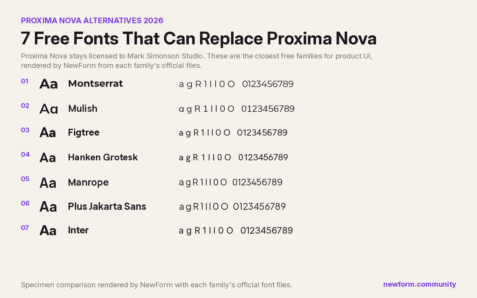
7 Free Fonts Similar to Proxima Nova (Real Specimens, 2026)
Proxima Nova is a licence you have to buy and it sets wider than you expect. These 7 free families, rendered from their official files, do the same job: Montserrat, Inter, Mulish, Hanken Grotesk, Figtree, Plus Jakarta Sans, Manrope.
13 min read · Nov 4, 2026

6 Free Fonts Similar to Futura (Real Specimens, 2026)
Futura is licensed and awkward at small sizes. These 6 free geometric sans, rendered from their official files, do the same job: Jost, Poppins, Outfit, Urbanist, Josefin Sans, Questrial.
13 min read · Nov 3, 2026