
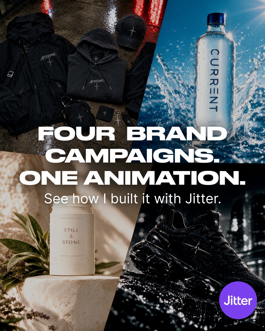
How to Create Reusable Brand Animations in Jitter
Source carousel by @expert.pitch. Images reproduced from the original Instagram post.
Motion can make a brand feel more expressive, but a set of disconnected animated posts often looks like a set of unrelated experiments. The carousel’s premise is more useful: four brand campaigns, one animation workflow. Rather than rebuilding the motion language for every campaign, treat one animation as a flexible system. This tutorial shows how to plan that system, produce variations, and keep the result readable across formats.

Start with a motion brief
Write down the campaign’s message, audience, and destination before opening a timeline. Decide whether the animation needs to introduce a product, demonstrate a feature, announce a promotion, or simply establish a recognizable mood. Then choose one action that carries the idea: a word appearing, a shape transforming, a product moving into focus, or an interface element responding.
Keep the first version small enough to judge. A short loop or a few seconds of movement can reveal whether the central idea works. If the message only becomes clear after several decorative transitions, simplify the concept before polishing the animation.
Build one reusable composition
The original post names Jitter as the tool to try. Its website describes a browser-based motion-design workflow with imports, editable layers, timelines, templates, and exports. Capabilities and plan limits can change, so check the product’s current documentation and pricing before production. The useful workflow principle remains stable: organize the master composition so the parts most likely to change are easy to locate.
Separate the campaign into layers for background, subject, headline, supporting copy, and brand mark. Name the layers by function rather than by temporary appearance. Keep typography, color, and logo placement consistent, while exposing only the campaign-specific content as variables. A second designer should be able to identify what changes without reverse-engineering the whole file.
Give the motion a clear hierarchy
Choose a single focal action and let supporting movement reinforce it. A headline might enter first, followed by the product or visual proof. Avoid making every layer move at once. Staggering the sequence can guide the eye, but excessive delay makes the animation feel slow. Use a simple easing curve as a starting point, then adjust timing based on the content and the platform where it will appear.
Check the animation at normal playback speed, not just frame by frame. Text should remain on screen long enough to read, and transitions should not obscure important details. A good motion treatment makes a message easier to notice or understand. If removing the movement changes nothing about the experience, the animation may be decoration without a job.
Create campaign variations without losing the system
Once the master works, duplicate it for each campaign or message. Swap the specific headline, image, accent color, or product while preserving the timing logic and layout rules. Keep a simple variation table: version name, audience, primary message, aspect ratio, and any changed asset. That record prevents near-identical exports from becoming difficult to distinguish.
Make the differences intentional. A seasonal campaign might change its palette, but still use the same entrance and transition. A product launch might use a new visual but keep the established brand signature. The goal is not to make every asset identical. It is to help each variation feel like it belongs to the same family.
Adapt the composition to each destination
A square social post, a vertical story, and a website hero have different constraints. Reframe the composition for each rather than stretching a single export. Check safe areas, text size, cropping, and whether the key action remains visible when the platform overlays controls. If the target platform autoplays silently, make the message understandable without audio and provide captions when speech is essential.
Export a short proof and inspect it on an actual phone before producing the full set. Watch for tiny copy, awkward crops, banding, and motion that feels too fast on a small screen. Preserve a still frame or reduced-motion alternative when the animation is part of a product experience and users may prefer less movement.
A quality check before publishing
Review four things: message, timing, consistency, and delivery. Can a viewer identify the subject quickly? Is there enough time to read? Do all variants share recognizable rules? Does the export match the destination’s format and quality requirements? Get a second person to review the master and one variation. Their confusion often exposes hidden assumptions in the template.
A reusable animation is not a shortcut around creative judgment. It is a way to spend less time rebuilding structure and more time refining the idea. Build a clear master, test one variation, and expand only after the motion works for both the message and the audience.
Original carousel: Four brand campaigns, one animation
Related on NewForm
Keep reading
Find Your Stack
Discover the perfect design tools for your workflow.
Take the 60-second quizNewForm Studio
Turn your designs into professional mockups instantly.
Open StudioMore from NewForm
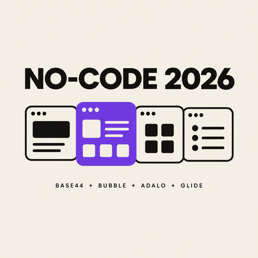
Best No-Code App Builders for Designers in 2026: Base44 vs Bubble vs Adalo vs Glide
Base44 ships prompts to real apps fastest, Bubble wins on complex custom web products, Adalo publishes to the app stores, Glide turns spreadsheets into tools. A designer-first comparison with pricing and trade-offs.
9 min read · Nov 2, 2026

How to Extract a Brand Look from an Image in Adobe Express
Use Adobe Express’s Brand panel and “Extract from image” as a visual starting point, then refine the crop, color, and copy with a practical pre-publish checklist.
5 min read · Oct 31, 2026