
7 Free Fonts Similar to Proxima Nova (Real Specimens, 2026)
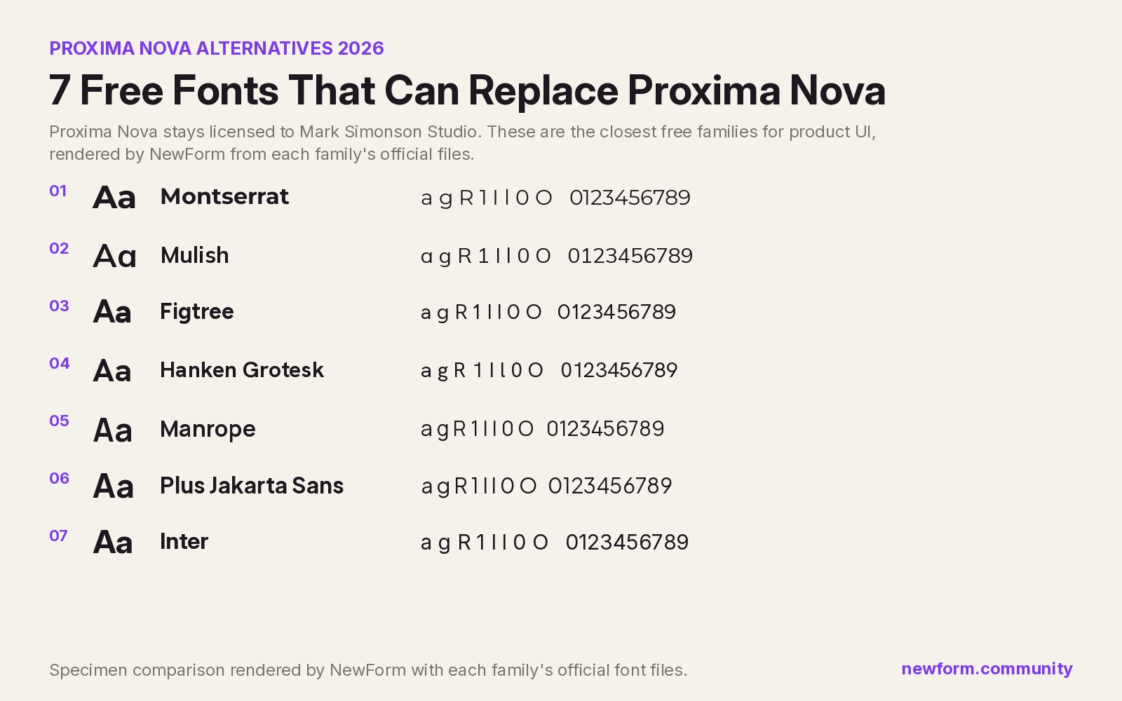
The closest free replacement for Proxima Nova is Montserrat for warmth and Inter for dense product UI. Both are free on Google Fonts, and both keep the geometric-grotesque balance that makes Proxima Nova work. Six more free options follow, all rendered from their official files at identical settings so you can compare them honestly.
TL;DR: the seven, ranked
- Montserrat, closest overall feel. Free, Google Fonts. Round geometric bones with enough grotesque structure to survive small sizes. Best for marketing pages, brand systems, and anywhere the Proxima Nova warmth is the point.
- Inter, best for product UI. Free, Google Fonts. Designed for screens at small sizes, so tables, forms and settings panels stay readable at 13px. Best for dashboards and apps.
- Mulish, best for long body copy. Free, Google Fonts. Low contrast, calm, generous x-height. Best for editorial layouts and documentation.
- Hanken Grotesk, the quietest swap. Free, Google Fonts. A neo-grotesque with just enough geometry. Best when you want people to notice the layout and not the typeface.
- Figtree, best for friendly products. Free, Google Fonts. Softer terminals, contemporary proportions. Best for consumer apps and onboarding screens.
- Plus Jakarta Sans, best for branding. Free, Google Fonts. Geometric with humanist details and a strong display weight. Best for wordmarks and campaign pages.
- Manrope, best for numbers. Free, Google Fonts. Tight apertures, confident numerals. Best for analytics dashboards and pricing tables.
Why Proxima Nova is so hard to replace
Proxima Nova is Mark Simonson's 2005 redraw of his own 1994 Proxima Sans, and it sits deliberately in the middle of two traditions: the geometric sans (circular bowls, near-monoline strokes) and the 20th-century grotesque (tighter spacing, sturdier joints). That middle position is exactly why it became the default for so many startups: it reads as modern without reading as trendy.
It is also a commercial licence. You buy it from Mark Simonson Studio, or you use it through an Adobe Fonts subscription, and either route comes with terms that most side projects and client handoffs cannot absorb. So the real question is not "what looks identical" (nothing free does), it is "which free family gets the same job done without the layout collapsing".
The boards below answer that. Every one was rendered by NewForm from the family's official font files at the same sizes, the same paragraph, the same buttons, so the differences you see are the typefaces and not the settings.
The specimens
1. Montserrat: the closest free match
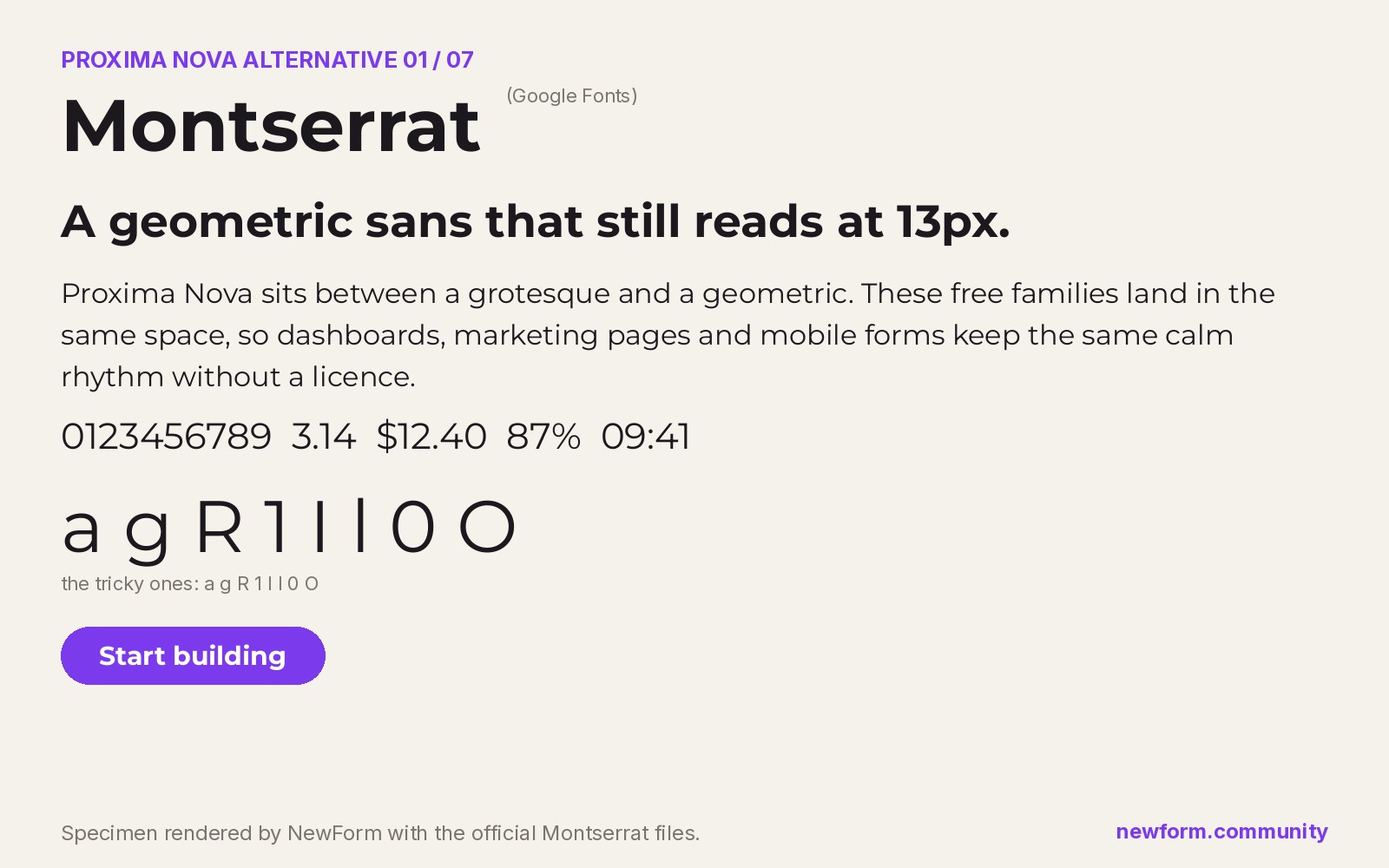
Why it works. Montserrat was drawn by Julieta Ulanovsky from the hand-painted signage of the Montserrat neighbourhood in Buenos Aires, which gives it the same urban geometric confidence as Proxima Nova. Circular bowls, tall ascenders, flat terminals. Swap it in and the page still feels like the same brand.
Where to use it. Marketing pages, brand systems, presentation decks, hero sections, anything where the type is doing persuasion rather than data entry.
Settings that work. Proxima Nova headings are usually set slightly tighter than default. Pull Montserrat's tracking in at display sizes to match:
h1, h2 {
  font-family: Montserrat, ui-sans-serif, system-ui, sans-serif;
  font-weight: 700;
  letter-spacing: -0.02em;
}
body {
  font-family: Montserrat, ui-sans-serif, system-ui, sans-serif;
  font-weight: 400;
  letter-spacing: 0;
  line-height: 1.6;
}
Watch out for it. Montserrat is wider than Proxima Nova. Long headlines wrap a line earlier than you expect, and dense tables start to feel loose. If your layout was tuned around Proxima Nova's width, cut the body size by one step before you cut the padding.
Where to get it. Montserrat on Google Fonts, free for commercial use.
2. Inter: the best for product UI
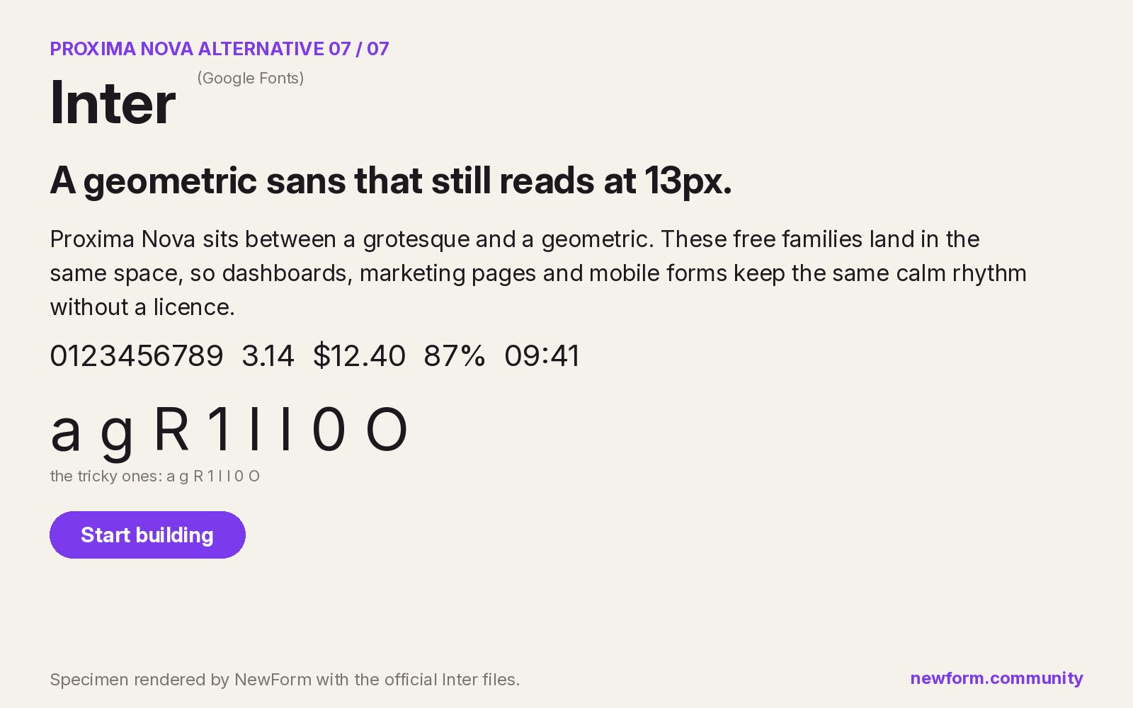
Why it works. Inter was built by Rasmus Andersson specifically for interface text, with a large x-height and open apertures. It does not have Proxima Nova's geometric charm, but it wins where Proxima Nova usually gets used in practice: menus, forms, tables, toasts, and all the 12 to 14px text nobody designs carefully.
Where to use it. Dashboards, admin panels, settings screens, developer tools, and any product where legibility at small sizes matters more than personality.
Settings that work. Inter needs less tracking than most sans-serifs, and its optical size axis does real work on screens:
body {
  font-family: Inter, ui-sans-serif, system-ui, sans-serif;
  font-optical-sizing: auto;
  font-weight: 400;
  letter-spacing: -0.011em;
  line-height: 1.5;
}
.numeric { font-variant-numeric: tabular-nums; }
Watch out for it. Inter reads more neutral and more "software" than Proxima Nova, so a brand that leans on warmth will feel colder. It is also extremely common now, which is a positioning question rather than a design one.
Where to get it. Inter on Google Fonts, free. Our full Inter alternatives hub covers what Inter itself is and is not.
3. Mulish: the best for long body copy
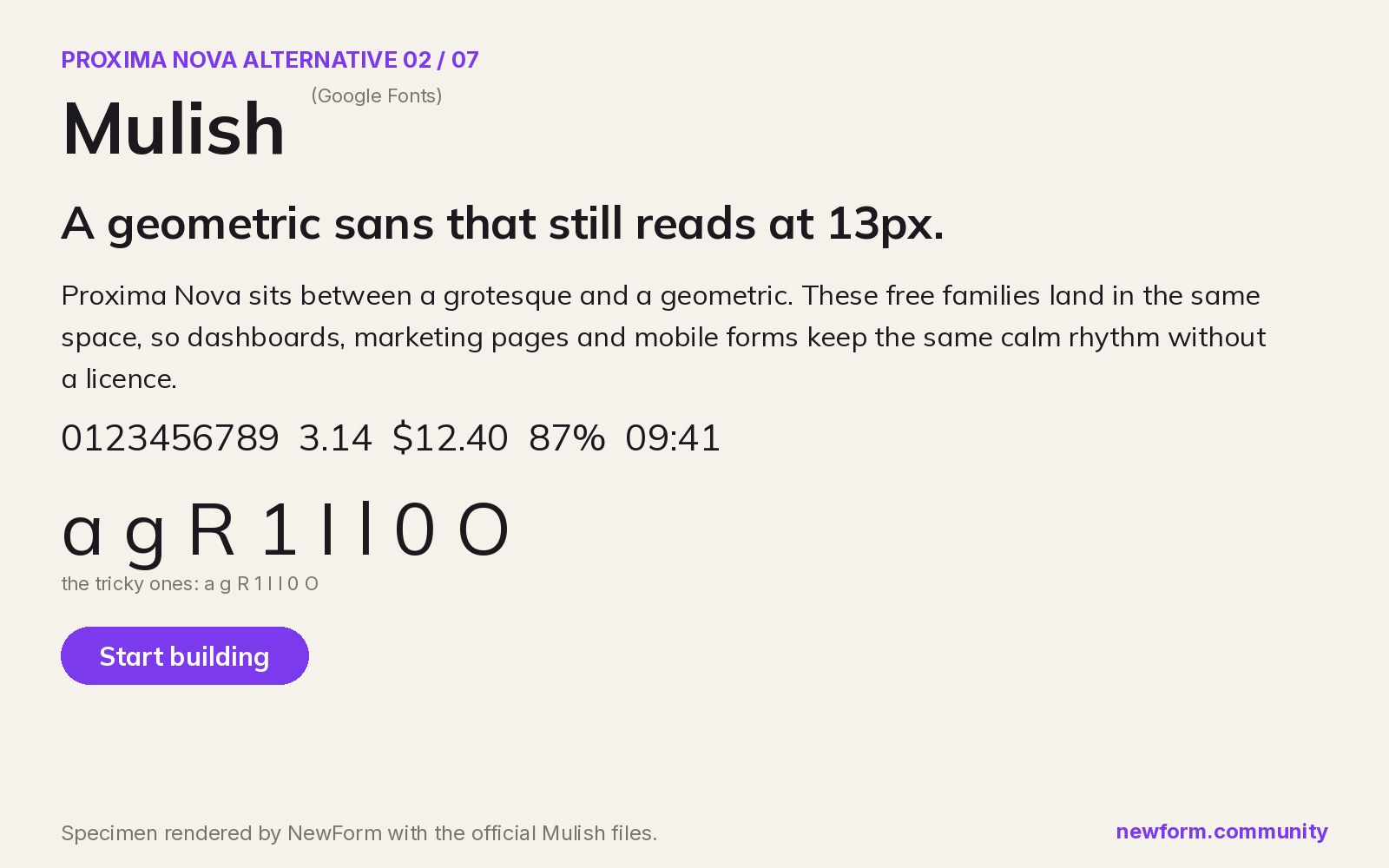
Why it works. Mulish was originally released as Muli by Vernon Adams and later expanded into a full variable family. It is a minimalist sans with very low stroke contrast, which makes paragraphs feel calm and even at small sizes. Proxima Nova's paragraph texture is close, and Mulish removes the geometric quirks that slow reading down.
Where to use it. Documentation, help centers, long form articles, changelogs, and any product with a lot of prose next to the UI.
Settings that work.
.prose {
  font-family: Mulish, ui-sans-serif, system-ui, sans-serif;
  font-weight: 400;
  letter-spacing: 0.002em;
  line-height: 1.7;
  max-width: 68ch;
}
Watch out for it. At display sizes Mulish is a little plain. Pair it with a stronger heading face rather than scaling it up to 72px.
Where to get it. Mulish on Google Fonts, free.
4. Hanken Grotesk: the quietest swap
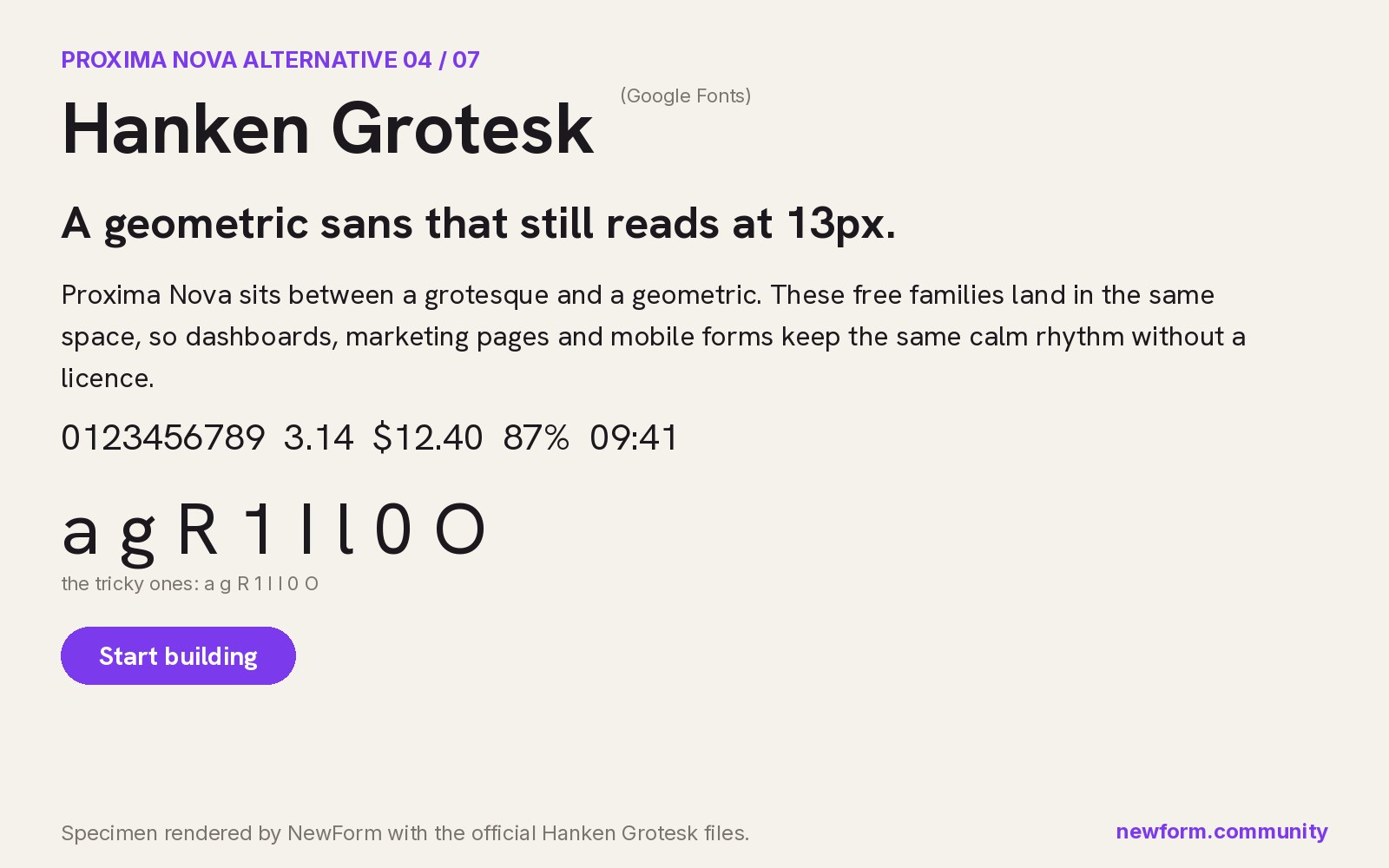
Why it works. Hanken Grotesk is a neo-grotesque with just enough geometry to sit comfortably where Proxima Nova sat. Where Montserrat announces itself, Hanken Grotesk disappears, which is often the goal when you are swapping a font in a live product and do not want to trigger a redesign conversation.
Where to use it. Client work with signed-off comps, existing design systems, and any interface where consistency matters more than a fresh look.
Settings that work.
:root {
  font-family: "Hanken Grotesk", ui-sans-serif, system-ui, sans-serif;
  font-weight: 400;
  line-height: 1.55;
}
strong, b { font-weight: 600; }
Watch out for it. The personality budget is low. If the brand needs to feel playful or luxurious, this is not the pick.
Where to get it. Hanken Grotesk on Google Fonts, free.
5. Figtree: the best for friendly products
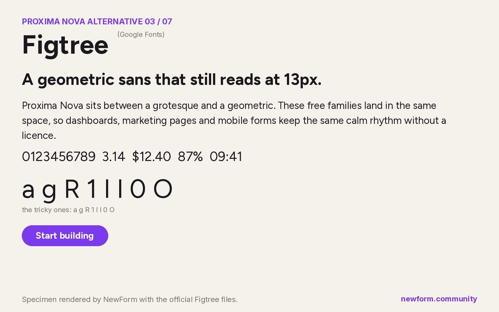
Why it works. Figtree, drawn by Erik Kennedy, keeps geometric proportions but softens the terminals and evens out the spacing. The result is a friendlier cousin: same skeleton, warmer surface. Proxima Nova used in consumer products (fintech apps, health apps, onboarding flows) lands here easily.
Where to use it. Consumer apps, signup and onboarding screens, empty states, marketing pages with human photography.
Settings that work.
body {
  font-family: Figtree, ui-sans-serif, system-ui, sans-serif;
  font-weight: 400;
  letter-spacing: 0;
  line-height: 1.6;
}
button, .btn { font-weight: 600; letter-spacing: -0.005em; }
Watch out for it. Figtree has fewer weights than Montserrat, so very heavy display treatments run out of range quickly.
Where to get it. Figtree on Google Fonts, free.
6. Plus Jakarta Sans: the best for branding
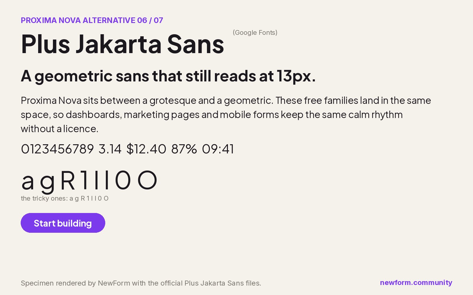
Why it works. Plus Jakarta Sans was commissioned for the city of Jakarta's identity and later released free. It is geometric with humanist details, so it holds up in a wordmark and still reads cleanly in a paragraph. Of the seven, it has the strongest display presence.
Where to use it. Logos and wordmarks, campaign landing pages, pitch decks, and brand systems that need one family to do both jobs.
Settings that work.
.wordmark {
  font-family: "Plus Jakarta Sans", ui-sans-serif, system-ui, sans-serif;
  font-weight: 800;
  letter-spacing: -0.03em;
  text-transform: none;
}
Watch out for it. The distinctive details become noise in very small UI text. Use it for headings and set body copy in Inter or Mulish.
Where to get it. Plus Jakarta Sans on Google Fonts, free.
7. Manrope: the best for numbers
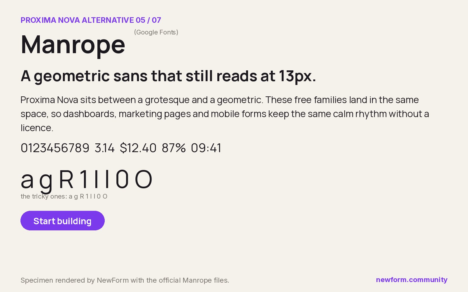
Why it works. Manrope, by Mikhail Sharanda, is a semi-geometric sans with tight apertures and confident numerals. In pricing tables, analytics cards and financial dashboards it reads sharper than Proxima Nova, mostly because the digits were treated as a first-class feature rather than an afterthought.
Where to use it. Analytics dashboards, pricing pages, invoicing, anything where a column of numbers has to align and still look designed.
Settings that work.
.metric {
  font-family: Manrope, ui-sans-serif, system-ui, sans-serif;
  font-weight: 700;
  font-variant-numeric: tabular-nums;
  letter-spacing: -0.02em;
}
Watch out for it. Manrope at small sizes in long paragraphs can feel congested. Keep it to headings, labels and figures, and set prose in something calmer.
Where to get it. Manrope on Google Fonts, free.
Proxima Nova vs Montserrat: the head-to-head
This is the comparison most people actually run, so here is the honest version.
Proxima Nova has tighter default spacing and a slightly narrower set width. Montserrat is rounder and wider, with a larger apparent size at the same px value. Side by side at 16px, Montserrat looks one step bigger. Set Montserrat at 15px where you had Proxima Nova at 16px and the optical weight evens out.
Proxima Nova's italics are true italics. Montserrat ships real italics too, so that part is a fair match. Where they diverge is the numerals: Proxima Nova's lining figures feel designed into the text, while Montserrat's sit a little more separately. For financial interfaces, that is the detail that pushes people to Inter or Manrope instead.
If the brand is the priority, take Montserrat. If the product is the priority, take Inter. That single sentence covers 80% of these decisions.
How to switch from Proxima Nova without breaking the layout
- Match x-height before width. Put a line of Proxima Nova and a line of the candidate at the same size and compare how tall the lowercase letters are. The family with the closer x-height needs less retuning everywhere else.
- Retune tracking, not size, for headings. Geometric families usually need minus 0.02em at display sizes. Proxima Nova headings tuned at default tracking will look loose.
- Remap weights. Proxima Nova's 600 (semibold) does the work that many Google families give to 700. Check buttons and labels after the swap, they are where weight mismatches show first.
- Fix the numerals once. Turn on tabular figures for anything in a table or dashboard. If the family's figures feel wrong, keep the numbers in a secondary face rather than fighting it.
- Check the smallest size in the product. Open the densest screen, set it to the new family, and read it at arm's length. That test kills more candidate fonts than any specimen board.
- Ship a variable file. All seven families above are available as variable fonts, so one file covers the weights instead of five static requests.
FAQ
What font is most similar to Proxima Nova?
Montserrat is the closest free font to Proxima Nova overall, because it shares the geometric bowls and urban grotesque structure. For interface work at small sizes, Inter is the better practical match.
What is a free alternative to Proxima Nova?
Montserrat, Inter, Mulish, Hanken Grotesk, Figtree, Plus Jakarta Sans and Manrope are all free on Google Fonts and all cover the Proxima Nova role. Montserrat and Inter are the two most teams end up choosing.
Is there a Google Font similar to Proxima Nova?
Yes. Montserrat is the closest match on Google Fonts, and Plus Jakarta Sans and Figtree are close on proportions with a slightly different personality.
Is Proxima Nova free?
No. Proxima Nova is a commercial typeface by Mark Simonson Studio, sold as a licence, and also available through an Adobe Fonts subscription. The free families in this guide are separate typefaces, not copies.
Can I use Proxima Nova on a website?
Yes, with a web licence from Mark Simonson Studio or an active Adobe Fonts subscription. Self-hosting the files without a licence is not permitted, which is why so many teams switch to a free family instead.
What is the closest Google Font to Proxima Nova for a logo?
Plus Jakarta Sans at 800 with tracking pulled in is the strongest wordmark option among the free families. Montserrat at 700 is the safer, more familiar choice.
Why does my layout break when I swap Proxima Nova for a free font?
Almost always because of width and x-height, not weight. Free geometric families set wider, so headings wrap earlier and buttons grow. Reduce the size one step and tighten tracking before changing any padding.
Put the type to work
You have the specimen. The part people actually judge is how the type looks in a real layout, in a real product, with real content in it.
Render your pick as a mockup in Mockup Studio, then build the interface in Base44, which turns a prompt into a working app so you can test the type on a screen instead of in an image:
Where to get the paid originals. Some links in this section may be affiliate links. If you buy through them, NewForm earns a commission at no extra cost to you.
- Proxima Nova and Proxima Sans: Mark Simonson Studio.
- Proxima Nova inside Creative Cloud: Adobe Fonts.
- Premium alternatives from independent foundries: Creative Market.
If you are still choosing, start with the Inter alternatives hub for UI-first picks, then font pairings every designer should memorize for a second family, and typography sizes for websites for the actual px values.
More in the Fonts Similar To series
Every guide uses our own rendered specimens and the same structure, so you can compare fonts side by side:
Keep reading

Find Your Stack
Discover the perfect design tools for your workflow.
Take the 60-second quizNewForm Studio
Turn your designs into professional mockups instantly.
Open StudioMore from NewForm

6 Free Fonts Similar to Futura (Real Specimens, 2026)
Futura is licensed and awkward at small sizes. These 6 free geometric sans, rendered from their official files, do the same job: Jost, Poppins, Outfit, Urbanist, Josefin Sans, Questrial.
13 min read · Nov 3, 2026

Free UI Components, SVG Generators and Icons: 4 Sites Every Designer Should Bookmark
Uiverse, fffuel, Iconbuddy and WebGradients cover most of the UI work designers re-solve every week: copy-paste components, SVG generators, 150,000 icons and CSS gradients.
4 min read · Nov 2, 2026