
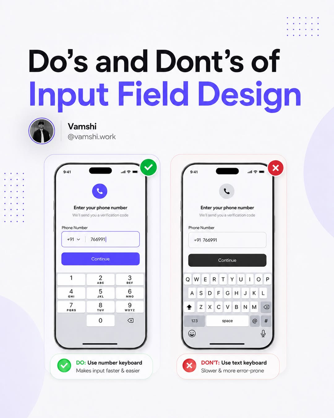
Input Field Design: Do's and Don'ts Every Designer Should Follow
Input fields are everywhere. Login forms, search bars, checkout flows, onboarding screens, they're the primary way users interact with your product. Yet they're also one of the most commonly botched elements in UI design. A poorly designed input field creates friction, errors, and abandoned forms.
Post by @vamshi.work, original carousel here.

1. Do Use Clear, Visible Labels
Labels should be visible at all times, not hidden behind placeholders that disappear the moment a user starts typing. Placeholder text is not a label. It's a hint, and it should be treated as one.

Best practice: Place labels above the input field. Left-aligned labels are easier to scan, but top-aligned labels reduce completion time. Choose based on your form's length and context.
2. Don't Rely on Color Alone for Errors
Red text on a red border might seem obvious to you, but colorblind users won't see it. Always pair color with an icon, text, or pattern that communicates the error independently of hue.

Best practice: Use a red border + an error icon + descriptive text. Something like "Email must contain @" is infinitely better than a red outline with no explanation.
3. Do Show the Right Keyboard Type
On mobile, the keyboard should match the input type. Email fields should trigger the email keyboard with the @ symbol visible. Phone numbers should bring up the numeric keypad. This is a small detail that dramatically reduces friction on mobile devices.

4. Don't Make Users Guess the Format
If you need a phone number in a specific format, show the format. If you need a date, use a date picker. Don't make users type "MM/DD/YYYY" and then throw an error when they type "MM-DD-YYYY".

Best practice: Use input masks and formatting hints. Show the expected format before the user starts typing, not just in the error message after they get it wrong.
5. Do Validate Inline (But Gently)
Real-time validation is great when it helps. It's terrible when it shouts at users for every keystroke. Validate when the field loses focus (on blur), not on every character entry. And when validation passes, consider a subtle confirmation, a green checkmark, not a parade.

6. Don't Forget Accessibility
Input fields need to work with screen readers, keyboard navigation, and voice control. This means proper ARIA labels, sufficient contrast ratios (at least 4.5:1 for text), and a visible focus state that doesn't rely on color alone.

Quick checklist:
- Tab order follows visual order
- Focus state is clearly visible
- Error messages are announced to screen readers
- Required fields are marked with both an asterisk and text
- Touch targets are at least 44x44px
7. Do Design for Every State
An input field has more states than you think: default, hover, focus, filled, disabled, error, success. Each one needs to be designed intentionally. A common mistake is designing only the default and error states, leaving everything else to the browser's defaults.

The Takeaway
Input field design is one of those areas where the details matter more than the big picture. A beautiful form that's hard to fill out is worse than an ugly form that's effortless. Focus on clarity, accessibility, and reducing the number of decisions users have to make.
Remember: every input field is a micro-conversation with your user. Make it a pleasant one.
Want to build forms that actually convert? Try Base44, design and deploy working forms with AI, no code required.
Original Instagram carousel by @vamshi.work. Follow them for more UI/UX design content.
Related on NewForm

FREE FIELD GUIDE
The 8-Prompt Product
Answer 24 questions, run 8 prompts, and walk away this afternoon with a working, beautiful MVP you would be proud to show.
See what's insideKeep reading
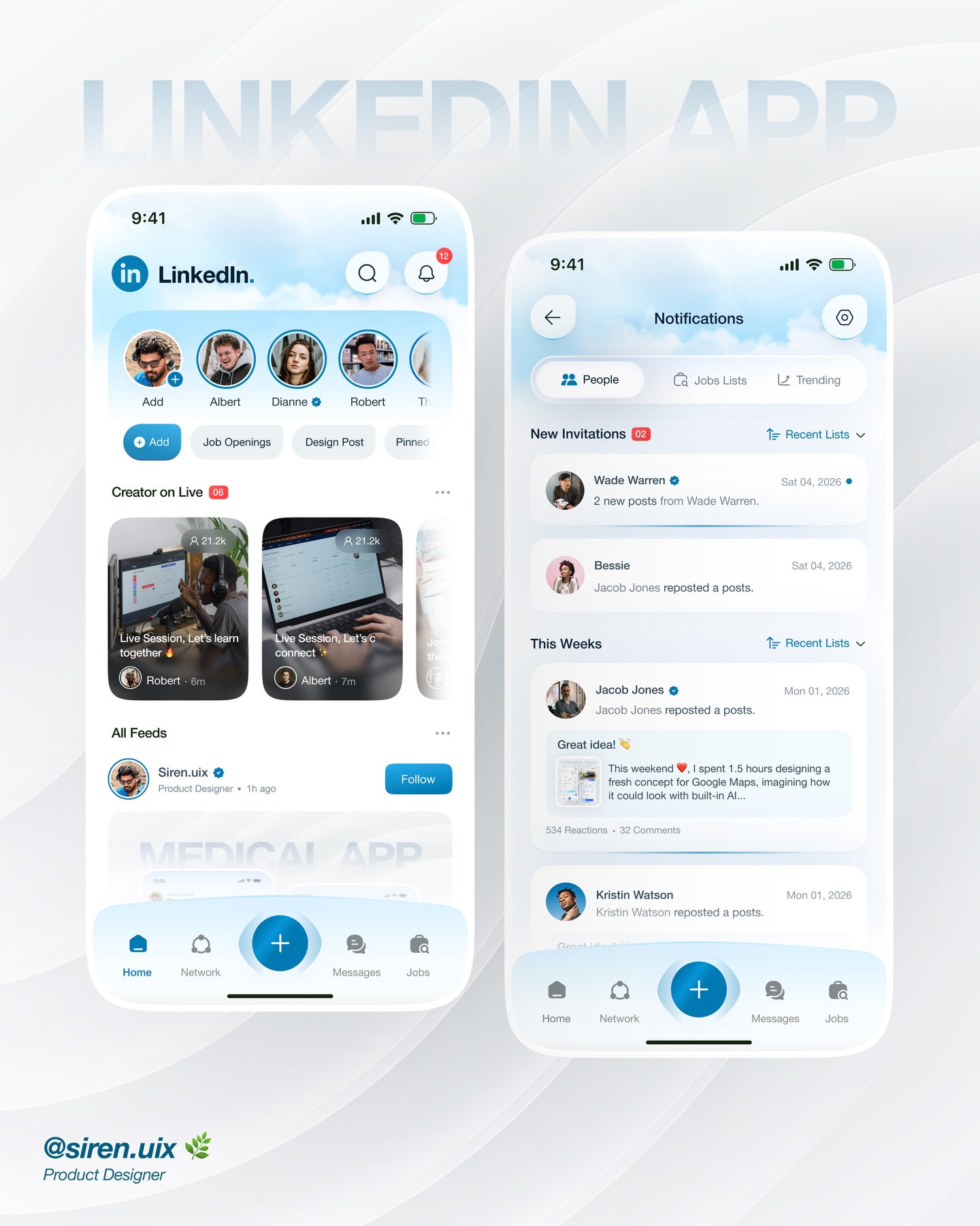
Find Your Stack
Discover the perfect design tools for your workflow.
Take the 60-second quizNewForm Studio
Turn your designs into professional mockups instantly.
Open StudioMore from NewForm

15 UX Portfolio Examples That Get Designers Hired (And What Each One Does Right)
Fifteen real UX portfolio examples from working designers, the one lesson each teaches, a structure checklist, and how to build yours in a weekend.
11 min read · Nov 1, 2026
How to Choose UI Fonts by Mood: A Practical Pairing Method
Turn mood words like elegant, bold, and editorial into a practical type pairing, then test it on real interface content.
4 min read · Oct 21, 2026