
How to Choose UI Fonts by Mood: A Practical Pairing Method
How to Choose UI Fonts by Mood: A Practical Pairing Method
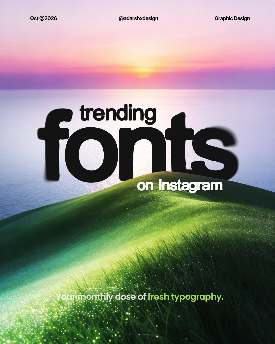
Choosing type is easier when you stop asking which font is “best” and start asking what the interface needs to feel like. In a recent carousel, @adarshxdesign compared several display faces with mood labels such as elegant, timeless, bold, gritty, sharp, editorial, romantic, experimental, and friendly. Those labels are a useful starting point, but a font still has to work in context. This guide turns that visual comparison into a repeatable selection exercise.

1. Write the mood in plain language
Pick two adjectives for the product or page. “Elegant and timeless” suggests a different direction from “bold and gritty.” “Sharp and editorial” may suit a publication or portfolio, while “friendly and experimental” might fit a creative tool. Two words create a useful constraint. A list of six moods usually means the brief is not decided yet.

2. Test the font on real interface copy
A display specimen can make almost any typeface look appealing. Instead, test the font with the actual content: a page title, a short paragraph, a button label, a navigation item, and a number or date. Check how lowercase letters, punctuation, and numerals behave. A dramatic headline face may be excellent for a portfolio title but tiring for a long settings panel.
The carousel’s contrast between the elegant Athelas example, the bold Bostzy sample, and the sharp editorial Moonscape demonstrates why mood changes with the type’s shape and rhythm. Treat these as references, not prescriptions. Confirm the font’s licensing and language support before using it in a live project.

3. Pair a distinctive headline with a dependable UI face
For most interfaces, use one expressive display face for a limited set of headings and a highly readable text face for paragraphs, labels, and controls. The contrast should feel intentional, not like two unrelated brands. Compare x-height, stroke weight, width, and letter spacing. If both faces are expressive, they may compete. If both are neutral, the hierarchy may need help from size and spacing instead.
Create a simple specimen page in Figma with H1, H2, body, caption, button, and navigation styles. Put the two candidates beside one another and view the page at realistic desktop and mobile widths. Keep line lengths comfortable and avoid using ultra-light weights for small text.

4. Check function before committing
Test the pairing with long and short labels, a dense paragraph, and a form. Does the button label fit? Do numbers remain easy to scan? Does the heading still read clearly when it wraps? Check the available weights and italic styles, too. A family with only one useful weight can make the design system harder to maintain.
Use a web reference such as Google Fonts to compare available families and verify web-use details. For implementation, define a small type scale and reuse it instead of tuning every heading independently. Good typography is a system, not a collection of one-off choices.

5. Make a decision with a small scorecard
Rate each pairing from one to five for mood fit, readability, available weights, and performance or licensing fit. Give readability extra weight for text-heavy interfaces. Then test the top pairing with real users or teammates. Ask what feels clear and what feels out of place. Do not ask only which font looks more attractive in isolation.
A practical set of three contrasting directions is enough for an initial review: a restrained serif-led option, a bold sans-serif option, and a neutral interface-first option. These are not a universal ranking. They help a team articulate the design personality and choose based on the actual product.
Credit and source
Typography inspiration by @adarshxdesign. Original carousel: Instagram.


A practical team review
When a font decision involves more than one designer, create a side-by-side specimen rather than debating font names in the abstract. Use the same words, size, line length, and background for each candidate. Add one real interface sample so the group can see how the face behaves outside a polished title card. Ask each reviewer to describe the personality first, then note any readability or implementation concern. This separates useful feedback from personal preference.
If two directions both fit, test them on the page where typography matters most. A marketing headline may tolerate a distinctive display face, while a dense product table needs stable scanning. The right system may use different roles for these contexts, but the handoff should explain which font belongs where.
Before handoff, verify that font files load, fallback fonts do not distort the layout, and line breaks remain acceptable. Record the licensing source and the chosen weights in the project notes. These small checks prevent a promising visual direction from becoming a production surprise.
A good font choice is not simply the most fashionable one. It is the pairing that supports the product’s tone, remains comfortable to read, and can be used consistently across its real content.
More in the Fonts Similar To series
Every guide uses our own rendered specimens and the same structure, so you can compare fonts side by side:
- Fonts similar to Inter (the hub)
- Fonts similar to Helvetica
- Fonts similar to SF Pro
- Inter vs Geist
- Font pairings every designer should memorize
- Typography sizes for websites
Related on NewForm
Keep reading
Find Your Stack
Discover the perfect design tools for your workflow.
Take the 60-second quizNewForm Studio
Turn your designs into professional mockups instantly.
Open StudioMore from NewForm

15 UX Portfolio Examples That Get Designers Hired (And What Each One Does Right)
Fifteen real UX portfolio examples from working designers, the one lesson each teaches, a structure checklist, and how to build yours in a weekend.
11 min read · Nov 1, 2026
LinkedIn App Redesign Case Study: 5 UX Decisions for a Clearer Professional Network
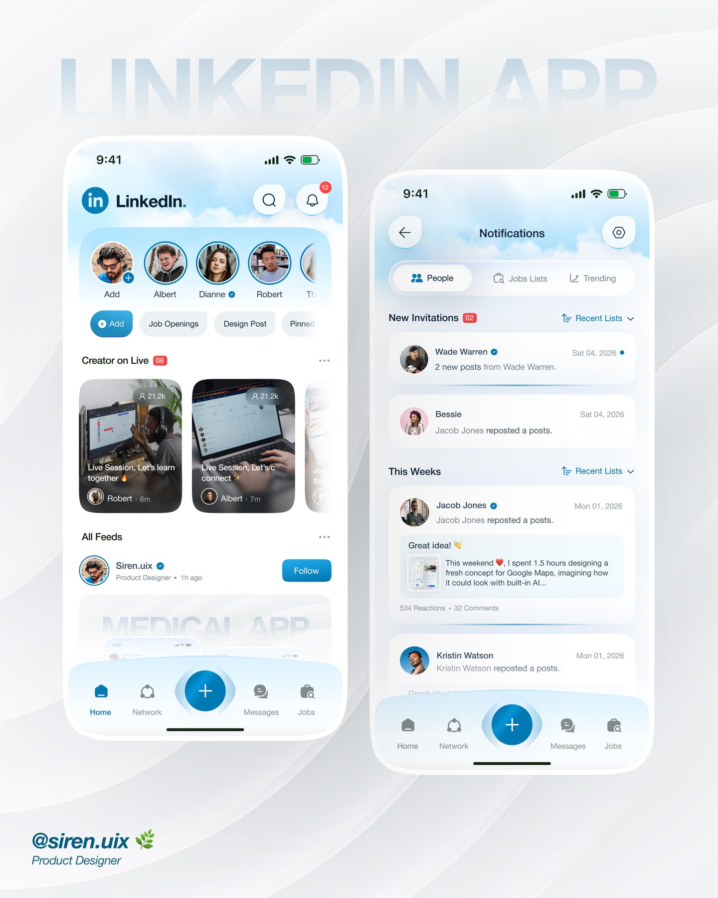
A visual LinkedIn app redesign becomes a useful UX case study when it connects navigation, alerts, discovery, and follow-through. Here are five ways to critique the flow.
4 min read · Oct 19, 2026