
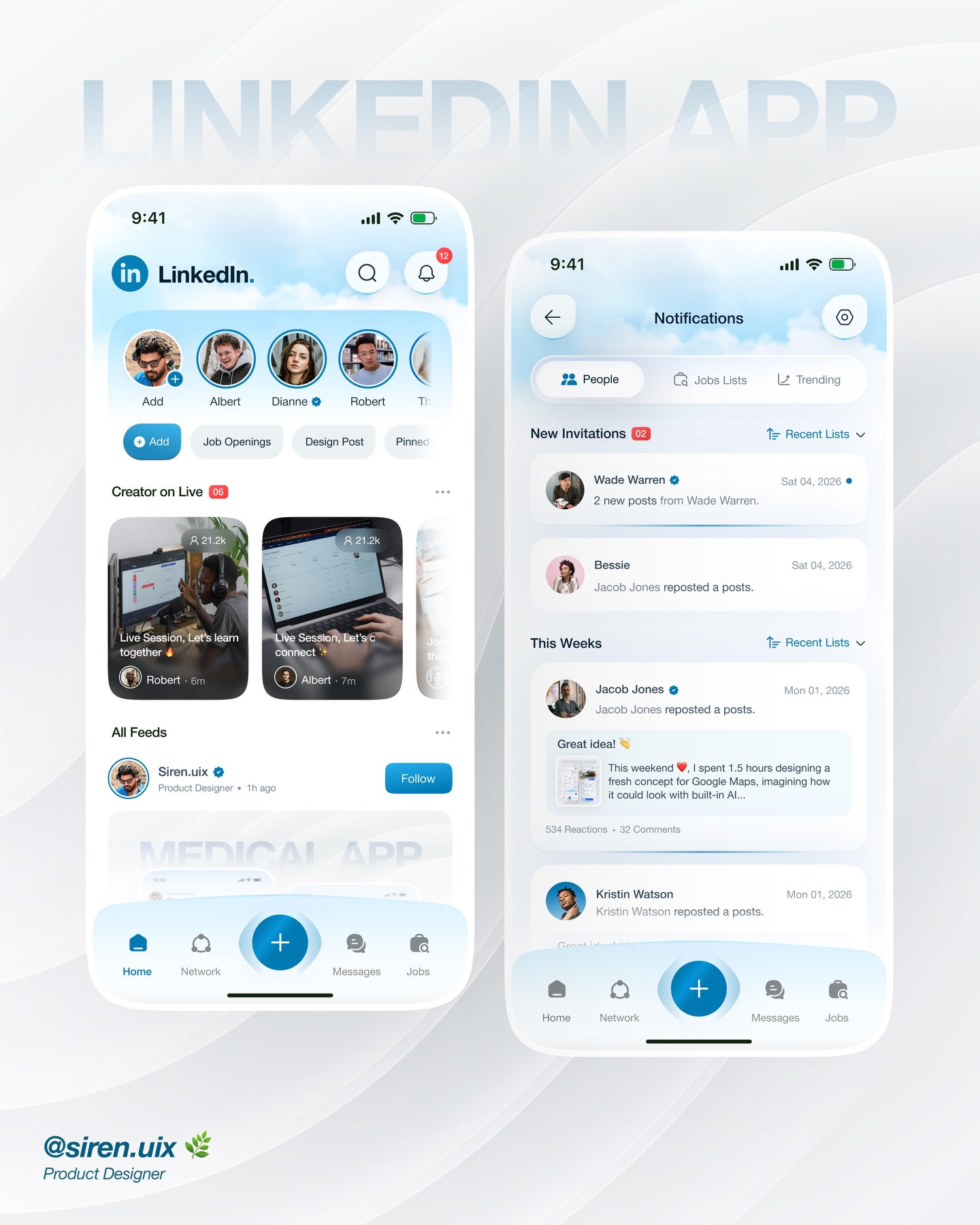
LinkedIn App Redesign Case Study: 5 UX Decisions for a Clearer Professional Network
Concept redesign by siren.uix. This is an independent visual concept, not an official LinkedIn product update or a usability-test result.

A social app redesign is not just a new coat of paint. The hard part is deciding which actions deserve attention, how a user moves between them, and what each screen should make easier. In this LinkedIn app concept by siren.uix, the familiar professional-networking product is reimagined through a mobile interface with navigation, feed content, notifications, people, jobs, lists, and a live-session concept. That makes it a useful case study in how to evaluate a redesign: treat each screen as a decision in a larger journey.
1. Audit the current task before drawing

Start by naming the user task, not the screen. Someone might want to check a notification, find a person, follow a topic, save a job, or join a professional conversation. Write down the entry point, the next expected action, and what success looks like. That prevents a redesign from adding attractive controls without making the underlying task easier.
For a portfolio concept, be transparent about the scope. This carousel is a visual exploration, not evidence that LinkedIn users prefer a particular layout. A polished case study should distinguish observed product behavior, design hypotheses, and any testing that actually happened.
2. Make navigation reflect real destinations

Professional networks contain several related but different modes: the feed, messaging, jobs, alerts, and people discovery. A navigation bar can make these destinations visible, but it should not turn every feature into an equal priority. Group lesser-used destinations, keep primary actions predictable, and use familiar labels. When a design experiments with a new destination such as live sessions, show how a user gets there and how they return to the main task.
A useful critique question is: can a first-time user predict what happens after tapping each destination? If not, the labels or grouping need another pass.
3. Separate alerts from content

Notifications compete with feed content for attention. Distinguish an actionable alert from a passive update through clear hierarchy, not just color. A concise title should say what happened, supporting text can explain the context, and a visible action should make the next step obvious. Avoid making every row look urgent. If everything is highlighted, nothing is.
For a redesign exercise, show at least one quiet state and one busy state. Empty and overloaded conditions expose whether the hierarchy survives outside the ideal mockup.
4. Give discovery a useful structure

People search, job discovery, and followed topics are different goals. A strong interface helps users understand what they are looking at and what filters can narrow it. Use visible context such as role, organization, location, or topic where appropriate, but do not cram every possible detail into a card. Put the highest-value information first and let the user open a profile or detail view for the rest.
If the concept introduces saved lists or collections, explain their role. A collection should help users return to people or opportunities, not create another organizational burden.
5. Design the whole loop, not one hero screen

A hero screen can sell a concept, but a redesign becomes convincing when the connected screens tell one coherent story. Trace one journey from discovery to action: find a relevant person, inspect the profile, send or save something, then confirm what happened. Check that the same visual language, terms, and back behavior carry through each step.
A five-minute audit is enough to find many gaps: tap through the prototype in order, narrate what you expect, and mark every point where the interface makes you guess. Turn each guess into a design question. Does the notification need a clearer action? Is the job state saved? Can the user tell whether a list is private? Those are useful prompts for another iteration.
What this concept teaches
The strongest takeaway is not that one particular screen is the right LinkedIn interface. It is that redesign work should connect navigation, alerts, discovery, and follow-through. Keep the visual concept grounded in a specific task, label hypotheses honestly, and present enough of the flow for people to critique the experience rather than only the first impression.
For more context, compare the concept with LinkedIn's official product and review independent examples such as this LinkedIn UX redesign case study. The original visual concept is by siren.uix. See the Instagram carousel.
Related on NewForm
Keep reading
Find Your Stack
Discover the perfect design tools for your workflow.
Take the 60-second quizNewForm Studio
Turn your designs into professional mockups instantly.
Open StudioMore from NewForm

15 UX Portfolio Examples That Get Designers Hired (And What Each One Does Right)
Fifteen real UX portfolio examples from working designers, the one lesson each teaches, a structure checklist, and how to build yours in a weekend.
11 min read · Nov 1, 2026
How to Choose UI Fonts by Mood: A Practical Pairing Method
Turn mood words like elegant, bold, and editorial into a practical type pairing, then test it on real interface content.
4 min read · Oct 21, 2026