

15 UX Portfolio Examples That Get Designers Hired (And What Each One Does Right)
What separates the UX portfolio examples that get calls from recruiters from the ones that never do? Positioning, depth, and speed. The strongest portfolios open with one clear sentence about who you are, show three to five deep case studies, and let a stranger understand your work in seconds. Below are 15 real portfolios from working designers, each paired with the single lesson most worth stealing.
Every portfolio listed is live today, belongs to the named designer, and is linked as the primary source. Notice that these sites get attention not because they are pretty, but because each makes a specific, legible promise.
The 15 at a glance
| # | Portfolio | Designer | Known for | Steal this |
|---|---|---|---|---|
| 1 | adhamdannaway.com | Adham Dannaway | The split designer and developer intro | Positioning made literal |
| 2 | rleonardi.com | Robby Leonardi | A resume built like a video game | Format that proves the skill |
| 3 | dennissnellenberg.com | Dennis Snellenberg | Silky page transitions | One motion language, everywhere |
| 4 | danielspatzek.com | Daniel Spatzek | Cinematic depth and detail | Art-directed presentation |
| 5 | alyssax.com | Alyssa X | Shipped products as case studies | Working links over static mockups |
| 6 | vanschneider.com | Tobias van Schneider | Strong, opinionated writing | A point of view that filters |
| 7 | bruno-simon.com | Bruno Simon | A playable 3D portfolio | The portfolio as the demo |
| 8 | creativemints.com | Mike, Creative Mints | Illustration-led personal brand | One visual style, everywhere |
| 9 | brittanychiang.com | Brittany Chiang | Dark-mode engineering restraint | Typographic discipline |
| 10 | sarahdoody.com | Sarah Doody | Research-led positioning | Niche specialization |
| 11 | jessicahische.is | Jessica Hische | Playful site structure | Personality in the navigation |
| 12 | repponen.com | Anton Repponen | Grid discipline, big photography | Fewer, larger pieces |
| 13 | mikekus.com | Mike Kus | Bold type, curated selection | Depth over quantity |
| 14 | rauno.me | Rauno Freiberg | Interface craft details | Publishing the micro-decisions |
| 15 | dannpetty.com | Dann Petty | Fast, product-focused freelance work | A frictionless hire-me path |
1. Adham Dannaway: positioning made literal
Adham Dannaway is a UI/UX designer and front-end developer based in Sydney. His portfolio opens with a portrait split straight down the middle: one half of him as the buttoned-up designer, the other half in a developer hoodie. One click tells you exactly what he sells before you have read a single word.
That split intro is the whole lesson. Most portfolios bury their positioning three paragraphs deep, or never state it. Adham's says "I design and I build" in one image, and his case studies then prove both halves. Recruiters do not have to interpret anything.
If you straddle two disciplines, or you serve one specific industry, make that split your hero. Confused positioning kills more applications than weak work does.
2. Robby Leonardi: the format is the proof
Robby Leonardi is a multidisciplinary designer in New York whose interactive resume is built like a classic side-scrolling video game. You scroll through four levels of his career while the details play out in the environment around you. It went viral years ago and is still cited constantly as the example of format creativity.
The lesson is not "make a game." It is that when interaction is your craft, a PDF argues against you. Robby's medium is his evidence: he did not claim interactive design skill, he shipped it.
Match the format of your portfolio to the skill you are selling. A typography lead should have immaculate typesetting. A researcher should write beautifully structured case studies. The container itself gets graded.
3. Dennis Snellenberg: one motion language
Dutch digital designer Dennis Snellenberg's portfolio is famous for its transitions. Pages do not swap, they flow. The cursor behaves consistently, reveals ease in with the same timing everywhere, and nothing ever jumps or stutters. The site has earned repeated recognition on Awwwards.
The stealable idea is consistency. Plenty of portfolios have impressive individual moments: a slick hero, a clever hover, then a jarring page load. Motion reads as craft only when it forms one system, the same way a type scale does.
Pick one easing curve, one transition duration and one cursor behavior, and apply them everywhere. Restraint within a system is what separates senior-feeling work from a demo reel.
4. Daniel Spatzek: art-directed presentation
Austrian designer Daniel Spatzek treats his portfolio like a short film. Depth cues, layered parallax and carefully lit imagery make each project feel like a title sequence, and the award-winning result has stayed a reference point for years.
His case studies do not just dump screenshots. They stage them. The lesson: presentation is part of the product. If your work looks better inside a considered frame, art direction on the portfolio itself is fair game.
You do not need motion graphics. You need deliberate cropping, breathing room, and imagery at consistent quality. Treat every case study cover like a poster.
5. Alyssa X: shipped beats static
Product designer Alyssa X built her portfolio as a running record of things that actually work: side projects she designs, builds and releases in public, each documented as it ships.
The lesson for UX portfolios is blunt: a working link is stronger evidence than a beautiful mockup. When Alyssa says she can take an idea from problem to product, the site itself is the receipt. Hiring managers have been burned by concept art presented as experience, and "live" is the word that relaxes them.
If you cannot ship the product, ship the prototype. If not the prototype, a clickable flow. Descend the ladder of liveness as far as your skills allow, and link it.
6. Tobias van Schneider: a point of view that filters
Tobias van Schneider, the Austrian designer and former Spotify design lead, uses his portfolio and essays to do something most designers avoid: express opinions. Strong ones, sometimes polarizing ones, about craft, clients and career.
The effect is a filter: his writing repels clients who want a safe pair of hands and attracts the ones who want a specific person. A portfolio that pleases everyone is forgettable to everyone. Case studies with an actual narrative voice, where you argue for your decisions, show judgment, not just execution.
You do need his skill to survive the exposure. But a portfolio with no stated opinion is leaving its most durable impression on the table.
7. Bruno Simon: the portfolio as the demo
French creative developer Bruno Simon's portfolio is a low-poly 3D world you drive a car through, with his work displayed as stops along the way. It collected awards and became one of the most-shared developer portfolios ever, because it demonstrates Three.js and WebGL skill in the most direct way possible: you are using it.
The transferable lesson is economy of proof. The best portfolio in every discipline collapses "claims" and "evidence" into one artifact. An interaction designer whose site interaction is flawless has already submitted the test.
Ask what the one-screen test of your core skill is, then build your portfolio as that test.
8. Mike, Creative Mints: one style, everywhere
The Czech designer behind Creative Mints built a portfolio where the personal brand and the illustration style are inseparable. Candy-colored characters, rounded geometry and playful micro-details show up in the logo, the project covers and even the loading moments.
If a distinctive visual style is your product, this is the reference. The site does not describe the style, it is the style, repeated with such consistency that remembering it is unavoidable.
Designers with a strong personal aesthetic often dilute it to look "professional." Do the opposite: apply your signature relentlessly. Consistency compounds into recognition, and recognition is what a portfolio is for.
9. Brittany Chiang: restraint as confidence
Software engineer Brittany Chiang's portfolio is the counter-argument to animation: a dark-mode, single-page site with a strict type scale, subtle section reveals and nothing else. It loads instantly and became one of the most-forked personal sites on GitHub.
The lesson is that restraint reads as seniority. Every element she keeps, she keeps on purpose, and the typographic discipline does the talking. For UX engineers and design-adjacent developers especially: clean semantic structure, fast load and a perfect mobile pass will out-convert a portfolio that melts your laptop.
10. Sarah Doody: specialize until it hurts
UX researcher and strategist Sarah Doody built her site around a narrow identity: research. Her writing, courses and portfolio reviews all reinforce the same positioning, and she has become a go-to voice on how designers should present case studies.
The lesson is the compounding value of a niche. A generalist portfolio competes with every generalist; a specialist portfolio gets cited, recommended and remembered. When someone says "we need a research person," her name is the shape of the answer.
You can serve a specialty (healthcare, fintech, developer tools) or a discipline (research, design systems, accessibility). Pick the one you can back up with genuine work, then write every headline toward it.
11. Jessica Hische: personality in the navigation
Lettering artist and author Jessica Hische organizes her portfolio with playful URLs and section names that read like her speaking. The structure itself is expressive, and side projects like her famous "Should I Work for Free?" flowchart carry her voice to audiences who had never heard of lettering.
The stealable idea is that information architecture is a personality surface. Most portfolios use navigation labels borrowed from a template: Work, About, Contact. Hers behaves like a person with a sense of humor, which makes the site memorable long after the details fade.
Do not force jokes. Write your own labels, intros and error states. Templates are invisible; voice is not.
12. Anton Repponen: fewer, larger pieces
New York designer and photographer Anton Repponen's portfolio is a masterclass in editing. Projects appear large, spaced generously on a disciplined grid, backed by his own photography. Nothing crowds anything.
The effect is confidence. A portfolio showing a small number of pieces at poster scale says "this is my best work." The lesson: your portfolio is not an archive, it is an argument. Include only the projects that support the positioning sentence at the top of your site, and give each one enough room to be understood.
13. Mike Kus: depth over quantity
UK product designer Mike Kus keeps his portfolio deliberately small: a short list of selected projects, presented with bold typography and hand-crafted illustration rather than a stream of everything he has shipped in a decade.
Depth over quantity is the lesson. Five projects, each explained from problem to outcome, beat a wall of twenty screenshots every time, because depth is the only place where thinking becomes visible. Hiring teams are trying to answer one question: how does this person reason? Thin case studies give them nothing to judge.
Cut until it hurts, then cut the weakest remaining project. The strongest portfolio on the internet is a graveyard of removed work.
14. Rauno Freiberg: publish the micro-decisions
Design engineer Rauno Freiberg's site catalogs interface craft at a level most designers never document: cursors, focus states, transition curves, rendering details, each one named and explained. It reads like a working notebook, and that is exactly why it is trusted.
The lesson: craft becomes legible when it is explained. A beautiful portfolio proves you have taste. A portfolio plus notes on why every micro-decision was made proves you have judgment, and judgment is what gets hired.
Add a short rationale to every case study: three decisions you made and what each one bought. This is the cheapest possible upgrade, and almost nobody does it.
15. Dann Petty: a frictionless hire-me path
Freelance product designer Dann Petty, who also founded the Epicurrence design retreat, keeps his portfolio fast and product-focused: the work loads quickly, reads clearly, and the path from "interested" to "contact" is short. For a freelancer whose income depends on inquiry volume, that speed is the strategy.
The lesson: end every portfolio with a visible, one-click next step. Your best project buried behind a splash screen, a broken mobile menu or a contact page three clicks deep is losing you work quietly.
Check your portfolio on a phone on slow cellular, then time how long a stranger needs to reach you. Fix both before adding anything else.
The structure checklist
Pull back from the individual styles and all 15 sites share a skeleton. Before you publish, run this list:
- A positioning sentence above the fold. Who you are, what you do, for whom, in one line (Adham's split intro is the visual version).
- Three to five case studies, maximum. Every one of these designers curates ruthlessly.
- A repeatable case study structure. Problem, constraints, decisions, outcome, reflection. Same shape every time.
- Outcomes, honestly stated. Numbers where you have them, described behavior change where you do not. Never invented.
- A fast, mobile-perfect site. Several of these designers are famous partly for restraint and speed.
- One-click contact. Email visible, form optional, resume and LinkedIn linked.
- Credits and collaborators named. Nothing burns trust faster than work you cannot dissect honestly.
Build yours in a weekend
Day one, write. Draft your three strongest case studies in a blank doc using the structure above. Do not open a design tool first: the writing is the portfolio, the site is just the delivery vehicle.
Day two, build. If you want the fastest path from written case studies to a live, responsive site, Base44 lets you describe the pages and publish, hosting included, which is why it is our default recommendation for designer portfolios. Starting from a Framer portfolio template is a solid alternative if you prefer hand-assembling the layout.
Want structured mentorship and portfolio reviews while you rebuild? Designlab runs UX courses built around exactly this kind of portfolio critique.
Disclosure: the Base44 link in this post is an affiliate link. It supports NewForm at no extra cost to you. Designlab is linked as a plain recommendation.
FAQ
What should a UX portfolio include? A positioning statement, three to five case studies written as decision narratives (problem, constraints, decisions, outcome, reflection), the working files or prototypes where possible, and a visible way to contact you. Skip the fifty-thumbnail gallery.
How many projects should a UX portfolio have? Three to five. More projects dilute attention and hide your best work. Five deep case studies beat twenty shallow ones in every hiring conversation.
Do UX designers need a portfolio to get hired? Almost always, even for embedded or research roles. The format flexes with the discipline: a researcher's portfolio is mostly writing, an interaction designer's is prototypes, a visual designer's is imagery. But some demonstration of reasoning is expected everywhere.
How long should a UX case study be? Six hundred to one thousand words, front-loaded with the outcome and the two or three decisions that mattered, then supported with detail. Nobody opens a case study hoping for a diary.
All fifteen portfolios belong to their designers and are linked above as the canonical sources. Cover board rendered by NewForm.
Related on NewForm
Keep reading
Find Your Stack
Discover the perfect design tools for your workflow.
Take the 60-second quizNewForm Studio
Turn your designs into professional mockups instantly.
Open StudioMore from NewForm
How to Choose UI Fonts by Mood: A Practical Pairing Method
Turn mood words like elegant, bold, and editorial into a practical type pairing, then test it on real interface content.
4 min read · Oct 21, 2026
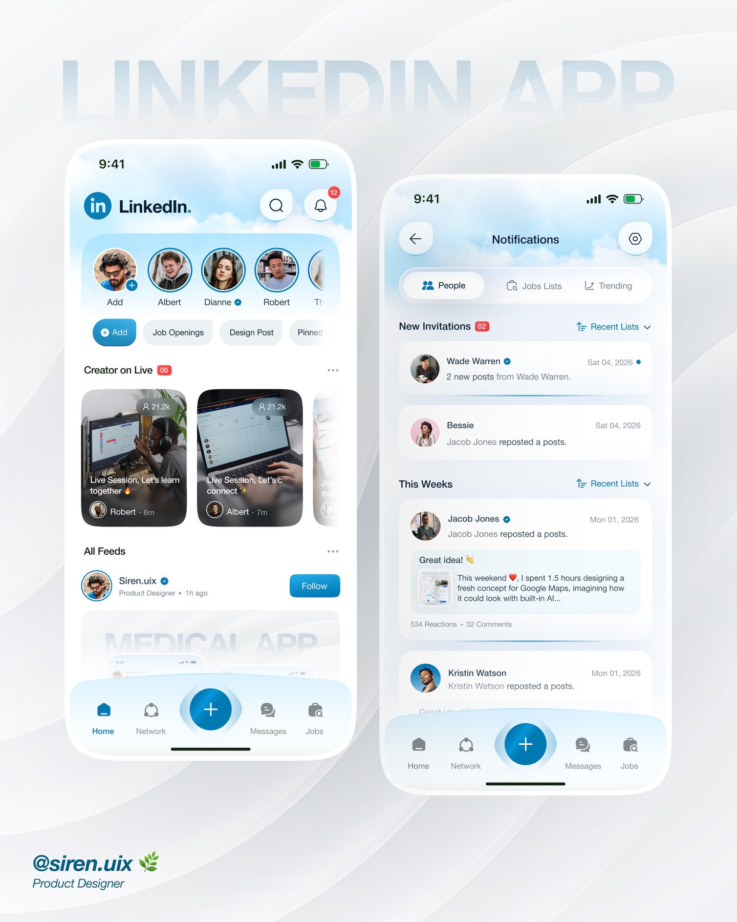
LinkedIn App Redesign Case Study: 5 UX Decisions for a Clearer Professional Network
A visual LinkedIn app redesign becomes a useful UX case study when it connects navigation, alerts, discovery, and follow-through. Here are five ways to critique the flow.
4 min read · Oct 19, 2026