
Tutor Booking App UX: 5 Screens That Make a Language Lesson Easier to Book
A booking flow is a sequence of decisions
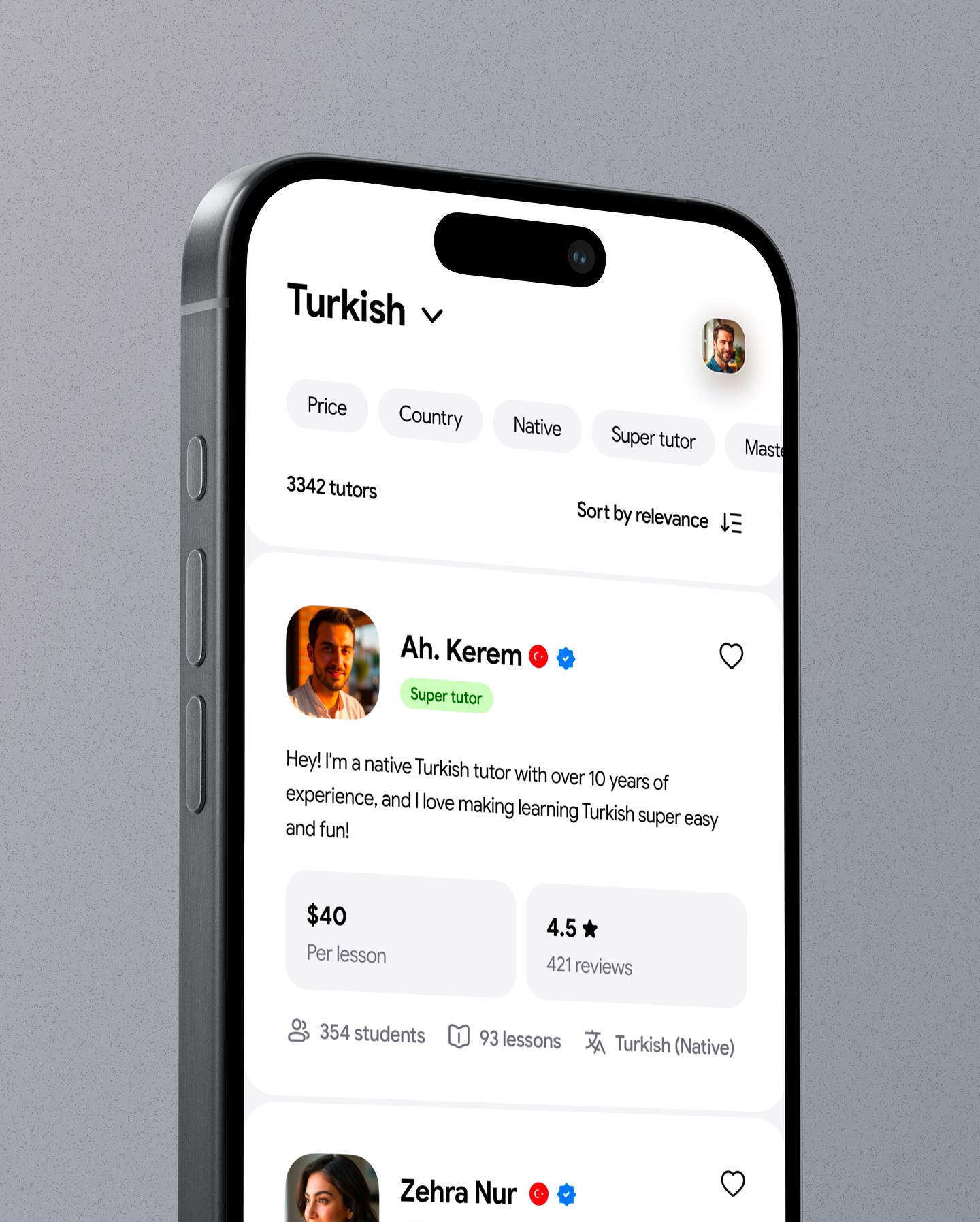
Finding a language tutor is not one decision. A learner has to describe what they want, compare people who may help, choose a format and time, and understand what they are paying for. The screens in this concept by @uimrhraju make that journey visible, from a Turkish tutor listing through goal selection, scheduling, and a payment confirmation.

This is a visual design concept, not a verified product or a report of user testing. Its value is as a compact example of how a tutor booking app UX can keep the next decision clear. Below, we will examine five stages and the design choices that can reduce uncertainty without hiding important information.
1. Let the learner name the goal
The goal screen offers options such as learning Turkish for work, improving speaking, starting a new language, preparing for an exam, or choosing another goal. That small prompt gives the product useful context and helps the learner recognize their own reason for booking.

The best goal question is easy to answer and does not assume every learner fits a preset. Keep an “Other” route, allow users to revise their answer later, and avoid turning onboarding into a long questionnaire. If the answer changes tutor recommendations, explain that connection. If it only personalizes a headline, do not make it feel mandatory.
2. Make tutor comparison scannable
The profile list brings several useful signals into one view: language, tutor description, price per lesson, reviews, number of students or lessons, and a visible “super tutor” label. This helps people compare without opening every profile. The design challenge is to show enough evidence without making the list feel like a dense spreadsheet.

A strong card should distinguish the signals that matter most to the choice. Price and availability are practical filters. Reviews and experience are trust signals, but labels should be explained and supported by a transparent policy. Avoid presenting a badge as a guarantee of learning results. Add a clear way to sort or filter when the number of tutors grows, and preserve those controls when the learner returns from a profile.
3. Put profile details where they answer questions
A tutor profile expands the compact card into a fuller picture: a short introduction, languages, qualifications or badges, reviews, and an action to book a lesson. The learner should be able to answer, “Is this person a fit for my goal?” without hunting through unrelated content.
The screen also hints at confidence-building details such as a trial session, refund language, or popularity. These can reduce hesitation, but they need precise wording. If “100% refundable” has conditions, make those conditions available before payment. If popularity is based on recent bookings, explain the timeframe. Trust comes from making the terms understandable, not simply adding more reassurance labels.

4. Schedule around the learner's real life
The booking screen asks for session language, fluency, duration, and a date. It also distinguishes starting now from scheduling later. That is a meaningful choice because a person preparing for an exam may want a specific date, while someone casually exploring may prefer a trial soon.
Keep scheduling controls connected. If the chosen tutor is unavailable for a selected time, explain why and show the closest alternatives without erasing the learner's previous choices. Make the timezone clear, especially for online sessions. If a trial and a standard lesson have different durations or prices, display the difference before the user commits.
5. Confirm the price and the booking outcome
The payment screen summarizes the tutor, language, duration, date, time, and price, then presents payment methods such as Apple Pay or Klarna. The confirmation message repeats who the session is with and when it happens. This repetition is useful: after payment, the user should not have to wonder whether the booking succeeded.

Before the final action, show the total amount, any discount, cancellation terms, and whether the payment is for one lesson or a package. Distinguish “booked” from “requested” if the tutor must still approve the appointment. After confirmation, offer a clear next step, such as adding the session to a calendar or messaging the tutor. A reliable receipt should also be available if the user closes the screen.
What to borrow for your own product
The transferable pattern is a staged decision flow: capture the goal, compare options, reveal relevant detail, choose a time, and confirm the transaction. Each step should answer one primary question while carrying forward the selections already made. That creates momentum without forcing a rushed decision.
Use this five-part review on your next booking flow: Can someone state their goal? Can they compare options on consistent criteria? Are claims and terms transparent? Can they choose a time with timezone context? Does the final summary clearly state what happens next? A clickable prototype and a few short usability sessions can expose confusing labels or missing states before implementation.
Artist credit: Visual concept by @uimrhraju, shared by Daily Webdesign.
View the original Instagram carousel.
Related on NewForm
Keep reading
Find Your Stack
Discover the perfect design tools for your workflow.
Take the 60-second quizNewForm Studio
Turn your designs into professional mockups instantly.
Open StudioMore from NewForm

15 UX Portfolio Examples That Get Designers Hired (And What Each One Does Right)
Fifteen real UX portfolio examples from working designers, the one lesson each teaches, a structure checklist, and how to build yours in a weekend.
11 min read · Nov 1, 2026

How to Choose UI Fonts by Mood: A Practical Pairing Method
Turn mood words like elegant, bold, and editorial into a practical type pairing, then test it on real interface content.
4 min read · Oct 21, 2026