
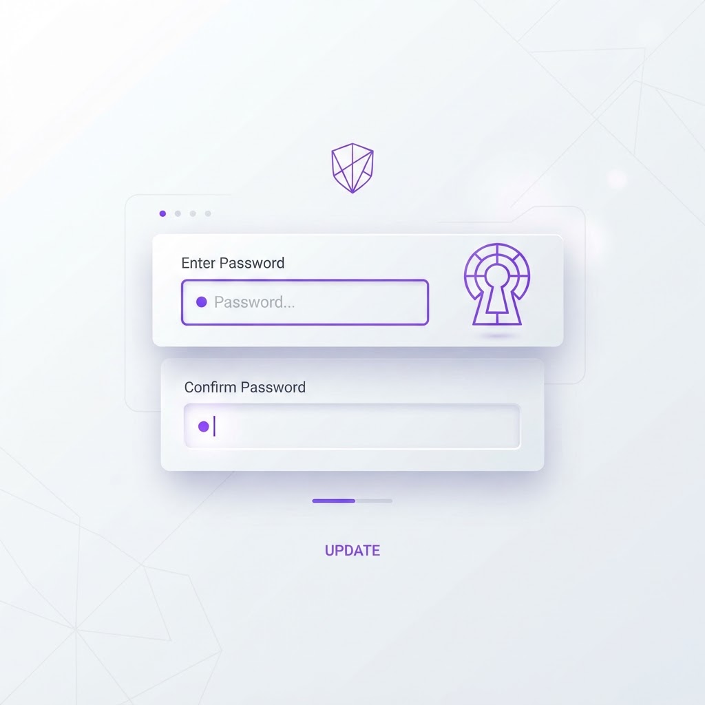
Password Forms Screen Redesign: Before and After UX Analysis
Originally shared as a carousel on @dailywebdesign, original carousel by @ui.abraham.
Password Forms Screen Redesign: Before and After UX Analysis
Password forms are one of the most friction-filled moments in any app. Get the design wrong, and users abandon the flow. Get it right, and they barely notice it happened. This redesign by Abraham John (@ui.abraham) shows exactly how a few targeted changes can transform a forgettable form into a confidence-inspiring interaction.
The Before: Functional But Forgettable

The original screen is straightforward: a header that says "Set your password," a single input field with a visibility toggle, a purple "Continue" button, and a "Forgot password?" link below. It works. Users can type a password and move on. But it misses several opportunities to reduce friction and build confidence.
What's missing:
- No password strength indicator
- No real-time validation
- No guidance on what makes a strong password
- No visual reinforcement of security
- The header is generic and doesn't reassure the user
The After: Guided, Confident, and Clear

The redesigned version addresses every gap:
-
A padlock icon at the top, immediately signals security and sets a different emotional tone. The orange color adds warmth and draws attention without being alarming.
-
The header changed from "Set your password" to "Create a secure password", this subtle shift reframes the task from a chore to an active choice about security.
-
A password strength meter, shows a green bar labeled "Very Strong" the moment the user types. This provides instant feedback and gamifies the process of creating a good password.
-
A real-time validation checklist with four requirements:
- Minimum of 8 characters
- Lower and uppercase letters
- At least 1 number
- At least 1 symbol
Each item gets a green checkmark as the user satisfies it. This eliminates the guesswork and frustration of submitting a password only to be rejected.
What Makes This Redesign Work
The redesign succeeds because it shifts the form from reactive to proactive. Instead of waiting for the user to submit and then showing errors, it guides them in real time. This is the difference between:
- "Your password must contain at least one symbol" (error message after submission)
- A green checkmark appearing next to "At least 1 symbol" the moment they type one (real-time validation)
The second approach feels like guidance. The first feels like a gatekeeper.
Key Takeaways for Your Own Forms
- Use real-time validation, not post-submission errors. Show users what they need before they fail.
- Add visual security cues. A padlock icon or shield immediately sets the right tone.
- Reframe headers to be active, not passive. "Create a secure password" is more engaging than "Set your password."
- Gamify the process. A strength meter turns a boring task into a mini accomplishment.
- Keep the friction low. The redesigned form has the same number of fields, it just communicates better.
Tools to Build This Yourself
This redesign was built in Framer, which is excellent for high-fidelity form prototypes. If you want to create your own form designs and see them in realistic mockups, try the NewForm Studio, it turns your designs into professional mockups instantly.
Want to discover more tools for your design workflow? Take the 60-second quiz to find your perfect stack.
Credit: Original carousel by @ui.abraham, follow them for more design content.
Find Your Stack
Discover the perfect design tools for your workflow.
Take the 60-second quizNewForm Studio
Turn your designs into professional mockups instantly.
Open StudioMore from NewForm

Top Dashboard UI Designs to Learn From (2026 Showcase)
Five standout dashboard designs across SaaS, AI, cybersecurity, energy, and fintech. Each one shows how to turn complex data into a clean, usable interface.
7 min read · Sep 24, 2026

10 UI Design Ideas to Steal for Your Next Project (2026)
Ten practical UI design patterns worth borrowing for your next project, from clear empty states to premium dark mode and compact data displays.
6 min read · Sep 24, 2026