
How to Design Product Packaging: A Practical 4-Style Concept Guide
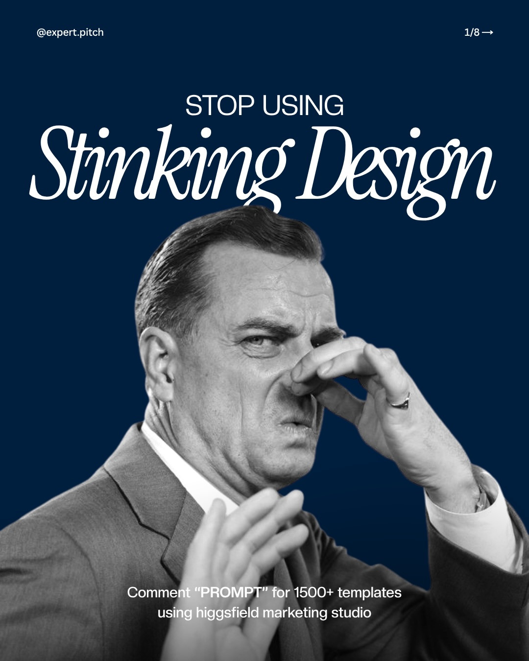
A product package has a tiny window to say what it is and why it belongs in someone’s hand. In the carousel from @expert.pitch, seven packaging concepts show how dramatically that first impression changes when typography, color, and illustration shift. Rather than treating them as a gallery of styles, use them as a practical exercise: build one clear product story, choose a visual direction that supports it, then test that direction on the object itself.

Start with the product, not the template
Many designers begin by browsing mockups or templates. That reverses the useful order. First decide what the product should communicate. A sparkling drink might need to feel crisp and straightforward; a pantry staple could lean warm and handmade; a skincare oil might call for a quieter, more considered mood. The opening slide’s warning about relying on thousands of templates points to the underlying issue: a template can supply a layout, but it cannot make the brand’s choices for you.
Use the following process to turn a direction into a package concept.
1. Build one clear product story before choosing a style
Start with a single sentence: what is the product, who is it for, and what should it feel like? A sparkling water can promise crispness; a chili oil might signal heat and craft; facial oil can suggest care and calm. This sentence is the filter for every later decision. If a typeface, color, illustration, or flourish does not reinforce that promise, remove it. The carousel makes the contrast visible: the same broad packaging category can feel quiet, bold, nostalgic, or handmade depending on the visual system.

2. Use typography to set the shelf-reading order
A package is read at a glance, not like a page. Decide the order of information before styling it: brand or product name first, product type or flavor next, and supporting details after that. Give the first line the strongest size or weight, then create a deliberate step down. Figma’s typography guide describes hierarchy as a way to direct attention through size, weight, and type choices. On a label, that hierarchy needs to survive at thumbnail size as well as close up. Test a small crop of the front panel. If the product name disappears, simplify.

3. Choose a visual language, then keep it coherent
The examples suggest four useful directions, not four templates to copy. A brutalist treatment can use blunt lettering, hard contrast, and little ornament. A minimal direction can rely on whitespace, restrained color, and precise alignment. Retro styling can use period cues such as display lettering and warm color, but one or two cues are stronger than a pile of nostalgic decoration. Hand-drawn illustration can make a product feel personal, provided the drawing style, type, and palette belong together. Pick one direction that fits the product sentence, then carry its rules across every face of the package.

4. Make the color do a job
Color is not a finishing coat. Assign each color a role: primary brand field, supporting accent, and neutral for breathing room or information. Check contrast between the product name and its background, especially on narrow cans or curved containers. A limited palette often makes the package more recognizable and gives typography room to work. If you use a vivid accent, reserve it for an intentional signal such as flavor or a key illustration detail instead of scattering it everywhere.

5. Mock up the physical context before polishing
A flat label can look balanced while failing on a can, jar, pouch, or bottle. Check how the composition wraps, where seams or folds interrupt it, and what remains visible when the object is turned slightly. Build a simple front view first, then test a three-quarter view and a small thumbnail. Keep the product name readable in all three. For a design presentation, show one clean hero angle and one close crop that proves the details are real. NewForm’s Mockup Studio can help present a finished concept in context.

6. Finish with a practical pass
Before calling the concept done, check four things: the product is identifiable at a glance; the type hierarchy survives at small size; the color and illustration support the intended tone; and the layout still reads when wrapped around the object. Then compare the result against the original one-sentence product story. This turns a moodboard exercise into a repeatable packaging-design method.

A quick packaging design checklist
Before you export a presentation, ask: Can someone name the product from a small image? Does the package communicate one clear personality rather than several competing ones? Are the type, color, and illustration working as one system? Does the design still read when curved, cropped, or viewed at an angle? If one answer is no, return to the product sentence and remove the choices that do not support it.
The point is not to avoid references or templates altogether. It is to make the decisive choices yourself, then use mockups to test them. A consistent visual idea will do more for recognition than a more elaborate label.
Design credit: @expert.pitch. View the original Instagram carousel.
Exploring a finished presentation? Try NewForm Mockup Studio.
Related on NewForm
Keep reading

Find Your Stack
Discover the perfect design tools for your workflow.
Take the 60-second quizNewForm Studio
Turn your designs into professional mockups instantly.
Open StudioMore from NewForm
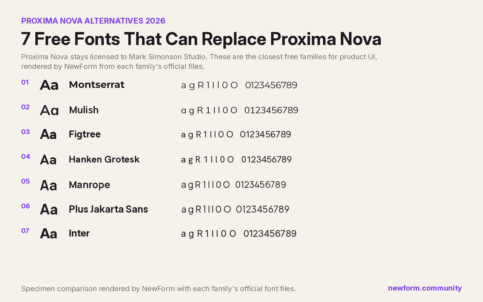
7 Free Fonts Similar to Proxima Nova (Real Specimens, 2026)
Proxima Nova is a licence you have to buy and it sets wider than you expect. These 7 free families, rendered from their official files, do the same job: Montserrat, Inter, Mulish, Hanken Grotesk, Figtree, Plus Jakarta Sans, Manrope.
13 min read · Nov 4, 2026

6 Free Fonts Similar to Futura (Real Specimens, 2026)
Futura is licensed and awkward at small sizes. These 6 free geometric sans, rendered from their official files, do the same job: Jost, Poppins, Outfit, Urbanist, Josefin Sans, Questrial.
13 min read · Nov 3, 2026