
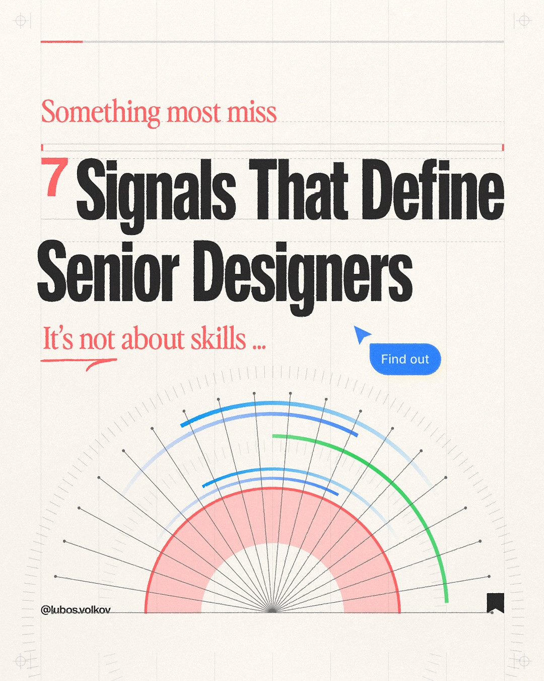
7 Senior Product Designer Skills That Turn Good Screens Into Better Products
The difference is in the decisions
A polished interface can still solve the wrong problem. The strongest senior product designer skills show up before a screen is finished: in the questions a designer asks, the evidence they use, and the tradeoffs they make with a team. This guide turns seven signals from a carousel by Lubos Volkov into practical behaviors you can apply to your next product project.

Seniority is not a title or a visual style. It is the ability to connect user needs, business goals, and implementation constraints without losing sight of the person using the product. The examples below are a useful self-review, whether you are moving from junior to mid-level or trying to make your current work more influential.
1. Ask better questions before opening the design file
A less experienced workflow can jump straight from a request to a mockup. A more effective one checks what the request is trying to change. Who experiences the problem? What do they currently do instead? How often does it happen? What evidence would tell us that a new design helped?


Try writing a one-sentence problem statement before sketching: “People who ___ need a way to ___ because ___.” Then list assumptions separately from evidence. If the team cannot agree on the user, context, or desired outcome, the next useful design step may be a conversation or a small research check, not another screen.
2. Design for impact, not applause
Visual craft matters, but it is not the only measure of good product work. A design can improve comprehension, completion, trust, retention, or the speed at which someone finds what they need. Choose one outcome that matches the problem, then decide how it could be observed.

For a checkout redesign, for example, the goal might be fewer abandoned purchases, but guardrails matter too. A higher conversion rate is not a win if support requests or mistaken orders rise sharply. A senior designer makes the intended benefit and possible costs visible to the team before launch.
3. Remove friction instead of adding features
When users struggle, the instinct is often to add another control, explanation, or setting. First look for steps that can be removed, choices that can be clarified, and terminology that can be simplified. A shorter path is only better when it preserves user control and required information.

Map the current flow and mark every step with a reason: required, reassurance, recovery, or legacy. If a step has no current purpose, test removing it. If two options mean nearly the same thing, combine them or explain the distinction in the user's language. Less interface is not a style goal. It is a way to lower the effort needed to finish a task.
4. Explain why a decision is right for this problem
Taste can help a designer notice a mismatch, but a team needs reasoning it can inspect. Instead of saying “this feels cleaner,” connect the choice to a user need, a content hierarchy, a design principle, or an observed behavior. A clear rationale also makes critique more useful because colleagues can challenge the assumption rather than the person.

A helpful format is: “We chose ___ because ___; we will check it by ___.” It can be concise. The point is to make the decision testable, not to defend every pixel. When evidence is weak, say so and propose the smallest experiment that could reduce uncertainty.
5. Think in systems, not isolated screens
A product is a set of connected states and patterns. A new screen may work on its own and still create inconsistent buttons, spacing, content rules, or error handling elsewhere. Before adding a component, check whether a pattern already exists and whether the new case exposes a gap in the system.

Document the rule, not just the appearance. For example, define when a confirmation appears, what actions it offers, and how it behaves on mobile. Systems thinking does not mean forcing every case into one component. It means making intentional choices so that exceptions are understood instead of accidental.
6. Anticipate problems before they become rework
A senior designer looks beyond the ideal path. What happens when a field is empty, a network request fails, a user changes their mind, or the content is much longer than the sample? These are not late-stage edge cases. They are part of the experience.

Use a quick state inventory: default, loading, success, empty, error, and permission or validation states. Review it with engineering early. The earlier a missing state is discovered, the easier it is to resolve without scrambling around a launch date. Prevention is often invisible, but users notice when the experience stays understandable under pressure.
7. Design for the people using the product
Designers can become attached to conventions, references, and their own preferences. Users are the final test. Watch someone attempt the task, look for hesitation and workarounds, and revise the interface around what they need to understand or do.

When testing is not possible, state the uncertainty rather than treating an internal opinion as proof. Use accessible language, preserve clear feedback, and make important actions distinguishable. The measure is not whether another designer recognizes the pattern. It is whether the intended user can move forward confidently.
Turn the signals into a weekly practice
Pick one active project and use these questions in the next critique: Is the problem clear? What outcome matters? What can be removed? Can the rationale be explained? Does the system cover all states? What might fail? What evidence reflects user behavior? Write down one gap and one next action. Small, repeated improvements build the judgment that people often call seniority.

The carousel also points readers to Product Design Skills, Articulating Design Decisions, and learning material from The Futur. For structured UX courses, see the Interaction Design Foundation. These resources are starting points, not substitutes for practicing with real constraints, critique, and feedback.
Artist credit: This article is adapted from a carousel by @lubosvolkov, shared by Daily Webdesign.
View the original Instagram carousel.
Related on NewForm
Keep reading

Find Your Stack
Discover the perfect design tools for your workflow.
Take the 60-second quizNewForm Studio
Turn your designs into professional mockups instantly.
Open StudioMore from NewForm

6 Free Fonts Similar to Futura (Real Specimens, 2026)
Futura is licensed and awkward at small sizes. These 6 free geometric sans, rendered from their official files, do the same job: Jost, Poppins, Outfit, Urbanist, Josefin Sans, Questrial.
13 min read · Nov 3, 2026

Bold Typographic Packaging: 4 Lessons From Standout Label Designs
Four real label designs, from LINEN sparkling water to DEWLO facial oil, teach hierarchy, color blocking, functional copy and quiet-color loud-type discipline.
4 min read · Nov 2, 2026