
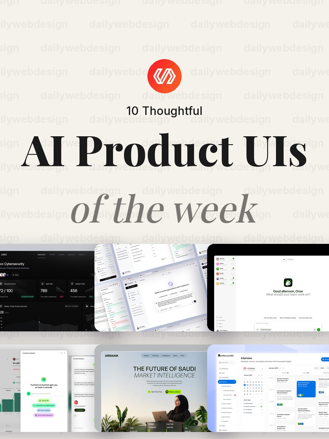
10 Thoughtful AI Product UI Designs to Learn From (October 2026)
AI is moving into products people already use for security, money, hiring, legal work, and everyday routines. That makes interface design less about adding a chat box and more about helping people understand what the system knows, what it recommends, and where their judgment still matters. These ten Dribbble concepts offer useful prompts for designing that balance.
1. Locc — AI Cybersecurity Dashboard UI Design by Dipa Inhouse
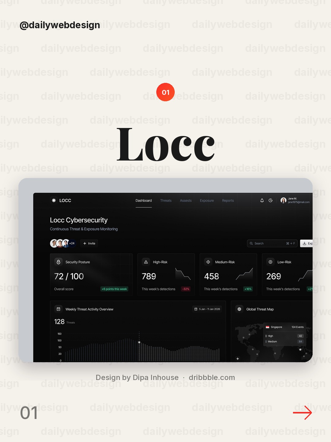
Design by Dipa Inhouse, via Dribbble
An AI cybersecurity dashboard has to make risk legible without turning every signal into an alarm. Study how the interface separates the immediate security question from the supporting evidence, then borrow that hierarchy for any product where trust matters.
2. Juristify AI - How to Turn AI Answers Into Trusted Decisions by Ofnav
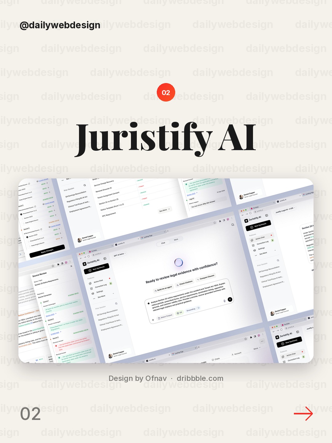
Legal AI is most useful when an answer can be checked, not merely generated. Look for ways to keep the source, uncertainty, and next decision close to the response so users can move from fluent output to a defensible action.
3. Alif - AI Agent WebApp by Silverslab
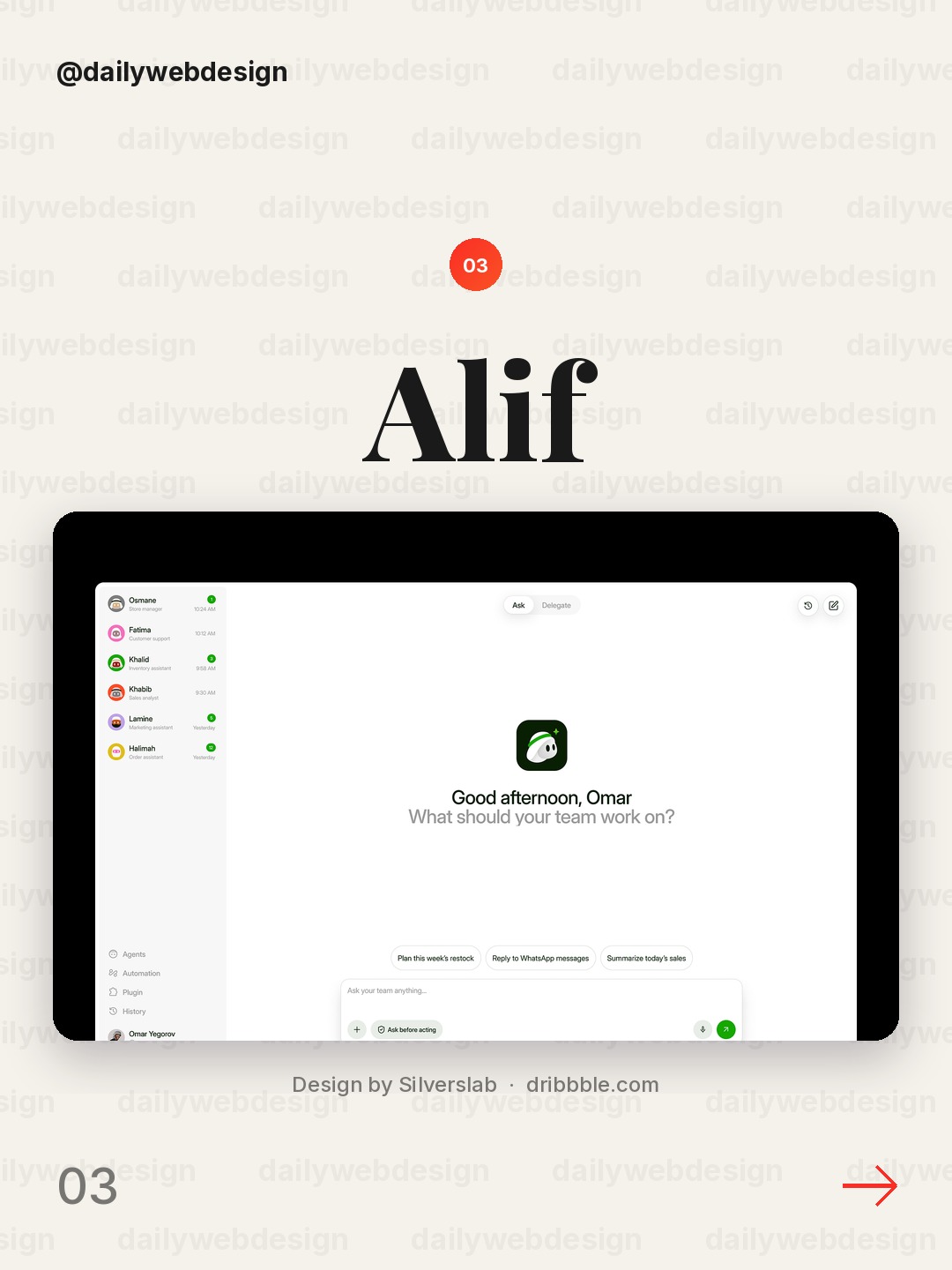
Design by Silverslab, via Dribbble
An agent web app asks users to delegate, then verify. Make the handoff visible: show what the agent is doing, what it has completed, and where the person can intervene instead of presenting automation as a black box.
4. AI Assistant for Finance by Alamin Hossen
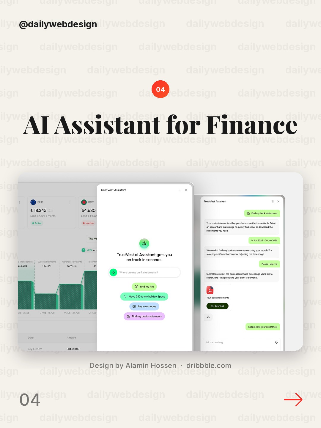
Design by Alamin Hossen, via Dribbble
Finance is a strong test for an AI assistant because a confident mistake has real consequences. Keep the user’s goal and relevant account context visible, and make the reasoning or assumptions inspectable before a recommendation becomes an action.
5. AI Finance Website by NexUX Lab
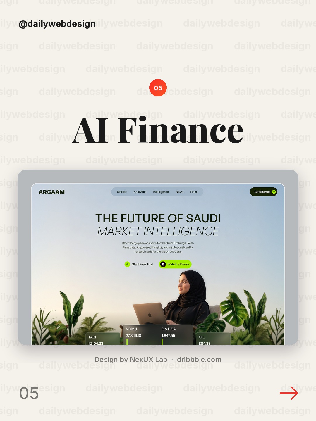
Design by NexUX Lab, via Dribbble
An AI finance site has to explain a new capability while earning confidence. Separate the promise from proof: demonstrate a concrete task, make the limits understandable, and keep the primary next step clear rather than layering on generic AI claims.
6. AI Recruitment Platform UIUX by Fahema Yesmin
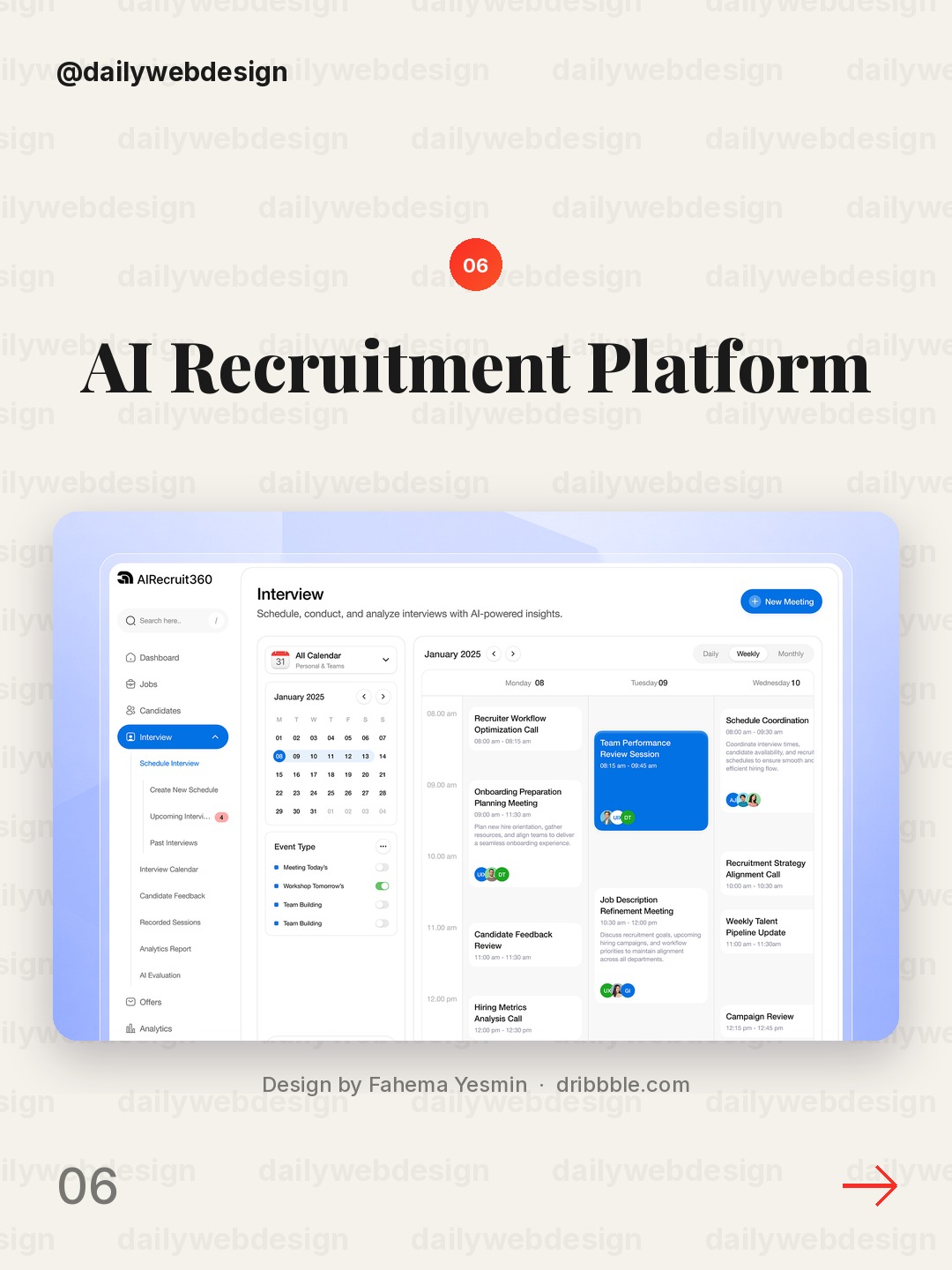
Design by Fahema Yesmin, via Dribbble
Recruitment tools handle decisions that affect people, so speed cannot be the only design objective. Make the status of each step clear, preserve human review, and expose the criteria behind recommendations instead of letting a score stand in for judgment.
7. Recruitment dashboard design by Awe Design Studio
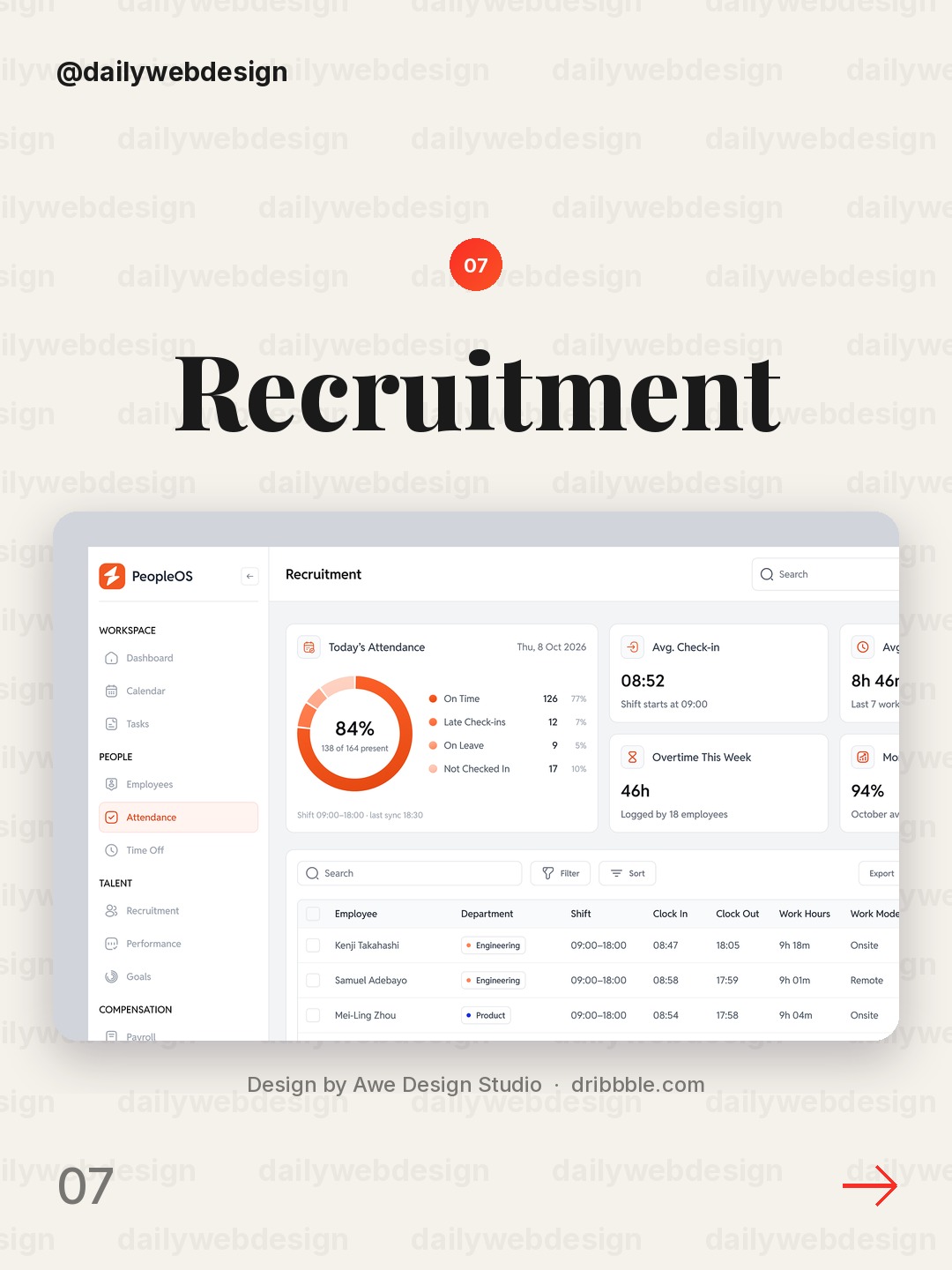
Design by Awe Design Studio, via Dribbble
A recruitment dashboard is a useful reminder that AI features often sit inside an existing operational workflow. Put the next actionable item first, but retain enough context for a recruiter to review and challenge a suggestion.
8. NeuroRoutine mobile app design by Uigeek Studio
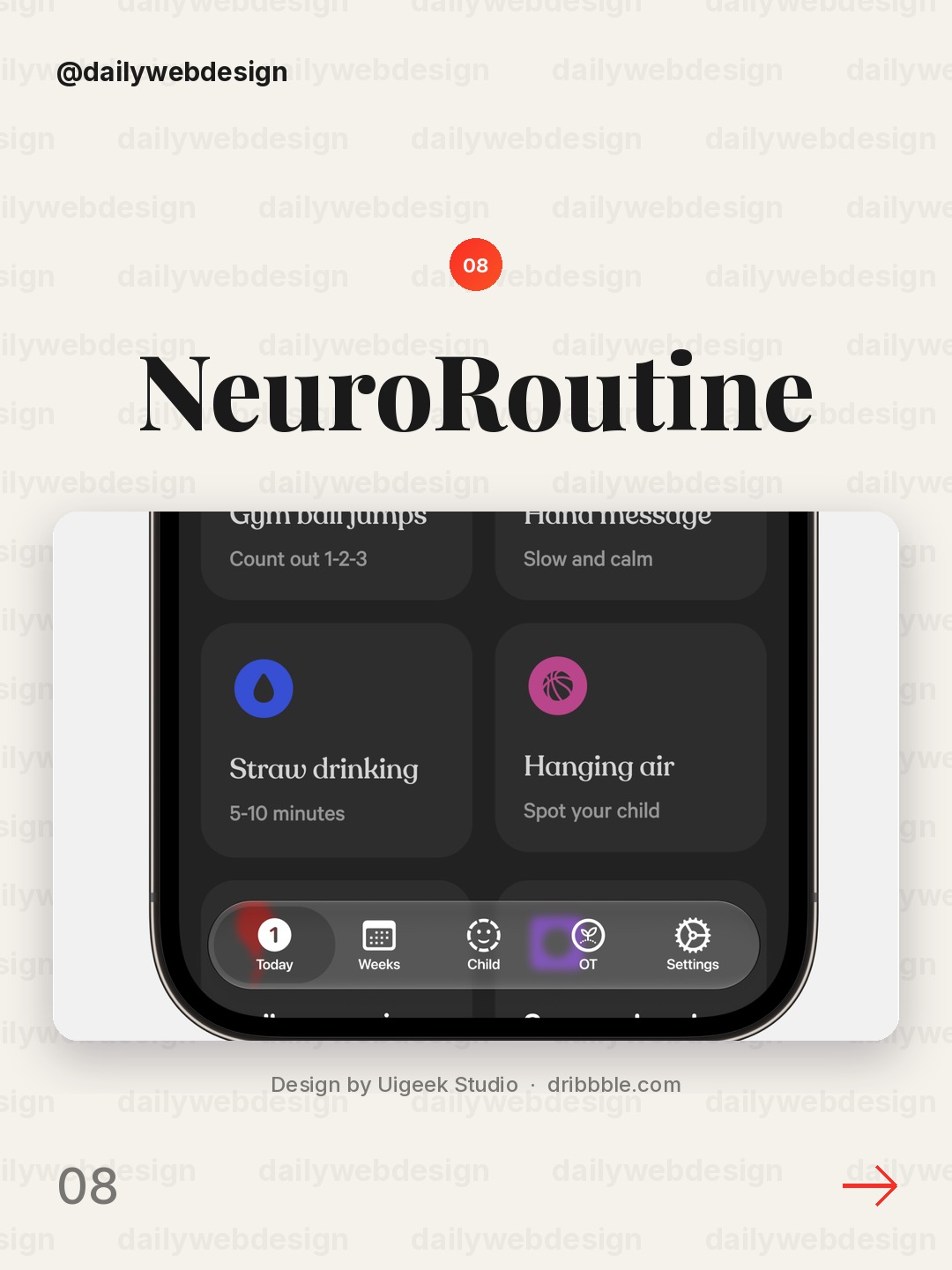
Design by Uigeek Studio, via Dribbble
A routine-building app succeeds through small, repeatable actions, not a dramatic AI reveal. Keep the recommendation connected to a manageable next step, and make progress understandable without making the user feel monitored.
9. Dashboard view by Never Before Seen
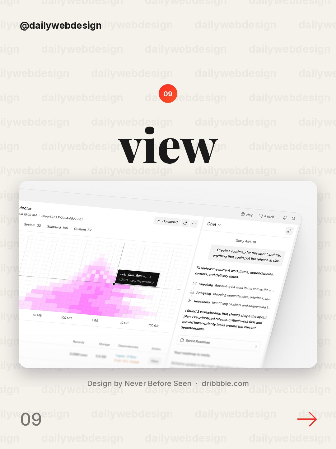
Design by Never Before Seen, via Dribbble
A generic dashboard is a useful constraint exercise: decide which single question the screen should answer first. Use that answer to establish hierarchy, and demote secondary information until it is needed.
10. Creator card search for UGC by Monty Hayton
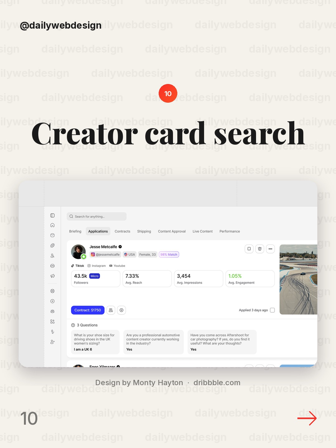
Design by Monty Hayton, via Dribbble
Creator search is fundamentally a matching problem. Let people compare candidates using meaningful signals and clear filters, while keeping the card itself scannable enough to support quick exploration.
What I would copy this week
First, put a visible human checkpoint before consequential AI actions. Second, show the evidence or context behind a recommendation right where it appears. Third, design one clear next step for the user instead of asking them to interpret a wall of output. Those three choices make AI feel useful without asking people to trust it blindly.
Want to put these ideas into practice? Explore the NewForm monthly challenges.
Related on NewForm
Keep reading
Which one is your favorite?
Pick the shot you would save. One vote per visitor.
Locc — AI Cybersecurity Dashboard UI Design
Design by Dipa InhouseJuristify AI - How to Turn AI Answers Into Trusted Decisions
Design by OfnavAlif - AI Agent WebApp
Design by SilverslabAI Assistant for Finance
Design by Alamin HossenAI Finance Website
Design by NexUX LabAI Recruitment Platform UIUX
Design by Fahema YesminRecruitment dashboard design
Design by Awe Design StudioNeuroRoutine mobile app design
Design by Uigeek StudioDashboard view
Design by Never Before SeenCreator card search for UGC
Design by Monty HaytonFind Your Stack
Discover the perfect design tools for your workflow.
Take the 60-second quizNewForm Studio
Turn your designs into professional mockups instantly.
Open StudioMore from NewForm
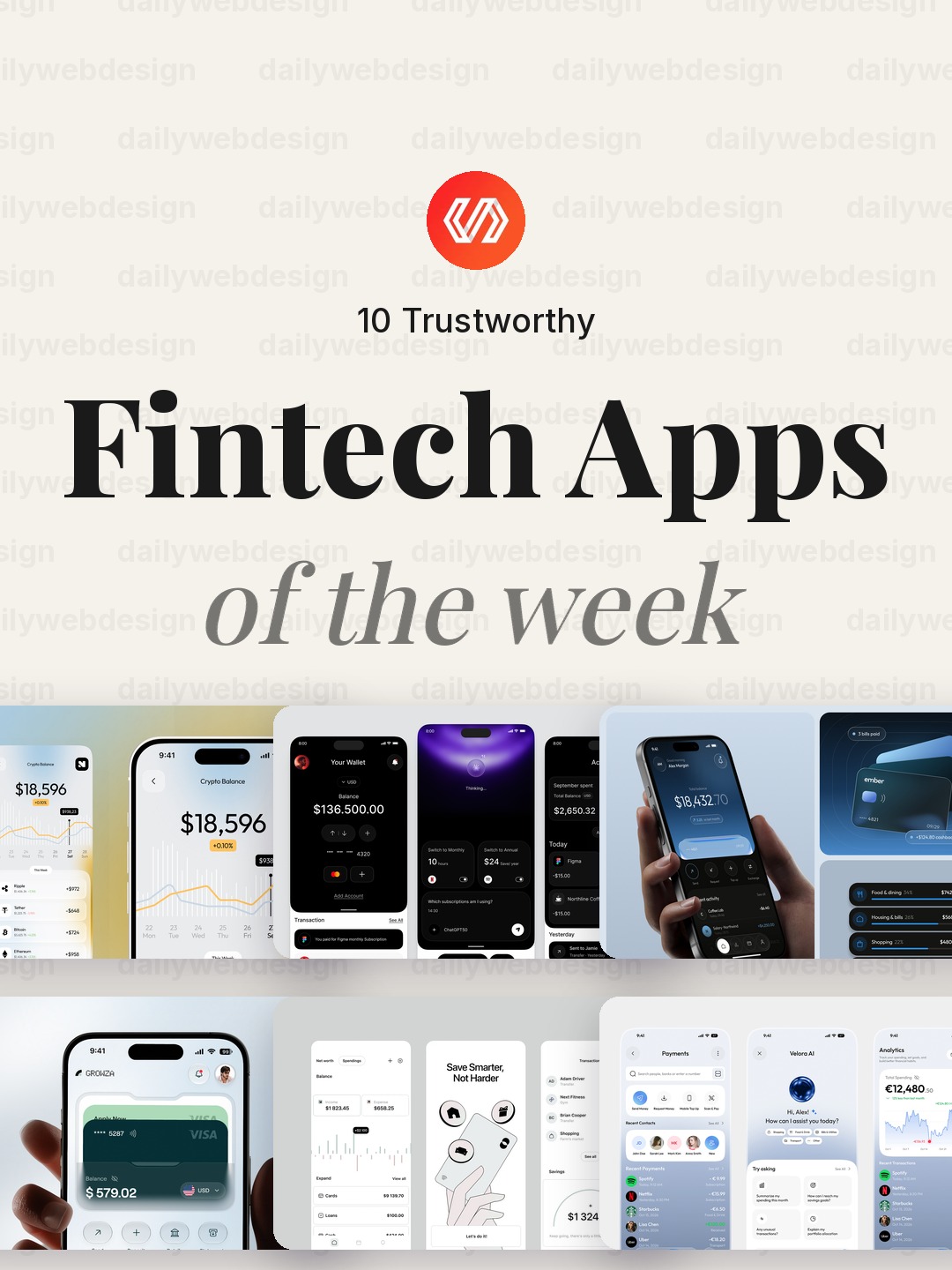
10 Trustworthy Fintech Apps Designs to Learn From (October 2026)
Ten fintech app designs cover banking, payments, personal finance, and investing, with practical interface patterns to borrow. Explore the full collection, designer credits, and cast your vote.
5 min read · Oct 30, 2026
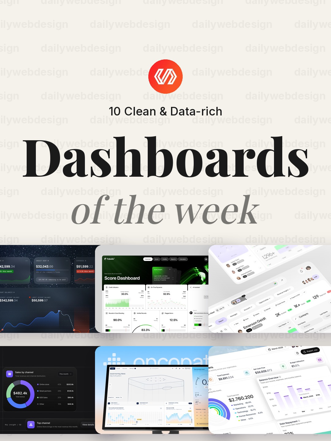
10 Clean Dashboard Designs to Learn From (October 2026)
Ten dashboard designs spanning finance, sales, healthcare, security, and monitoring, with practical interface patterns to borrow. Explore the full collection, designer credits, and cast your vote.
5 min read · Oct 29, 2026