
3 UI Color Palettes, and How to Turn Them Into a Usable Design System
Visual source and original design: @uiux.build.
A useful UI palette does more than make a screen look attractive. It helps users recognize what is interactive, understand what matters, and move through a product without visual friction. This carousel from @uiux.build offers three ready-made six-color directions. Here is how to turn those swatches into a practical interface palette, not just a row of hex codes.
Start with a palette that has a job
Before adding colors to a design file, write down the mood and task of the product. A finance dashboard may need confidence and legibility. A wellness app may benefit from softness. The palette should support the product's purpose rather than simply follow a trend. Each of these three sets makes a distinct starting point.
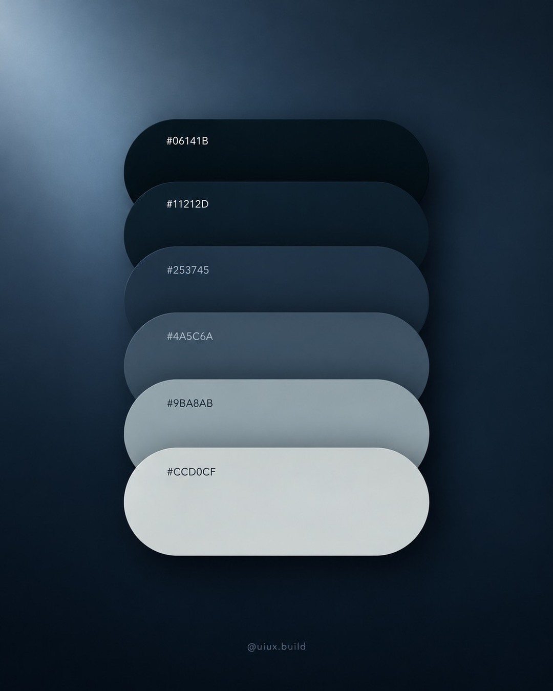
Image: @uiux.build, via Instagram carousel.
1. Deep blue-gray for focus and structure
The first set runs from near-black navy (#06141B) through dark blue-gray (#11212D, #253745), mid-tone slate (#4A5C6A), and lighter neutral tones (#9BA8AB and a pale gray). Use the darkest values for primary text, navigation, or a dark canvas. The middle shades work for cards, dividers, and secondary controls. Reserve the lightest values for surfaces and muted information. This works well for analytics, developer tools, and other interfaces that need to feel calm and precise.
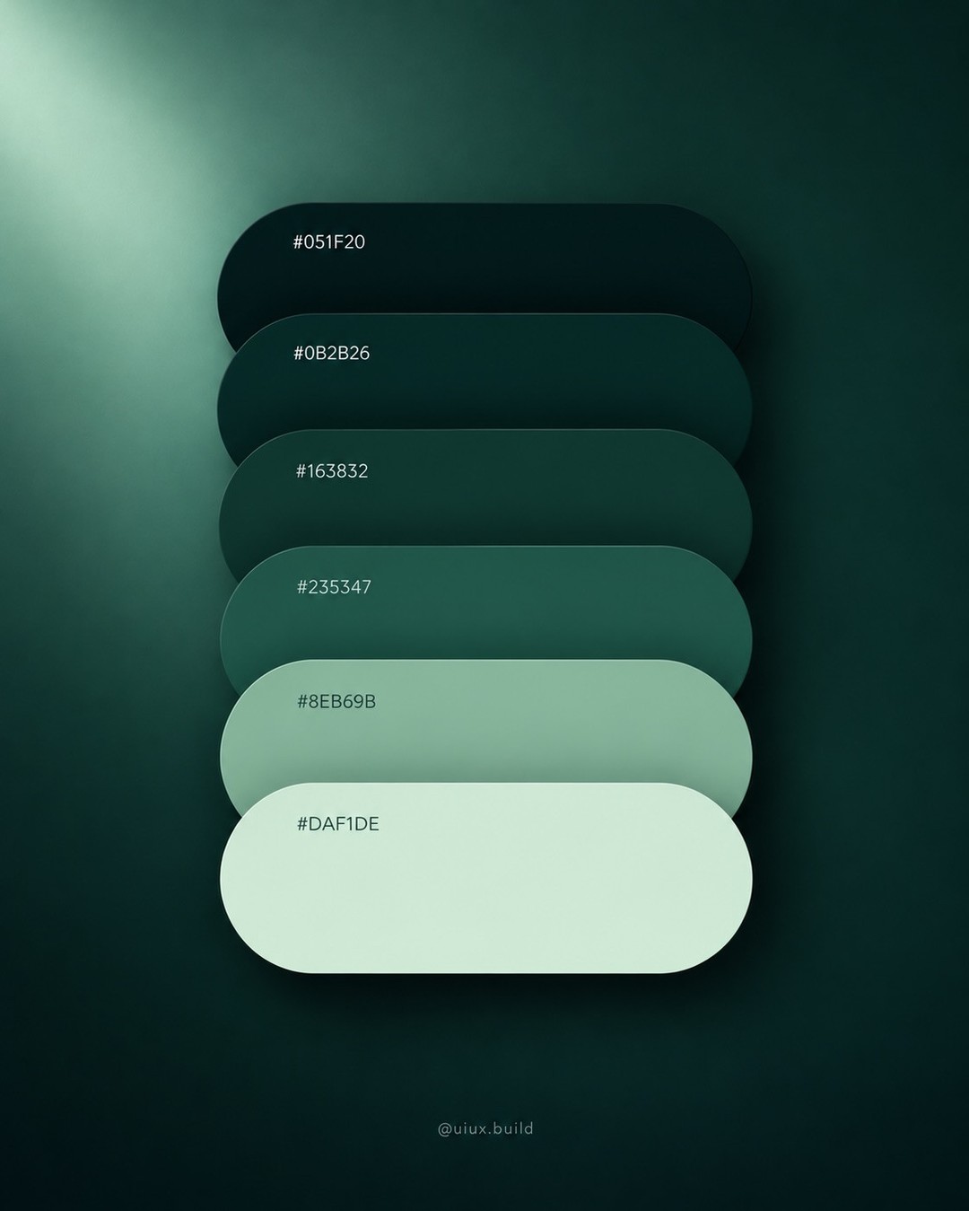
Image: @uiux.build, via Instagram carousel.
2. Forest green for grounded, natural products
The second palette moves from deep green-black (#051F20) through rich greens (#0B2B26, #163832, #235347), then opens into sage (#8EB69B) and a pale green tint. This range is useful for sustainability, food, health, or outdoor products, but it can also give a financial product a more human feel. Keep small text dark on pale surfaces. Use the lighter sage for selected states, charts, or supportive accents, not as the default color for long paragraphs.
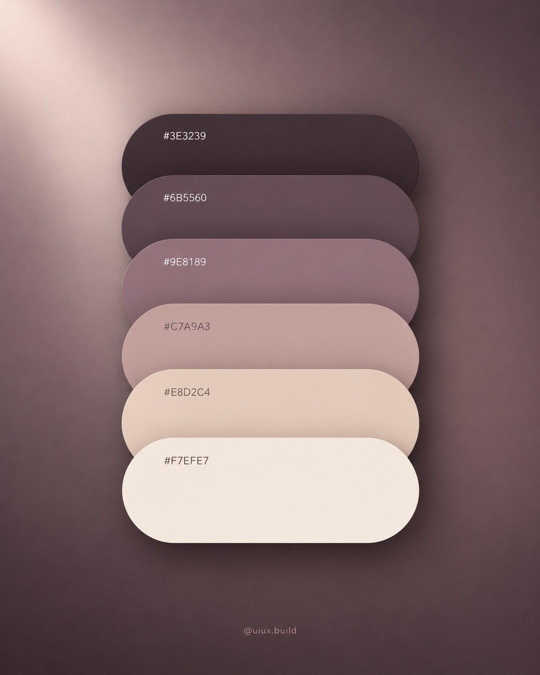
Image: @uiux.build, via Instagram carousel.
3. Warm mauve for editorial warmth
The third set blends charcoal plum (#3E3239), muted mauve (#6B5560, #9E8189), dusty rose (#C7A9A3), warm cream (#E8D2C4), and off-white (#F7EFE7). It is a natural fit for beauty, lifestyle, culture, and creator products. Use the plum for strong text and primary controls, the middle mauves for accents, and the cream as a quiet background. Avoid placing pale blush text on cream, because the subtle contrast can disappear on a phone.
Turn six swatches into interface roles
A palette becomes useful when every color has a role. Create a compact set of tokens: background, surface, primary text, secondary text, border, primary action, and accent. Then assign the six palette colors to those roles. You do not need six colors visible on every screen. Most interfaces should lean on a small neutral foundation and use stronger colors only where they communicate state or action.
A practical first pass is the familiar 60-30-10 balance: roughly 60 percent background and large surfaces, 30 percent supporting surfaces or secondary color, and 10 percent high-attention accents. Treat it as a starting ratio, not a law. The Nielsen Norman Group describes the approach as a useful way to keep color distribution balanced. In a dense dashboard, a large amount of neutral space can make a small accent feel more intentional.
Check contrast before polishing
Test each text and control pairing, not just the overall swatch combination. Body text needs dependable contrast against its surface. A bright accent can look excellent in a large button but fail when reduced to tiny chart labels. Check hover, focus, disabled, error, and success states too. Accessibility guidance from the W3C Web Content Accessibility Guidelines gives measurable contrast requirements, while tools such as the WebAIM Contrast Checker help evaluate specific foreground and background values.
Build a repeatable palette workflow
- Pick one palette based on product mood and audience.
- Define semantic roles before decorating components.
- Apply the colors to one representative screen, including a form and a data-heavy area.
- Check contrast for text, buttons, links, and status indicators.
- Remove colors that do not communicate a distinct role.
- Preview the screen at mobile size and in a dim environment.
The key is consistency. If the same shade means “primary action” on one screen and “warning” on another, users have to relearn the interface. A color system should make meaning predictable. For a deeper foundation, Material Design's color system explains how primary and secondary colors can extend into lighter and darker variants.
The takeaway
These three palettes are starting points, not finished systems. Choose one with intent, map its shades to clear interface roles, then validate contrast and state behavior on real components. The best palette is the one that helps people use the product, while still giving the brand a recognizable voice.
Visual source and original design: @uiux.build.
View the original Instagram carousel
Related on NewForm
Keep reading

Find Your Stack
Discover the perfect design tools for your workflow.
Take the 60-second quizNewForm Studio
Turn your designs into professional mockups instantly.
Open StudioMore from NewForm

6 Free Fonts Similar to Futura (Real Specimens, 2026)
Futura is licensed and awkward at small sizes. These 6 free geometric sans, rendered from their official files, do the same job: Jost, Poppins, Outfit, Urbanist, Josefin Sans, Questrial.
13 min read · Nov 3, 2026

Bold Typographic Packaging: 4 Lessons From Standout Label Designs
Four real label designs, from LINEN sparkling water to DEWLO facial oil, teach hierarchy, color blocking, functional copy and quiet-color loud-type discipline.
4 min read · Nov 2, 2026