
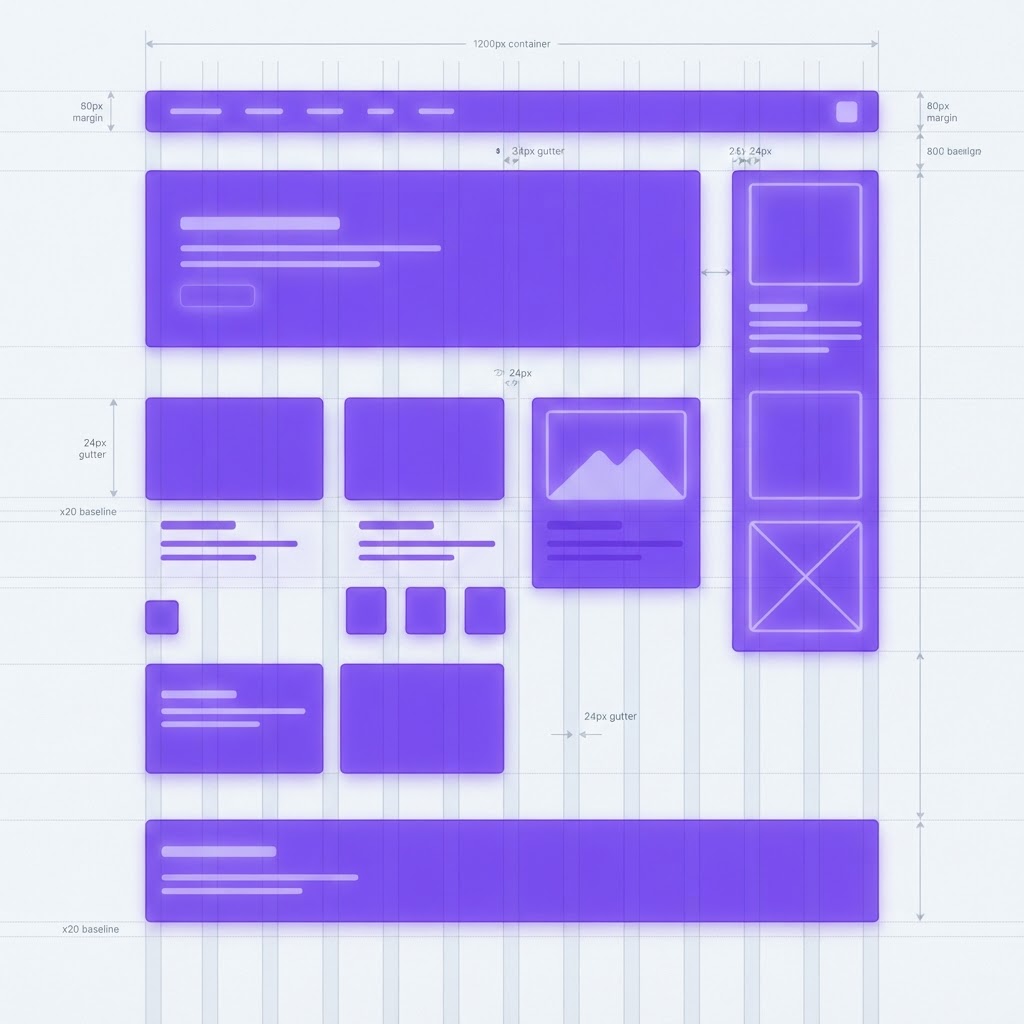
Website Grid Setup: The System Every Designer Should Master
Originally shared as a carousel on @dailywebdesign, original carousel by @sajon.co. Expanded with responsive grid breakpoints and Figma setup instructions.


The grid is the invisible backbone of every well-designed website. When it's working, users don't notice it, the layout just feels right. When it's wrong, everything feels slightly off: elements don't align, spacing is inconsistent, and the page looks amateur even when individual components are well-designed.
Here's how to set up a website grid that handles every viewport from mobile to widescreen.
Why the grid matters more than you think
A grid does three things that you can't achieve through intuition alone:
- Consistency, elements across different sections align because they share reference points
- Rhythm, spacing between elements follows a pattern that feels natural to read
- Responsiveness, a grid-based layout collapses predictably across screen sizes
The 12-column grid: why 12?
The 12-column grid is the web standard because 12 divides evenly by 2, 3, 4, and 6:
- Full width: 12 columns, hero sections, full-bleed images
- Half and half: 6 + 6, two-column features
- Two-thirds / one-third: 8 + 4, content with sidebar
- Thirds: 4 + 4 + 4, three-card feature rows
- Quarters: 3 + 3 + 3 + 3, four-up grids
Setting up your grid in Figma
Desktop (1440px frame)
- Columns: 12 | Gutter: 24px | Margin: 80px
Tablet (768px frame)
- Columns: 8 | Gutter: 16px | Margin: 32px
Mobile (375px frame)
- Columns: 4 | Gutter: 16px | Margin: 16px
In Figma: Frame selected → Design panel → Layout Grid → + → switch from Grid to Columns.
The baseline grid: spacing that breathes
Beyond columns, use an 8px baseline grid for vertical rhythm:
- Line heights: 16px, 24px, 32px, 40px
- Vertical spacing between sections: 48px, 64px, 80px, 96px, 128px
- Component internal padding: 8px, 16px, 24px, 32px
Everything is a multiple of 8. When you zoom out to look at the whole page, the vertical rhythm feels intentional.
Content max-width: don't let your text go edge-to-edge
On large monitors, full-width text becomes unreadable. Apply a max-width to your content:
- Article body text: max-width 680–760px
- General content container: max-width 1200–1280px
- Hero sections: max-width 1440px (full bleed)
Common grid mistakes to avoid
Breaking the grid inconsistently. Intentional breaks (a full-bleed image) create drama. Accidental breaks (an element 2px off the column edge) just look messy.
Using different grids on different pages. Your grid should be a consistent system across the entire site.
Not designing for mobile first. Start with your 4-column mobile grid and scale up.
Presenting grid-based designs professionally
Once your layout is set, present it with device mockups using NewForm Studio, upload your design and wrap it in a laptop or mobile frame instantly.
For deeper learning on layout systems, Interaction Design Foundation offers structured courses that cover grids, visual hierarchy, and layout theory.
View the full carousel on Instagram →
Credit: Original carousel by @sajon.co, follow them for more web design and layout content.
Find Your Stack
Discover the perfect design tools for your workflow.
Take the 60-second quizNewForm Studio
Turn your designs into professional mockups instantly.
Open StudioMore from NewForm

Master Your Workflow: Design Smarter, Not Harder in 2026
Discover how the latest design tools and efficient workflows can help you create professional, high-impact visuals without the burnout. Elevate your creative output today.
3 min read · Oct 3, 2026

Before and After UI Redesign: What Actually Changes When You Level Up a Design
A before and after UI redesign reveals the difference between decent and great design. Here is what changes and the principles that drive the improvement.
5 min read · Oct 3, 2026