
Website Typography Sizes: A Practical Guide for Better UI Design
Typography is not decoration added after a website is designed. It is the system that determines whether a page feels calm or chaotic, premium or improvised, effortless or difficult to read. A useful typography scale gives every piece of content a role, creates rhythm between sections, and helps visitors understand what matters first.
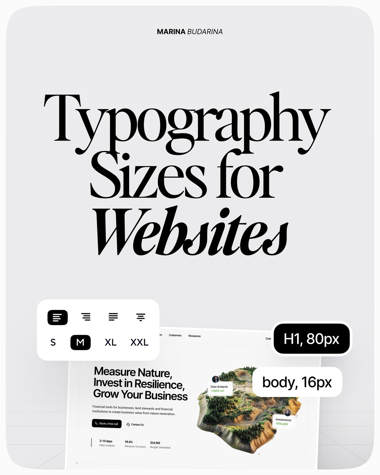
The visual guide by @marina_uiux offers a practical starting point for choosing website type sizes. Below is a web-ready interpretation of the guide, with the original slides included so you can save the reference and apply it to your next landing page or product interface.

Start with a simple type scale
For desktop websites, the guide recommends a clear hierarchy: an H1 around 80px, an H2 around 56px, an H3 around 32px, and body text around 16px. These values are not laws. They are anchors that make a design system easier to build and keep consistent.
An 80px H1 works well for a short, high-impact hero statement. It gives the primary message enough presence to compete with imagery and whitespace. A 56px H2 creates a visible step down for major sections, while a 32px H3 is large enough to introduce a supporting idea without confusing it with the page’s main promise. Body text at 16px remains familiar and comfortable for everyday reading.

The most important part is the relationship between sizes. If every heading is oversized, nothing feels important. If the steps are too close together, visitors lose the structure of the page. Define the hierarchy once, then reuse it across navigation, hero copy, feature sections, testimonials, and calls to action.
Design responsive typography deliberately
A desktop scale should not simply shrink by the same percentage on every screen. The guide’s responsive examples keep some levels stable while reducing the sizes that would otherwise overwhelm a mobile layout: H1 moves from 80px to 64px to 44px across desktop, tablet, and mobile; H2 moves from 56px to 56px to 32px; and H3 moves from 32px to 32px to 28px. H4 moves from 20px to 20px to 18px, while large body text moves from 18px to 18px to 16px.

This approach protects hierarchy while preserving space. On a phone, a 44px hero heading can still feel confident without forcing awkward line breaks. Meanwhile, keeping smaller sizes stable avoids making secondary content too tiny to read. Test real headlines at each breakpoint rather than relying only on a scale token: the number of words, font family, and available width all affect the result.
Use weight to clarify, not shout
Type size is only one part of hierarchy. The guide suggests regular or medium weights for 16–20px body text, semibold or bold for body accents, and semibold or bold for headings above 24px. This creates emphasis without requiring every important phrase to become larger.

A good rule is to reserve the heaviest weight for the smallest number of decisions: the primary heading, a key metric, or the main action. If body copy is bold throughout, the page loses contrast and becomes tiring to scan. Check the actual font you selected, too. A “600” weight in one family may look closer to a “700” in another.
Set line-height for reading comfort
Line-height controls the vertical space between lines of text. For body copy between 16px and 20px, the guide recommends roughly 140% to 175%. Headings above 24px can use a tighter 100% to 120% range because large letters already create visual presence.

In practice, dense paragraph text usually benefits from more breathing room, while a two-line hero heading often looks stronger when its lines sit closer together. Adjust by eye after applying the percentage; ascenders, descenders, x-height, and the language of the copy all change how a setting feels.
Keep paragraphs within a readable measure
The guide recommends a body-text line length of 50–60 characters per line. This measure is easy to overlook in wide desktop layouts, where a paragraph can stretch from edge to edge. Long lines make it harder for the eye to find the next line; very short lines create excessive vertical scrolling and distracting breaks.

Use a max-width on article and supporting copy columns instead of letting text fill the entire viewport. Then check the result with your real content, including links, numbers, and short headings. A comfortable measure is one of the simplest ways to make a landing page feel more considered.
Tune tracking with restraint
Tracking, or letter-spacing, changes the spacing between individual characters. The guide suggests approximately -2% for body text, -6% for headings, and 1% for all-caps text. These are subtle adjustments intended to create uniform spacing, not to make typography look compressed.

Treat tracking as a finishing control. Large headings often need slightly tighter spacing, while all-caps labels can need a little extra room to remain legible. Always test the setting in the actual font and size, because optical spacing varies widely between typefaces.
Turn the guide into a reusable system
The fastest way to use these recommendations is to convert them into tokens: text-display, text-h1, text-h2, text-h3, text-body, line-height-body, and tracking-heading. Add responsive values for each token, then use those tokens everywhere instead of adjusting individual text layers by hand.
Start with the guide’s numbers, preview them on a real page, and revise based on content density and brand personality. Consistency matters more than copying a specific pixel value. If you want to turn the finished designs into premium presentation visuals, try NewForm Mockup Studio.
Artist credit: Typography guide by @marina_uiux. View the original Instagram carousel for the complete visual reference.
,
Originally published from: @dailywebdesign on Instagram
Related on NewForm

FREE FIELD GUIDE
The 8-Prompt Product
Answer 24 questions, run 8 prompts, and walk away this afternoon with a working, beautiful MVP you would be proud to show.
See what's insideKeep reading

Find Your Stack
Discover the perfect design tools for your workflow.
Take the 60-second quizNewForm Studio
Turn your designs into professional mockups instantly.
Open StudioMore from NewForm
7 Free Fonts Similar to Proxima Nova (Real Specimens, 2026)
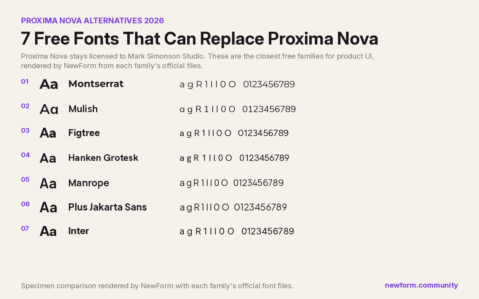
Proxima Nova is a licence you have to buy and it sets wider than you expect. These 7 free families, rendered from their official files, do the same job: Montserrat, Inter, Mulish, Hanken Grotesk, Figtree, Plus Jakarta Sans, Manrope.
13 min read · Nov 4, 2026

6 Free Fonts Similar to Futura (Real Specimens, 2026)
Futura is licensed and awkward at small sizes. These 6 free geometric sans, rendered from their official files, do the same job: Jost, Poppins, Outfit, Urbanist, Josefin Sans, Questrial.
13 min read · Nov 3, 2026