
Inter: the free UI sans-serif, explained
Inter is a free, open-source neo-grotesque sans-serif designed by Rasmus Andersson for screens. It ships in nine weights with italics plus a variable version, and covers a wide range of languages. Inter is available on Google Fonts under the SIL Open Font License, so commercial use, modification and self-hosting are all permitted.
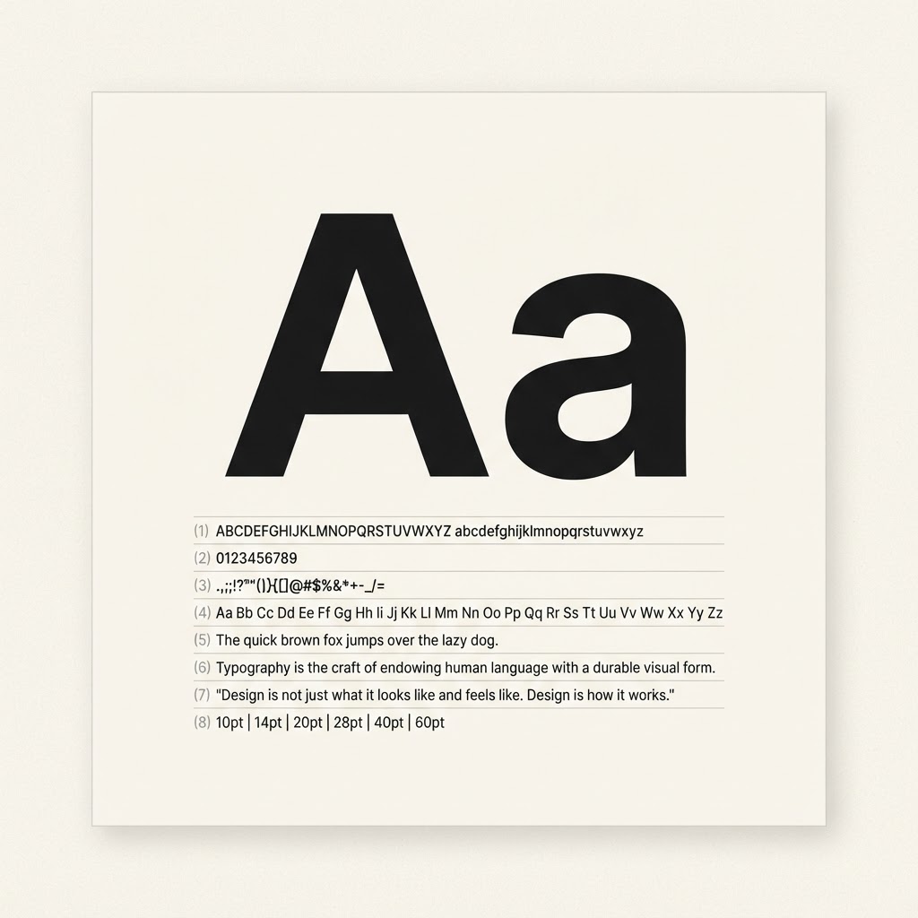
| Designer | Rasmus Andersson |
|---|---|
| Foundry | Independent open-source release (rsms.me) |
| Released | 2016, expanded through Inter 4.0 |
| Classification | Neo-grotesque sans-serif |
| Weights | 9 weights (Thin 100 to Black 900) plus italics |
| Variable font | Yes, with weight and optical size axes |
| License | SIL Open Font License 1.1 |
| Google Fonts | Yes |
| Language support | Latin, Greek, Cyrillic and more |
| Name | Best for | Free or paid | Note |
|---|---|---|---|
| Inter | Product UI, dashboards, documentation | Free (SIL OFL) | The default choice for dense interfaces; even spacing at small sizes. |
| Geist | Developer-tool marketing and product UI | Free (SIL OFL) | Wider and cooler than Inter, with a more technical voice. |
| IBM Plex Sans | Enterprise products and long documentation | Free (SIL OFL) | Warmer, more humanist curves that read well in long text. |
| Public Sans | Civic, neutral institutional interfaces | Free (SIL OFL) | Less geometric, plainer personality than Inter. |
| SF Pro | Native Apple apps | Free for Apple platforms only | Apple's system font; not licensed for general web embedding. |
Why Inter ended up in so many products
Inter was drawn for interfaces, not for print. Rasmus Andersson designed it while working on tools where small text had to stay legible on ordinary screens, and that constraint shaped everything: a tall x-height, open apertures, and spacing that holds together at 13 to 16 pixels.
It also arrived at the right moment. It is open source, it shipped with a variable font early, and it looks neutral enough to sit behind almost any brand. That combination made it the default for design systems, dashboards and documentation.
- Screens first. Tight vertical metrics and a large x-height keep small text readable.
- Nine weights. Thin through Black, with italics, so hierarchy rarely needs a second family.
- Variable font. One file covers every weight, which keeps page weight down.
- Open license. The SIL OFL lets you self-host, modify and ship it inside a product.
Inter vs Geist vs SF Pro
| Font | Feel | Best for | License |
|---|---|---|---|
| Inter | Neutral neo-grotesque, slightly condensed | Product UI, dashboards, docs | SIL OFL |
| Geist | Wider, cooler, technical | Developer-tool marketing | SIL OFL |
| SF Pro | Soft, humanist, Apple-tuned | Native iOS and macOS apps | Apple platforms only |
| IBM Plex Sans | Warmer, more humanist | Enterprise, long documentation | SIL OFL |
How to use Inter without the default-font look
- Tighten large headings. Inter is spaced for small text, so at 32px and up set letter-spacing to roughly -0.02em.
- Try the stylistic sets.
font-feature-settings: "cv11", "ss01"switches to a single-storey a and a more geometric feel. Test it before committing. - Keep body text at 16px or above with a line-height near 1.6.
- Set a real fallback stack so the layout does not jump while loading.
- Do not pair it with another grotesque. Use a serif or a mono for contrast instead.
Where to get it
Some links are affiliate links; NewForm may earn a commission at no cost to you.
- Google Fonts
Free download plus the embed code for Google Fonts.
- rsms.me/inter
The official release, with the variable font and every format.
- @fontsource/inter
Self-hosted files for React and other bundlers.
Copy the CSS
/* Inter variable font from Google Fonts */
@import url('https://fonts.googleapis.com/css2?family=Inter:wght@100..900&display=swap');

body {
  font-family: "Inter", ui-sans-serif, system-ui, -apple-system, "Segoe UI", sans-serif;
  font-feature-settings: "cv11", "ss01";
  letter-spacing: -0.011em;
}

h1, h2, h3 {
  letter-spacing: -0.02em;
}
Frequently asked questions
Is Inter free for commercial use?
Yes. Inter is released under the SIL Open Font License 1.1, which allows commercial use, modification, embedding in websites and apps, and self-hosting. You can ship it inside a paid product without paying a licence fee.
Who designed Inter?
Inter was designed by Rasmus Andersson, a designer and software engineer, and first released in 2016. It has continued as an independent open-source project rather than a commercial foundry release.
Is Inter good for long body text?
It is fine for interface copy and short to medium paragraphs. For long reading passages, many designers prefer a text face with more generous spacing or a serif, because Inter is tuned for compact UI rather than continuous reading.
Inter or Helvetica and Arial?
Inter is designed for screens, with a taller x-height, tighter vertical metrics and many more weights. Helvetica and Arial are system fonts with limited web licensing and fewer weights, so Inter is usually the safer choice for a modern product interface.
Does Inter support languages beyond English?
Yes. Inter covers the Latin script extensively, plus Greek and Cyrillic, and later versions add further language support. If you need Arabic, Hebrew or CJK scripts you will want a companion family.
Read next on the blog
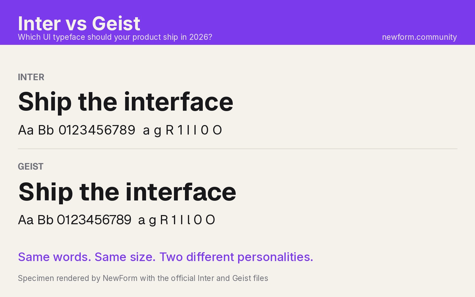
Inter vs Geist: Which UI Font Should You Ship in 2026?
Geist vs Inter is a closer fight than you think. Real rendered specimens, measured x-heights, line-box surprises, numerals and CSS stacks, and a clear verdict for each kind of product.
7 min read · Oct 24, 2026
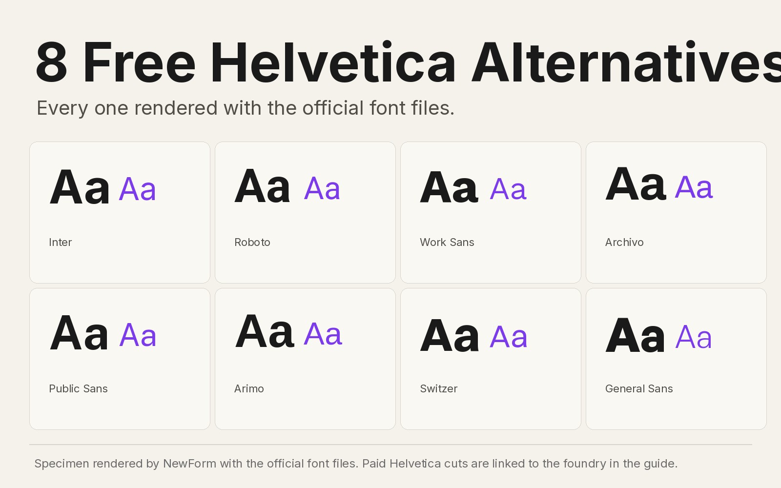
8 Free Helvetica Alternatives for UI Designers (2026 Edition)
Helvetica still costs money. These 8 free fonts genuinely substitute for it in UI work, with our own rendered specimens, CSS stacks and settings for each.
8 min read · Oct 22, 2026
How to Choose UI Fonts by Mood: A Practical Pairing Method
Turn mood words like elegant, bold, and editorial into a practical type pairing, then test it on real interface content.
4 min read · Oct 21, 2026
Font Sizes for Websites: The Complete 2026 px Guide for Every Element
Typography sizes for websites with exact px values: body text, headings H1 to H6, captions and buttons on mobile vs desktop, line heights, and a copy-paste clamp() CSS type scale.
10 min read · Oct 11, 2026
Build it with Base44
Describe the interface you want and Base44 builds the working app: real components, real data, ready to publish.
Start building with Base44