
Inter vs Geist: Which UI Font Should You Ship in 2026?
"Geist vs Inter" is the most common font question I get from developers shipping products, and it is a genuinely close fight: both are free, both are screen-first grotesques, and both were drawn for interfaces rather than print. I rendered both from their official files at identical settings so you can stop guessing. Here is the honest breakdown, with the measurements from the files themselves.
TL;DR: the verdict in 60 seconds
- They are 90 percent the same job. Same tall x-height (75 percent of cap height in both files), same neutrality, same small-size intent. Nobody on your user base can tell them apart in a blind test at 16px.
- Inter wins for dense product UI and design systems. More weights in real use, optical size tuning on the variable file, and a deeper feature set for interface work.
- Geist wins for developer-facing brands. It is about 4 percent narrower, reads slightly more technical, and pairs perfectly with Geist Mono, the best free UI companion for code.
- Geist needs more vertical room. Its ascender and descender box is taller than Inter's, so tight components clip. Check badges and buttons after a swap.
- Both are free under the SIL Open Font License. There is no budget argument here, only a fit argument. If you want a broader list of what else can stand in for Inter, see our 12 Inter alternatives hub.
Some links in this guide are affiliate links. If you sign up through them, NewForm earns a small commission at no extra cost to you. Free options are always listed first.
The specimens
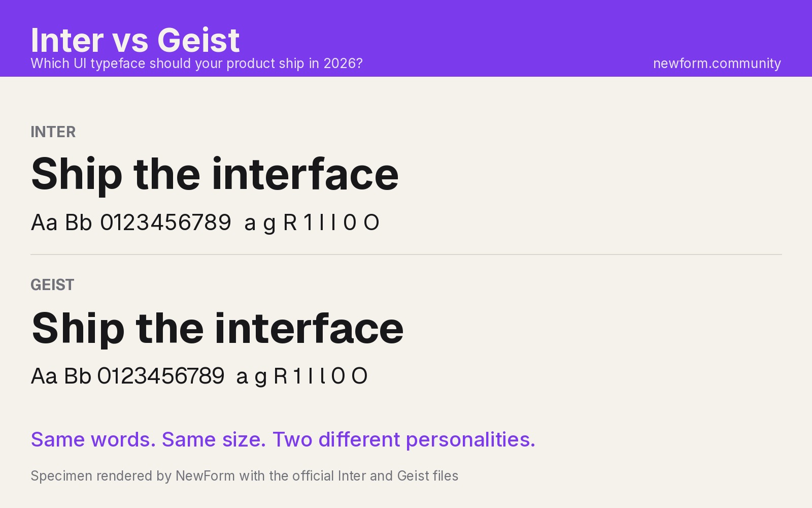
Both boards below are rendered by NewForm with the official Inter and Geist files. No screenshots, no approximations.

Specimen rendered by NewForm with the official Inter files.

Specimen rendered by NewForm with the official Geist files.
Where each one came from
Inter was drawn by Rasmus Andersson and released in 2017, explicitly for screens. Figma runs its product UI on it, Linear's entire brand and product sit in it, and it became the default typeface of design systems this decade. If you want the full story and twelve alternatives, the Inter hub has it.
Geist is Vercel's house typeface, drawn in-house and released in 2023 under the Open Font License. Vercel's site runs on it, v0 generates with it, and it joined Google Fonts afterward, which is why you keep seeing it everywhere. The name is German for "spirit", a nod to the geometric grotesques it descends from.
The head-to-head
-
Height and density. Both files measure an x-height of roughly 75 percent of cap height, which is why they feel interchangeable at body size. But Geist sets the same test string about 4 percent narrower than Inter. On a 72 character line that is two to three extra characters per line. In dense dashboards and data tables, Geist buys you a little more room per row.
-
The line box nobody warns you about. This is the practical difference. Geist's ascender plus descender measures about 1,300 units per 1,000, versus roughly 1,210 for Inter. At the same line-height the rhythm survives, but the glyphs reach further: tight pills, badges, uppercase labels and buttons with
overflow: hiddencan clip the extremes of Geist after a swap. Give Geist containers 2 to 4 percent more height, or trim ascenders withline-heighton the text node, and you are safe. -
Apertures and personality. Inter keeps its apertures tight and its terminals flat, which is exactly why it disappears into interfaces. Geist opens up slightly and treats curves a touch more geometrically, so it reads faintly more engineered. At 16px it is a vibe; at 64px on a pricing page it is a brand decision. Geist looks like it belongs next to a terminal window, Inter looks like it belongs in a settings panel.
-
Display sizes and optical tuning. Inter's variable release added an optical size axis that tightens spacing and sharpens joins at large sizes, so one file serves 12px labels and 96px headlines. Geist on Google Fonts ships a weight axis (100 to 900) with no optical size axis. In practice both hold up on marketing pages, but Inter has the more deliberate answer for mixing scales, and our font sizes guide covers where each size actually belongs.
-
Numerals and data. Both ship lining figures and both can force tabular alignment (Inter:
font-feature-settings: "tnum" 1). Where Geist pulls ahead is the pairing: Geist Mono is purpose-built for code, logs and API output, and it harmonizes with Geist Sans better than any external mono pairs with Inter. For developer tools, that mono pairing is a real reason to pick the Geist family. -
Interface features. Inter carries a deep OpenType bench: character variants cv01 through cv13 (the single-story a, the straight-legged l, disambiguated zero), stylistic sets, and tabular figures on demand. Geist keeps the feature list short and opinionated. If your design system depends on a disambiguated 0/O or a specific l, Inter gives you the switches; Geist gives you fewer decisions to make.
-
Licensing and loading. Both are free under the SIL Open Font License, commercially, forever. Inter: Google Fonts or the official rsms.me release. Geist: Google Fonts, Vercel's own download, or the
geistnpm package for Next.js. There is no paid upgrade, so the affiliate question does not apply to the fonts themselves here.
How to switch between them
The stacks, in a product that expects a Helvetica-family fallback chain:
/* Inter, with the disambiguation features I always turn on */
font-family: "Inter", "Helvetica Neue", Arial, sans-serif;
font-feature-settings: "cv05" 1, "tnum" 1;
/* Geist, with Inter as a metrics-adjacent fallback */
font-family: "Geist", "Inter", "Helvetica Neue", Arial, sans-serif;
They are not metrics-compatible like Arimo is for Helvetica (we cover that idea in the Helvetica alternatives guide), so do not treat this as a zero-shift swap. Audit three things after switching: tight vertical components (see round 2), line lengths in tables (round 1), and any place you relied on Inter's character variants.
If you are on Next.js, load either one with next/font and the geist package so the file is self-hosted with no layout shift:
import { Inter } from "next/font/google";
import { GeistSans, GeistMono } from "geist/font";
When to pick which
- Design system for a mainstream SaaS product: Inter. The feature set, the optical axis and the sheer number of teams already using it make it the safe, boring, correct choice.
- Developer tool, API platform, or anything that shows code: Geist. The technical read and the built-in mono pairing do work Inter cannot do without importing a second family.
- Marketing site on a budget that must look expensive: Geist. It is less ubiquitous than Inter in 2026, so it still reads as a deliberate brand choice rather than a default. Pair either one correctly using the font pairings guide.
FAQ
Geist vs Inter: which is better for UI? For dense product interfaces and design systems, Inter. For developer-facing brands and anything pairing with code, Geist. At body size the difference is smaller than most people expect.
Inter vs Geist: which is more readable at small sizes? Both were drawn for small screen sizes and measure almost identical x-heights, so both are comfortable at 14 to 16px. Inter's disambiguation variants give it an edge in contexts where 0, O, l and 1 get confused, like IDs and codes.
Geist vs Inter font: can I swap one for the other without breaking layout? Mostly, but not exactly. Geist sets about 4 percent narrower and has a taller line box, so re-check tight badges, buttons and table line lengths after the swap.
Geist font vs Inter: which loads faster?
Neither has an inherent edge. Both self-host cleanly, and Next.js users can load Geist through the geist npm package with zero layout shift. Keep the weights you actually ship down to two or three and the question disappears.
Geist Sans vs Inter: which has better numerals for dashboards? Both offer tabular figures. Geist Sans plus Geist Mono is the stronger data duo because the mono was drawn alongside it, which matters when tables mix prose and code.
Put the winner to work
Typesetting is step one. The next step is seeing the interface in context: paste a specimen or a real screen into NewForm's Mockup Studio and it becomes a presentation-ready mockup in seconds. And when you are ready to ship the real thing instead of the mockup, build it with Base44, where the fonts you just picked drop straight into a working app.
More in the Fonts Similar To series
Every guide uses our own rendered specimens and the same structure, so you can compare fonts side by side:
- Fonts similar to Inter (the hub)
- Fonts similar to Helvetica
- Fonts similar to SF Pro
- Fonts similar to Futura
- Font pairings every designer should memorize
- Typography sizes for websites
- How to choose UI fonts by mood
Related on NewForm
Keep reading

Find Your Stack
Discover the perfect design tools for your workflow.
Take the 60-second quizNewForm Studio
Turn your designs into professional mockups instantly.
Open StudioMore from NewForm

6 Free Fonts Similar to Futura (Real Specimens, 2026)
Futura is licensed and awkward at small sizes. These 6 free geometric sans, rendered from their official files, do the same job: Jost, Poppins, Outfit, Urbanist, Josefin Sans, Questrial.
13 min read · Nov 3, 2026

Bold Typographic Packaging: 4 Lessons From Standout Label Designs
Four real label designs, from LINEN sparkling water to DEWLO facial oil, teach hierarchy, color blocking, functional copy and quiet-color loud-type discipline.
4 min read · Nov 2, 2026