
7 Free Fonts Similar to Times New Roman (Real Specimens, 2026)
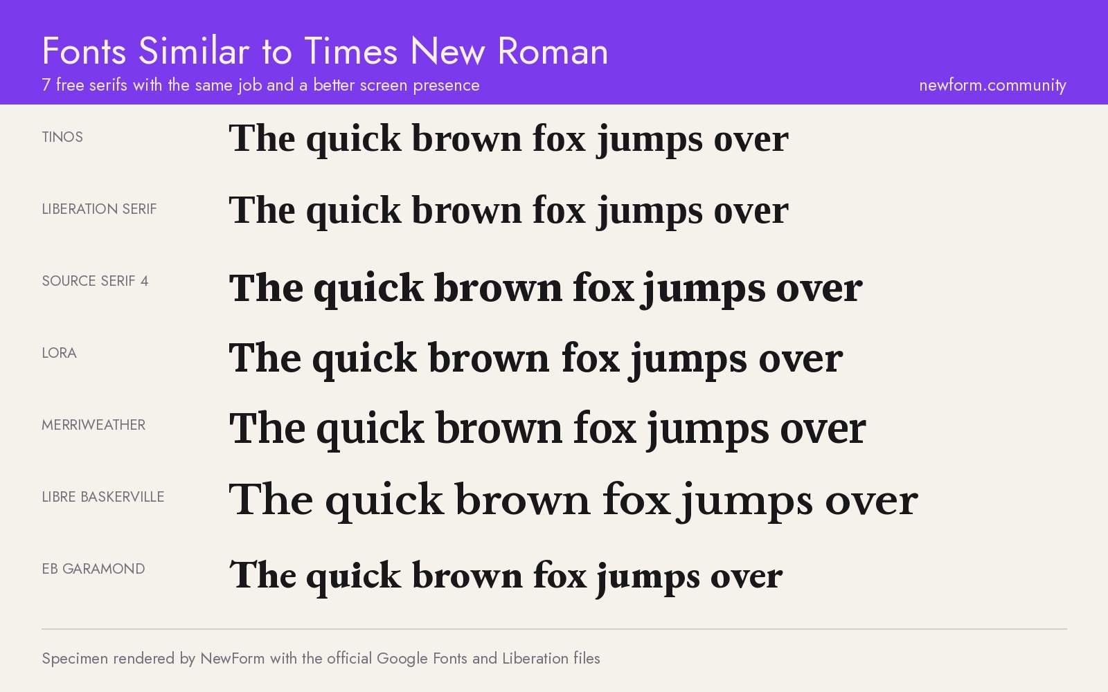
Times New Roman is a licensed Monotype typeface, and the two free fonts closest to it are Tinos and Liberation Serif: both are metric-compatible, meaning every line breaks in the same place. If you want a serif that simply reads better on screen, Source Serif 4 and Lora are the stronger upgrades. Below are seven free serifs, each rendered from its official files at identical settings.
TL;DR: the seven, ranked
- Tinos, the exact swap. Free, Google Fonts, Apache licence. Metric-compatible with Times New Roman, so a document set in Times reflows to identical line breaks. Best for migrations: contracts, academic templates, anything where the page count cannot move.
- Liberation Serif, the office default. Free, SIL Open Font License. The same metric-compatibility idea, and the font LibreOffice automatically substitutes when a document asks for Times New Roman. Best for documents that travel between Word, LibreOffice and the web.
- Source Serif 4, the best upgrade. Free, Google Fonts, variable with an optical size axis. A screen-first serif with sturdier strokes and a calmer rhythm. Best for product blogs, documentation, long-form reading in a browser.
- Lora, the best for editorial voice. Free, Google Fonts, variable. Brushed curves, moderate contrast, a little warmth. Best for magazines, newsletters, brand storytelling where Times feels institutional.
- Merriweather, the best at small sizes. Free, Google Fonts, variable with optical sizing. Wide, open letterforms built for low-resolution reading. Best for news, dense article pages, anything read at 15 to 17 pixels.
- Libre Baskerville, the best for body text. Free, Google Fonts, four styles. A Baskerville revival drawn specifically for the web, with a large x-height. Best for legal pages, help centres, support documentation.
- EB Garamond, the best for print feel. Free, Google Fonts, variable. A faithful Garamond revival with a huge character set. Best for publishing, editorial layouts, anything that should feel older than the internet.
The shortest possible answer: use Tinos if nothing may shift, Source Serif 4 if you want it to look better.
Why everyone is looking for this
Times New Roman has been the default serif of Western documents since Microsoft and Monotype put it in Windows in 1992. It is on almost every machine. That is also the problem.
The face was drawn in 1931 and 1932 by Victor Lardent at the Times in London, under the art direction of Stanley Morison, for one job: squeezing more words onto a narrow newspaper column printed on cheap paper. Every decision in it serves that. Tight spacing. Small apertures. Thin hairlines that hold up in ink and disappear in pixels.
On a 1440 pixel screen at 16 pixels, those hairlines turn to grey mush. The tight spacing makes long paragraphs feel dense. And when a design tool asks for a webfont licence, the answer is that Times New Roman ships with Windows and macOS, so you can name it in a CSS stack, but you cannot serve the file yourself.
So people end up searching for one of three different things:
- A legal, self-hostable copy. A font that ships with its licence so a build pipeline, a PDF generator or a print vendor is covered.
- A metric-compatible replacement. A font whose characters occupy the same widths, so a 40 page document does not become 44 pages when someone swaps it.
- A serif that looks like Times but reads better. Same seriousness, better screen performance, no 1992 energy.
Those are three different jobs and they want three different fonts. The list below says which one you need for which job.
The specimens
Every board below was rendered by NewForm from the official font files at identical settings: the same headline, the same paragraph at 32 pixels to simulate 16 at 2x, the same numerals, the same awkward glyph row (a g R 1 I l 0 O) where serifs either hold together or fall apart.
1. Tinos: the exact swap
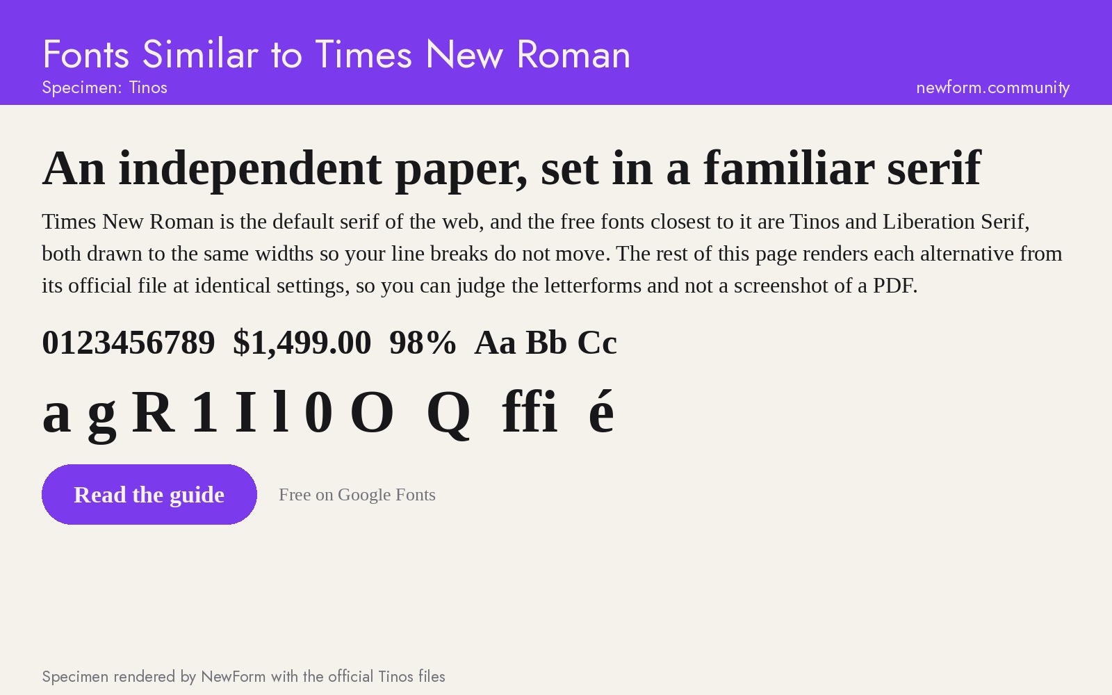
Why it works. Tinos was drawn by Steve Matteson at Ascender as part of the Chrome OS core fonts, and its whole reason to exist is metric compatibility with Times New Roman. Cap heights, x-height, advance widths and kerning all land in the same places. A page of Times New Roman and a page of Tinos have the same number of lines and the same words on each line. That is not a claim about looking similar. It is a claim about measuring identical.
Where to use it. Document migrations where pagination is contractual or academic. A resume that must stay one page. A 200 page report that a legal team has already signed off. A React PDF generator that currently bundles a licensed font it should not be shipping. Tinos is also what Chrome OS ships as its Times substitute, which is why a document that travels from a Chromebook to a Mac looks the same on both.
Settings that work. Because the metrics are identical, do not change anything. Keep the sizes and line heights you already have.
body {
  font-family: Tinos, "Times New Roman", Times, serif;
  font-size: 1rem;      /* keep whatever Times used */
  line-height: 1.45;
  font-synthesis: none; /* never let a browser fake a weight */
}
Watch out for. Tinos has the same problem as Times at small sizes: fine hairlines, tight spacing. It solves licensing and layout, not readability. It also has only regular, bold, italic and bold italic. There is no variable axis, no display cut and no optical size, so a headline at 64 pixels looks like a headline set in Times at 64 pixels.
Where to get it. Google Fonts: Tinos (free, Apache 2.0) or Google Fonts for the whole library.
2. Liberation Serif: the office default
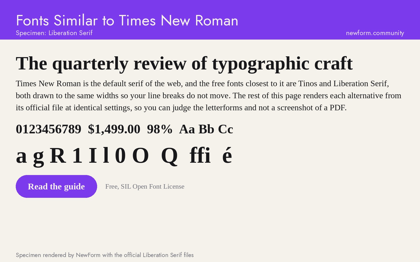
Why it works. Liberation Serif is the other metric-compatible member of the family, originally commissioned by Red Hat and now under the SIL Open Font License, which is a more permissive licence for embedding than most foundry agreements. LibreOffice substitutes it automatically for Times New Roman, so most people who have read a "Times" document on Linux in the last fifteen years have actually been reading Liberation Serif.
Where to use it. Documents that move between Word, LibreOffice, Google Docs and a web viewer. If your team exports PDFs from a mixed set of machines, this is the font that keeps the layout from drifting. It is also the safer choice than Tinos when you need an OFL rather than an Apache licence for a font bundle you redistribute.
Settings that work. Same as Times, metric for metric. Set it first in the stack only when the target machine has it installed, otherwise list it after a hosted webfont.
.doc-body {
  font-family: "Liberation Serif", Tinos, "Times New Roman", Times, serif;
  font-size: 1rem;
  line-height: 1.45;
}
Watch out for. Its glyph set is narrower than Tinos for extended Latin and it has no small caps. If the document uses special characters (currency symbols, accented capitals beyond Western Europe, mathematical signs), check the rendering before you commit. Liberation Serif also keeps Times's slightly cramped counters, so it is a fidelity choice, not a beauty choice.
Where to get it. Liberation Fonts on GitHub (free, SIL OFL 1.1).
3. Source Serif 4: the best upgrade
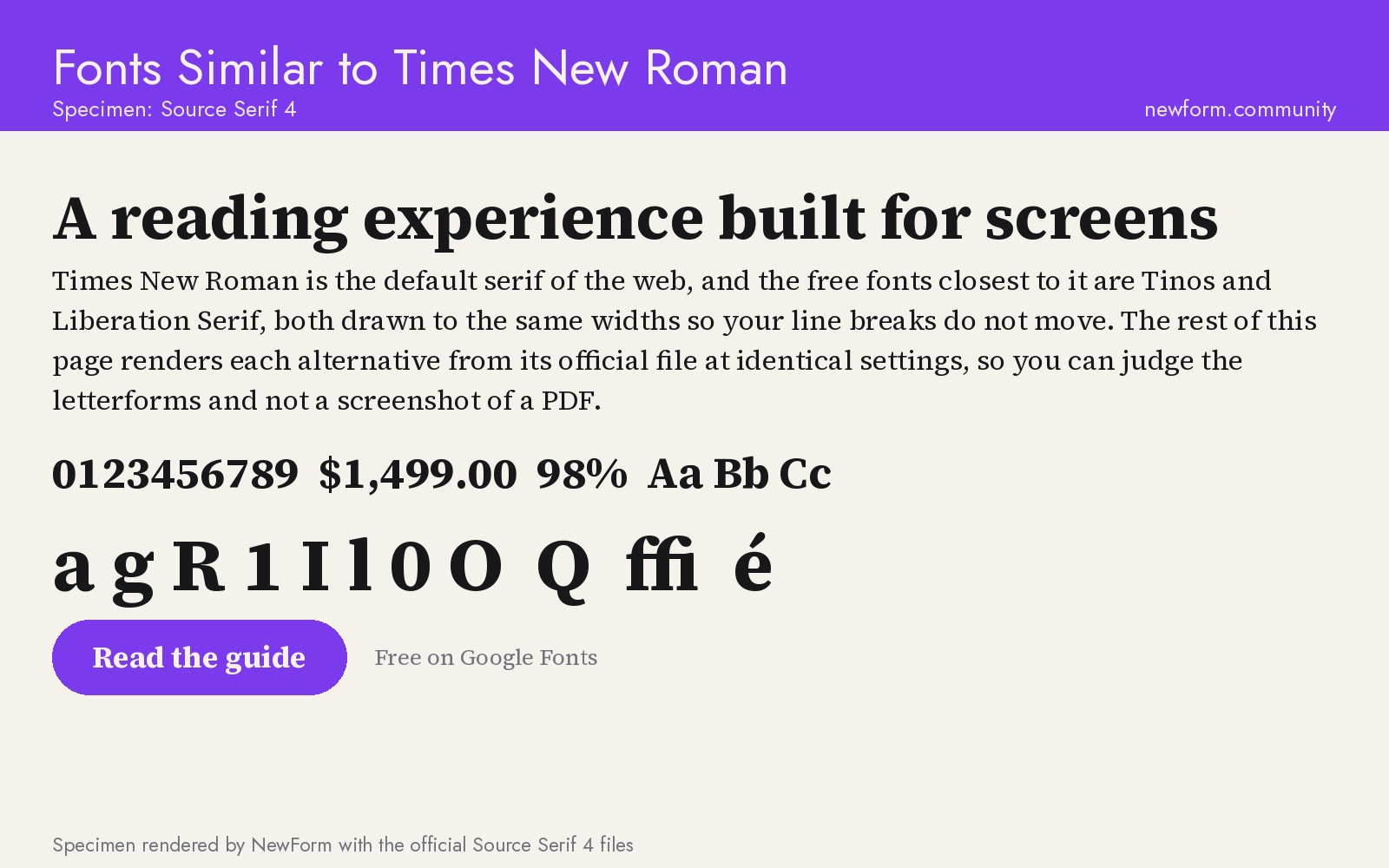
Why it works. Source Serif 4 was designed by Frank Grießhammer for Adobe as a companion to Source Sans, and it was drawn for pixels from the start: thicker hairlines, sturdier serifs, a taller x-height and wider counters than Times. It also carries a real optical size axis from 8 to 60 points, so the face gets sturdier at small sizes and more delicate at display sizes without you switching families.
Where to use it. Product blogs, documentation, release notes, changelogs, long-form reading inside an app. Anywhere the text is the product and Times is only there because nobody changed the default. This is the font to pick when the brief is "serif, serious, but not a court document".
Settings that work. Turn optical sizing on and let the variable axis do its job, then keep the measure between 60 and 75 characters.
.prose {
  font-family: "Source Serif 4", Georgia, serif;
  font-size: clamp(1.0625rem, 0.6vw + 0.95rem, 1.25rem);
  line-height: 1.6;
  max-width: 68ch;
  font-optical-sizing: auto;
}
Watch out for. It is noticeably larger on the page than Times at the same font size because of the x-height, so a direct swap will grow your documents. It also has a quieter, more technical voice than a Garamond or a Baskerville: it reads as a software company, not a magazine.
Where to get it. Google Fonts: Source Serif 4 (free, SIL OFL). Adobe ships the larger family with Creative Cloud: Adobe Fonts .
4. Lora: the best for editorial voice
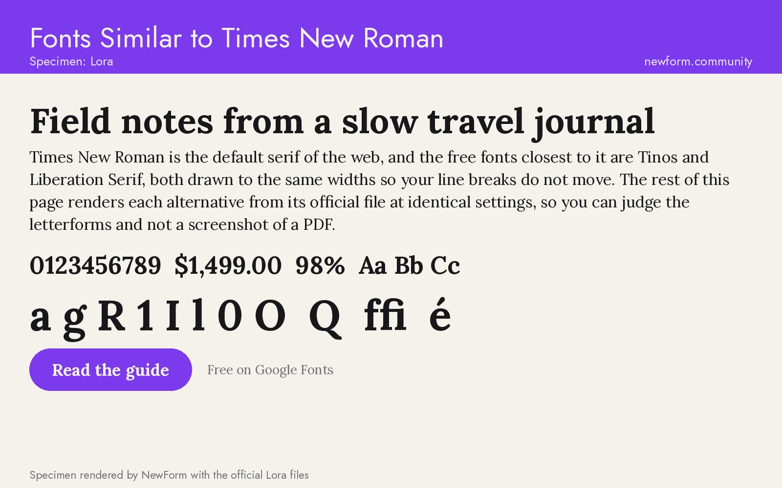
Why it works. Lora was drawn by Cyreal in 2011 from calligraphic roots: the strokes have a slight brush curve, the terminals flare, and the contrast between thick and thin is moderate rather than dramatic. That combination keeps it readable at body sizes while giving it more personality than Times in a headline. It is also variable now, so one file covers 400 to 700.
Where to use it. Newsletters, editorial features, founder letters, brand storytelling, the about page a client actually reads. Anywhere the writing has a voice and Times is flattening it.
Settings that work. Lora's curves need air. Give it a line height of 1.6 or more and never set it below 16 pixels.
.story {
  font-family: Lora, Georgia, serif;
  font-size: 1.125rem;
  line-height: 1.65;
  letter-spacing: 0.002em;
}
Watch out for. The calligraphic details that make it charming at 40 pixels become noise at 12. It also pairs badly with another high-contrast serif: if you use Lora for body text, use a neutral sans for labels rather than a second display serif.
Where to get it. Google Fonts: Lora (free, SIL OFL).
5. Merriweather: the best at small sizes
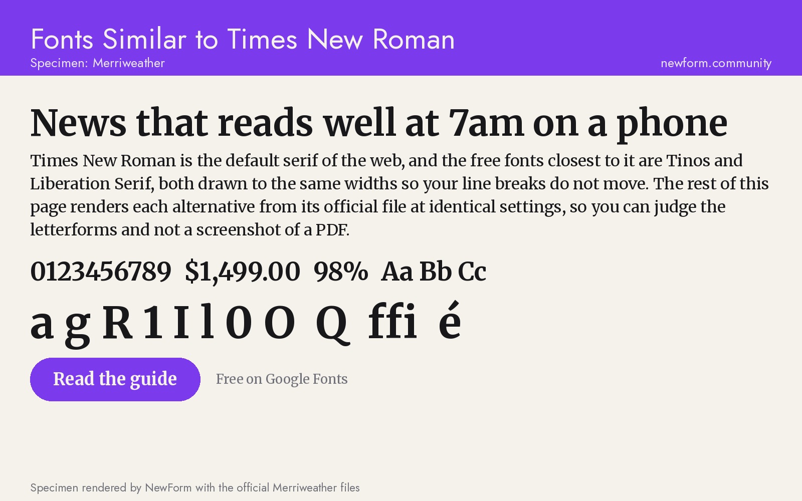
Why it works. Merriweather was designed by Eben Sorkin in 2010 with one constraint: it had to stay legible on screens that were still mostly 96 dpi. Wide letterforms, generous counters, a large x-height, low contrast and slightly condensed spacing add up to a serif that survives 15 pixels on a laptop in a bright room. The current release is variable with an optical size axis, so the small-size cut is even sturdier.
Where to use it. Article pages, news, knowledge bases, email templates rendered in Outlook. Anywhere you cannot control the viewing conditions.
Settings that work. Because it is wide, it needs a narrower measure than Times to stay comfortable: 60 to 68 characters, not 80.
.article {
  font-family: Merriweather, Georgia, serif;
  font-size: 1rem;
  line-height: 1.7;
  max-width: 62ch;
  font-optical-sizing: auto;
}
Watch out for. At display sizes it can feel heavy and slightly clumsy: those wide letterforms that help at 15 pixels look bulky at 56. Use it for text and pick something with more contrast for the cover.
Where to get it. Google Fonts: Merriweather (free, SIL OFL).
6. Libre Baskerville: the best for body text
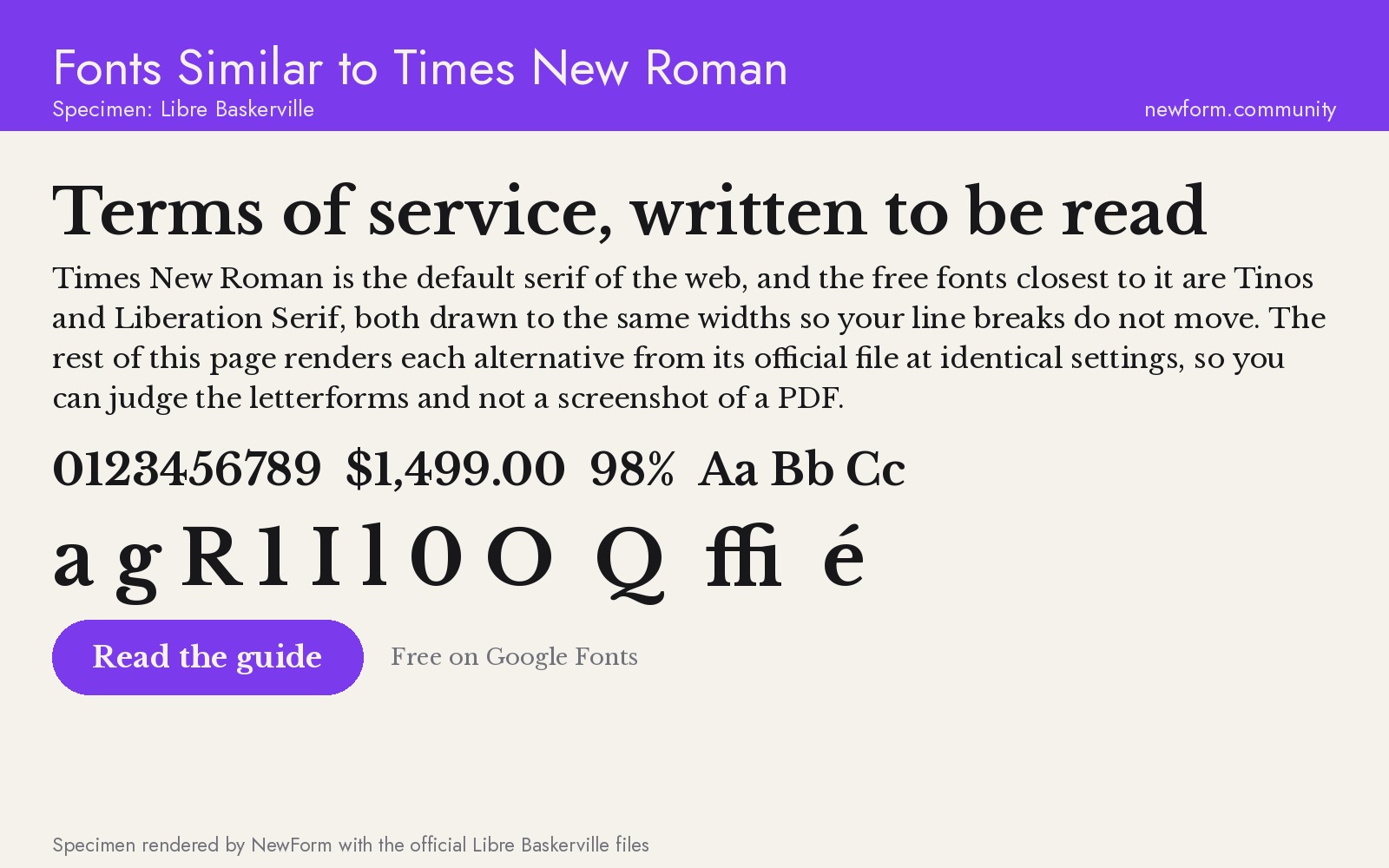
Why it works. Pablo Impallari drew Libre Baskerville from the American Type Founders 1941 Baskerville, then adjusted it for the web: a taller x-height, wider spacing and sturdier thin strokes than the original. The result keeps Baskerville's high contrast feel at low resolution, which is why it works in a help centre where the alternative was Times.
Where to use it. Legal pages, terms, privacy policies, support documentation, knowledge bases. Text that is long, dry and read under duress, where the reader's comfort is the whole design brief.
Settings that work. Baskerville wants a little more size and a lot more line height. 17 to 18 pixels with 1.7 line height is the sweet spot; below 16 it starts to sparkle.
.legal {
  font-family: "Libre Baskerville", Baskerville, Georgia, serif;
  font-size: 1.0625rem;
  line-height: 1.72;
  max-width: 66ch;
}
Watch out for. Only four styles, no variable axis, and the italic is quite decorative. It is also wide: a table laid out for Times will overflow, so check your data grids before swapping.
Where to get it. Google Fonts: Libre Baskerville (free, SIL OFL).
7. EB Garamond: the best for print feel
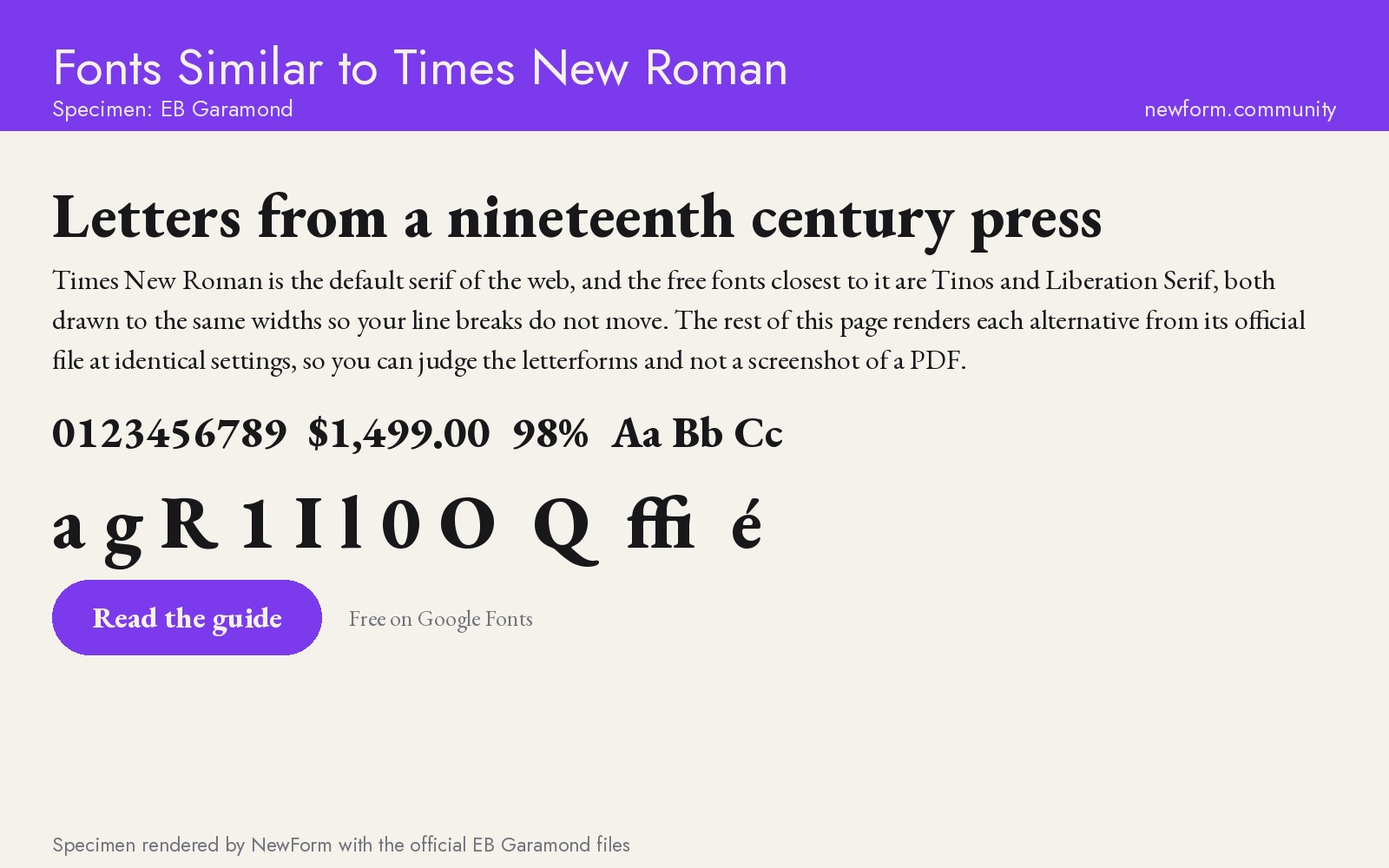
Why it works. EB Garamond is Georg Duffner's open revival of Claude Garamont's sixteenth century types, the model that most of the serif tradition is a reaction to. It is elegant where Times is efficient: softer transitions, a smaller x-height, more air between letters, and true italics with a calligraphic swing. The character set is unusually complete, including Greek and Cyrillic.
Where to use it. Publishing, editorial layouts, book pages, essay collections, invitation and event design. Anything that should feel handmade rather than corporate.
Settings that work. Garamond runs small. Set it 1 to 2 pixels larger than you would set Times and give it a generous line height, otherwise it disappears.
.essay {
  font-family: "EB Garamond", Garamond, Georgia, serif;
  font-size: 1.25rem;
  line-height: 1.6;
  max-width: 64ch;
}
Watch out for. At 14 or 15 pixels it is genuinely hard to read, and the small x-height means UI labels in it look like fine print. This is a reading font, not an interface font. It also has the least conventional feel of the seven, which is either the point or a problem depending on the client.
Where to get it. Google Fonts: EB Garamond (free, SIL OFL).
Times New Roman vs Tinos: the head-to-head
If the question is "which of these is literally Times New Roman", the answer is Tinos, for the practical reason that it is legal to embed and serve.
Same metrics means the same line breaks, so a document does not reflow. Different outlines means you can tell them apart at large sizes: Tinos has slightly more open counters and a marginally lighter overall colour, and the italic is less cramped than Times. At 16 pixels in a paragraph, nobody reading will notice the difference, which is exactly what a migration needs.
Where Tinos loses is the same place Times loses: it is a newspaper face used at a screen size it was never drawn for. If you are not required to preserve the layout, do not start here.
Georgia vs Times New Roman: the other swap people ask about
Georgia was designed by Matthew Carter for Microsoft in 1996, for screens, and it is the reason Times looks dated on the web. It has a bigger x-height, sturdier hairlines, wider spacing and old-style numerals that sit inside the text block, so prices and dates stop jumping out of a sentence.
The catch is that Georgia is also a system font: fine to name in a CSS stack, not a file you can self-host, and it renders differently across platforms. If you want the look of Georgia with a licence you control, Source Serif 4 and Merriweather are the closest free equivalents, and both are variable.
How to switch without breaking the layout
Swapping a serif is not a one-line change. Four things move.
- Measure. Serifs are not the same width per character. Times at 70 characters per line becomes 62 with Merriweather and 76 with EB Garamond. Reset
max-widthinchunits, not pixels, and re-check every template. - Size. x-height drives perceived size. Times to Source Serif 4 will read about one step larger at the same pixel value, Times to EB Garamond about one step smaller. Move the base size by 0.0625 to 0.125 rem and compare screenshots, not numbers.
- Line height. Every font on this list except Tinos and Liberation Serif wants more leading than Times. Start at 1.6 and adjust from there.
- Numerals and punctuation. Check currency symbols, the percent sign, hyphens versus en dashes, and the quotes. Serif revivals often ship smarter punctuation (real curly quotes, proper ligatures), and your copy may have been written around Times's limitations.
Then check three views before you ship: a dense table, a long article, and a form with labels. The table catches width overflow, the article catches rhythm, the form catches anything below 14 pixels.
If you want to see the new type in a presentation mockup before committing, NewForm Mockup Studio turns a specimen into a real product frame in a few clicks.
FAQ
What is the closest free font to Times New Roman?
Tinos. It is metric-compatible with Times New Roman, so every character takes the same width and lines break in the same place. Liberation Serif is equally close in metrics and uses the SIL Open Font License, which is often easier to redistribute.
Is Tinos the same as Times New Roman?
Visually, at body sizes, almost. Legally, no. Tinos is a separate typeface released under the Apache 2.0 licence, drawn to the same measurements so it can substitute without reflowing a document. Times New Roman is a Monotype typeface you can name in CSS but cannot package as a webfont file.
Can I use Times New Roman as a webfont on my website?
You can name it in a font stack, because it ships with Windows and macOS. You cannot serve the font file yourself, and it does not exist on Android or most Linux machines, so those readers get your fallback instead. For anything where type matters, use a free font you can self-host.
What is a good serif font for body text on a website?
Source Serif 4 for product and documentation sites, Merriweather for news and article pages, Libre Baskerville for legal and support content. All three are free, variable or near-variable, and designed for screens rather than for newsprint.
What font looks like Times New Roman but is better?
Source Serif 4. It keeps the serious, text-first feel but adds thicker hairlines, a larger x-height and an optical size axis, so it holds up at 16 pixels where Times goes grey. Lora is the alternative if you want more warmth and a more editorial voice.
Why do designers avoid Times New Roman?
Because it was drawn in 1931 for narrow newspaper columns on cheap paper. Thin hairlines, tight spacing and small apertures all work in ink and fail on screens. It is also a system font, so it renders differently on every platform and cannot be served as a webfont.
What is the difference between Times New Roman and Times?
Times New Roman is the Monotype version, licensed to Microsoft and shipped with Windows. Times is the Linotype version released at the same time in 1931. The two are metric-compatible, which is why documents swap between them without reflowing, but they are separate designs with separate owners.
What free serif pairs well with a sans-serif UI font?
Pair a serif with a low-contrast grotesque, not with another high-contrast face. Source Serif 4 with Inter, or Merriweather with a neutral sans like Public Sans, gives you contrast of class without a fight over texture. Our guide to font pairings every designer should memorize has the combinations with real specimens.
Keep reading
- Fonts similar to Inter, the hub for the sans-serif side of this problem
- Typography sizes for websites, the sizes to set once you have picked a serif
- Font pairings every designer should memorize, for what to put next to it
Put the type to work
You have a serif you can licence, a size scale and a pairing. The next step is usually a page, and the design is now the slow part.
Build the page in Base44: describe the layout, get a working page, then apply the type stack you just chose.
Where to get the fonts: Google Fonts and Liberation Fonts are free. Premium options are linked through the stores below, and some of those links may earn NewForm a commission.
- Google Fonts (free)
- Liberation Fonts (free)
- MyFonts for licensed revivals like Miller, Tiempos and Freight Text
- Adobe Fonts for the full Source Serif family and Minion
- Creative Market for indie serifs
- Envato Elements for an unlimited font subscription
More in the Fonts Similar To series
Every guide uses our own rendered specimens and the same structure, so you can compare fonts side by side:

FREE FIELD GUIDE
The 8-Prompt Product
Answer 24 questions, run 8 prompts, and walk away this afternoon with a working, beautiful MVP you would be proud to show.
See what's insideKeep reading

Find Your Stack
Discover the perfect design tools for your workflow.
Take the 60-second quizNewForm Studio
Turn your designs into professional mockups instantly.
Open StudioMore from NewForm
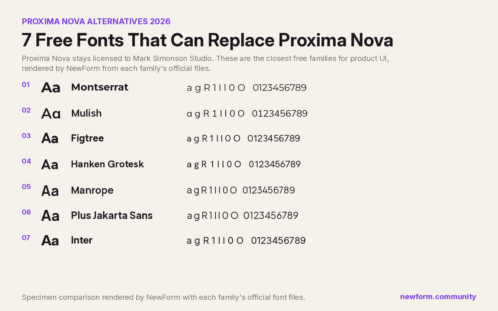
7 Free Fonts Similar to Proxima Nova (Real Specimens, 2026)
Proxima Nova is a licence you have to buy and it sets wider than you expect. These 7 free families, rendered from their official files, do the same job: Montserrat, Inter, Mulish, Hanken Grotesk, Figtree, Plus Jakarta Sans, Manrope.
13 min read · Nov 4, 2026

6 Free Fonts Similar to Futura (Real Specimens, 2026)
Futura is licensed and awkward at small sizes. These 6 free geometric sans, rendered from their official files, do the same job: Jost, Poppins, Outfit, Urbanist, Josefin Sans, Questrial.
13 min read · Nov 3, 2026