
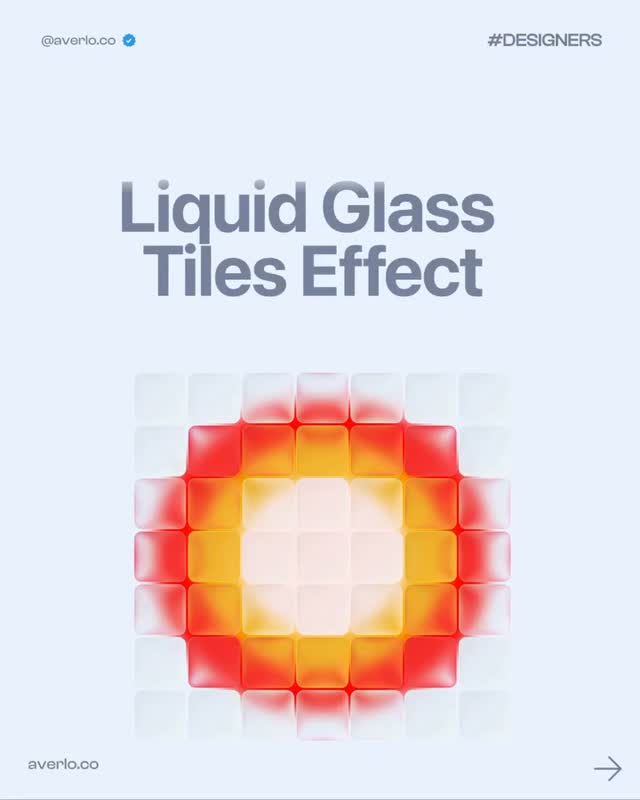
How to Create a Glassmorphism Motion Effect in Figma
How to Create a Glassmorphism Motion Effect in Figma
A good interface animation often starts with a surprisingly simple object. The latest tutorial shared by @averlo.co breaks a polished glassmorphism motion effect into three approachable steps: create a square, round its corners, add a glass effect, and then animate the result with two keyframes. It is a compact workflow, but it contains several useful lessons about restraint, depth, and motion in UI design.

1. Start with a simple shape
Begin with a square in Figma. The point is not to start with a complicated illustration or a fully built interface. A basic shape gives you a clean surface for testing how light, blur, transparency, and movement interact. It also makes the exercise easy to reuse in a card, modal, navigation element, product tile, or decorative hero graphic.
Once the square exists, adjust its corner radius to your liking. A small radius creates a more technical, compact feel, while a larger radius makes the object softer and more friendly. The right value depends on the surrounding design system, so treat this step as a visual decision rather than a rigid setting. Match the radius to nearby cards and controls if the object will eventually live inside a real product.
This is a useful reminder for designers: a strong visual effect does not require a complex starting point. When the base geometry is controlled, the later styling choices are easier to evaluate.
2. Add the glass effect

Next, apply a glass effect to the rounded square and tune the settings until the object feels dimensional without becoming distracting. Glassmorphism usually depends on some combination of translucency, background blur, a subtle border, and a restrained shadow or highlight. The goal is to suggest a translucent surface, not to make the component unreadable.
The most important test is contrast. Place the object over a background with enough variation to reveal the blur, then check whether the content inside or behind it remains legible. If the effect only looks good on one background, it is probably too fragile for production. Keep an eye on text contrast, especially for small labels and secondary actions. Decorative blur should never compete with usability.
You can also use the effect as a way to establish hierarchy. A glass panel over a background can signal that it is floating above the page. A lighter edge can imply a light source, while a darker shadow can separate the panel from the surface beneath it. These details work best when they are consistent with the rest of the interface.
3. Introduce movement with two keyframes

The final step uses Figma’s Motion tool. Add one keyframe at the start and another at the end, then change the object’s position or transformation between them. This is enough to create a subtle floating, drifting, or sliding motion without building a complex timeline.
Keep the distance small at first. A gentle movement usually makes a glass object feel more believable than a dramatic jump. You can experiment with position, rotation, scale, opacity, or even the intensity of the glass treatment, but change one or two variables at a time. If everything moves at once, it becomes difficult to understand what is creating the visual effect.
Timing matters as much as distance. A short duration can make the object feel energetic, while a slower cycle creates a calmer, premium impression. Use easing to avoid mechanical starts and stops. For interface work, the best animation often feels noticed rather than announced.
Where to use this effect
This technique works well for onboarding screens, music players, weather cards, portfolio hero sections, floating controls, and experimental landing pages. It can also serve as a quick prototype for a larger interaction system. Before shipping it, test the effect on smaller screens and lower-powered devices. Blur and continuous motion can affect performance, and excessive animation may be uncomfortable for some users.
The larger lesson from this tutorial is that visual polish often comes from combining a few controlled decisions. Start with basic geometry, create depth through material styling, and use restrained motion to give the object life. That sequence is easy to understand, easy to iterate, and flexible enough to become part of a real design system.
For more hands-on interface experiments, build and test your next design workflow with Base44.
,
This tutorial was inspired by the original carousel from @averlo.co. View the original Instagram post for the source visuals and save it for later reference.
,
Credit: @averlo.co
A quick review checklist
Before calling the effect finished, review it at three levels. First, check the static frame: does the shape still look intentional when the animation is paused? Second, check the transition: does the movement have a clear beginning and end, or does it feel like a random wobble? Third, check the real interface context: does the effect support the user’s attention, or does it pull focus away from the task?
You can turn the prototype into a reusable component by saving the visual values as styles and documenting the motion duration and easing. That makes the effect easier for teammates to reproduce and easier to adjust later. A little documentation prevents a polished one-off from becoming an inconsistent pattern across the product.
Related on NewForm

FREE FIELD GUIDE
The 8-Prompt Product
Answer 24 questions, run 8 prompts, and walk away this afternoon with a working, beautiful MVP you would be proud to show.
See what's insideKeep reading

Find Your Stack
Discover the perfect design tools for your workflow.
Take the 60-second quizNewForm Studio
Turn your designs into professional mockups instantly.
Open StudioMore from NewForm
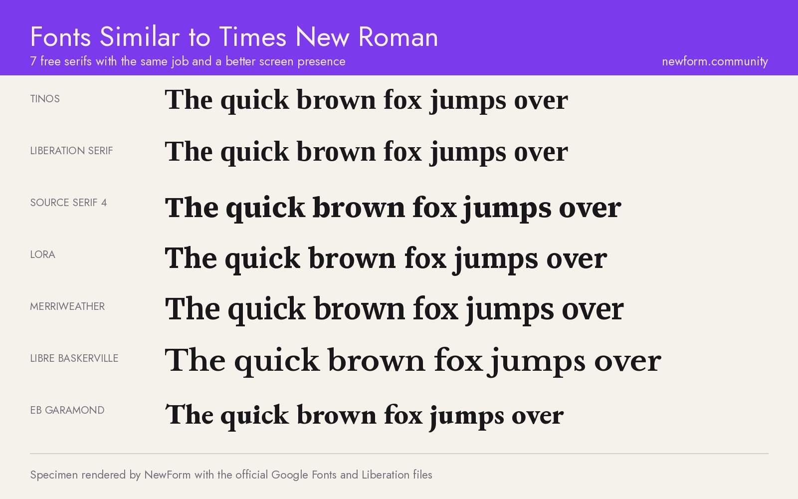
7 Free Fonts Similar to Times New Roman (Real Specimens, 2026)
Times New Roman is licensed and greys out on screen. These 7 free serifs, rendered from their official files, do the same job better.
15 min read · Nov 5, 2026
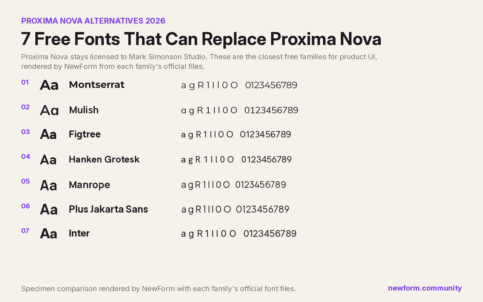
7 Free Fonts Similar to Proxima Nova (Real Specimens, 2026)
Proxima Nova is a licence you have to buy and it sets wider than you expect. These 7 free families, rendered from their official files, do the same job: Montserrat, Inter, Mulish, Hanken Grotesk, Figtree, Plus Jakarta Sans, Manrope.
13 min read · Nov 4, 2026