
11 Graphic Design Principles, Applied to a Real Layout
Visual source and credit: @lubosvolkov, original Instagram carousel.
Good graphic design often feels effortless because the underlying decisions are consistent. A carousel by @lubosvolkov makes that idea concrete with practical layout advice: use fewer column variations, respect outer margins, keep spacing mathematically consistent, and use asymmetry to create focus. These are not rigid laws. They are checks that help a designer make intentional choices instead of accumulating accidental ones.
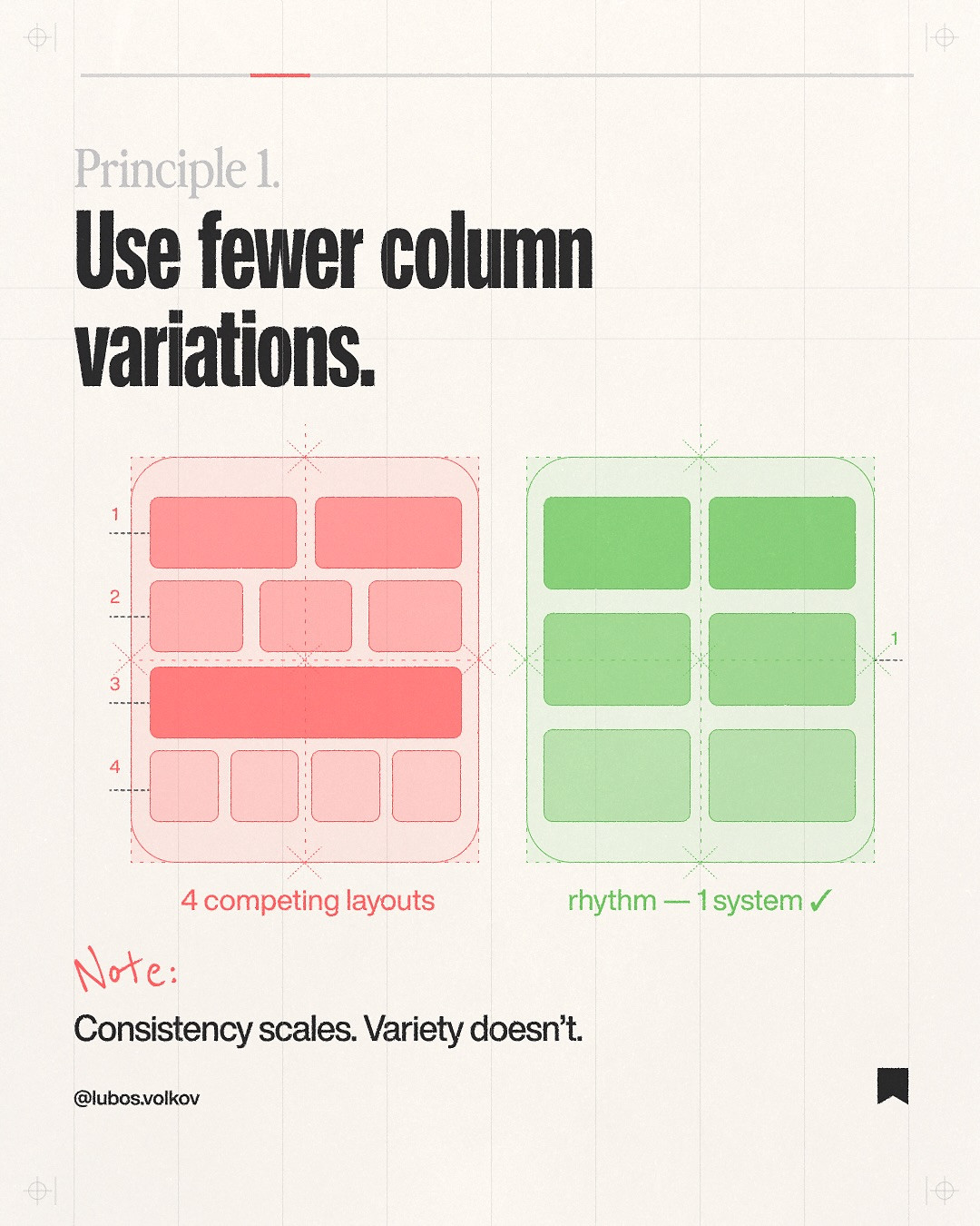
1. Limit the number of column patterns
A grid gives a page structure, but switching between unrelated column widths makes that structure hard to feel. Pick a grid that suits the content, then reuse its alignments for headings, images, and captions. A magazine spread may need a wide text column beside a narrow note column. That is a deliberate variation. Six unrelated widths on one page usually are not.
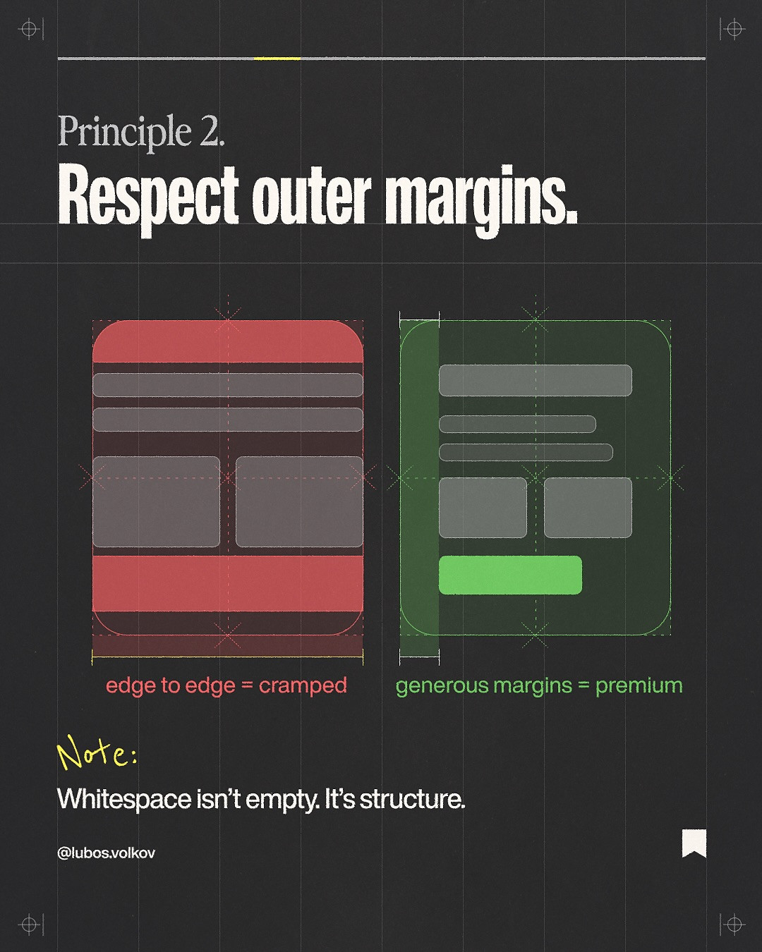
2. Protect the outer margins
Margins establish a frame and give the content room to breathe. Set them before polishing the details. A useful starting point is to make the outer margin visibly larger than the smallest internal gap, then adjust for the format and reading distance. Edge-to-edge layouts can work, but use them for a deliberate full-bleed moment rather than because the canvas ran out of space.
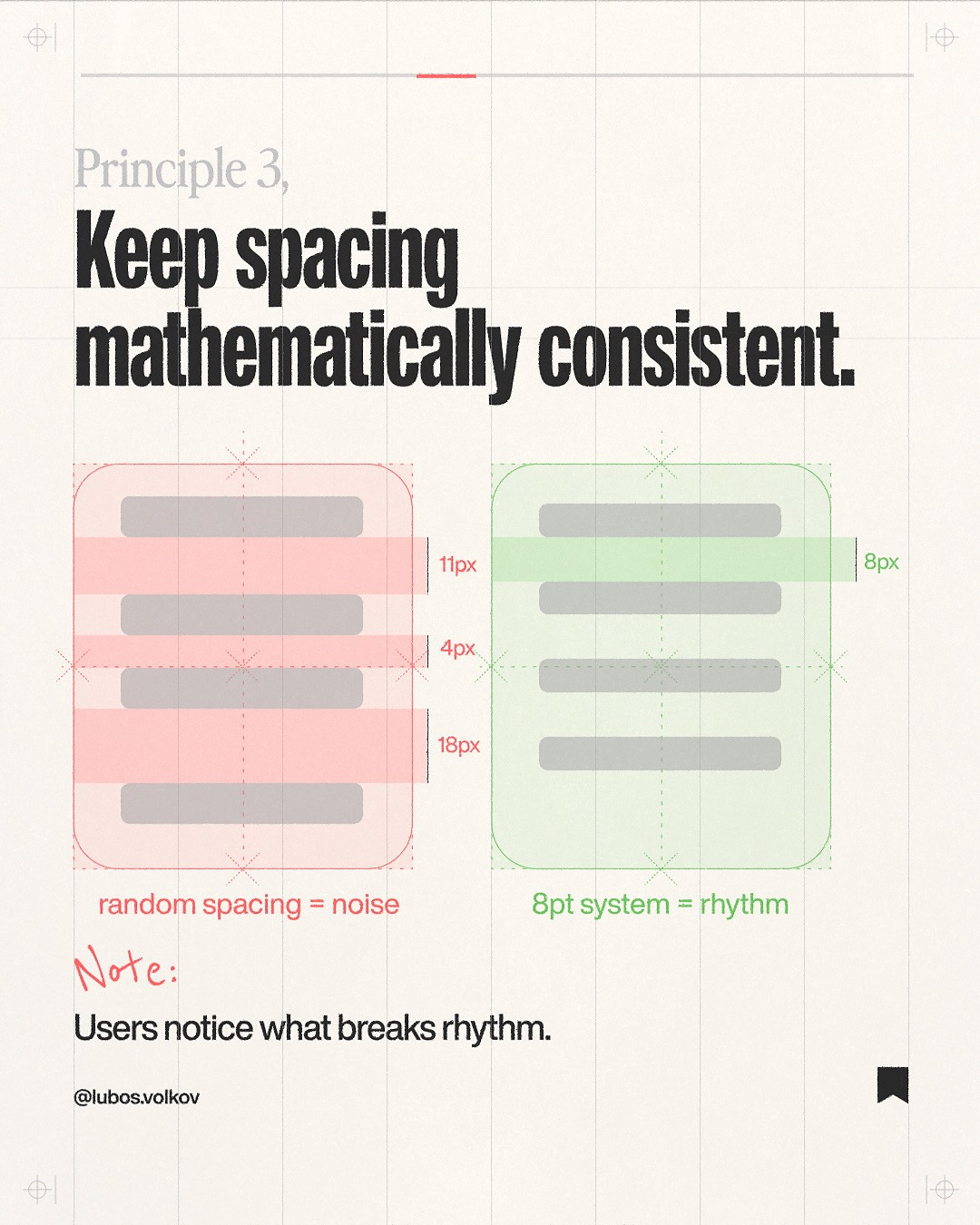
3. Build a spacing scale
Choose a base increment and use multiples of it for common gaps. An 8-point system is a practical starting point: 8, 16, 24, and 32 pixels cover many interface and editorial relationships. Smaller increments can be useful for optical corrections, but random values make repeated components feel unrelated. Consistency lets the reader sense the rhythm even without measuring it.
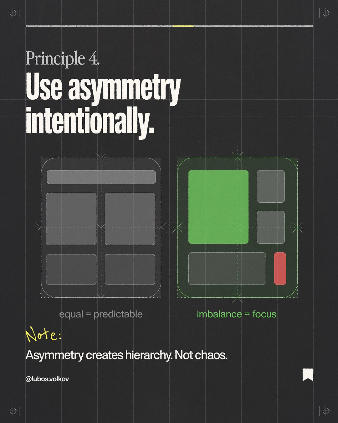
4. Use asymmetry to direct attention
Symmetry feels stable; asymmetry creates movement. Put the dominant visual on one side and balance it with a smaller block of type, a quiet area, or a secondary detail. The composition should still feel weighted, not lopsided. Squint at the page or blur it slightly: if your eye lands on the intended focal point, the visual balance is probably working.
5. Create hierarchy before adding decoration
Decide what matters most, second most, and least. Use size, contrast, position, and whitespace to show those levels. A large headline surrounded by equally bold labels has no clear priority. Reduce competing emphasis before reaching for shadows or ornamental shapes.
6. Align related elements
Alignment creates invisible connections. Align a caption with the image it describes, and keep repeated labels on a shared axis. Center alignment can be effective for short, formal compositions, while left alignment is often easier to scan across longer text. Choose a system and use it consistently.
7. Repeat a few visual cues
Repeated color, shape, or type treatment makes separate elements feel like one composition. Repetition does not mean copying everything. It means choosing a small set of cues and varying them with purpose. A single accent color can connect a title, a callout, and a page number without turning every object into a highlight.
8. Use contrast to separate roles
Contrast can come from size, weight, color, texture, or shape. Strong contrast helps the viewer distinguish the headline from supporting detail. Check that the contrast is meaningful rather than merely loud. If every element is high contrast, nothing stands apart.
9. Keep type choices functional
Use a type pairing that supports the content and has enough distinction to establish roles. More typefaces do not automatically create more personality. Start with one family and a clear range of weights. Add another only when it solves a real problem, such as creating a distinct editorial voice for a display heading.
10. Leave intentional negative space
Whitespace is part of the structure, not wasted real estate. It can isolate a focal element, separate unrelated groups, and make a dense page feel calmer. If a section feels cramped, first remove redundant content or group related items. Reducing every gap uniformly may not address the actual problem.
11. Review the layout at its final size
A design that works at 200 percent zoom may fail as a thumbnail or on a phone. Preview the actual output size, check text contrast, and look for details that become visual clutter. Ask a simple question: can someone understand the main point without studying every element?
Put the principles to work
Choose one existing poster or presentation page. Mark its grid, measure its margins, and list the spacing values you see. Then make a second pass using a consistent scale, fewer column patterns, and one intentional asymmetrical focal point. Compare both versions at the size the audience will encounter them. The goal is not to obey a formula. It is to make the design’s logic visible.
Source and credit: Principles adapted from the carousel by @lubosvolkov, original Instagram post.
A quick audit you can repeat
Take a screenshot of the finished page and draw over it with a temporary annotation layer. Mark the left and right edges of the main grid, circle the largest empty areas, and note any gaps that appear to repeat. If repeated elements sit on different axes, correct alignment before changing decoration. If a gap feels inconsistent, compare it with the spacing scale you chose and decide whether the difference is intentional. Then reduce the screenshot to a thumbnail. The thumbnail test removes the temptation to judge every detail individually and reveals whether contrast and hierarchy still work as a whole. Keep the annotated version beside the revised layout. This makes your decisions visible and helps a collaborator understand why the new version feels calmer, not merely that it looks different.
Treat the rules as defaults, not a cage
A poster, a data-heavy dashboard, and a children’s book do not need identical grids or spacing. The principles are useful because they give you a baseline to depart from knowingly. Break the grid when the story needs a full-bleed image. Use irregular spacing when it communicates a deliberate pace. But make the exception legible: if the composition looks inconsistent by accident, viewers will spend attention resolving the layout instead of understanding its message. A good review question is, “What does this exception help the audience notice?” If there is no clear answer, return to the simpler system.
Carousel slides
Related on NewForm
Keep reading

Find Your Stack
Discover the perfect design tools for your workflow.
Take the 60-second quizNewForm Studio
Turn your designs into professional mockups instantly.
Open StudioMore from NewForm

6 Free Fonts Similar to Futura (Real Specimens, 2026)
Futura is licensed and awkward at small sizes. These 6 free geometric sans, rendered from their official files, do the same job: Jost, Poppins, Outfit, Urbanist, Josefin Sans, Questrial.
13 min read · Nov 3, 2026

Bold Typographic Packaging: 4 Lessons From Standout Label Designs
Four real label designs, from LINEN sparkling water to DEWLO facial oil, teach hierarchy, color blocking, functional copy and quiet-color loud-type discipline.
4 min read · Nov 2, 2026