
5 Graphic Design Backgrounds That Make a Flat Layout Feel Tactile
Visual source and credit: @adarshxdesign, original Instagram carousel.
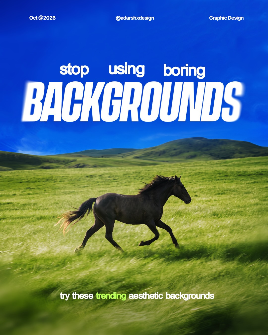
A background is not empty space. It sets the material, mood, and contrast for everything placed on top of it. In a carousel by @adarshxdesign, the prompt “stop using boring backgrounds” leads into a useful set of material directions, including a cutting mat, fabric texture, and liquid glass. The practical lesson is not to decorate every canvas. It is to choose a background whose visual character supports the content.
Start with the job the background needs to do
Before adding texture, write down what the viewer should notice first. A product name, a poster headline, and a small interface card have different needs. If the background competes with the focal point, it is doing too much. If the foreground feels pasted on, a carefully chosen surface can connect the pieces.
A simple test: temporarily set the foreground to grayscale. If the hierarchy disappears, fix contrast and scale before adding effects. Then introduce one material cue at low intensity and check whether it improves depth without reducing legibility.
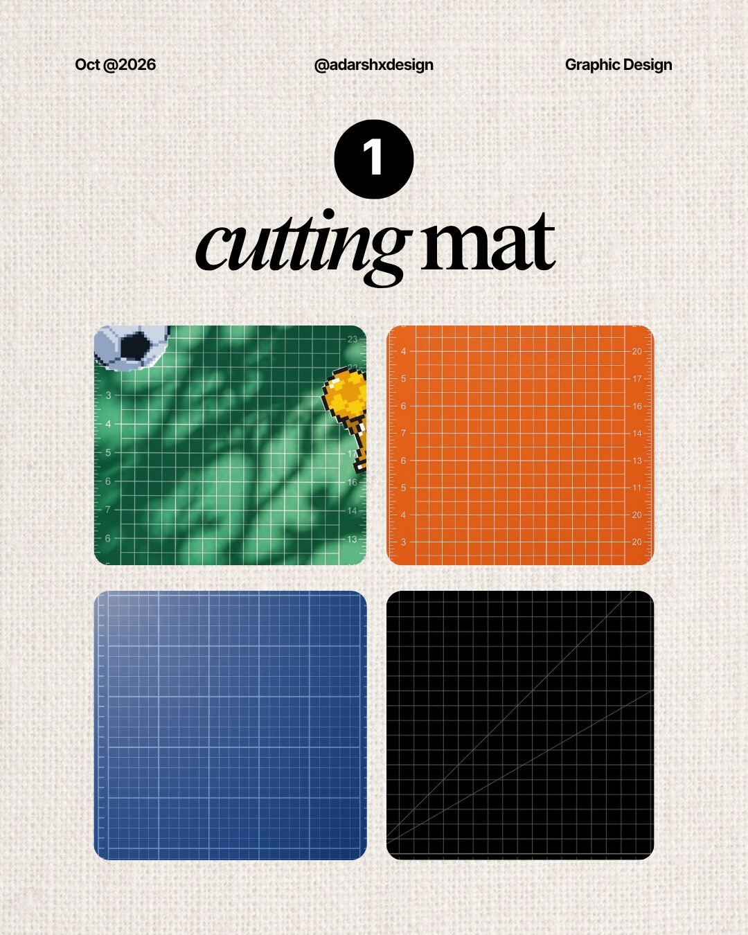
1. Use a cutting-mat grid for precision
A cutting mat suggests craft, measurement, and deliberate construction. Its grid can make a composition feel like a workspace rather than a blank page. Use a fine grid behind a product mockup, a process diagram, or a poster about making. Keep the grid lighter than the main content, and align major edges or labels to it. When every line is equally visible, the surface becomes noise, so lower the contrast and let only a few intersections show.
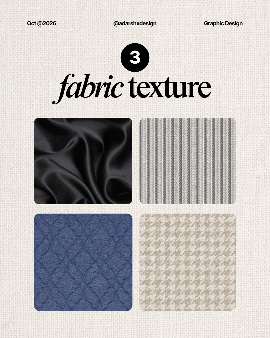
2. Use fabric grain to soften a digital composition
Fabric texture carries warmth and physicality. It can help a brand feel handmade, editorial, or approachable, especially when the foreground is clean vector art. Start with a subtle monochrome texture, then place a solid or lightly tinted panel behind small text. Avoid placing fine copy directly over high-frequency fibers. The contrast may look adequate on a large monitor but collapse on a phone.
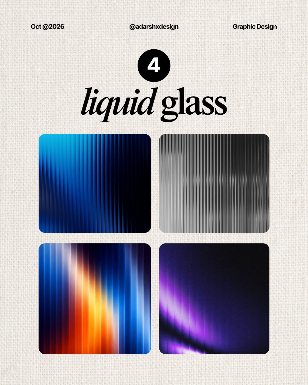
3. Try liquid glass only where transparency has meaning
The liquid-glass direction creates depth through translucency, highlights, and softened edges. Use it for a small foreground surface, a badge, or a single focal panel. It works best when the layer appears to sit in a believable environment. Give it a restrained blur, a clear edge, and enough opacity for the text to remain readable. If every object is translucent, the composition loses hierarchy and the effect stops feeling special.
4. Make the texture serve the message
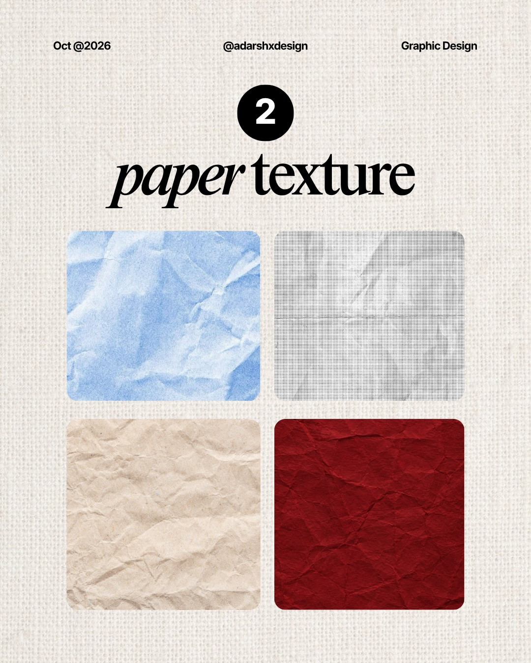
Match material to meaning. A technical guide can use a measured grid. A tactile product story can use fibers or paper grain. A futuristic interface might use glass, but only if the content benefits from that cue. This is a quick art-direction shortcut: pick the material that reinforces the idea, not the effect that happens to be trending.
5. Check the background at real viewing size
Zoom out to the size where people will actually see the design. Check the title, supporting copy, and key object on a phone-sized canvas. If the background makes the first read slower, reduce its contrast, simplify the pattern, or add a quiet backing shape. Also inspect the edges. Repeating patterns often reveal awkward seams where the background tiles or crops.
A practical workflow
Make three versions of the same composition: plain color, one subtle texture, and one more expressive material. Keep typography and layout identical so the comparison is fair. Ask someone to identify the headline and subject after a two-second glance. Choose the least intense treatment that improves the intended mood while keeping the message immediate. Save the texture as a separate layer so you can tune it later.
The best background is usually not the most elaborate one. It is the one that gives the foreground a clearer context. Try one surface at a time, protect text contrast, and let the content remain the star.
For more visual directions, explore NewForm Mockup Studio.
Source and credit: Visual reference from @adarshxdesign, original Instagram carousel.
Choosing a texture without losing accessibility
Texture changes the local contrast of a surface, so inspect it behind every text size, not just the headline. Small labels need a calmer patch of color or a solid card. Avoid putting essential information over a moving or highly detailed pattern, and do not use color alone to distinguish foreground from background. If you export a social graphic, check it on a phone with brightness turned down. A texture that looks delicate on a calibrated desktop display can become a muddy field on a small screen. Keep a clean version available for responsive crops and for audiences who prefer reduced visual complexity. This is especially important when the design will be reused as a template: the next editor may replace your short headline with a longer one, so leave enough quiet area for the layout to tolerate realistic content.
Save the treatment as a reusable recipe
When a background works, note its ingredients: source texture, scale, opacity, blend mode, blur, and any tint. Keep the recipe editable instead of flattening the treatment into the artwork. That makes it possible to reuse the mood on another size without stretching the texture or losing crispness. Create a small set of approved surfaces rather than starting from scratch for every post. The result is a more coherent visual language and less time spent auditioning effects. A repeatable material library also helps distinguish intentional brand texture from a one-off filter applied at the last minute.
Carousel slides
Related on NewForm
Keep reading

Find Your Stack
Discover the perfect design tools for your workflow.
Take the 60-second quizNewForm Studio
Turn your designs into professional mockups instantly.
Open StudioMore from NewForm

6 Free Fonts Similar to Futura (Real Specimens, 2026)
Futura is licensed and awkward at small sizes. These 6 free geometric sans, rendered from their official files, do the same job: Jost, Poppins, Outfit, Urbanist, Josefin Sans, Questrial.
13 min read · Nov 3, 2026

Bold Typographic Packaging: 4 Lessons From Standout Label Designs
Four real label designs, from LINEN sparkling water to DEWLO facial oil, teach hierarchy, color blocking, functional copy and quiet-color loud-type discipline.
4 min read · Nov 2, 2026