
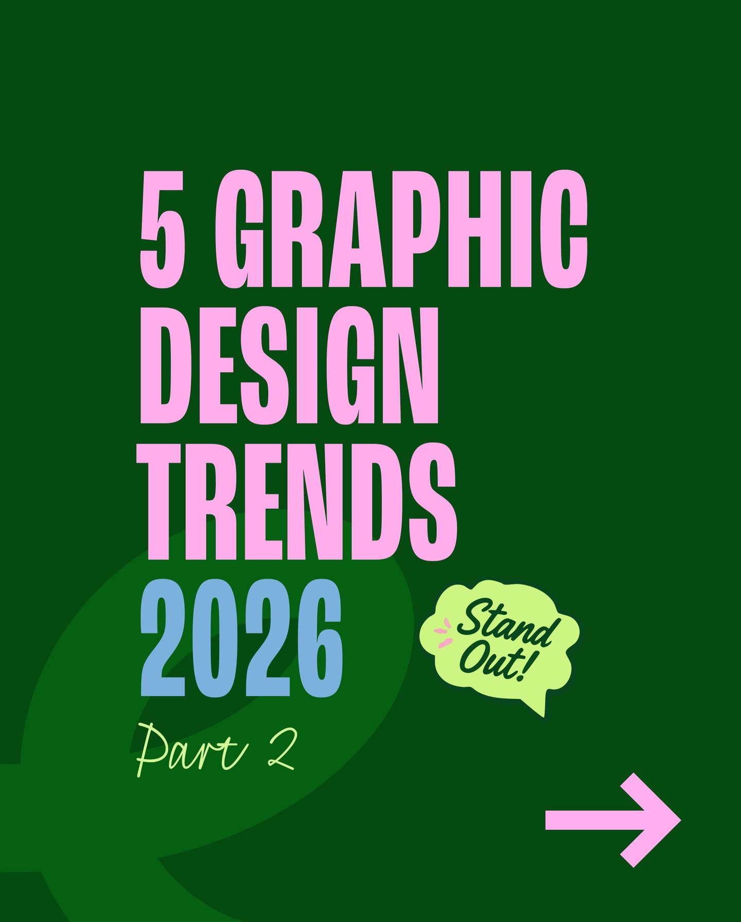
How to Build a Graphic Design Trend Board That Feels Original
How to Build a Graphic Design Trend Board That Still Feels Original
Trend posts are useful as visual prompts, but copying a style wholesale can make a brand feel temporary. The carousel by @geecreativestudio opens with graphic design trends for 2026 and shows visually specific directions, including Gzhel-inspired ornament and a shabby-chic treatment. Instead of treating trends as a checklist, use them to build a focused reference board and test one direction against a real brief.

1. Start with the project, not the trend
Write down the audience, the message, and the setting where the design will appear. A poster, product label, and mobile interface have different constraints. Choose one design problem to solve, such as making a seasonal campaign feel handmade, communicating heritage, or giving a digital product more warmth. This prevents a reference board from becoming a pile of attractive but unrelated images.
2. Translate references into design ingredients
A Gzhel-inspired direction can suggest blue-and-white ornament, hand-painted detail, and a sense of craft. Shabby chic can suggest faded florals, soft edges, layered paper, and a deliberately worn finish. These are observations from the visual references, not rules that every project must follow. Record the ingredients separately from the source image so you can combine, simplify, or reinterpret them.

Make three columns in your board: color, texture, and form. Add a few examples to each, then write a short note explaining what each reference contributes. This is more useful than collecting screenshots without labels. If the project needs restraint, select just one ingredient, perhaps the palette, rather than layering every motif at once.

3. Create three controlled directions
Build three small compositions using the same headline and content. Direction A can borrow a limited palette. Direction B can explore texture. Direction C can use ornament or layout. Keeping the content fixed makes the comparison about visual language, not copy changes. Set a boundary for each direction, such as two colors, one display typeface, or a single decorative motif. Constraints help a reference become a design decision rather than a collage.

4. Check legibility and context
Zoom out, reduce the design to a thumbnail, and test it against the intended use. Does the message remain clear? Is the texture competing with small text? Does the style fit the audience, or is the trend simply recognizable? For digital work, check contrast, responsive behavior, and motion preferences where relevant. For print, consider how fine details and pale colors will reproduce on the actual stock.
5. Keep the recognizable idea, change the execution
The strongest result usually keeps one recognizable cue and changes the rest to serve the project. A decorative border might become a restrained corner detail. A faded palette might be paired with crisp modern typography. An ornamental motif can become a custom icon rather than a background pattern. The goal is a design with a point of view, not a direct imitation of a reference.
Before presenting, write one sentence explaining the choice: “We used the hand-painted blue detail to make the package feel crafted, while keeping the type and layout contemporary.” If you cannot explain why a trend element is present, remove it.
Credit and source
Design inspiration by @geecreativestudio. Original carousel: Instagram.


Use trends as prompts, not deadlines
A trend can help a team notice a visual possibility, but its popularity does not prove that it belongs in a particular project. Ask whether the reference supports the audience, the message, and the medium. If the answer is yes, adapt one or two ingredients and make the rest of the system specific to the project. If the only reason to use it is that it is currently everywhere, keep looking.
Build a small test with actual content before committing. Place the real title, product name, and call to action into the composition. A reference may feel expressive with abstract shapes but become hard to read when practical information is added. Check the result at the size and format people will encounter.
For a digital campaign, inspect mobile crops and contrast. For packaging, check print production and fine detail. For a portfolio case study, show the references and explain how you transformed them. This makes the process transparent and demonstrates design judgment, not just trend awareness.
The useful question is not “Which trend should I copy?” It is “Which visual ingredient helps this project communicate more clearly, and how can I make that ingredient its own?”
A final checklist before you present
Make sure the board has a clear focal direction, each reference has a written purpose, and the final layout uses original compositions. Check that the design still works without decorative texture, then add only the details that improve the message. Save the board alongside the final files so the reasoning is easy to revisit later.
Related on NewForm
Keep reading

Find Your Stack
Discover the perfect design tools for your workflow.
Take the 60-second quizNewForm Studio
Turn your designs into professional mockups instantly.
Open StudioMore from NewForm

Free UI Components, SVG Generators and Icons: 4 Sites Every Designer Should Bookmark
Uiverse, fffuel, Iconbuddy and WebGradients cover most of the UI work designers re-solve every week: copy-paste components, SVG generators, 150,000 icons and CSS gradients.
4 min read · Nov 2, 2026

Bold Typographic Packaging: 4 Lessons From Standout Label Designs
Four real label designs, from LINEN sparkling water to DEWLO facial oil, teach hierarchy, color blocking, functional copy and quiet-color loud-type discipline.
4 min read · Nov 2, 2026