
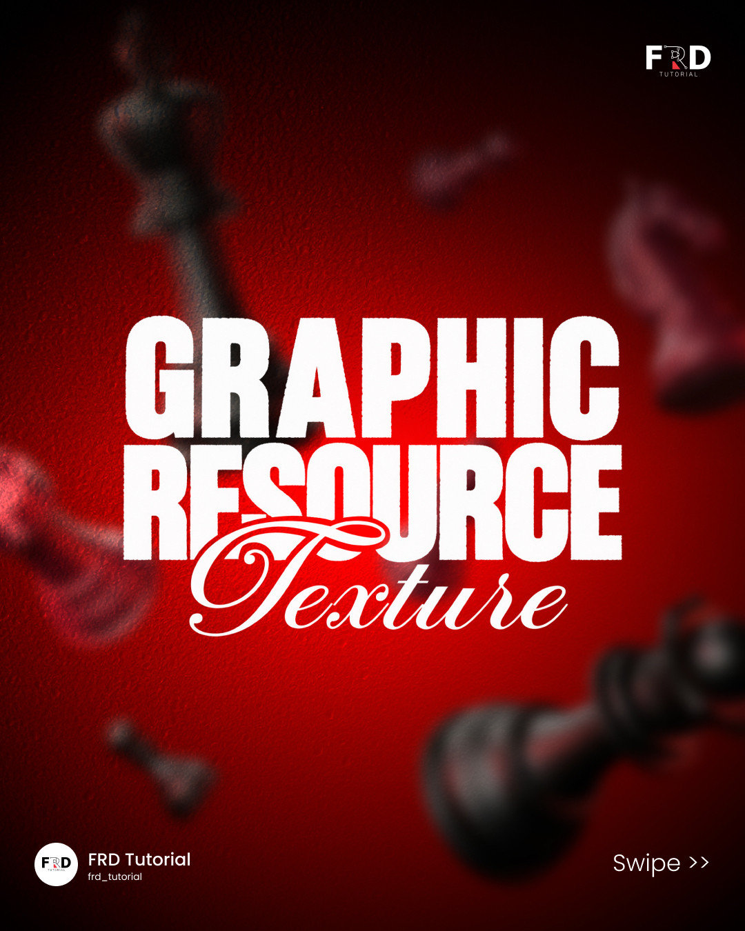
How to Use Texture Overlays in Graphic Design: 5 Effects and When to Use Them
Visual reference by frd_tutorial.

Texture is not decoration sprinkled over a finished design. Used well, it gives a surface a material, sets a mood, and helps a flat composition feel tactile. The Instagram carousel by frd_tutorial shows a useful set of directions: leather, foil, photocopy grain, light leaks, and wood. Each has a different visual job. Choosing the right texture overlay starts with deciding what the design should feel like, then controlling the texture so it supports the message instead of competing with it.
Start with the job, not the effect
Before searching for a texture, write down three things: the material or mood you want to suggest, the area that should carry the texture, and the elements that must remain easy to read. A premium skincare label may need a restrained foil glint. A music poster may benefit from photocopy grit. A warm food identity might use a subtle wood grain. The effect should reinforce the content, not become the content.
A practical rule is to keep one dominant texture per composition. Combining several strong surfaces often muddies the hierarchy. If you need a second effect, reserve it for a small accent, such as a highlight or edge.
Five texture directions and when they work
1. Leather: weight and craft

Leather suggests durability, craft, and a premium object. It can work on a title panel, product mockup, or a small badge. Keep the pattern scale believable. Grain that is too large can read as camouflage, while a very fine grain may disappear after export. Place the texture beneath the typography and use enough contrast that letters do not break across busy patches.
2. Foil: a controlled highlight

Foil is most convincing when it is selective. Use it for a word, emblem, border, or a small printed detail rather than coating the whole canvas. Metallic texture relies on changes in brightness, so leave room for dark and light regions. A single bright accent often looks more expensive than a page full of shine.
3. Photocopy: urgency and imperfection

Photocopy grain brings a handmade, editorial edge. It suits gig posters, zines, culture campaigns, and layouts that should feel assembled rather than immaculate. Apply the grain to a background or image treatment first, then place clear type above it. If the texture reduces small text legibility, mask it away from the copy instead of lowering contrast everywhere.
4. Light leaks: warmth and motion

Light leaks create a photographic glow and a sense of movement. Use them near an edge or behind a focal image, where they can frame the subject. Avoid putting the brightest part directly behind a headline. A gradient mask can taper the effect so it fades naturally instead of looking like a flat sticker.
5. Wood: natural and grounded

Wood grain signals natural materials, food, interiors, and hands-on making. It works best when its grain direction supports the composition. Horizontal grain can stabilize a wide layout, while vertical grain can make a narrow package feel taller. Keep the grain low contrast behind labels and product details.
A simple texture-overlay workflow
- Build the clean layout first. Set the typography, spacing, and image hierarchy without effects. This gives you a baseline to protect.
- Add texture on a separate layer. Keep the source editable and make a mask for the area it should affect.
- Match scale to the surface. Zoom out to presentation size. If the texture looks enormous or vanishes, adjust its scale before changing opacity.
- Reduce intensity before adding more effects. Lower opacity or use a softer blend. Check the result on both a light and dark screen if it will be viewed digitally.
- Protect the reading zones. Keep fine grain, bright flashes, and deep shadows away from small text, buttons, and logos.
- Test the export. Inspect a real-size image, not just the zoomed canvas. Compression can exaggerate grain and banding.
The final test
Toggle the texture off and on. If the design loses a useful material cue or emotional quality when it is off, the layer is doing work. If the only difference is that the page looks busier, remove it or reduce it. That quick check keeps texture in service of the idea.
The examples are visual inspiration, not a claim that one effect fits every brand. Start with the message, use one convincing surface, and keep the important content legible. See the original carousel by frd_tutorial on Instagram.
Related on NewForm
Keep reading

Find Your Stack
Discover the perfect design tools for your workflow.
Take the 60-second quizNewForm Studio
Turn your designs into professional mockups instantly.
Open StudioMore from NewForm

6 Free Fonts Similar to Futura (Real Specimens, 2026)
Futura is licensed and awkward at small sizes. These 6 free geometric sans, rendered from their official files, do the same job: Jost, Poppins, Outfit, Urbanist, Josefin Sans, Questrial.
13 min read · Nov 3, 2026

Bold Typographic Packaging: 4 Lessons From Standout Label Designs
Four real label designs, from LINEN sparkling water to DEWLO facial oil, teach hierarchy, color blocking, functional copy and quiet-color loud-type discipline.
4 min read · Nov 2, 2026