
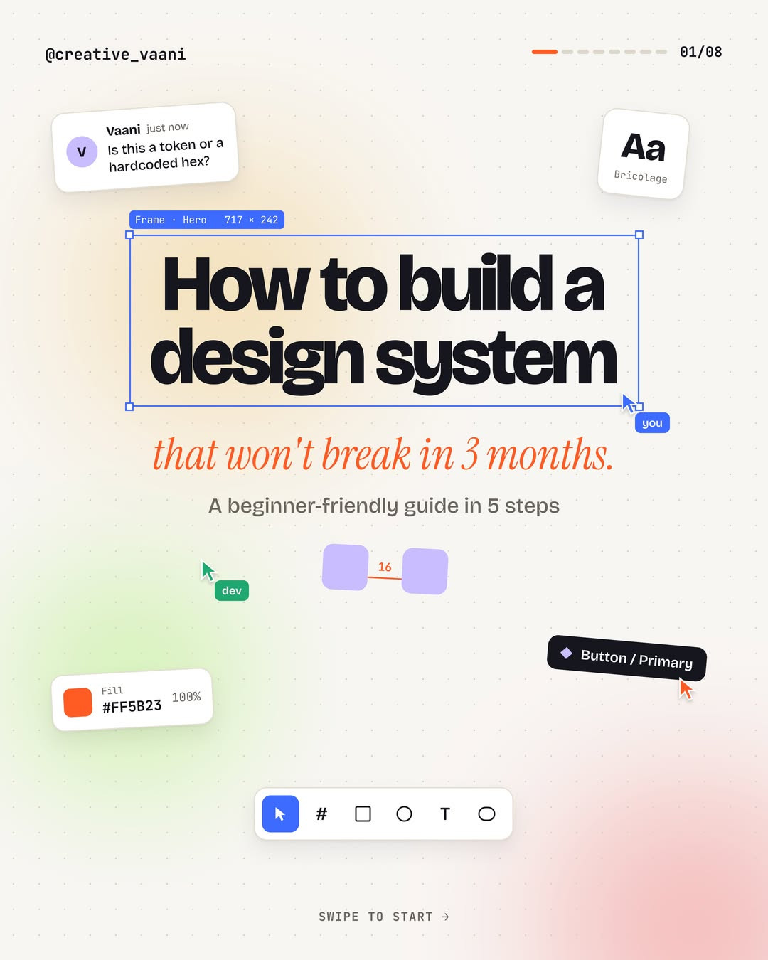
How to Build a Design System in 5 Practical Steps
Source carousel by @creative_vaani. Images reproduced from the original Instagram post.
A design system usually becomes fragile for a predictable reason: teams start drawing dozens of components before they agree on the decisions those components should share. This five-step guide reverses that order. Set the foundations, name reusable values, build a compact core, describe its states, and document how it should be used. The sequence is practical for a small product team because it makes the system useful early without pretending it is finished.

Step 1: Decide the foundations before drawing screens
Begin with the rules that shape many decisions. Choose a color palette with semantic roles, a type scale, a spacing rhythm, and a small set of radii and elevation levels. The carousel suggests a four-point spacing grid. The exact unit matters less than consistent relationships: a compact control, a standard card, and a spacious section should feel intentionally related rather than arbitrarily measured.
A useful first pass might define primary and neutral colors, display and heading styles, body and caption sizes, plus a spacing scale that increments predictably. Test the values in a real screen, not just a token sheet. Check a long label, a dense form, and a mobile-width layout. Foundation decisions should make common screens easier, not force every screen into one rigid template.

Step 2: Turn raw values into tokens
A token gives a decision a name. Instead of repeating a hex value everywhere, create a primitive value and refer to it through a semantic name such as color/action/primary. Components can then reference the semantic choice rather than the raw number. If a rebrand or dark theme changes the underlying value, the update can happen in one deliberate place.
Keep the layers understandable. Primitive tokens describe raw values, semantic tokens describe intent, and component tokens apply that intent in a specific context. Do not create layers for their own sake. If a token has no clear consumer or meaning, it may be premature. Start with the colors, spacing, typography, and radii that actually recur in the product.

Step 3: Build five useful components, not fifty
The source guide recommends starting with five common pieces: button, input, card, avatar, and navigation. These are a sensible starting point when they occur in the product, not a mandatory checklist. Choose components by frequency and impact. A recurring control that appears on several high-traffic flows is usually a better first investment than a rare decorative widget.
For each component, write down its anatomy and its key dimensions. A button might have a label, optional icon, padding, height, and radius. Record which properties are fixed and which are configurable. This lets a designer use the component consistently while preserving enough flexibility for real content.
Step 4: Model variants and states explicitly
A component is not complete when it only looks correct in its default state. Buttons may be primary, secondary, or quiet, and they may be hovered, pressed, focused, or disabled. Inputs may be empty, focused, invalid, or completed. Define these states intentionally, then check that each one remains legible and understandable.
Avoid a variant explosion. A variant should represent a meaningful behavior or visual role, not a one-off local exception. If two variants differ only because a particular screen needs a special padding value, ask whether the component needs a real option or whether the screen should use the standard. Fewer, clearer choices make a system easier to adopt.
Step 5: Document usage and accessibility
Documentation turns a component file into a shared language. State when a component should be used, what properties it accepts, and which states it supports. The carousel calls out practical guardrails such as contrast, visible focus rings, and touch targets. Check these against current accessibility guidance and your actual product context rather than treating a static number as the whole accessibility review.
Show examples of good and poor use. For a primary action, explain its purpose and whether a screen should have one dominant action. For an input, show how validation is communicated in text and not by color alone. Include ownership and version notes so teams know who can make changes and whether a component is stable.
Three mistakes to avoid
First, do not build forty components on day one. Start with foundations and a few high-use parts, then expand from evidence. Second, do not hardcode colors, spacing, or radii in many places. Repeated values should come from tokens so updates remain coherent. Third, do not publish components without explaining their states and usage. Unclear components invite local forks, which quickly undermine consistency.
Make the first release deliberately small
Choose one user flow and identify the repeated patterns inside it. Establish the smallest useful foundation, define tokens for repeated values, build the few components that appear in that flow, and test them with real copy and edge cases. Ask a designer and an engineer to implement the same screen using the system. Wherever they interpret a rule differently, clarify the naming or documentation.
A design system is not a library that must be complete before it can help. It is a maintained agreement between design and implementation. Release a small, coherent version, observe where it saves time or creates friction, and let those findings decide what to add next.
Original carousel: How to build a design system
Related on NewForm
Keep reading
Find Your Stack
Discover the perfect design tools for your workflow.
Take the 60-second quizNewForm Studio
Turn your designs into professional mockups instantly.
Open StudioMore from NewForm

15 UX Portfolio Examples That Get Designers Hired (And What Each One Does Right)
Fifteen real UX portfolio examples from working designers, the one lesson each teaches, a structure checklist, and how to build yours in a weekend.
11 min read · Nov 1, 2026
How to Choose UI Fonts by Mood: A Practical Pairing Method
Turn mood words like elegant, bold, and editorial into a practical type pairing, then test it on real interface content.
4 min read · Oct 21, 2026