
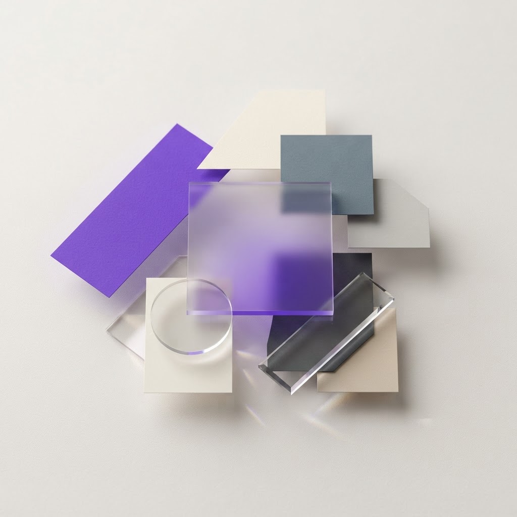
7 Color Decisions That Make Any Design Feel Premium
Originally shared as a carousel on @dailywebdesign, original carousel by @lubosvolkov. Expanded with examples, color values, and design rationale.


Premium-feeling design isn't about using black and gold. It's about a set of specific, repeatable color decisions that signal quality, the kind of care that makes users trust a product before they've read a single word.
Here are 7 color decisions that consistently separate premium-feeling design from ordinary work.
1. Use tinted neutrals, not pure grey
Pure grey (#808080, #CCCCCC) is flat and lifeless. Premium designs use neutrals nudged 2–4% toward the primary brand color. If your brand is blue, your neutrals lean slightly blue. This creates subtle harmony users feel without being able to explain.
Tool: Coolors lets you generate harmonious palettes and adjust saturation easily.
2. Limit your palette to 60/30/10
- 60%: Dominant neutral (backgrounds, large surfaces)
- 30%: Secondary tone (cards, panels, subtle UI elements)
- 10%: Accent (CTAs, highlights, interactive elements)
Most non-premium designs use accent colors at 40–50%. Premium designs are restrained: the accent earns its impact by being rare.
3. Never use pure black for text
Pure black (#000000) on white feels low-budget, it's the default, and defaults feel cheap. Instead:
- Dark mode: Use #E8E8E8 or a slightly warm off-white
- Light mode: Use #1A1A2E or #111827
- Body text: Drop to #374151 or #4B5563
4. Use one true accent, executed in 9 shades
Premium design systems have blue-50 through blue-900, not just "blue." This gives you light tints for badges, mid-range values for borders, and deep shades for text-on-color. A single accent with a proper scale replaces the need for multiple competing colors.
Tool: Radix Colors generates accessible, perceptually-balanced color scales.
5. Apply color to communicate meaning, not decoration
Amateur designs use color for decoration. Premium designs use color to communicate: green = success, red = error, yellow = warning, blue = information. Every color has a job.
6. Design for accessible contrast from the start
Premium feels trustworthy. Trustworthy means accessible. WCAG AA requires:
- 4.5:1 contrast ratio for body text
- 3:1 for large text and UI components
Tool: WebAIM Contrast Checker or the checker built into Figma.
7. Create shadow that matches your brand color
Default drop shadows are cool grey (#00000020). Premium interfaces use shadows tinted toward the dominant color of the surface casting the shadow. A card with a blue accent casts a slightly blue shadow. This subtle detail creates depth that default grey shadows never achieve.
In Figma: set your shadow color to your primary or accent color at 15–25% opacity instead of black.
Practice: redesign one UI element using all 7
Take one component, a button, a card, a form field, and apply all 7 rules simultaneously. The transformation is immediate.
Want to present the result? Generate a professional mockup in seconds with NewForm Studio. For deeper color theory and UI design training, Interaction Design Foundation has excellent visual design courses.
View the full carousel on Instagram →
Credit: Original carousel by @lubosvolkov, follow them for more UI design and visual design content.
Find Your Stack
Discover the perfect design tools for your workflow.
Take the 60-second quizNewForm Studio
Turn your designs into professional mockups instantly.
Open StudioMore from NewForm

Top Dashboard UI Designs to Learn From (2026 Showcase)
Five standout dashboard designs across SaaS, AI, cybersecurity, energy, and fintech. Each one shows how to turn complex data into a clean, usable interface.
7 min read · Sep 24, 2026

10 UI Design Ideas to Steal for Your Next Project (2026)
Ten practical UI design patterns worth borrowing for your next project, from clear empty states to premium dark mode and compact data displays.
6 min read · Sep 24, 2026