
The Complete Guide to Spacing and Whitespace in UI Design
The Complete Guide to Spacing and Whitespace in UI Design
Spacing is the invisible language of interface design. It's what separates a clean, professional layout from a cluttered, amateur one. Yet most designers learn it through trial and error instead of principles.
This guide breaks down spacing into actionable rules you can apply immediately.
The 8px Grid System
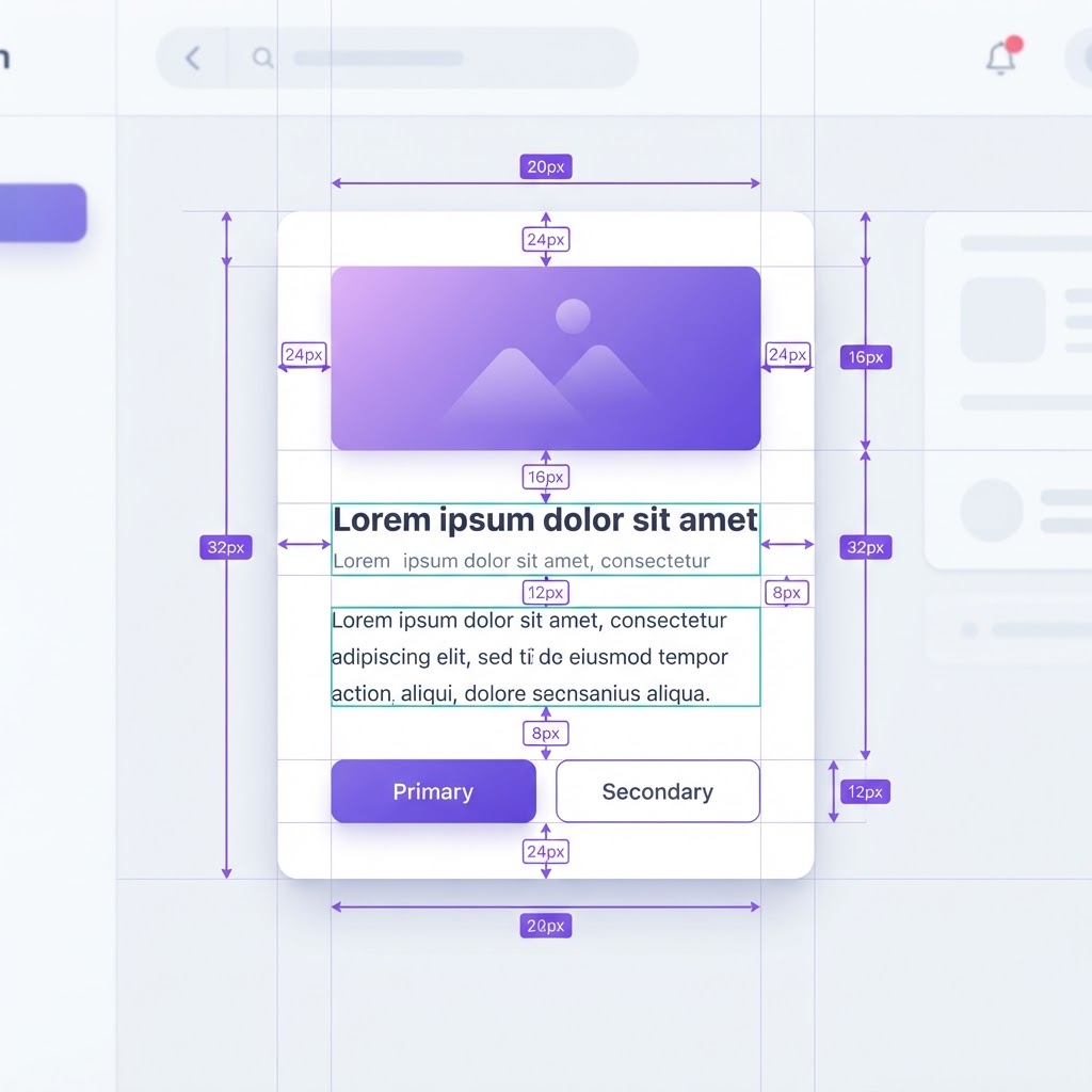
Most design systems are built on an 8-pixel base unit. This isn't arbitrary, it's the sweet spot where elements feel distinct without feeling disconnected.
The 8px scale:
- 4px, tight spacing (inside components, between icon and label)
- 8px, default spacing (between related elements)
- 16px, section spacing (between groups of elements)
- 24px, major section breaks
- 32px, page-level divisions
- 48px+, hero sections and large separations
Why 8? It divides evenly into most screen sizes, scales cleanly across devices, and creates rhythm. Designers who use the 8px grid consistently produce layouts that feel structured without being rigid.
Inner vs Outer Spacing
A card has two types of spacing: inner (padding inside the card) and outer (margin between the card and other elements). The ratio between them matters.
Rule of thumb: Inner spacing should be roughly 50-75% of outer spacing. A card with 24px of padding should sit 32-48px from its neighbors. This creates a visual grouping where elements that belong together feel connected.
Whitespace as Hierarchy
Whitespace isn't empty space, it's a design element. More whitespace around an element signals more importance. A headline with 64px above it and 16px below it commands attention. A body paragraph with 16px above and below it blends in.
Practical application:
- Primary CTAs: 32px+ of whitespace around them
- Section headers: 48px above, 24px below
- Body text: 24px above, 16px below
- Related items: 8-16px apart
Line Height and Letter Spacing
Typography spacing is just as important as layout spacing.
Body text: Line height of 1.5 (24px line height for 16px text). This gives each line enough room to be read independently.
Headings: Line height of 1.2-1.3. Headlines can be tighter because the larger font size creates natural separation.
Letter spacing:
- Body text: 0 (default)
- All-caps labels: +1-2% (slightly looser)
- Large display text: -1-2% (slightly tighter)
Common Spacing Mistakes
- Inconsistent spacing. Using 12px here, 14px there, 16px somewhere else. Pick a scale and stick to it.
- Too tight around CTAs. Buttons need breathing room. 16px of padding minimum.
- Equal spacing everywhere. If everything has 16px, nothing has hierarchy. Vary spacing intentionally.
- Forgetting vertical rhythm. Horizontal spacing is easy to see. Vertical rhythm is what makes a page feel structured.
- Ignoring content density. A dashboard needs different spacing than a landing page. Match density to purpose.
Spacing in Responsive Design
As screens shrink, spacing should compress, but not uniformly. Reduce outer spacing first (margins between sections), then inner spacing (padding within cards). Never reduce below the 4px minimum.
Mobile adjustments:
- Reduce page margins from 48px to 16-24px
- Reduce section breaks from 48px to 32px
- Keep component padding at 16px minimum
- Maintain the 8px base unit
Tools for Managing Spacing
If you design in Figma, set up your spacing as variables. If you want to see your designs in realistic mockups to check spacing in context, try the NewForm Studio. And to find the right design tools for your workflow, take our 60-second quiz.
Find Your Stack
Discover the perfect design tools for your workflow.
Take the 60-second quizNewForm Studio
Turn your designs into professional mockups instantly.
Open StudioMore from NewForm

Master Your Workflow: Design Smarter, Not Harder in 2026
Discover how the latest design tools and efficient workflows can help you create professional, high-impact visuals without the burnout. Elevate your creative output today.
3 min read · Oct 3, 2026

Before and After UI Redesign: What Actually Changes When You Level Up a Design
A before and after UI redesign reveals the difference between decent and great design. Here is what changes and the principles that drive the improvement.
5 min read · Oct 3, 2026