
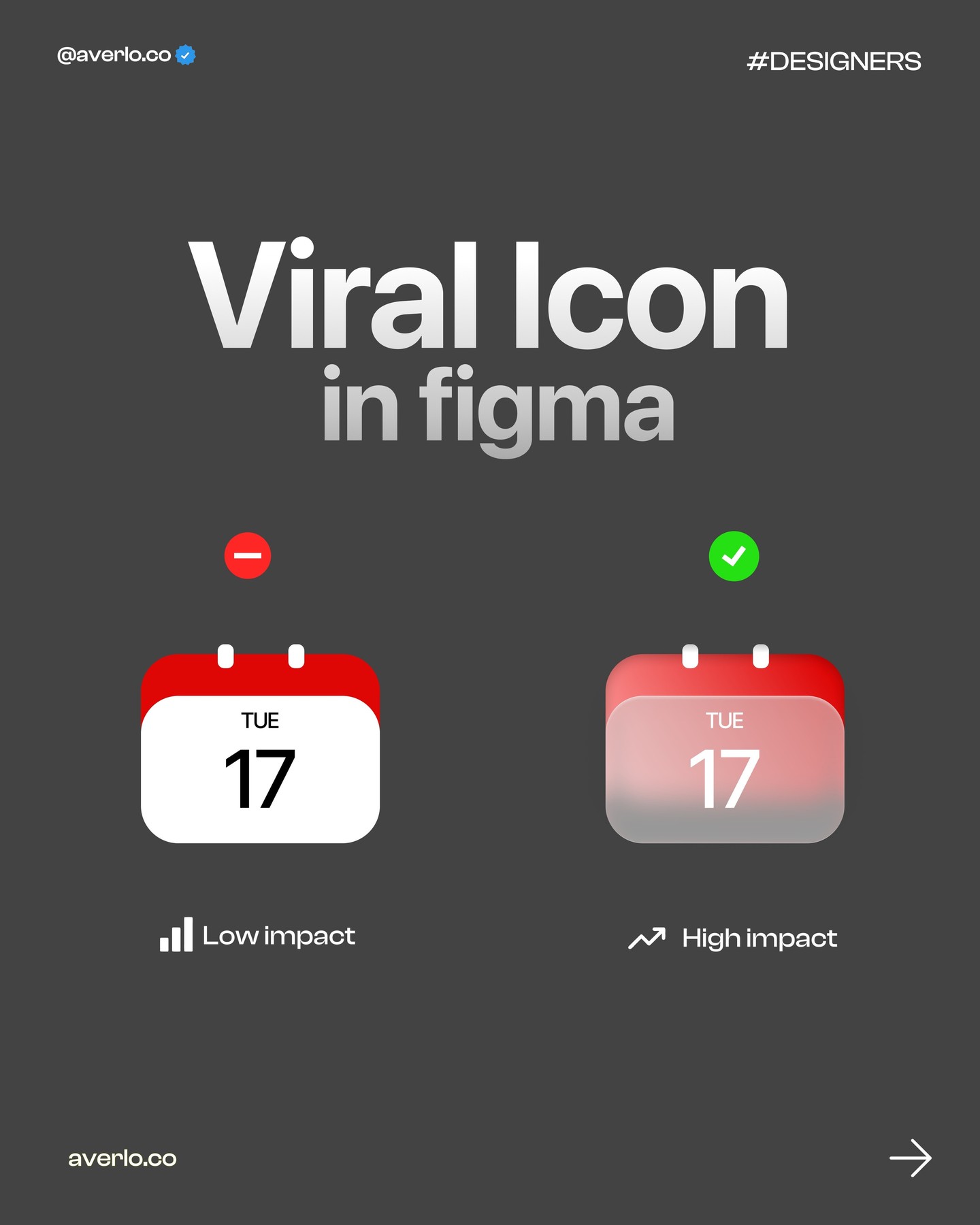
How to Make a UI Design Feel High-Impact in Figma
How to Make a UI Design Feel High-Impact in Figma
A polished UI does not need more decoration. It needs a clear focal point, deliberate contrast, and enough restraint for the important part to stand out. The @averlo.co carousel illustrates the difference between a low-impact presentation and a more confident, high-quality design. Here is a hands-on way to translate that idea into a practical Figma review.

Design inspiration by @averlo.co. This post is an independent design analysis.
1. Decide what should win attention
Before adjusting type or effects, identify the single most important action or piece of information. Use a short sentence: “The visitor should understand the offer,” or “The user should spot the latest result.” This keeps the work anchored in communication instead of visual tricks.

In Figma, duplicate your frame and label the copy “hierarchy test.” Temporarily remove decorative effects, then arrange the title, supporting copy, and action in an obvious order. Use position and spacing first. A clean hierarchy often improves the screen before you touch color.

2. Choose one strong contrast
A high-impact focal point can be larger, brighter, bolder, or more isolated than its surroundings. Choose one primary contrast and one supporting contrast. For example, pair a strong headline scale with a quiet background, or use a single accent color to signal the key action. Avoid making every card, label, and button equally vivid. If everything competes, nothing leads.
Use Figma’s component and text styles so your test stays consistent. Make three variants: scale-led, color-led, and spacing-led. Keep the words and content identical. This makes the comparison fair and helps you see which visual variable is doing the work.

3. Compare at real viewing size
Zoom out until the frame is close to the size it will appear on a phone or laptop. A design that looks dramatic at 200 percent can collapse at normal viewing size. Check whether the focal item is still obvious, whether secondary details remain legible, and whether the overall composition feels balanced.
Ask a colleague to glance at each variant for a few seconds, then tell you what they noticed first. Do not ask which one they “like” yet. First establish whether the design communicates the intended priority. If they notice a decorative badge before the product or action, revise the hierarchy.
4. Polish without adding noise
Once the structure works, refine type, color, and effects. Give the headline enough breathing room. Use shadows only when they clarify elevation or focus. Keep the supporting palette quiet so the key color retains meaning. High-quality work often feels more intentional because fewer elements are competing for attention.
Check the contrast of text and controls against the WCAG accessibility guidance. Test the frame at mobile width and make sure the message remains understandable without relying on color alone. Then remove any effect that does not improve hierarchy, legibility, or affordance.
A quick Figma exercise
Duplicate one current project screen and spend ten minutes making three hierarchy variants. Use no new assets. Change only scale, accent color, and spacing, one at a time. Compare them at thumbnail size and ask someone to identify the focal point. Keep the version that communicates the job fastest, not necessarily the one with the most visual effects.
For a more presentation-ready view of your finished interface, try NewForm Mockup Studio.
Credit and source
Design inspiration by @averlo.co. Original carousel: Instagram.
A closer look at why the comparison works
The strongest lesson in the carousel is not that every interface should be dramatic. It is that quality becomes visible when the choices feel connected. A headline, palette, spacing system, and supporting details should all point toward the same message. When one element pulls in a different direction, the design starts to feel accidental.
Use a simple review order. First check content priority, then alignment and spacing, then typography, then color, and only after that consider depth effects. This sequence prevents a common time sink: polishing a shadow on a card whose content is still arranged in the wrong order. Keep a note beside the frame explaining what the viewer should notice first. If the visual hierarchy contradicts that sentence, revise the layout before polishing.
Also compare the design with its neighboring screens. A single striking landing page can feel disconnected if the rest of the product uses a different type scale or interaction language. Reuse the same buttons, input patterns, and spacing rules unless there is a clear reason to depart from them. Consistency gives the accent moments more impact because they are not competing with a dozen unrelated styles.
Finally, save the rejected variants. They document the decision and make future reviews faster. A small set of labeled alternatives can show that the final result came from a deliberate test, not arbitrary taste.
For a presentation-ready mockup after the interface is complete, use NewForm Mockup Studio.
Related on NewForm
Keep reading

Find Your Stack
Discover the perfect design tools for your workflow.
Take the 60-second quizNewForm Studio
Turn your designs into professional mockups instantly.
Open StudioMore from NewForm

6 Free Fonts Similar to Futura (Real Specimens, 2026)
Futura is licensed and awkward at small sizes. These 6 free geometric sans, rendered from their official files, do the same job: Jost, Poppins, Outfit, Urbanist, Josefin Sans, Questrial.
13 min read · Nov 3, 2026

Bold Typographic Packaging: 4 Lessons From Standout Label Designs
Four real label designs, from LINEN sparkling water to DEWLO facial oil, teach hierarchy, color blocking, functional copy and quiet-color loud-type discipline.
4 min read · Nov 2, 2026