
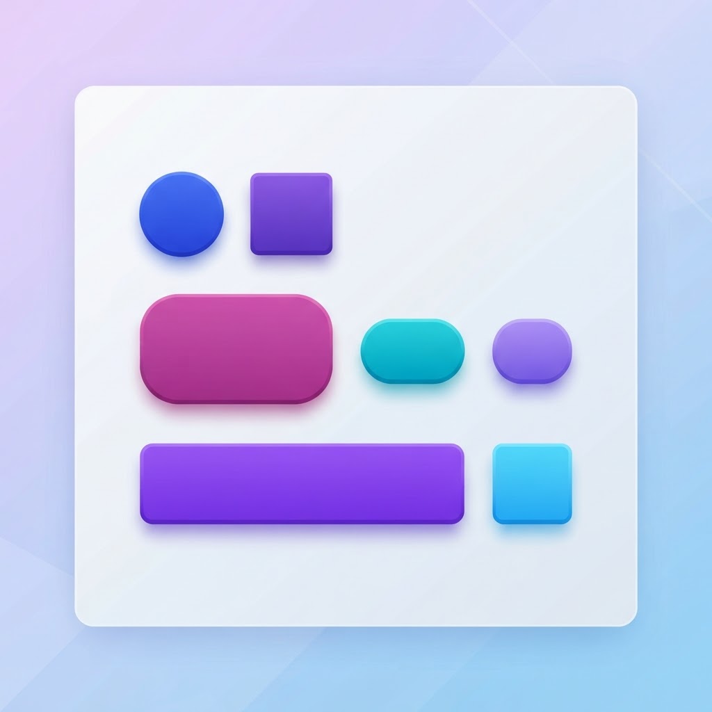
The Psychology of Button Design: How Shape, Color, and Placement Drive Clicks
The Psychology of Button Design: How Shape, Color, and Placement Drive Clicks
Every click, tap, and press in your app is a decision point. And the design of that button, its shape, color, size, and position, directly influences whether users take action or hesitate. Let's break down what the research actually says about button design.
Shape: Rounded Corners Win
Research from the University of Toronto found that rounded corners are perceived as more approachable and friendly than sharp corners. This isn't just aesthetic preference, it's rooted in how the brain processes shapes. Sharp edges trigger a subtle avoidance response (think: danger, caution), while curves feel safe and inviting.
Practical takeaway: Use rounded corners for primary action buttons. Pill-shaped buttons (fully rounded) work especially well for mobile, where thumb interactions benefit from the larger touch target.
Color: The Contrast Principle
The most effective button color isn't a specific hue, it's the one that contrasts most with its background. A blue button on a blue page will fail. A blue button on a white page with no competing blue elements will succeed.
Key color guidelines:
- Primary CTA: Use a color that appears nowhere else on the page. If your brand is blue, make your CTA orange or green.
- Secondary actions: Use muted or outline styles to create visual hierarchy.
- Destructive actions: Red is universally understood as destructive. Use it sparingly.
- Success states: Green for confirmation. It's the one color convention worth keeping.
Size: The 44px Rule (and Why It Matters)
Apple's Human Interface Guidelines recommend a minimum touch target of 44×44 pixels. Google's Material Design says 48×48. But the actual button can be smaller as long as the touch target meets the minimum.
Why this matters: Buttons that are too small cause mis-taps, frustration, and abandonment. On mobile, a button that looks fine on desktop can become nearly impossible to tap accurately.
Placement: Where Eyes Go First
The F-pattern and Z-pattern are well-known eye-tracking models. But for buttons specifically, placement research shows:
- Below the fold of a form: Users expect the action button at the end of a form. Placing it elsewhere causes confusion.
- Top-right for primary actions: On desktop, the top-right corner receives consistent visual attention. This is why "Sign Up" buttons live there.
- Bottom-center on mobile: The thumb zone, the area easily reached by the thumb on a phone, favors bottom placement. This is why mobile checkout buttons live at the bottom.
The Power of Whitespace Around Buttons
A button surrounded by whitespace draws more attention than one crowded by other elements. This is the isolation effect (also called the von Restorff effect), the item that stands out gets noticed and remembered.
Practical takeaway: Don't crowd your CTAs. Give them room to breathe. A button with 24px of padding on all sides will outperform one crammed next to text.
Text: Verb-First Buttons Convert Better
"Get Started" outperforms "Submit." "Create Account" outperforms "Sign Up." "Download Free Guide" outperforms "Download."
The pattern: verb + outcome. Tell users what will happen when they click. Specificity reduces uncertainty, and uncertainty is the enemy of action.
Loading States: Don't Leave Users Hanging
A button that does nothing for 2 seconds after being clicked feels broken. Always show a loading state:
- Spinner or pulse animation
- Text change ("Creating. ." instead of "Create Account")
- Disable the button to prevent double-submission
Key Takeaways
- Rounded corners > sharp corners for approachability
- Contrast with the background matters more than the specific color
- Minimum 44px touch targets on mobile
- Place primary actions where users expect them (bottom on mobile, top-right on desktop)
- Give buttons whitespace to make them stand out
- Use verb + outcome in button text
- Always show loading states
Want to test your button designs in realistic mockups? Try the NewForm Studio, it's free to start.
And if you're looking for the perfect tools to build your next interface, take our 60-second design stack quiz.
Find Your Stack
Discover the perfect design tools for your workflow.
Take the 60-second quizNewForm Studio
Turn your designs into professional mockups instantly.
Open StudioMore from NewForm

Mosaic Edition: 6 Color Palettes Every Designer Should Steal (2026)
Six curated color palette combinations from the Mosaic Edition series, complete with hex codes. Steal these palettes for your next UI, web, or brand design project.
6 min read · Sep 26, 2026

How to Create a Viral Shadow Effect in Figma (Step-by-Step Tutorial)
Most shadow effects in Figma look cheap and get no engagement. This tutorial breaks down the difference between low-impact shadows and viral-quality shadow effects that make your UI designs stand out.
5 min read · Sep 26, 2026