
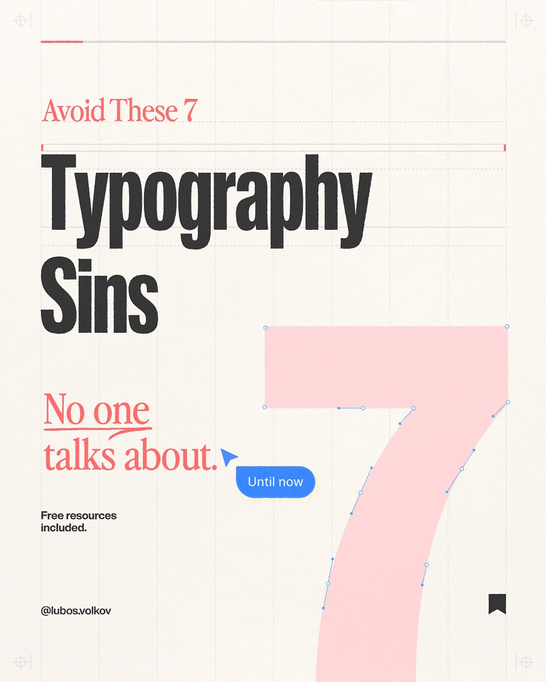
7 Typography Sins No One Talks About (But Every Designer Commits)
Typography is the most overlooked skill in UI design. Everyone talks about color theory and layout grids, but typography? It's the thing you set once and never touch again. That is, until someone points out your design looks "off" and you can't figure out why.
Post by @lubosvolkov, original carousel here.

Sin #1: Using Default Line Height
Every font has a different natural line height. Inter needs less. Georgia needs more. But most designers set line-height: 1.5 and call it a day. That works for body text in some fonts and looks cramped or loose in others.
The fix: Test line height for each font individually. A good starting point: 1.4–1.6 for body text, 1.1–1.3 for headings. But verify with your eyes, not a formula.

Sin #2: Ignoring Optical Sizing
Variable fonts are everywhere now, but most designers don't use optical sizing. Larger text needs tighter letter spacing and different weight adjustments. Smaller text needs more generous spacing to stay legible.
The fix: If your font supports it, enable optical sizing. If not, manually adjust letter spacing: tighter for large display text, slightly looser for small body text.

Sin #3: Too Many Font Weights
You don't need ten weights. Most interfaces need three: regular (400), medium (500), and bold (700). Maybe semibold (600) if you're feeling fancy. Loading every weight slows your site and tempts you to use weights you don't need.
The fix: Pick 3 weights maximum. Use size and color to create hierarchy, not weight alone.

Sin #4: Forgetting About Tracking on Uppercase
Uppercase text needs more letter spacing. Always. Set in the same tracking as sentence case, uppercase looks cramped and hard to read. This is a detail that separates good design from great design.
The fix: Add 5–10% extra letter spacing to any uppercase text. Eyebrow labels, buttons, navigation items, they all benefit from a little breathing room.

Sin #5: Using Em Dashes Wrong
Typography isn't just about fonts, it's about how text reads. Em dashes (, ) are for breaking thoughts. En dashes (–) are for ranges (pages 10–20). Hyphens (-) are for compound words. Mixing these up is the fastest way to make your design look amateur to anyone who pays attention.
The fix: Learn the difference. Use the right dash. Your keyboard shortcuts: em dash = Shift+Option+Dash (Mac), en dash = Option+Dash.

Sin #6: No Type Scale System
If you're eyeballing font sizes, you're playing a losing game. Without a type scale, every new element is a guess. The result: inconsistent sizes across screens, barely-different headings, and a design that feels disjointed.
The fix: Use a modular scale. Pick a base size (usually 16px) and a ratio (1.125 for subtle, 1.25 for dramatic). Generate your sizes: 12, 14, 16, 18, 20, 24, 30, 38, 48. . Stick to these values religiously.

Sin #7: Ignoring Text Alignment Context
Centered text looks great in headers and hero sections. It looks terrible in body paragraphs. Left-aligned text is easier to read because the eye knows where to return at the end of each line. Yet designers center everything when they want it to "look nice."
The fix: Center for display text only. Body copy is always left-aligned. Right-align only for specific cases like numbers in tables or timestamps.

The Bottom Line
Typography sins are silent. They don't crash your app or show up as red errors. They just make your design feel "off", a little less polished, a little less professional. Fixing them is the fastest way to level up your design work without learning any new tools.
Good typography is invisible. Great typography is felt.
Want to build design systems with perfect typography? Try Base44, generate production-ready UI with AI, no code required.
Original Instagram carousel by @lubosvolkov. Follow them for more typography and design content.
Related on NewForm

FREE FIELD GUIDE
The 8-Prompt Product
Answer 24 questions, run 8 prompts, and walk away this afternoon with a working, beautiful MVP you would be proud to show.
See what's insideKeep reading
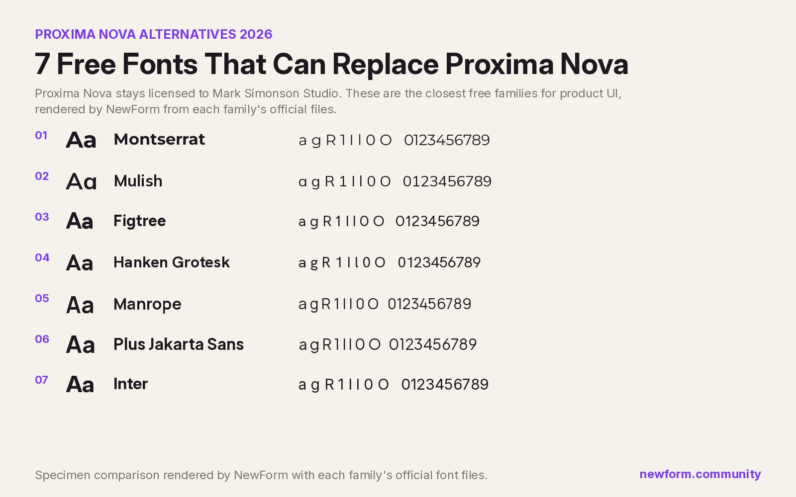
Find Your Stack
Discover the perfect design tools for your workflow.
Take the 60-second quizNewForm Studio
Turn your designs into professional mockups instantly.
Open StudioMore from NewForm
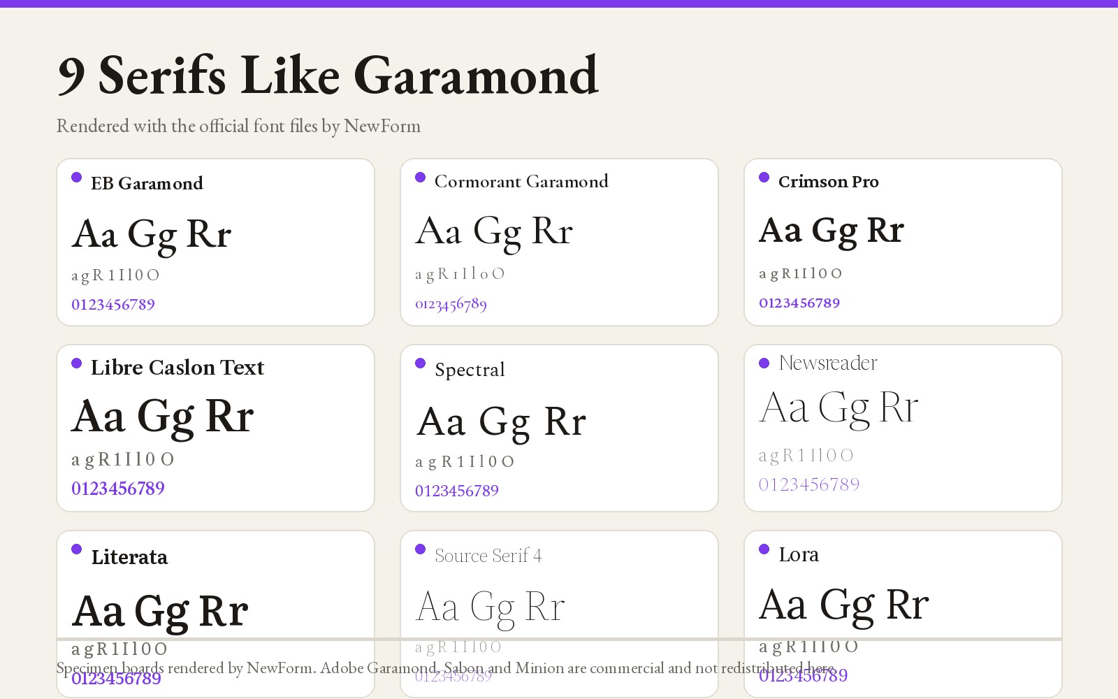
9 Fonts Similar to Garamond for Editorial and Web (Free and Paid, 2026)
EB Garamond is the closest free match, Cormorant Garamond the best at display sizes. Nine Garamond alternatives rendered from their official files, with settings, CSS and a switch checklist.
14 min read · Nov 6, 2026
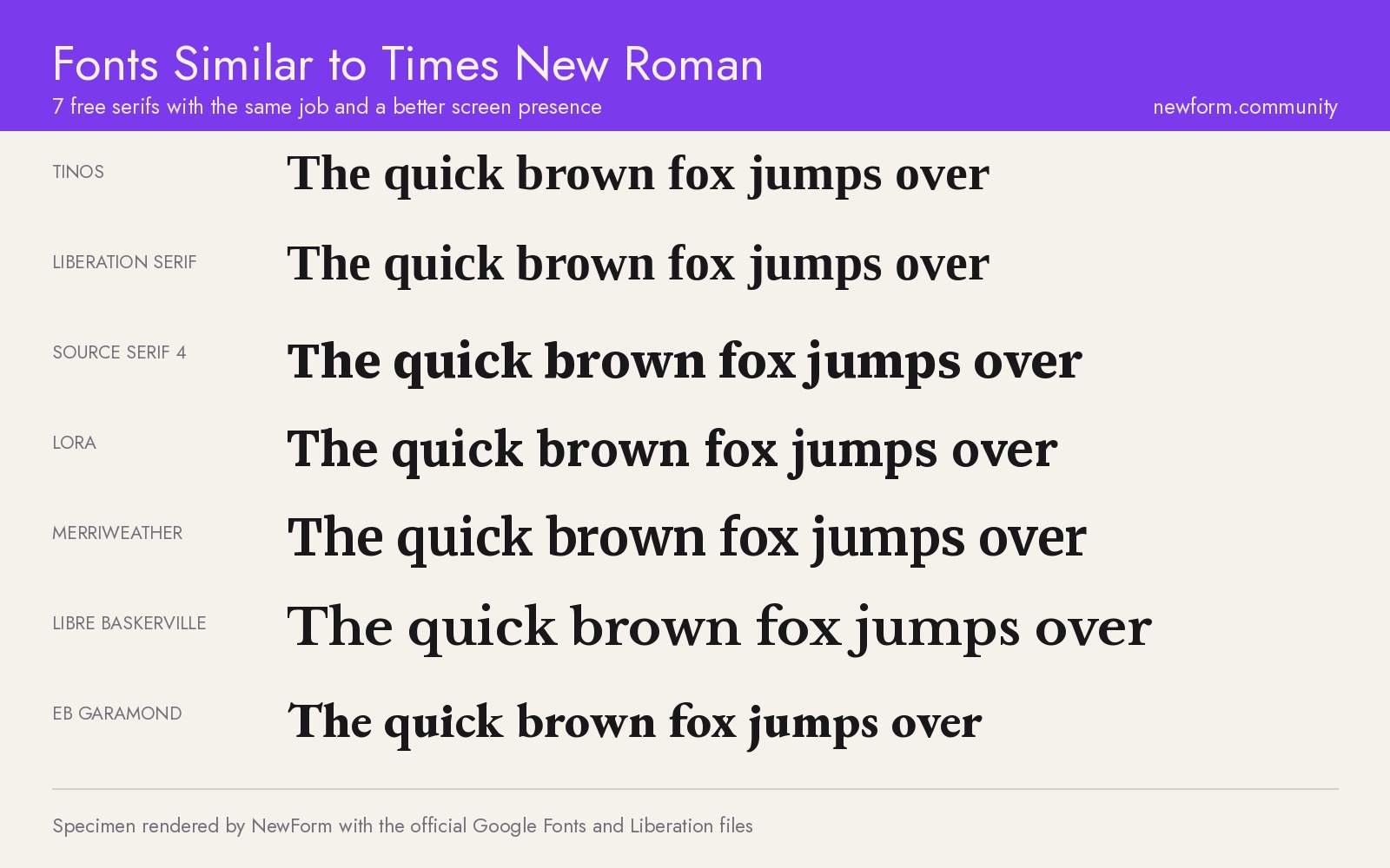
7 Free Fonts Similar to Times New Roman (Real Specimens, 2026)
Times New Roman is licensed and greys out on screen. These 7 free serifs, rendered from their official files, do the same job better.
15 min read · Nov 5, 2026