
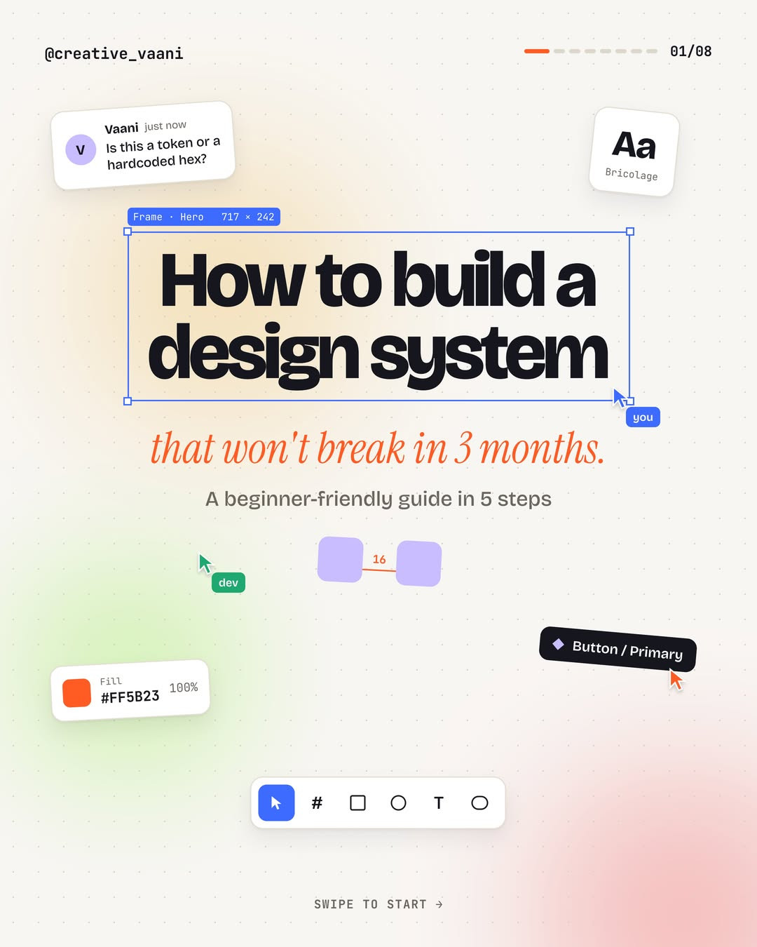
How to Build a Design System That Won't Break in 3 Months: A 5-Step Guide
Cover slide: how to build a design system that won't break in 3 months. Carousel by @creative_vaani.
Every design system guide tells you to build one. Almost none tell you why most of them collapse within three months while the team quietly goes back to copy-pasting old screens. The difference is rarely talent. It is order of operations.
This walkthrough by @creative_vaani lays out a five step sequence that keeps a system alive: foundations first, then tokens, then a small set of components, then variants, then documentation. Here is how to run that process in Figma without burning out in week two.
Step 1: Define your foundations before you draw a single screen

Decide the rules before any pixels. That means a primary and neutral color ramp, a type scale with real values (caption 12, body 16, heading 32, display larger), spacing steps, and rules for radius and elevation. Write them down somewhere visible, not just in your head.
The one habit worth stealing from this step: stick to a 4 point grid. If a padding or gap value is not divisible by 4, it does not ship. This single rule eliminates the endless "is it 18 or 20 pixels here" debates that quietly fragment a system before it exists.
Step 2: Turn values into tokens

A token is a name for a decision. The carousel breaks the layers down cleanly:
- Primitive tokens hold the raw values.
orange/500 = #FF8B23. Everything references these. - Semantic tokens describe what a value means.
color/action/primary = orange/500. This is the layer that lets you remap meaning without touching components. - Component tokens record where values live.
button/bg/defaultpoints at the semantic token.
Why bother with three layers? Rebranding becomes a primitive swap, and dark mode becomes a remap of the semantic layer. Components never change. In Figma, this maps to one variable collection per layer, with primitives and semantic collections and Light plus Dark modes.
Step 3: Build the five components you use on every screen

Start with five components, not fifty: button, input, card, avatar, and navigation. These five cover the majority of any interface. The discipline that matters here: auto layout and tokens only, zero hardcoded hex values inside a component. Fill pulls from color/action/primary, radius from radius/md, label styling from body/semibold. The moment a raw value sneaks into a component, the system has started breaking.
Step 4: Add variants and states

One component needs to cover every situation it will ever live in. That means building the full state matrix: default, hover, pressed, focus, and disabled, across each type (primary, secondary, ghost) and size (sm, md, lg). Inputs get the same treatment with default, focus, and error states.
Use a strict naming convention so variants are machine readable and predictable: Button / Type=Primary / Size=MD / State=Hover. Figma's variant menu will thank you, and so will anyone setting up variants programmatically.
Step 5: Document everything

Docs are what turn a tidy Figma file into a shared language. One page per component, covering:
- When to use it. For a primary button: the main action on a screen, and only one per view.
- Do and don't. One primary plus one secondary works. Two primaries fight for attention and both lose.
- Properties. Type, size, and state options, so engineers can mirror them in code.
- Accessibility. Contrast of at least 4.5 to 1, a 2px focus ring, and a 44px minimum tap target.
The five mistakes that kill design systems

The bonus slide lists the failure modes that show up in almost every file:
- Building 40 components on day one. Lock foundations and tokens first, then ship five core parts.
- Hardcoding hex values. Every color, spacing value, and radius should come from a token or a token is missing.
- Naming by looks instead of purpose. Name it
button/primary, not "blue-button". Colors change. Purpose does not. - No owner and no changelog. A system nobody maintains is a screenshot of past decisions.
- Skipping documentation. Undocumented components get reinvented, then forked.
Put it into practice
The whole sequence compresses into a rule: decide first, name it, build five of them, cover every state, and write it down. Teams that follow that order end up with a system that survives its first rebrand. Teams that start at step three end up with a component library that is already broken before the launch party.
Want to skip the blank canvas entirely? Build a working app in an afternoon with Base44 and apply these design system rules to a real product instead of a demo file.
Carousel by @creative_vaani (originally posted on Instagram, via @dailywebdesign). Images used with the original post attached.
Related on NewForm
Keep reading
Find Your Stack
Discover the perfect design tools for your workflow.
Take the 60-second quizNewForm Studio
Turn your designs into professional mockups instantly.
Open StudioMore from NewForm

15 UX Portfolio Examples That Get Designers Hired (And What Each One Does Right)
Fifteen real UX portfolio examples from working designers, the one lesson each teaches, a structure checklist, and how to build yours in a weekend.
11 min read · Nov 1, 2026
How to Choose UI Fonts by Mood: A Practical Pairing Method
Turn mood words like elegant, bold, and editorial into a practical type pairing, then test it on real interface content.
4 min read · Oct 21, 2026