
How to Build a Design System From Scratch (A Practical Guide)
Post by @kirti_uix, a practical breakdown of how design systems actually get built.

Design systems are one of those topics that sounds intimidating until you realize what they actually are: a shared library of decisions. That's it. Colors, typography, spacing, components, all the things you'd normally redefine on every new project, organized once and reused everywhere.
The problem isn't that design systems are hard. It's that most teams start wrong, they jump into Figma, create a bunch of components, and call it a system. But a system without structure is just a folder of inconsistent components.

Step 1: Audit What You Already Have
Before building anything new, do an inventory. Screenshot every screen in your product. List every color, font size, button style, card variant, spacing value. You'll find duplicates, inconsistencies, and things that exist for no reason.
This audit is your baseline. It tells you what needs to be standardized and what's already working. Skip this step and you'll build a system that nobody adopts because it doesn't match what's already in production.

Step 2: Define Your Design Tokens
Tokens are the foundation. They're named values that store your design decisions:
- Color tokens:
color-primary,color-surface,color-text-muted, not#7C3AED - Typography tokens:
font-heading,font-body,font-caption, notInter 24px Bold - Spacing tokens:
space-sm,space-md,space-lg, not8px,16px,24px - Radius tokens:
radius-sm,radius-md,radius-lg - Shadow tokens:
shadow-card,shadow-modal
The naming matters more than the values. When tokens are semantic, designers and developers speak the same language. When they're raw values, you're back to inconsistency.

Step 3: Build Your Core Components
Start with the components that appear on every screen:
- Buttons, primary, secondary, ghost, disabled, loading states
- Inputs, text, select, checkbox, radio, textarea, error states
- Cards, content card, media card, action card
- Navigation, tabs, breadcrumbs, pagination
- Feedback, toasts, alerts, modals, loaders
Each component should be built from your tokens, not hardcoded values. If a button uses color-primary instead of #7C3AED, changing your brand color updates every button instantly.

Step 4: Document Everything
A design system without documentation is just a Figma file that one person understands. For each component, document:
- When to use it, and when not to
- Anatomy, what pieces make it up
- Variants, all the states and options
- Do's and don'ts, common mistakes to prevent
- Code snippet, for developers to copy-paste
Tools like Figma's dev mode and Storybook make this easier, but even a simple Notion page beats no documentation.

Step 5: Roll Out and Maintain
The biggest reason design systems fail is adoption. You build it, send a Slack message, and nobody uses it. Here's how to avoid that:
- Start small. Get one team using it before rolling out company-wide.
- Make it the path of least resistance. If it's easier to use the system than to build from scratch, people will use it.
- Assign an owner. Someone needs to maintain it, review contributions, and keep it updated.
- Version it. When you make breaking changes, version the system so teams can upgrade on their own timeline.
- Track adoption. How many screens use system components vs custom ones? That's your north star metric.
The Takeaway
A design system is an investment that compounds. The first month is slower because you're building infrastructure. But by month three, your team ships twice as fast because nobody is reinventing buttons, debating spacing, or guessing at colors.
And if you want to build and test design systems with real, working components, Base44 lets you create functional apps from your designs without writing code, so you can see your system in action.
Originally posted by @kirti_uix on Instagram.
Related on NewForm

FREE FIELD GUIDE
The 8-Prompt Product
Answer 24 questions, run 8 prompts, and walk away this afternoon with a working, beautiful MVP you would be proud to show.
See what's insideKeep reading
Find Your Stack
Discover the perfect design tools for your workflow.
Take the 60-second quizNewForm Studio
Turn your designs into professional mockups instantly.
Open StudioMore from NewForm
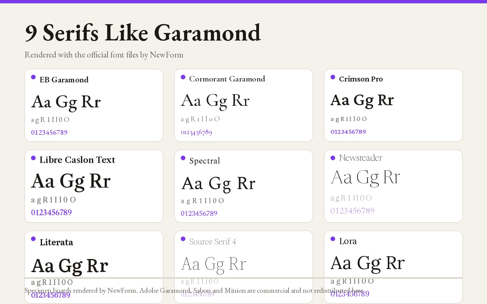
9 Fonts Similar to Garamond for Editorial and Web (Free and Paid, 2026)
EB Garamond is the closest free match, Cormorant Garamond the best at display sizes. Nine Garamond alternatives rendered from their official files, with settings, CSS and a switch checklist.
14 min read · Nov 6, 2026
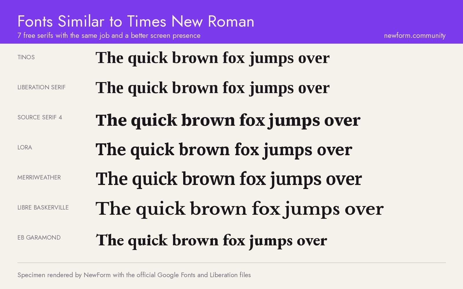
7 Free Fonts Similar to Times New Roman (Real Specimens, 2026)
Times New Roman is licensed and greys out on screen. These 7 free serifs, rendered from their official files, do the same job better.
15 min read · Nov 5, 2026