
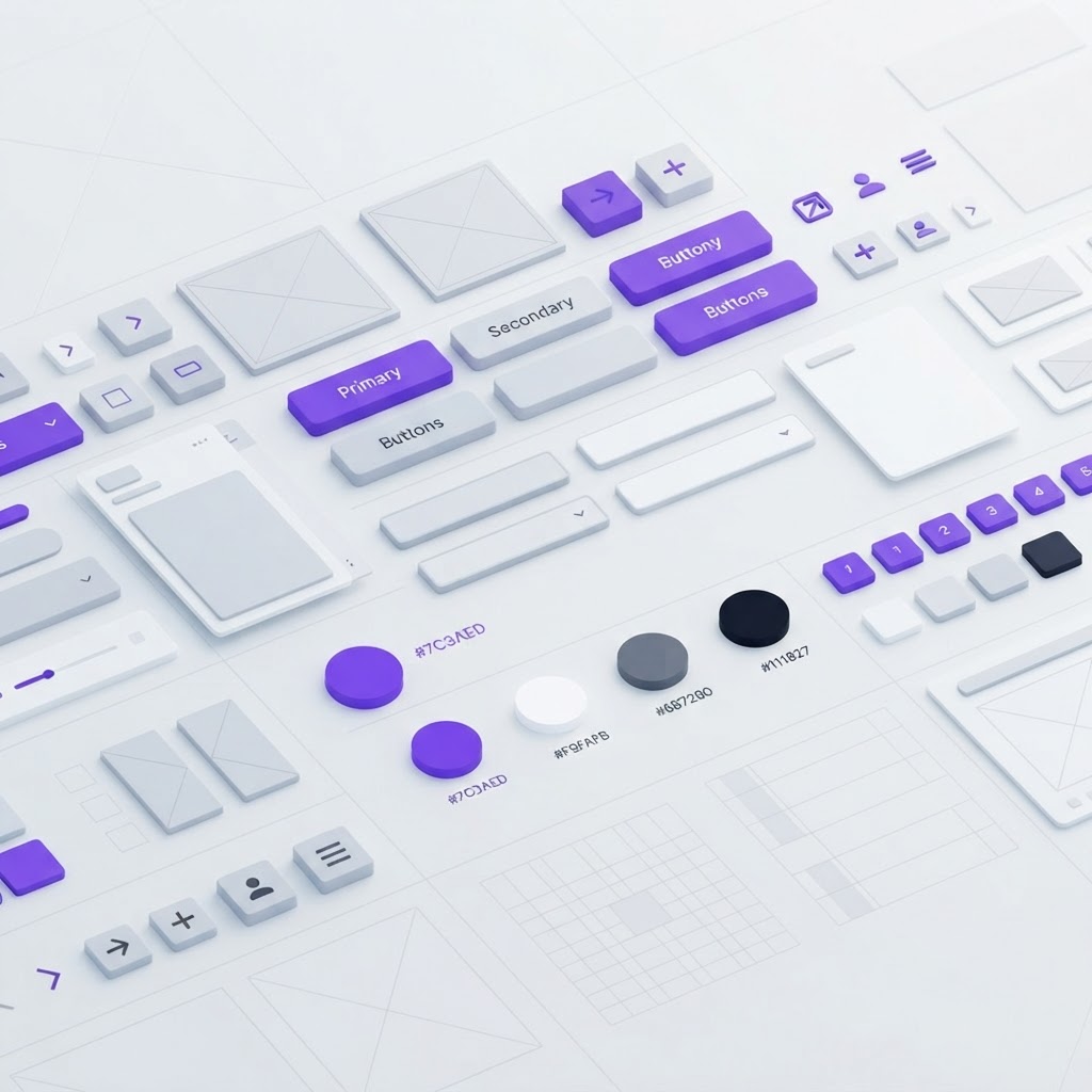
How to Build a Design System From Scratch (Step-by-Step)
Originally shared as a carousel on @dailywebdesign, original carousel by @kirti_uix. Expanded with additional steps, tools, and resources.


Building a design system is one of the highest-leverage things you can do as a designer. Done right, it eliminates inconsistency, speeds up every future project, and makes handoff to developers almost painless. Done wrong, it becomes a sprawling library nobody uses.
Here's a practical process for building a design system that actually gets used.
What a design system actually is (and isn't)
A design system is not just a component library. It's the combination of:
- Design tokens, your colors, typography, spacing, shadows, and border radii as named variables
- Component library, reusable UI building blocks built on top of those tokens
- Documentation, guidelines on when, why, and how to use each component
- Governance, a process for adding, changing, and deprecating components over time
Most teams build the component library and skip everything else. That's why most design systems fall apart.
Step 1: Audit what you already have
Before building anything new, inventory your existing UI. Open your current designs and list every unique button style, text style, color, spacing value, and component you see. You'll find duplicates: three slightly different shades of blue, five button variants that could be two, spacing that's 14px in one place and 16px in another.
Step 2: Define your design tokens first
Tokens are the foundation everything else is built on. Before creating a single component, define:
Color tokens: color-primary, color-neutral-100 through color-neutral-900, color-success, color-warning, color-error, color-background, color-surface, color-border
Typography tokens: font-size-xs through font-size-4xl, font-weight-regular/medium/bold, line-height-tight/normal/loose
Spacing tokens: Base-8 scale, 8, 16, 24, 32, 48, 64, 80, 96. Everything is a multiple of 8.
In Figma, these become Local Styles and Variables. Every component should reference tokens, never raw values.
Step 3: Build your atomic components first
Atoms first: Button, Input, Checkbox, Radio, Toggle, Badge, Tag, Avatar, Icon, Divider
Molecules next: Form field (label + input + error state), Search bar, Card
Organisms later: Navigation bar, Sidebar, Data table, Modal, Toast system
For each component, build all variants upfront: default, hover, focus, active, disabled, loading, error. Skipping states is the #1 mistake.
Step 4: Document as you build
As you create each component in Figma:
- Add a description in the component properties panel
- Create an "anatomy" frame showing each part labeled
- Add do/don't examples showing correct and incorrect usage
- Note accessibility requirements (minimum touch targets, color contrast ratios)
Zeroheight or Notion work well for external documentation shared with developers.
Step 5: Get developer buy-in early
Loop in your engineering team from step 1. Agree on naming conventions together, the names in Figma should match what ends up in code. Consider Tailwind CSS or shadcn/ui on the code side, which both use token-based approaches that map cleanly to a Figma system.
Step 6: Maintain governance
- How components get added: Review-based, not unilateral additions
- How components get changed: Deprecation notices, migration guides
- Who owns it: A named person or team
For a solo designer, governance is a habit: review your design system quarterly, archive what's unused, document what changed.
Ship faster with a pre-built foundation
If you're starting a new project and need a design system running today, Base44 generates fully functional apps with consistent component systems built in. Great for seeing a working design system in action while you're building your own.
And once you have your components designed, present them professionally using NewForm Studio.
View the full carousel on Instagram →
Credit: Original carousel by @kirti_uix, follow them for more UI/UX design content.
Find Your Stack
Discover the perfect design tools for your workflow.
Take the 60-second quizNewForm Studio
Turn your designs into professional mockups instantly.
Open StudioMore from NewForm

Progressive Layer Blur in Figma: A Step-by-Step Glass Effect Tutorial
Master the progressive layer blur effect in Figma to create depth, glassmorphism, and visual hierarchy. A practical step-by-step tutorial from a real carousel breakdown.
6 min read · Sep 29, 2026

Banking App UI Concept That Balances Trust and Modern Design
A banking app concept that proves financial interfaces do not have to be boring. We break down the design decisions that make fintech UI feel trustworthy without sacrificing visual appeal.
5 min read · Sep 29, 2026