
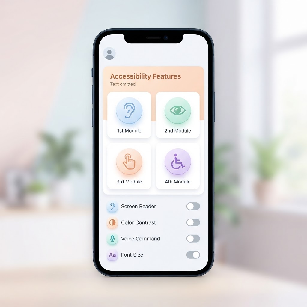
How to Design for Accessibility Without Sacrificing Aesthetics
How to Design for Accessibility Without Sacrificing Aesthetics
There's a persistent myth in design circles: making things accessible means making them ugly. This couldn't be further from the truth. The best accessible designs are indistinguishable from great design, because good design IS accessible design.
Start with Color Contrast
The WCAG (Web Content Accessibility Guidelines) recommends a minimum contrast ratio of 4.5:1 for body text and 3:1 for large text. Many designers treat this as a constraint. But with the right approach, it's actually a creative prompt.
How to make it beautiful:
- Use rich, saturated darks instead of pure black. Deep navy (#1a1a2e) provides excellent contrast against white while feeling warmer than #000000.
- For light backgrounds, use off-white (#FAFAFA) instead of pure white. This reduces eye strain while maintaining contrast.
- Build your palette with contrast in mind from the start, not as an afterthought.
Typography That Works for Everyone
Accessible typography isn't just about font size. It's about readability across contexts.
Key principles:
- Base size of 16px for body text. Anything smaller risks excluding low-vision users.
- Line height of 1.5 for body text. Tight line spacing reduces readability dramatically.
- Maximum line length of 70 characters. Longer lines cause readers to lose their place.
- Don't rely on font weight alone for emphasis. Italic, color, and size all work together.
- Avoid all-caps for long text. It reduces letter shape distinction and is harder to read.
Focus States: Not Just for Keyboard Users
Focus states (the visual indicator when an element is selected) are often ugly blue outlines that designers hide. But they're essential, not just for keyboard users, but for anyone navigating with a game controller, switch device, or voice commands.
The fix: Design focus states as part of your design system. A well-styled focus ring using your brand color at 2-3px width can look intentional and polished, not like a browser default.
Motion and Animation: Respect Preferences
The prefers-reduced-motion media query lets you detect users who have requested reduced motion in their system settings. This includes users with vestibular disorders, epilepsy, or simply those who find animations distracting.
How to handle it:
- Provide instant state changes (no animation) for reduced-motion users
- Replace parallax effects with static backgrounds
- Replace auto-playing carousels with manual navigation
- Keep transitions under 300ms when motion is enabled
Touch Targets: Size Matters
WCAG 2.1 requires a minimum touch target of 44×44 CSS pixels. This isn't just about accessibility, it improves the experience for everyone, especially on mobile.
Design tip: You can make a button visually small while keeping the touch target large. Use padding to expand the clickable area beyond the visual boundary.
Alt Text: Write It Like a Designer
Alt text doesn't have to be a dry description. Think of it as microcopy that serves the same purpose as the image, to communicate information, set a tone, or guide understanding.
Bad alt text: "Image of a chart" Good alt text: "Bar chart showing 40% increase in signups after the button redesign"
Color: Never the Only Signal
Color blindness affects about 8% of men and 0.5% of women. If your error states are only communicated through red, millions of users won't see them.
The fix: Always pair color with an icon, pattern, or text label. A red border with an error icon and "Please fix this field" text is accessible to everyone.
The Beauty of Accessible Design
When you design for accessibility from the start, you're forced to make deliberate choices about hierarchy, spacing, contrast, and clarity. These constraints don't limit creativity, they channel it.
The most beautiful interfaces in the world . Apple's, Stripe's, Linear's, are also highly accessible. That's not a coincidence. It's because the same principles that make a design accessible (clarity, contrast, consistency, hierarchy) are the principles that make it beautiful.
Want to test your designs for accessibility? Try the NewForm Studio to see your interfaces in realistic mockups. And find the right tools for your workflow with our 60-second quiz.
Find Your Stack
Discover the perfect design tools for your workflow.
Take the 60-second quizNewForm Studio
Turn your designs into professional mockups instantly.
Open StudioMore from NewForm

Top Dashboard UI Designs to Learn From (2026 Showcase)
Five standout dashboard designs across SaaS, AI, cybersecurity, energy, and fintech. Each one shows how to turn complex data into a clean, usable interface.
7 min read · Sep 24, 2026

10 UI Design Ideas to Steal for Your Next Project (2026)
Ten practical UI design patterns worth borrowing for your next project, from clear empty states to premium dark mode and compact data displays.
6 min read · Sep 24, 2026